Blog
Smiley Face Neon Sign: Happiness in One Circle
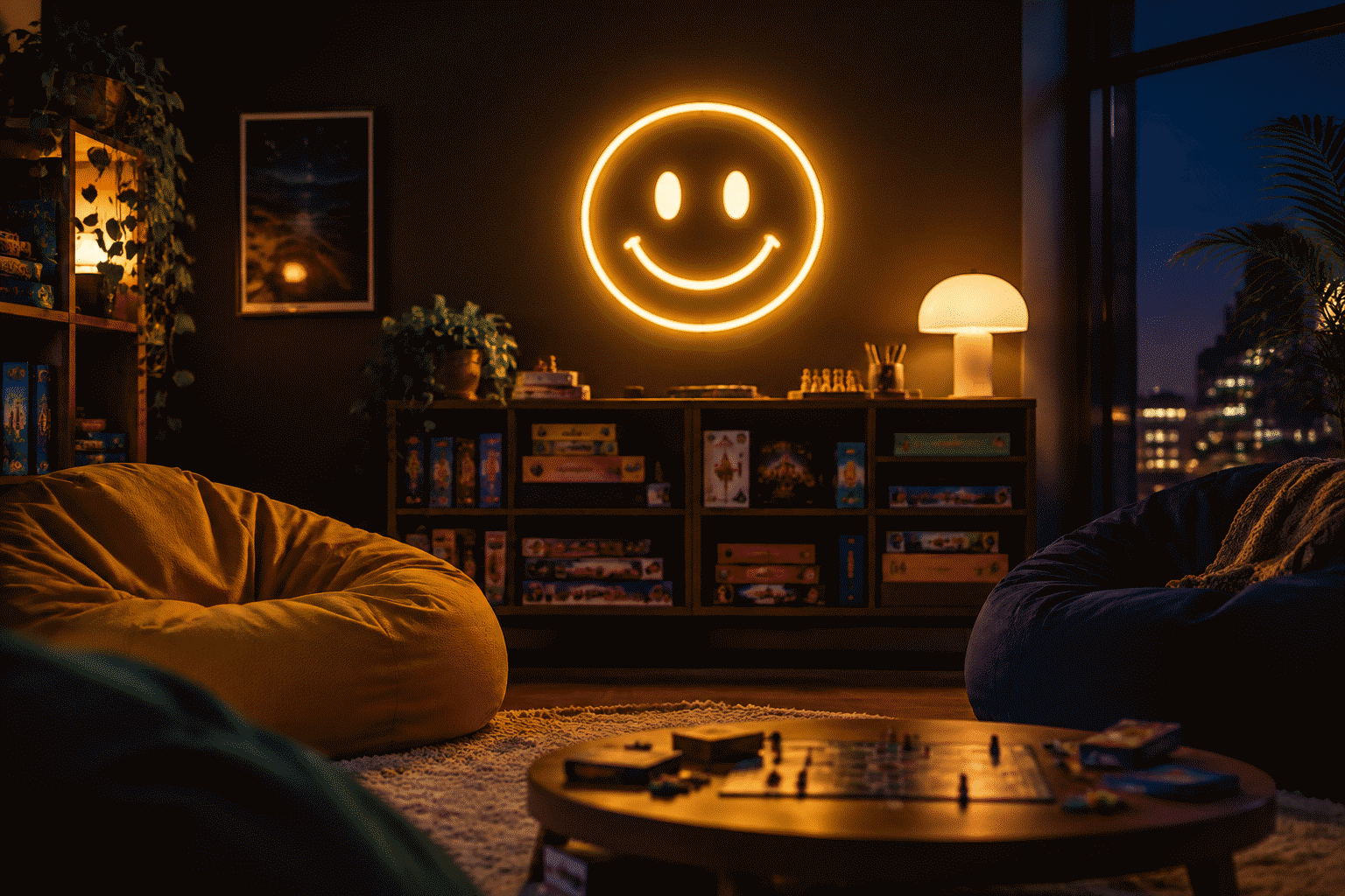
Two dots and a curve. The smiley is the smallest complete design in the decor catalog — a face you can draw in one second, recognize in one glance, and argue with never. It took a graphic designer in 1963 sixty minutes to create (a workplace-safety morale campaign, of all origins), and it has spent six decades since becoming the one symbol that means exactly one thing in every language on earth.
In neon, the smiley finds its medium match: the circle, the two dots, and the smile arc render as three clean tube strokes, and the yellow the icon was born wearing is the medium’s most cheerful hue. This guide covers the smiley glow: the icon’s three eras (each one a different wall context), the color registers, the five rooms it owns, the custom tiers, and the sizes. The short version for the impatient: the classic warm-yellow build at 14 to 20 inches, hung where the room needs the friendliest object it can afford, dimmed to taste.
The Three Smiley Eras (Why It Keeps Coming Back)
The icon has been through three distinct lives, and each one gives the wall a different context:
- The original (1963-1970s). The corporate-morale and fad era — buttons, decals, the “have a nice day” decade. The original smiley is earnest: warm yellow, simple features, the optimism of postwar graphic design. This is the version the warm-yellow neon piece renders.
- The acid house era (late 1980s-1990s). The icon’s second life: rave culture adopted it, bent it, and recolored it — the melting smileys and the day-glo variants. The smiley as subculture signifier: joy with an edge. This era’s version is the melted or X-eyed custom tier, the one collectors and ravers know.
- The Y2K revival (2000s) and the current wave. The icon’s third and fourth lives: first the nineties-nostalgia reboot, now the current maximalist-aesthetic wave where the smiley runs in rainbow and pastel variants. The smiley is decor’s most reliable comeback artist — it returns every decade in that decade’s colors.
The wall choice follows the eras: earnest warm yellow (the original), the melted custom (the rave tier), or the rainbow and pastel variants (the current wave). All three are the same two dots and a curve underneath.
The Color Registers
- Warm yellow. The canon — the icon’s birth color, and the medium’s happiest hue. The full behavior of yellow in glow is in our yellow sign guide; the smiley runs the warmer end of the family. The default build and the right one for most rooms.
- The rainbow and pastel tiers. The current wave’s variants: the smiley outline with gradient effects, or the pastel set for the aesthetic rooms. The version that matches a room already running pink or blue.
- White on dark. The minimal read — the smiley in warm white, the icon as pure design. The version for rooms that want the agreeable object without the color commitment.
- The duo-tone custom. Outline in one hue, features in another — the designer’s variant, and the build that photographs best.
The Rooms the Smiley Owns
The kids’ room. The icon’s most honest deployment: the face every toddler already knows, at the gentlest brightness. The kids room guide covers the wider wall; the smiley runs 12–16 inches in warm yellow with the dimmer doing the bedtime work.
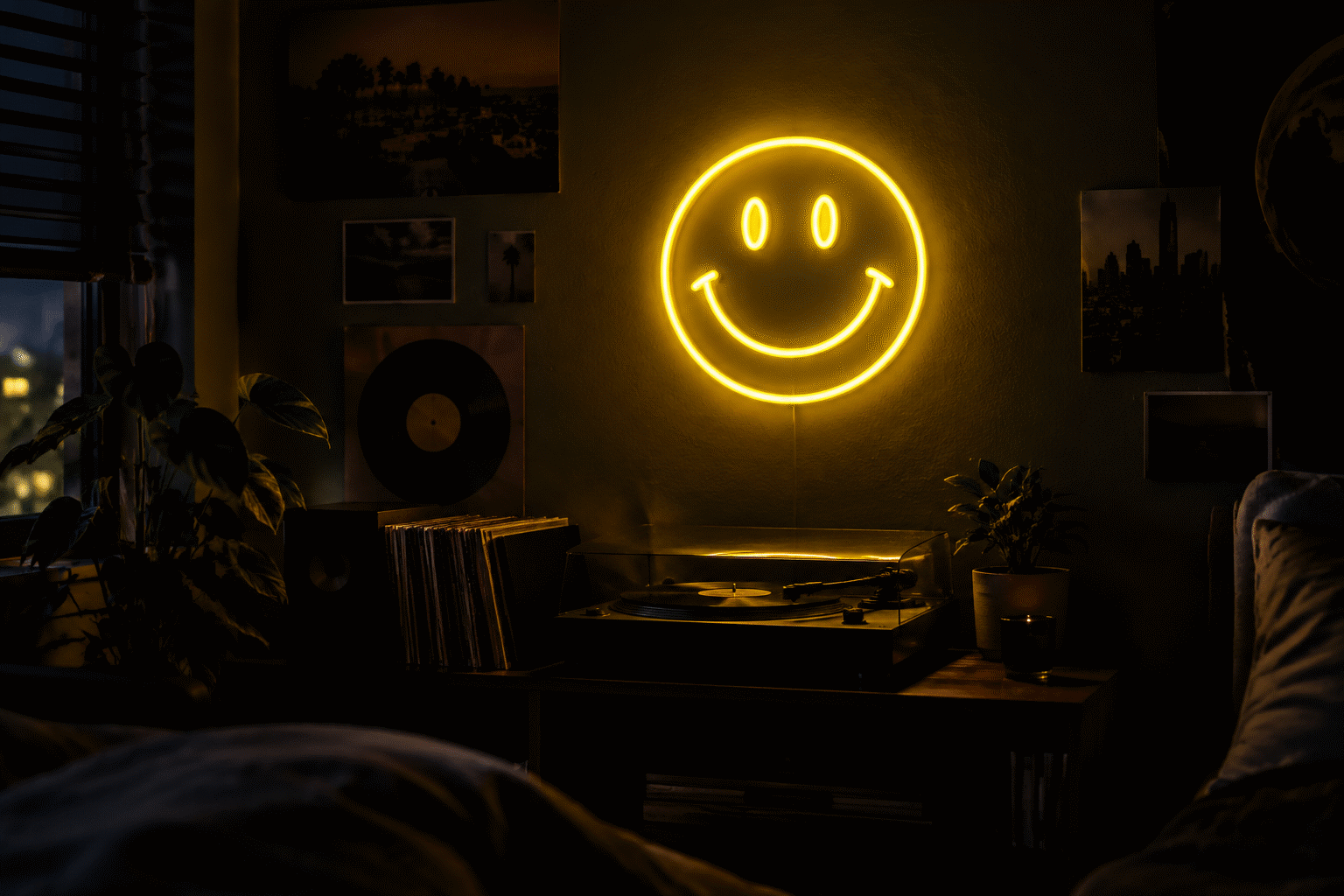
The entertainment and game room. The smiley’s party register: the piece that sets a room’s mood to friendly before anyone sits down. Pairs with the phrase tier — the Good Vibes Only design is the natural companion piece, phrase and icon from the same emotional shelf.
The home office and studio. The morale-camper’s original context, revived: the smiley over the desk as the anti-corporate corporate art. The 12–14 inch warm-yellow tier; the irony of the icon’s safety-campaign origins doing morale work in your own office is the point.
The retail and cafe tier. The commercial smiley: the window piece that says “friendly inside” — the frozen-yogurt shops and record stores already know. The icon reads as invitation rather than branding (no name needed), which is why small businesses run it.
The bathroom (the surprise tier). The current wave’s deployment: the small smiley in the bathroom’s aesthetic stack — the agreeable object in the room that needs it most at 2 a.m. The pastel variants’ native habitat.
The Custom Tiers
The fan-styled custom route (the icon is public-domain-adjacent design history — one of the few in this catalog):
- The classic build. Circle, dots, curve in warm yellow at 14–20 inches — the $80–$120 tier, the register’s bread and butter.
- The melted variant. The rave-era rendering — the smiley with the wavering outline, the acid-house custom. The deep-cut tier for the generation that was there.
- The set piece. Three smileys in three colors — the current wave’s wall cluster, the aesthetic-room standard.
- The phrase-plus-face. “GOOD VIBES” or “BE NICE” with the smiley — the combined build, phrase and icon in one piece; priced by width and color count in the custom builder.
The Icon in the Current Wave
The smiley’s fourth act deserves its own note, because it explains why the icon is selling again:
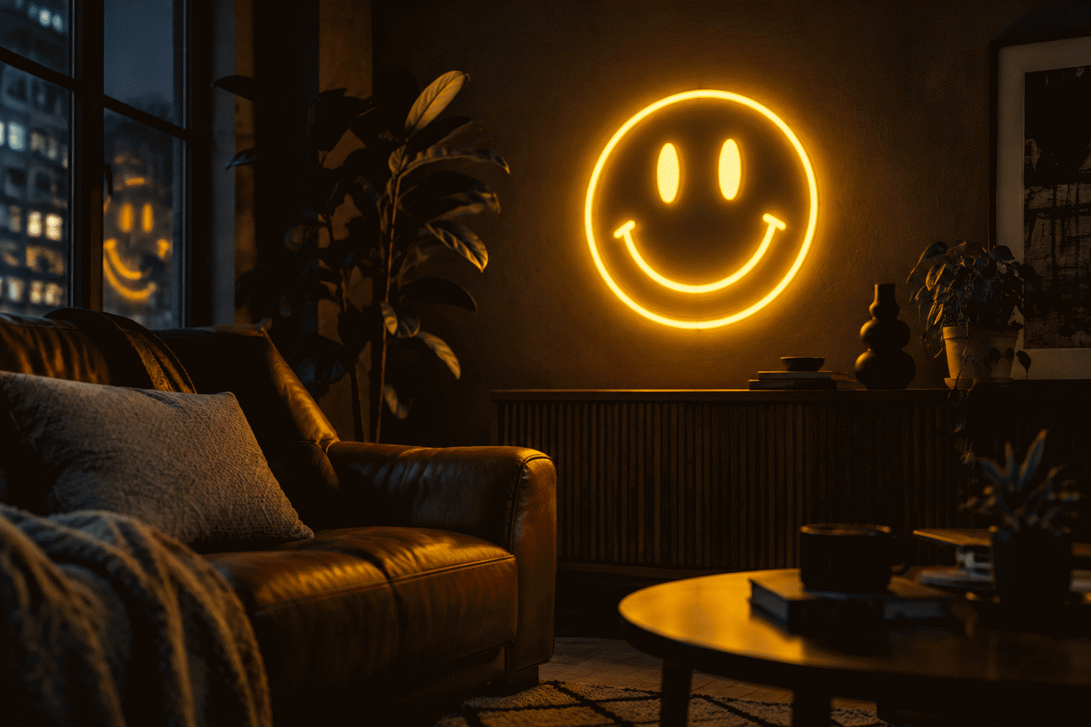
- The dopamine-decor era. The current aesthetic wave runs explicitly cheerful: bright colors, friendly icons, rooms designed to counterbalance the news cycle. The smiley is the wave’s smallest unit – the two-second version of the whole philosophy, and the most affordable piece of it.
- The nostalgia stack. The icon now reads as nostalgic twice over: the fad era for one generation, the rave era for the next, the Y2K revival for the one after that. Three generations each see their own smiley – the rare icon that is simultaneously everyone’s memory.
- The anti-irony turn. After a decade of decor that meant something else, the unironic smiley is the statement: a room that says what it means. The warm-yellow classic on a clean wall is the movement’s purest expression.
The Sizes
| Tier | Size | The tier is for |
|---|---|---|
| The desk smiley | 10-14 in | Desks, shelves, bathrooms |
| The room standard | 14-20 in | Kids’ rooms, game rooms |
| The statement circle | 20-28 in | The party wall, retail window |
| The set build | three pieces | The aesthetic cluster |
One sizing behavior unique to the icon: the smiley reads bigger than its measurements — a circle is optically larger than a word of the same width — so order a tier down from instinct.
Keep the good-mood wall growing: the howdy neon sign ideas piece covers the other friendly greeter worth the same shelf, and the lips neon sign ideas guide completes the pop-icon pairing for the wall's second slot.
FAQ: Smiley Face Neon Signs
What does a smiley face neon sign cost? The classic warm-yellow build runs $80-$120 at 14-20 inches; melted and duo-tone customs $120-$200; the three-smiley set $200-plus. The icon is one of the catalog’s most affordable pieces — three tube strokes do the whole job.
What color smiley sign is best? Warm yellow, the canon — the color the icon was born in. The rainbow and pastel tiers match the current aesthetic wave; white-on-dark is the minimal read. The duo-tone custom photographs best.
Where did the smiley face come from? A graphic designer created it in 1963 for a workplace morale campaign — sixty minutes of work, six decades of life. It ran the fad era, the acid-house era, and the Y2K and current revivals: decor’s most reliable comeback.
Is a smiley sign good for a kid’s room? One of the best — the face toddlers already know, in warm yellow at low brightness. The kids room guide covers the wider wall; the smiley’s dimmer does the night-light work.
What pairs with a smiley neon sign? The phrase tier from the same emotional shelf: the Good Vibes Only piece is the natural companion. The room aesthetic guide covers the wider friendly-wall stack.
Where should a smiley sign go? The icon works in the kids room (the face every toddler knows), the game room (the mood-setter), the home office (the morale piece), the retail window (the invitation), and the bathroom (the current wave surprise tier). The one place it fails: rooms trying to be serious – the icon disagrees with serenity on principle.
What is the melted smiley? The acid-house-era variant — the smiley with a wavering outline, the rave culture rendering. The deep-cut custom tier, for the generation that was on the dance floor when the icon got its second life.
Be Agreeable
Two dots and a curve, sixty years deep, fluent in every language. The most agreeable object in decor — build it in the canon yellow or this decade’s colors, and let the wall smile first.
More friendly glow: the yellow register, good vibes pieces, the eighties wave, kids’ walls.
Sources & Further Reading
- Neon sign (Wikipedia) — the consolidated public record of neon-sign history and technology.
- Mercury (U.S. EPA) — federal guidance on mercury exposure and safe handling.
Pricing based on CustomNeon’s current catalog (2026); custom quotes come live from the sign builder.