For Kitchens, Keys & Shared Walls

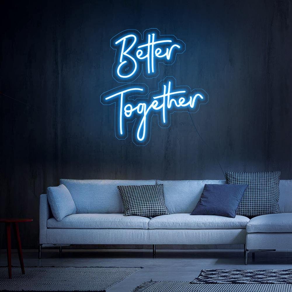
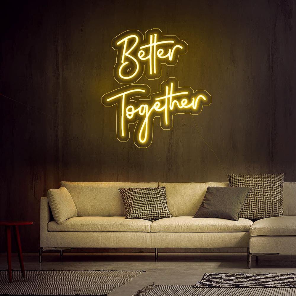
Better Together Neon Sign

The phrase that skips the fairytale and states the working thesis: the household runs better with both of you in it. Warm white and soft gold for the rooms where life actually happens.

Hero visual placeholder
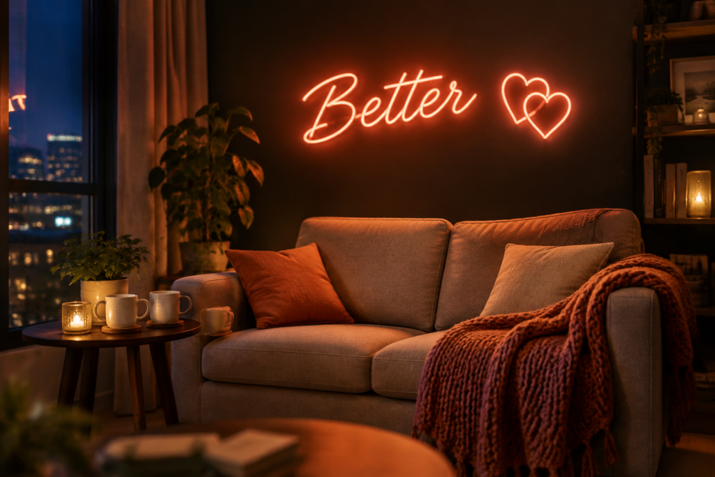
4:3 · warm white better together script glowing over a kitchen doorway between coffee mugs

Anniversary-native

The vow that reads true year five.

Kitchen-doorway tested

Sized for the room couples share most.

Free design preview

Names and date built in, free.

Gift-canon safe

Weddings, anniversaries, housewarmings.

In-Stock & Custom

Together & Partnership Sign Designs

Theses, realizations and daily reminders – the partnership family from kitchen to vows.

better together script

The thesis · warm white

$156

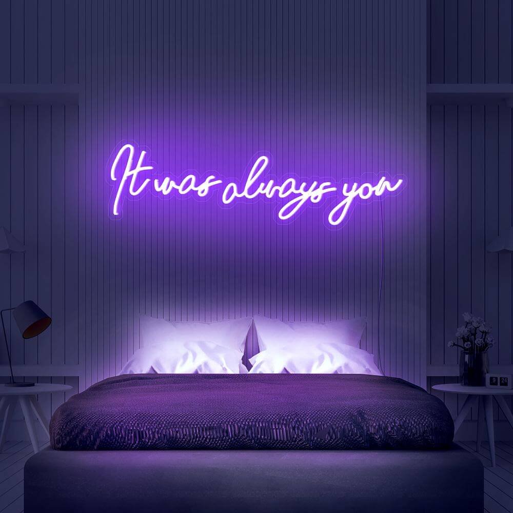
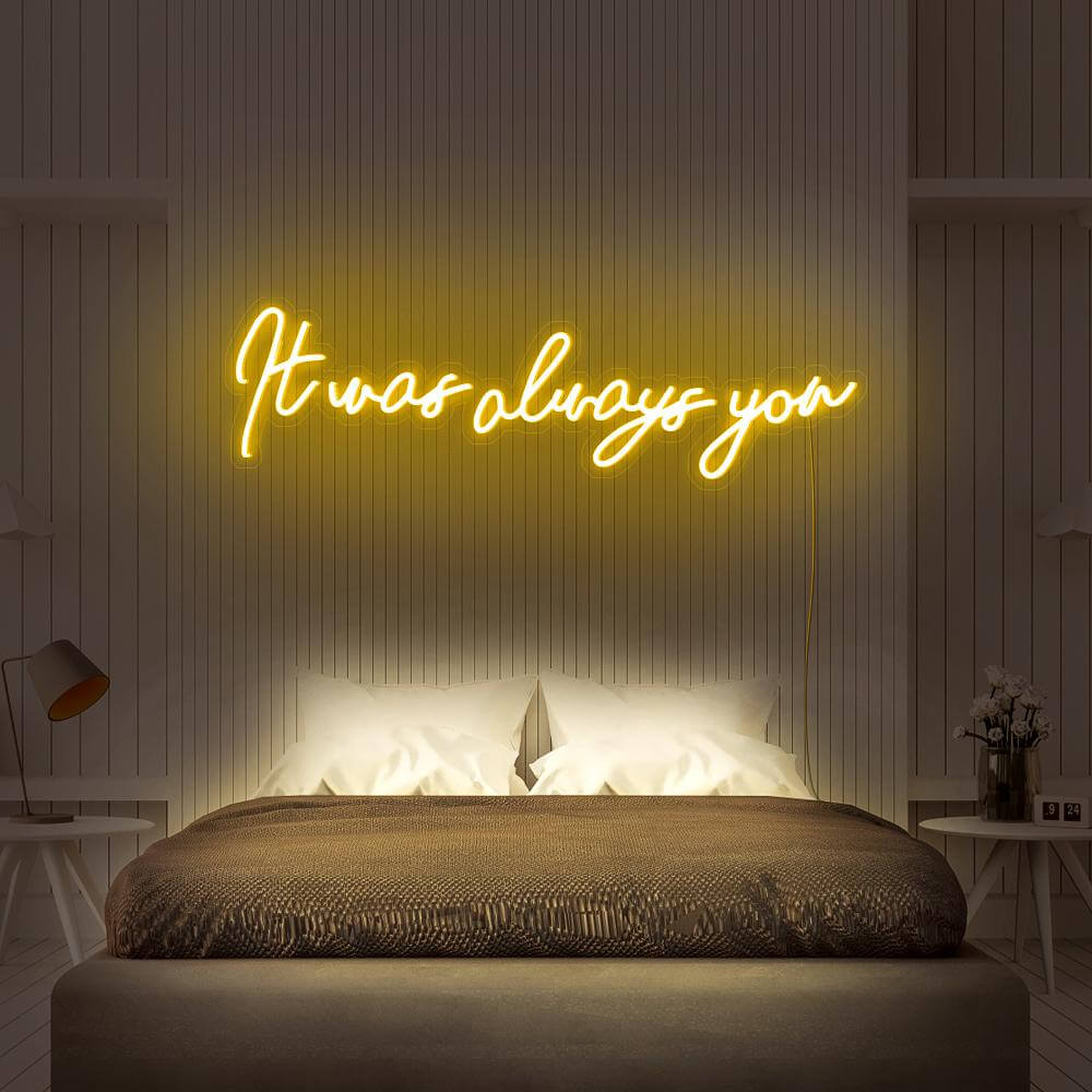
it was always you script

The realization · white

$234

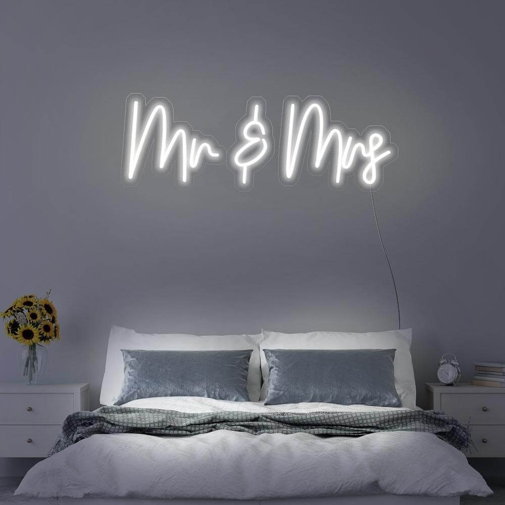
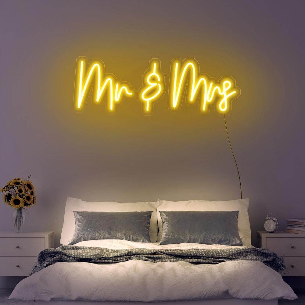
mr and mrs lettering

The formal · gold

$166

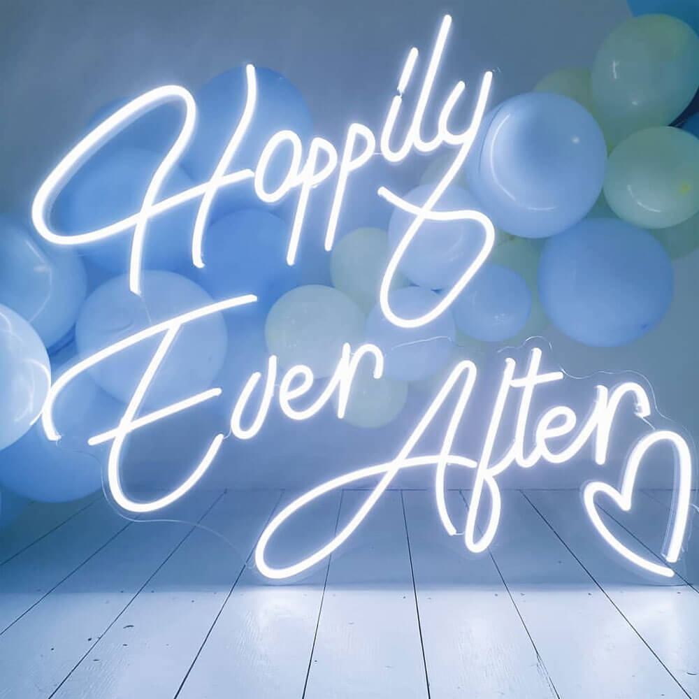
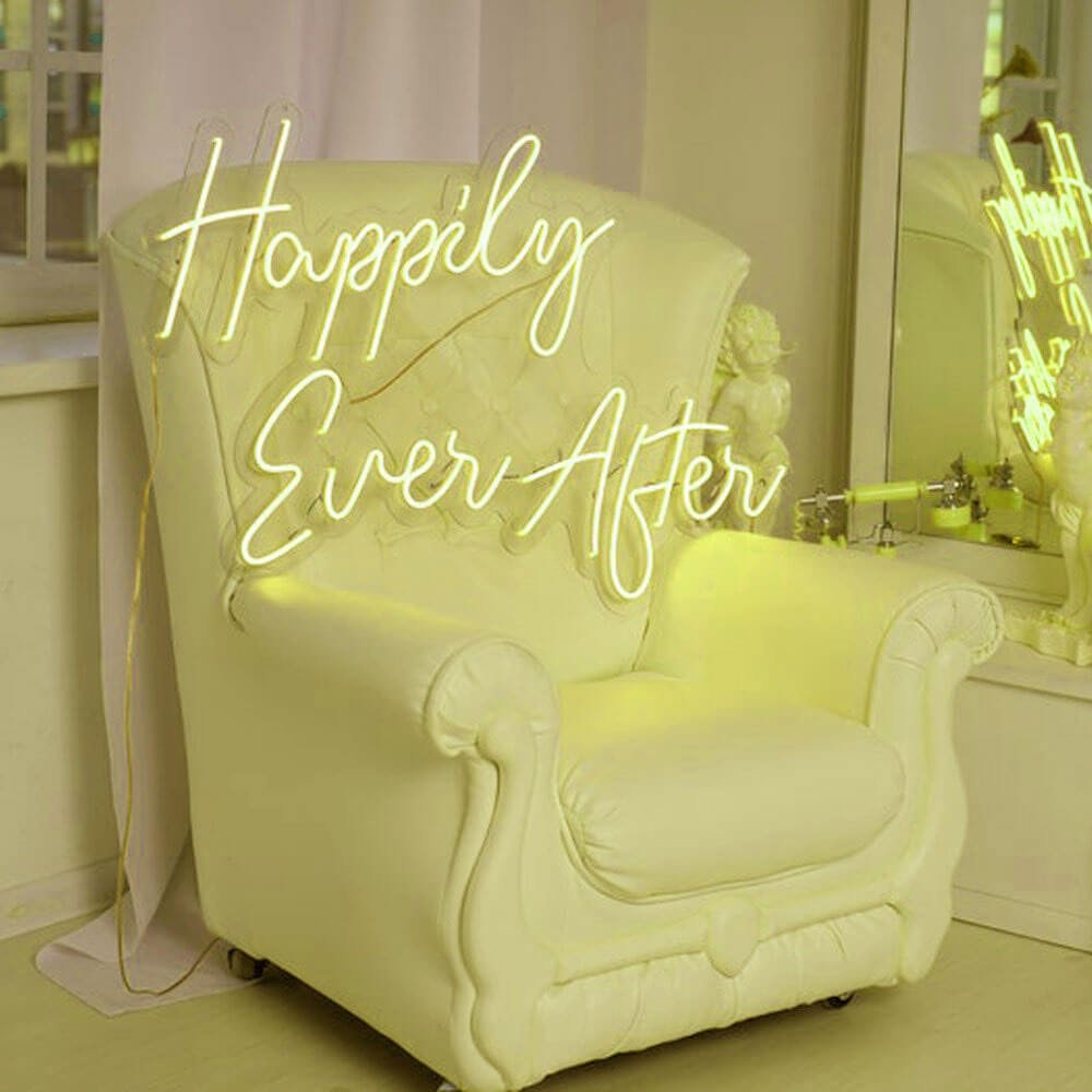
happily ever after script

The genre · blush

$238

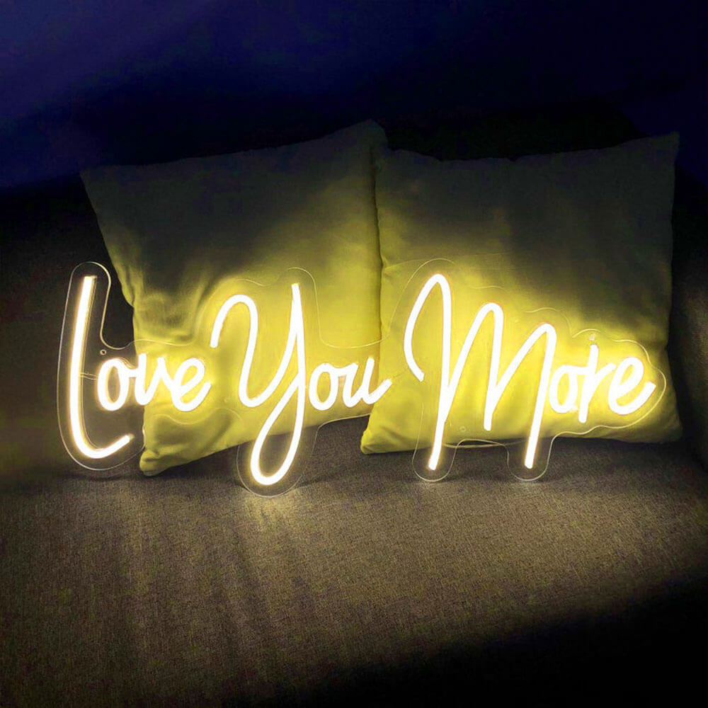
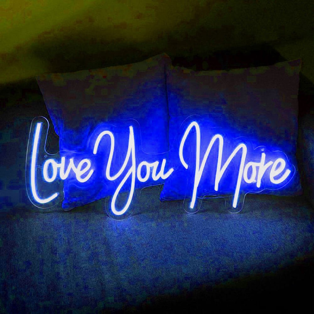
love you more script

The contest · pink

$206

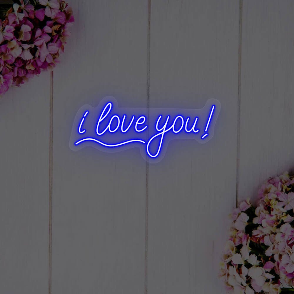
i love you script

The simple · red

$258

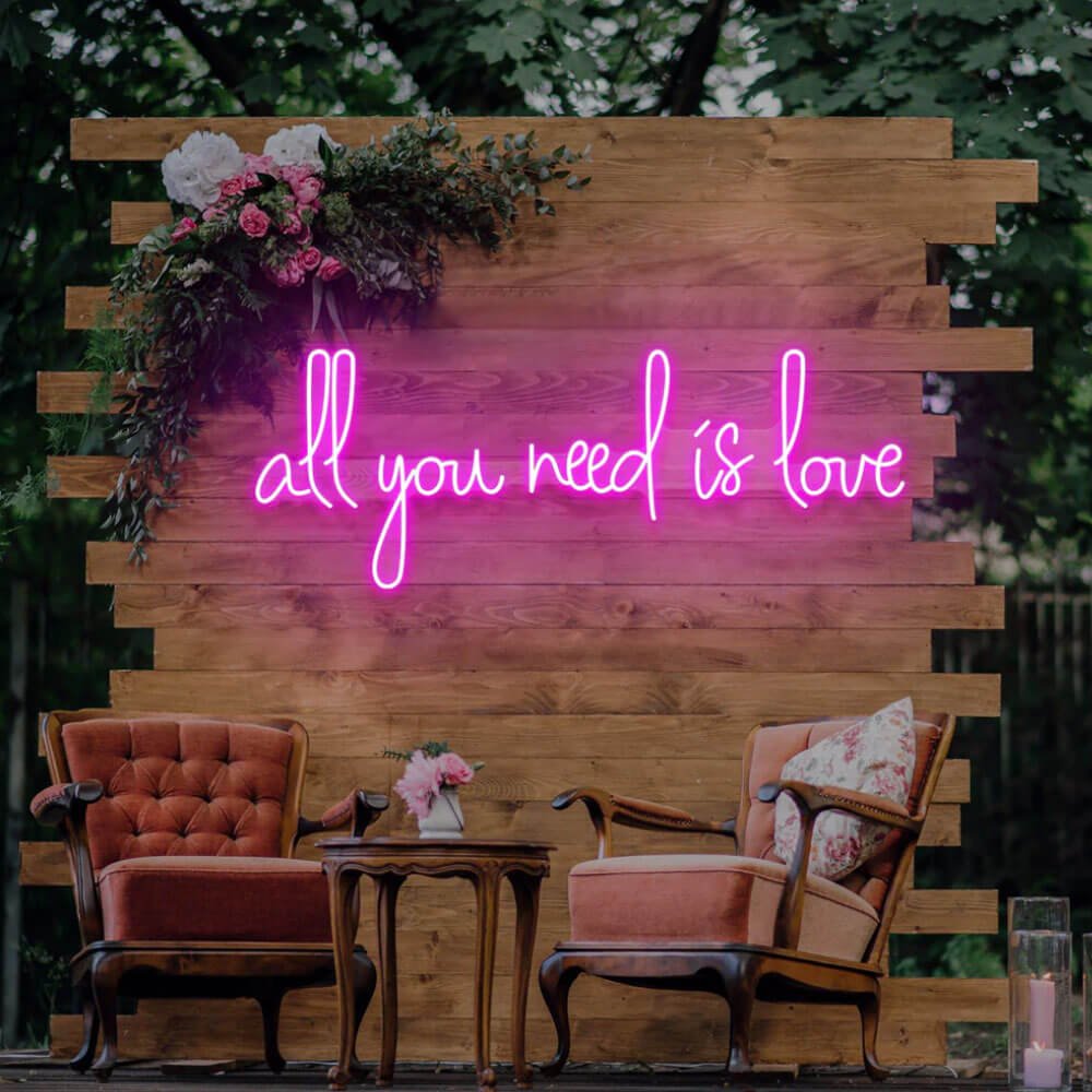
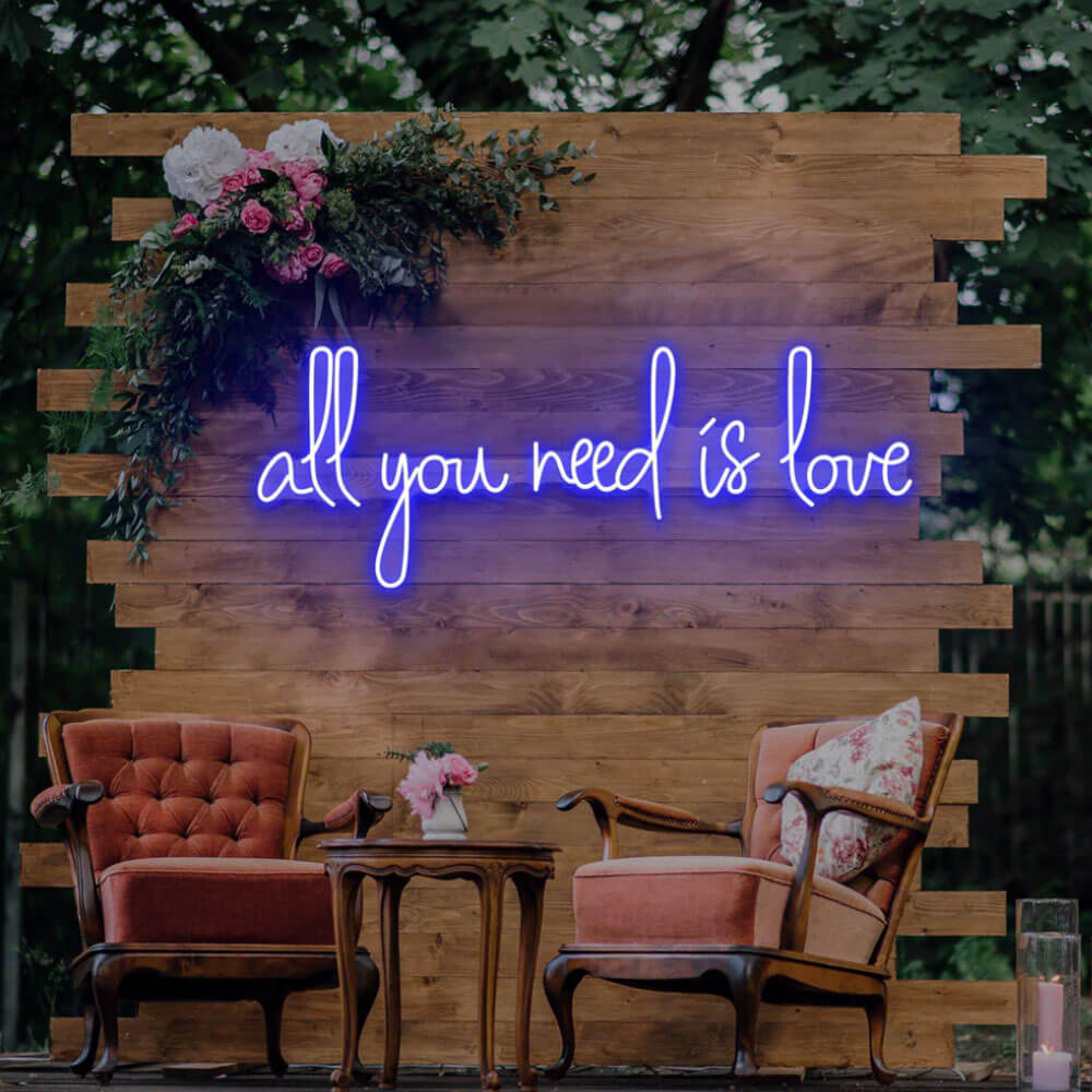
all you need is love letters

The anthem · red

$229

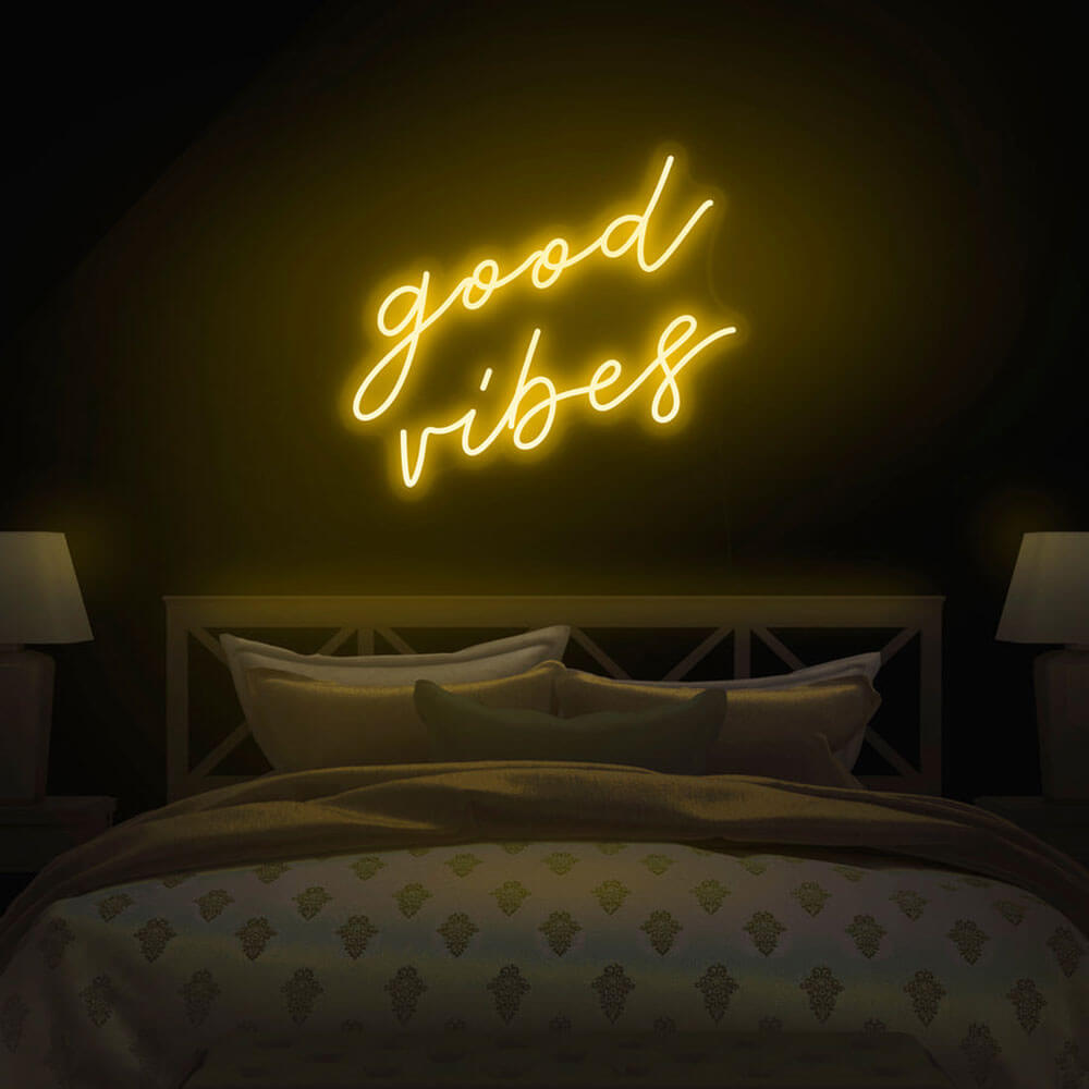
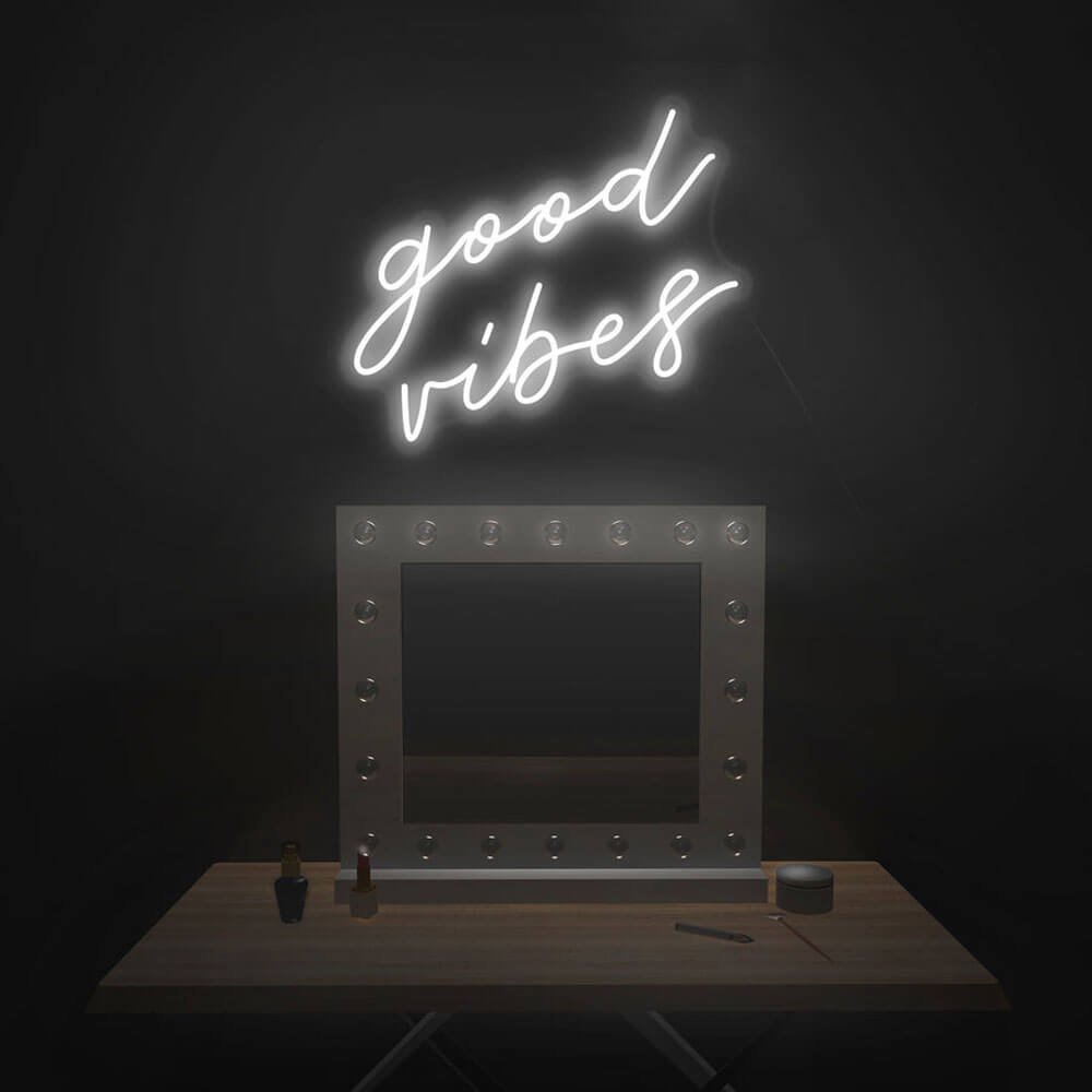
good vibes script

The household mood · green

$242

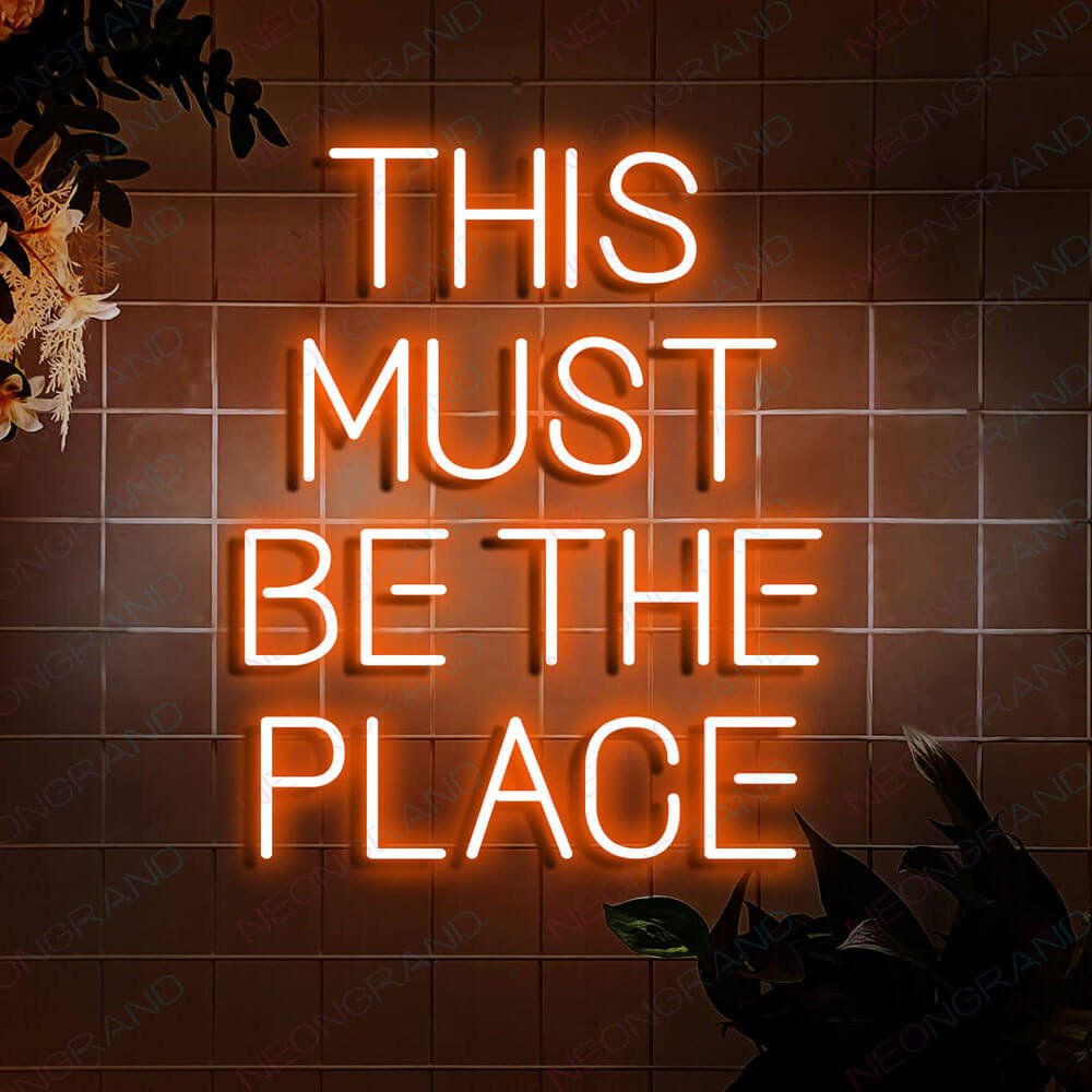
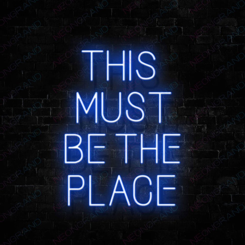
this must be the place script

The homecoming · sage

$178

welcome script letters

The opener · warm white

$145

Buyer's Guide

How to Choose a Better Together Sign

Happily-ever-after promises a genre; better together states a finding – that the household, the kitchen, the whole operation runs better with both names on it. It is the vow-sign for year five and the kitchen-sign for every morning. Here is how to choose it right.

warm white script over a kitchen doorway

1 · A thesis, not a fairytale

The phrase’s grammar does the work: better is comparative, which means the sign admits the solo version existed and finds it lacking. That honesty is why the phrase outlasts genre-signs in daily rooms – no storybook register to break, just a claim that re-proves itself at every grocery run. It is also the vow that ages best: happily-ever-after is tested by year five, better together is confirmed by it. Couples gravitate here when the wedding is past and the marriage is the project.

2 · Warm white, soft gold and the daily palette

Daily-room signs need daily-room colors: warm white is the workhorse – it glows like morning light over coffee and disappears politely into evening; the white page covers the range. Soft gold runs the anniversary register and pairs with wood and brass; the yellow page covers the warm family. Coral and peach are the modern-romance build; blue reads cool-calm for minimalist pairs. The rule for this phrase: no neon-bold – the claim is domestic, and the glow should match the volume of the room it proves.

sign above a living-room sofa gallery

soft gold version at an anniversary dinner

3 · The kitchen doorway and other daily posts

The phrase’s natural habitat is the architecture of daily life: over the kitchen doorway or above the counter where two mugs land; in the entry above the key rack where the household coordinates; over the sofa in the living room that hosts the marriage’s actual audience. Wedding backdrops take it for couples who want the thesis at the ceremony; the wedding guide covers venue positioning. Post it where the two of you actually stand, not where guests would expect a sign.

4 · Fonts, and the ampersand moment

Script is the default and suits the phrase’s conversational register. The detail that defines the design is the ampersand: a large decorative & between the two words is the signature build – the symbol doing the sentence’s work. Custom layouts frequently hang the couple’s names off the ampersand (name & name, better together beneath) – preview the exact arrangement free in the customizer. Block letters suit modern farmhouses; the 24-inch block build over a doorway is a common order.

names-and-date layout detail

sign with two coffee mugs on a counter

5 · Sizing doorways, sofas and counters

Over interior doorways, 24–36 inches spans the frame; the sign centered at 78–84 inches clears heads and reads at passing distance. Above a sofa, span two-thirds of the sofa – 40–48 inches typical. Counter and coffee-station builds run 18–24 inches, sized to the upper cabinets. The two-word phrase reads compact and warm; it does not need the width the fairytale phrases demand, which makes it the better fit for the small daily walls the fairytale cannot use.

6 · Power in daily rooms

This sign earns its keep on daily – which makes it the class where running cost matters: LED neon-style draw is a few watts, candle-adjacent, with the full math in the electricity guide. Many households run it dawn-to-dusk at the low dimmer as the kitchen’s standing light. Route cords along cabinet tops or door trim with clear clips – daily rooms forgive nothing, and a visible cord over a doorway reads as unfinished forever.

entryway version above a key rack

warm white script over a kitchen doorway

7 · Anniversaries and the paper year

The gift logic is the reverse of the fairytale signs: better together is the anniversary gift – especially the early years when the thesis is fresh – and the housewarming gift for couples merging two households into one address. The names-and-ampersand build is the keepsake version. For the friend-pair rather than the couple, the phrase works too – roommates and business partners order it at a genuinely surprising rate; the claim is not exclusive to romance.

8 · The claim beyond romance

The comparative grammar does more work than most buyers notice: better claims an improvement in the operation, not a romance – and the sales data proves the point. Roommate pairs order this sign at a surprising rate, the household thesis without the vow; business partners run it over studios and shared workbenches; pet households add the paw-print flourish for the day the dog moved in and the household objectively improved. The move-in market is its own chapter: couples merging two addresses into one hang the sign during move-in week and photograph it mid-chaos, the announcement that the merge worked. Same design, same grammar, every register of merge. That flexibility is why the phrase sits in daily rooms rather than ceremony walls – the claim needs to be proven daily to stay true, and doorways and coffee stations are where the evidence lands.

warm white sign over a shared coffee station with two mugs

sign centered over a kitchen doorway with clipped cord

9 · Kitchen air and doorway physics

Daily rooms are physically honest, so match them. Cooking spaces: diode tubing tolerates kitchen air far better than glass ever did, but the zone directly above the burners is disqualified twice – steam lives there, and so does the room’s worst sightline; the doorway or the coffee counter is the correct post. Doorframes themselves are kinetic environments: every slam sends vibration down the wall, and drywall-only anchors slowly lose to it, so find the studs and center the piece between 78 and 84 inches – comfortably over heads, comfortably readable at walking pace. Operating cost stops being a question at a few watts: a full year of dawn-to-dusk glow lands near the price of one café coffee, and a plug on a timer can trim even that to the morning-and-evening hours the doorway actually sees.

Post it where you actually stand, keep the glow daily-warm, hang the names off the ampersand – in that order. Start with the classic warm-white thesis or preview your layout free in the customizer. The claim re-proves itself; the sign just holds the light.

In the Wild

Together on Real Walls

Photo 4:3

厨房门洞上方暖白脚本与双咖啡杯实拍

Photo 4:3

客厅沙发照片墙中的柔金版本

Photo 4:3

周年纪念晚餐桌旁的字牌与花束

Photo 4:3

大号 & 符号定制版本细节特写

Photo 4:3

玄关钥匙架上方的小尺寸版本

Photo 4:3

brass 灯具与暖光脚本的厨房组合

More Phrases & Spaces

More Partnerships & Spaces

Theses, contests and homecomings – the daily-love family in light.

FAQ

Better Together Sign FAQ

Q1 Where should a better together sign hang?

The architecture of daily life: over the kitchen doorway or coffee counter, above the entry key rack, over the living-room sofa. Post it where the two of you actually stand – wedding backdrops take it too, but daily rooms are its home turf.

Q2 What color is best?

Warm white is the workhorse – morning-light glow that disappears politely into evening; the white page covers it. Soft gold runs the anniversary register; coral and peach are the modern-romance build. The rule: no neon-bold – the claim is domestic.

Q3 What's the ampersand build?

A large decorative & between the two words is the signature layout – couples frequently hang their names off it (name & name, better together beneath). Preview the exact arrangement free in the customizer – the preview is where the layout settles.

Q4 What size over a doorway or sofa?

Doorways 24–36 inches centered at 78–84 inches high; sofas take two-thirds of the span (40–48 typical); counters 18–24 under the cabinets. The two-word phrase reads compact – it fits the small daily walls the fairytale phrases cannot use.

Q5 Can it run all day?

Yes – a few watts at the low dimmer, candle-adjacent; the electricity guide has the math. Many households run it dawn-to-dusk as the kitchen’s standing light. Route cords along cabinet tops or door trim – daily rooms forgive nothing.

Q6 Is it only for couples?

No – roommates, business partners and friend-pairs order it at a genuinely surprising rate; the comparative claim is not exclusive to romance. For couples it is the anniversary-native gift – the vow that reads true at year five.

Keep Exploring

Where to Next

Two words.
One household.

Daily-warm, doorway-sized, thesis included – design yours and preview it free.