19 Y2K Neon Signs: Hot Pink to Cyber Blue
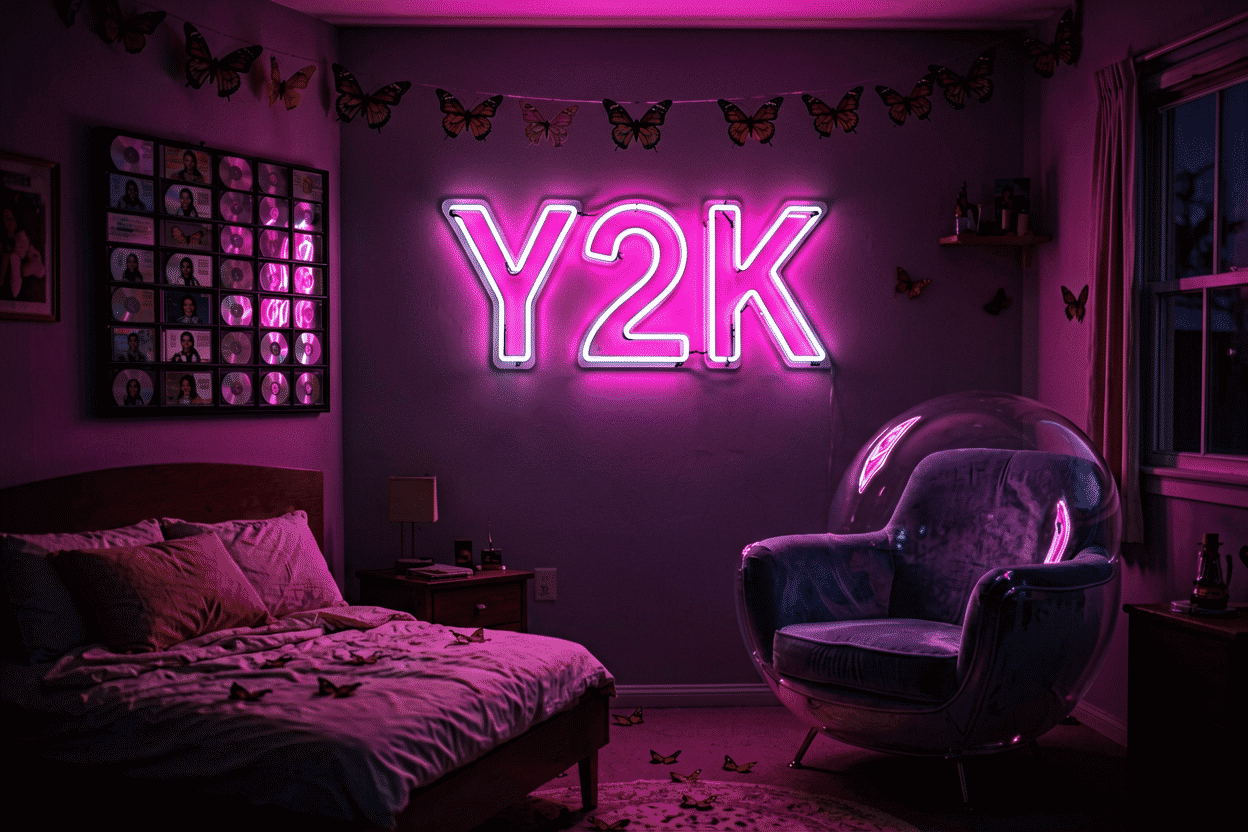
The Y2K neon sign is its own object — not a retro sign, not a modern aesthetic sign, but the specific era-collision piece: the bubbly optimism of 1999 rendered in the glow technology that actually arrived. The best ones read like artifacts from a future that 2001 promised, which is exactly the aesthetic’s whole idea.
Here are 19 signs in the register, organized by the era’s moods — candy, cyber, chrome, and irony — with the palette physics that makes a piece read Y2K on sight. The whole-room system lives at Y2K room decor; the era’s deeper retro context at retro room decor.
The Candy Tier: Ideas 1–6
- The bubble-letter phrase — your phrase in the era’s font: fat, bubbly, rounded (the customizer previews it): the single most Y2K object neon can make.
- A pink butterfly — the aesthetic’s icon, glowing hot pink: the piece that needs no caption in any context.
- The melting heart — the drip-heart in pink gradient: the era’s sincerity and now’s irony in one form.
- A glitter-star cluster — three sparkles in silver-pink: the sticker-drawer aesthetic, upgraded to light.
- “Cute” / “Sweet” / “Baby” — the one-word era adjectives: the phrase tier that reads like a Von Dutch hat, deliberately.
- The smiley outline — the mood icon in aesthetic pink: the anti-seriousness piece, era-correct.
The Cyber Tier: Ideas 7–11
- The frosted-blue tech piece — any icon in ice blue against silver: the iMac register; the Y2K calm face.
- The matrix-green accent — one acid-green piece (a code cascade, a single glyph): the hacking-era wink, once per room, never twice.
- The katakana piece — a Japanese phrase in neon: the era’s techno-orientalism register, still the aesthetic’s most sophisticated accent.
- The pixel icon — a low-res heart or star in square segments: the digital-native piece, nostalgia for the screen itself.
- The cyber-blue anchor — the big cool piece that carries the room’s evening mode: Y2K’s both-faces trick (candy by day, cyber by night).
The Chrome & Icon Tier: Ideas 12–15
- The flame piece — flames in orange-pink: the Hot-Topic-era icon, and the register that ages best of all of them.
- The peace-sign-and-flame combo — the era’s signature mashup: two icons, one glow, instantly 2002.
- The CD stack’s echo — a single neon disc: the burned-playlist shrine, minimal and hilarious.
- The dolphin or angel — the era’s spirit animals, glowing: the dolphins-and-stars graphic-tee register, redeemed by light.

The Phrase & Irony Tier: Ideas 16–19
- You’re Like Really Pretty — the compliment register’s flagship: movie-literate, era-adjacent, and still the most-hung phrase in the aesthetic.
- Good Vibes Only — the crossover: reads Y2K today, general tomorrow — the rotation-proof phrase.
- “As If” / “That’s Hot” — the era’s catchphrases, two words each: the irony tier that requires no explanation from anyone who was there.
- The custom era-quote — your AIM away message, your first ringtone’s title (preview it): the personal-nostalgia tier, the register no catalog can duplicate.
The Palette Physics
Y2K signs run four colors and one rule: hot pink leads, baby blue and lilac support, one acid accent punctuates — and silver is the frame, not the light (the full color logic). The era’s glow was optimistic: brightness runs at 70% and above for the candy moods, dropping to the cyber-blue 30% only for the evening’s second act. Neon green gets one piece per room — the matrix accent is a spice, not a sauce.

Placement runs the aesthetic’s own logic: clusters over minimalism, reflections over clean walls, and the anchor icon at photo height with the supporting field scattered deliberately. The hanging guide covers the adhesive-forward methods the aesthetic’s renters (and the era’s own apartment-dwellers, nostalgically) always needed.
The Sign-Buying Guide: Eras Within the Era
Y2K runs sub-registers, and the sign that nails the sub-register reads twice as right. The candy-tech register (1999-2001): the frosted-blue and bubblegum-pink pairing, the bubbly fonts, the optimism-of-technology icons – the iMac era’s signature, the calm face of the aesthetic. The cyber register (the matrix tier): the acid green and ice blue, the katakana and the pixel icons, the techno-orientalism that defined the era’s sci-fi – the aesthetic’s cool face. The mall-punk register (2001-2003): the flame-and-star iconography, the Lil Hot-Topic palette of pink-black-silver – the aesthetic’s loud face.
The buying discipline: pick the sub-register, buy within it, and let the room commit. The cyber piece in the candy room reads typo; the flame piece in the cyber room reads confused – the sub-registers are the era’s dialects, and fluency reads intentional (the palette decoder maps all three).
The font physics. Y2K signs live or die on the font: the bubble lettering (fat, rounded, the era’s ad-culture signature) reads instantly era-correct where the modern sans reads contemporary-with-a-theme. The commission route’s Y2K rule: bring the era font (the customizer previews any typeface) – the phrase that means nothing in Helvetica means everything in the 2001 bubble (the fonts logic covers the era registers).
The Budget and the Authenticity Tier
The entry tier ($50-150): the icons – the butterfly, the star cluster, the smiley – the era’s shorthand at the price the revival’s rotation deserves. The mid tier ($150-350): the phrase pieces and the sub-register signatures (the katakana custom, the bubble-font commission) – the pieces that define the room’s dialect. The authenticity tier ($300-700): the era-real pieces – the actual vintage survivors and the museum-grade reproductions (the vintage logic adjacent) – the room that means the era, not the revival of it.
The honesty the tier deserves: Y2K neon from 1999-2003 is genuinely scarce (the era’s LED tech was transitional), and much of what’s sold as “authentic” is revival product. The buyer who wants the real thing verifies provenance the way all vintage buyers do; the buyer who wants the look buys the revival tier proudly – both are legitimate, and the confusion between them is the market’s only real trap.
FAQ About Y2K Neon Signs
What makes a neon sign Y2K? Font and palette: bubble lettering, hot-pink-plus-chrome, and the icon set (butterflies, flames, stars, smileys). Any phrase in the era’s font reads Y2K even if the words are new (preview).
What’s the best Y2K neon sign? A pink butterfly or the melting heart — the icons that carry the era instantly. The phrase tier (You’re Like Really Pretty) for the movie-literate version; the custom era-quote for the personal one.
What colors are Y2K? Hot pink, baby blue, lilac, silver, and one acid accent (the decoder): the four-color rule with silver as frame. More than that reads generic; less reads modern.
Y2K or retro — what’s the difference in neon? Y2K is the specific 1999-2003 techno-optimist register (chrome, candy, cyber); retro neon runs older (70s earth tones, 80s vaporwave) — the retro guide covers the other eras. The mistake is mixing them; each era’s palette is its passport.
What colors make a sign look Y2K? The trio plus the frame: hot pink, baby blue, and lilac as the glow, silver as the non-glowing frame – the palette that says 2001 at any distance (the palette physics above). The acid accent (one green piece, once per room) punctuates; the chrome-and-iridescent surfaces do the reflection work that multiplies the glow. The colors that break the register: the earth tones (that is the 70s – the retro guide), the vaporwave pinks-and-teals (that is the 80s), and the modern jewel tones – each era’s palette is its passport, and the Y2K room stamps only its own.
How much does a Y2K neon sign cost? The entry tier runs $50-150 (the icons – the butterfly, the star cluster, the smiley in the era’s palette); the mid tier runs $150-350 (the phrase pieces and the sub-register signatures – the katakana custom, the bubble-font commission – preview); and the authenticity tier (the era-real pieces with the provenance) runs $300-700 (the brackets). The revival’s honest economics: the era’s actual glass is scarce (the transitional technology years), so most of what glows is revival product – legitimately, at the revival prices.
Where should a Y2K sign go in the room? The reflection-forward placements: the corner where the glow reaches the most chrome and holographic surfaces (the era’s signature system – the glow multiplied through the room’s reflective tier), and the photo wall at the aesthetic height (the placement logic). The palette’s discipline governs the wall choice: the hot-pink anchor against the silver-and-white room (the era’s native composition), the frosted-blue register against the tech-corner’s chrome. The Y2K room’s placements read best at the seventy-percent brightness – the era’s optimism runs bright.
What makes a good Y2K neon sign? The font and the palette, in that order: the era’s letterforms (the fat bubble script, the rounded block – the typefaces that read 2001 before the color lands) and the trio’s registers (hot pink, baby blue, the silver frame – the palette that finishes the read) (the sign-buying logic above). The good piece commits to a sub-register (the candy, the cyber, or the mall-punk – the era’s dialects), runs the era’s brightness (the optimistic 70%), and hangs in the reflection-forward placement (the corner where the chrome multiplies the glow). The piece that breaks the font (the modern sans), the palette (the earth tones), or the dialect (the mixed registers) reads the costume – the era’s look is specific, and the specificity is the style.
What separates true Y2K style from generic 2000s nostalgia? The specific palette and attitude: hot pink with electric blue, chrome-silver accents, the blob and butterfly iconography, lower-case script phrases with intentional typos — the aesthetic of mall culture, early internet, and frosted tech plastic. Generic 2000s nostalgia runs beige-and-denim; the Y2K register is synthetic, saturated, and unapologetic, and a glow piece hits it only when the whole palette commits.
Do Y2K pieces work in adult rooms or just dorms and studios? The mature version exists and it’s restraint-based: one Y2K statement piece (the butterfly, the chrome-style script) against a neutral room with disciplined everything-else, where the piece reads as pop-art reference rather than theme. The all-in version — multiple pieces, the full palette, the inflatable furniture — is the dorm and content-studio register; the difference is density, and adults get the look by owning one artifact of it well.
Sources & Further Reading
- Neon sign (Wikipedia) — the consolidated public record of neon-sign history and technology.
- Mercury (U.S. EPA) — federal guidance on mercury exposure and safe handling.
Pricing based on CustomNeon’s current catalog (2026); custom quotes come live from the sign builder.