21 Y2K Room Decor Ideas With Neon Leading
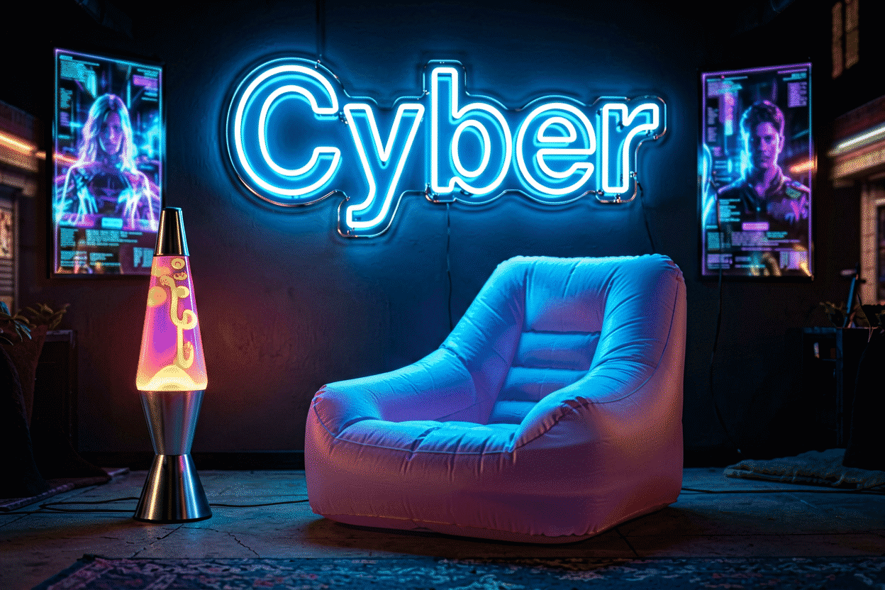
The Y2K revival is the first aesthetic that grew up with neon and came back for it. The 1999-2003 original ran on frosted blue electronics, butterfly clips, and the first wave of LED glow — and the revival version kept the one element that was always the style’s engine: light. A Y2K room without neon is a costume; with it, the room time-travels.
Here are 21 ideas organized by the aesthetic’s layers — the chrome-and-hot-pink core, the cyber-candy registers, the iconography, and the modern upgrades — with the palette system that keeps the look Y2K instead of just pink. The sign-level companion piece is the Y2K neon signs guide; the broader aesthetic context lives at room aesthetic ideas.
The Core System: Ideas 1–5
- Hot pink + silver, always — the aesthetic’s DNA: hot pink anchor piece against silver/chrome accessories. Every other Y2K decision agrees with this pair.
- The butterfly wall — butterflies in every medium, neon included (the butterfly tier): the single most-recognized Y2K icon, glowing pink and purple.
- The inflatable-furniture glow — the era’s transparent chairs, backlit by neon strips: the two most-photographed Y2K objects in one composition.
- The chrome-and-glow pairing — mirror balls, CD stacks, and holographic surfaces catching neon light: the reflection play that makes the room read 2001 at any brightness.
- The lava-lamp successor — the color-morph piece doing the lava lamp’s job at Gen-Z brightness: the ambient icon slot, upgraded.
The Cyber-Candy Registers: Ideas 6–10
- The baby-blue tech tier — frosted-blue everything with ice-blue neon: the iMac-era register, the aesthetic’s calm face.
- Lilac + glitter glow — lavender neon against iridescent surfaces: the dreamy Y2K register that runs closest to today’s soft-aesthetic.
- The neon-green matrix accent — one acid-green piece in the tech corner: the hacking-era wink, used exactly once per room.
- The holographic strip run — strips behind iridescent panels: the surface that changes color as you walk past, the room’s most futuristic foot.
- The checkerboard floor glow — the era’s black-white checker, edge-lit: the floor that photographs like a music-video set.
The Iconography: Ideas 11–15
- The smiley, Y2K edition — the glitter smiley in neon outline: the era’s mood ring, lit.
- The flame piece — the flame-and-peace-sign register: the Hot-Topic-era iconography, glowing orange.
- The star tier — shooting stars and sparkles in pink and silver: the sticker-collection aesthetic, upgraded to light.
- The heart, melty — the melting-heart adjacent register: the icon that reads both-era — 2001’s sincerity and now’s irony.
- The CD-and-disc piece — the burned-CD stack’s neon echo: the nostalgia object, lit like the shrine it now is.
The Phrase Tier: Ideas 16–18
- You’re Like Really Pretty — the Clueless-adjacent compliment: the era’s movie-literate register, and the aesthetic’s most-hung phrase.
- “As If” / “That’s Hot” — the era’s catchphrases, two words each: the Y2K phrase canon runs short and sassy by design.
- Good Vibes Only — the crossover piece: reads Y2K today, aesthetic-general tomorrow — the safe phrase for rooms that rotate eras.
The Modern Upgrades: Ideas 19–21
- The color-changing anchor — one RGB piece running the Y2K palette on schedule (the palette logic): bubblegum pink by day, cyber blue by night, the era’s both-faces solution.
- The LED curtain + neon combo — the fairy-light curtain behind one neon icon: the layered glow system that defines the modern Y2K build (the color decoder for the full palette).
- The anti-upgrade — one deliberately-era-authentic piece (the bubble lettering, the glitter font): the room’s time-capsule object, imperfect on purpose.

The Palette Discipline
Y2K reads Y2K through a specific palette: hot pink, baby blue, lilac, silver, and one acid accent — everything else is another aesthetic (the full decoder). The room’s glow layer runs this palette in neon while the surfaces (holographic, chrome, fur) do the reflection work. Brightness runs higher than most aesthetics — the era was optimistic about technology, and the light should be too — with the 30% dim register reserved for the cyber-blue evening mode.
Placement runs maximalist by genre: clusters, layers, and the reflection play over minimalism — but the hierarchy still exists (one anchor icon, the supporting field, the strips underneath). The hanging guide covers the adhesive-heavy methods this aesthetic’s renters run.
The Y2K Build: Room Audit and Budget
The Y2K room builds from an audit: what era assets does the room already have? The wood-tone furniture reads 70s (wrong revival – see the retro guide); the chrome-and-white pieces read Y2K-ready; the inflatable and butterfly assets are already halfway there. The audit’s output is the shopping list: the neon pieces that complete the era the room’s furniture already runs.
The palette lock. The Y2K room’s palette locks before the first purchase: hot pink + baby blue + silver as the core, lilac and one acid accent as the satellites (the palette physics). The room’s walls and bedding run neutrals or the core; the neon carries the satellites – the glow layer IS the era’s color, and the room’s non-glow surfaces stay disciplined enough to let it read.
The budget by depth. The entry Y2K room ($80-200): one icon (the butterfly or the melting heart) plus the strip glow – the era’s entry signature. The committed room ($200-500): the icon plus the phrase plus the reflective-surface tier – the aesthetic’s full look. The time-capsule room ($500-1,000): the era’s complete system – the chrome, the color-changing anchor, the era-authentic customs – the room that time-travels on purpose.
The era-budget honesty: Y2K is a revival, and revivals rotate. The pieces bought at the entry tier rotate painlessly; the pieces bought at the commission tier should mean something beyond the trend (the custom era-quote, the personal-nostalgia piece) – the same keeper-versus-phase discipline the teen room runs, applied to an aesthetic instead of an age.
The Reflective-Surface System
The Y2K room’s signature system is the reflection play: the neon’s glow doubled and tripled in the era’s surfaces. The chrome accessories (the CD stacks, the mirror balls, the holographic panels) each catch the pink and blue; the room’s glow multiplies through the surfaces until the effect is the decor. The system’s engineering: the anchor icon placed where its reflection reaches the most surfaces (the corner placement catches two walls’ worth), the strips run behind the reflective objects (the glow through the chrome), and the brightness at 70% – the era’s optimism runs bright, and the surfaces do the rest (the wall-lights logic covers the strip tier’s engineering).
FAQ About Y2K Room Decor
What makes a room Y2K instead of just pink? The palette trio (hot pink + baby blue + silver), the icons (butterflies, flames, smileys), and the surfaces (holographic, chrome, fur): neon carries the first two, the room provides the third (the palette).
What’s the best Y2K neon sign? A pink butterfly or the melting heart — the icons that read the era instantly. The phrase tier (“As If,” You’re Like Really Pretty) carries the movie-literate version.
Is Y2K still trending? The revival has outlived every prediction — it’s now a standing aesthetic with its own canon (the sign guide tracks the current tier). Rooms built on the palette system rotate with the trend cycle instead of dying with it.
How do I make Y2K decor look intentional? Palette discipline and one anchor icon: the era’s chaos worked because its colors agreed. Cluster deliberately, glow warmly, and let the reflection surfaces do the rest.
Is Y2K decor still popular in 2026? The revival has outlived every prediction – it’s a standing aesthetic now with its own canon (the sign guide tracks the current tier), its own palette physics, and its own generational spread (the nostalgia tier and the discovery tier running the same icons). The rooms that survive the trend-cycle runs are the ones built on the system (the palette trio, the icon anchors) rather than the meme pieces – the Y2K room that bought the butterfly at quality still glows; the room that bought the flash-in-the-pan phrase retired it two cycles ago.
How do I decorate my room Y2K style? The era’s system, in order: the palette lock (hot pink + baby blue + silver, the trio that says 2001 at any distance – the palette physics above), the icon anchor (the butterfly or the melting heart at the wall’s center), the reflective surfaces (the chrome, the holographic, the CD stacks – the glow’s multipliers), and the strip glow underneath (the halos at the era’s bright registers). The era’s furniture serves the look (the inflatable, the white-and-chrome), the bedding runs the neutrals (the palette’s discipline), and the brightness stays at the optimistic 70% – the era’s confidence in lumens. The committed room runs the whole system; the testing room runs the icon and the strips at the entry price – both Y2K, at the two depths.
What’s the foundation palette for a Y2K room redo? Lilac or hot pink as the wall or textile anchor, silver-chrome metallics as the second voice, and one translucent accent (the inflatable, the beaded curtain, the iMac-clear storage) — that triangle carries the era. The glow piece joins as the room’s saturated centerpiece in pink or blue; rooms that add a third strong color lose the era’s specific synth-pop cleanliness and land in generic rainbow territory instead.
How do you keep a Y2K room from reading like a costume? Anchor it with one modern element the era never had: a contemporary sofa silhouette, current art framing, or grown-up lighting alongside the period pieces. The rooms that work treat Y2K as an accent dialect spoken by a few objects (the glow sign, the butterfly motif, the metallic pillow) inside a room that otherwise lives in the present — full period immersion is the content-creator register, and it photographs better than it lives.
The Y2K Revival vs the Original: Buying Across Twenty-Five Years
The two eras’ buying routes, compared:
| Decision axis | The revival tier | The original tier |
|---|---|---|
| The availability | The catalogs’ current runs | The scarce survivors (the transitional-tech years) |
| The price | $50-350 (the revival brackets) | $300-700+ (the provenance premium) |
| The authenticity | The look, faithfully rebuilt | The piece that was actually there |
| The brightness control | The full modern range (the dimmers, the schedules) | The original’s fixed registers |
| The safety tier | The current codes, the adapters | The electrician’s review, the era’s wiring |
| The buyer | The aesthetic (the look, the budget) | The collector (the provenance, the patience) |
The comparison’s honest finding: the Y2K original glass is genuinely scarce (the era’s LED transition meant fewer glass pieces were commissioned than in the surrounding decades), and much of what sells as “authentic” is revival product – the buyer who wants the real thing verifies provenance the way all vintage buyers do, and the buyer who wants the look buys the revival tier proudly (the authenticity tier above).
The hybrid most Y2K rooms run: the revival pieces at the system’s core (the palette physics, the reflection play – the look at the use-it-daily price) with the one original piece as the authenticity anchor – the room that means the era without the era’s maintenance schedule (the vintage logic adjacent).
Sources & Further Reading
- Neon sign (Wikipedia) — the consolidated public record of neon-sign history and technology.
- Mercury (U.S. EPA) — federal guidance on mercury exposure and safe handling.
Pricing based on CustomNeon’s current catalog (2026); custom quotes come live from the sign builder.