The Compliment, Complimented

You're Like Really Pretty Neon Sign

The most-quoted compliment of the 2000s, glowing above your vanity. Pink, white or custom colorways – the phrase that made backhanded flattery an art form, made literal in light.

Hero visual placeholder
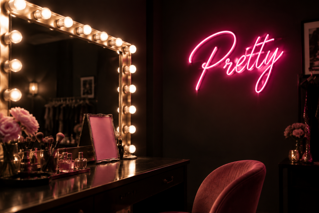
4:3 · pink you’re like really pretty script glowing above a vanity table

Free design preview

See the script in your color before buying.

Vanity-safe low voltage

Cool-running and mirror-friendly.

Dimmable glow

Soft light for evening, full output for photos.

Fast custom turnaround

Custom colors and wording ship in days.

In-Stock & Custom

Pretty & Compliment Sign Designs

The compliment classic plus the phrases that belong next to it – vanity-ready designs in soft and bold glow.

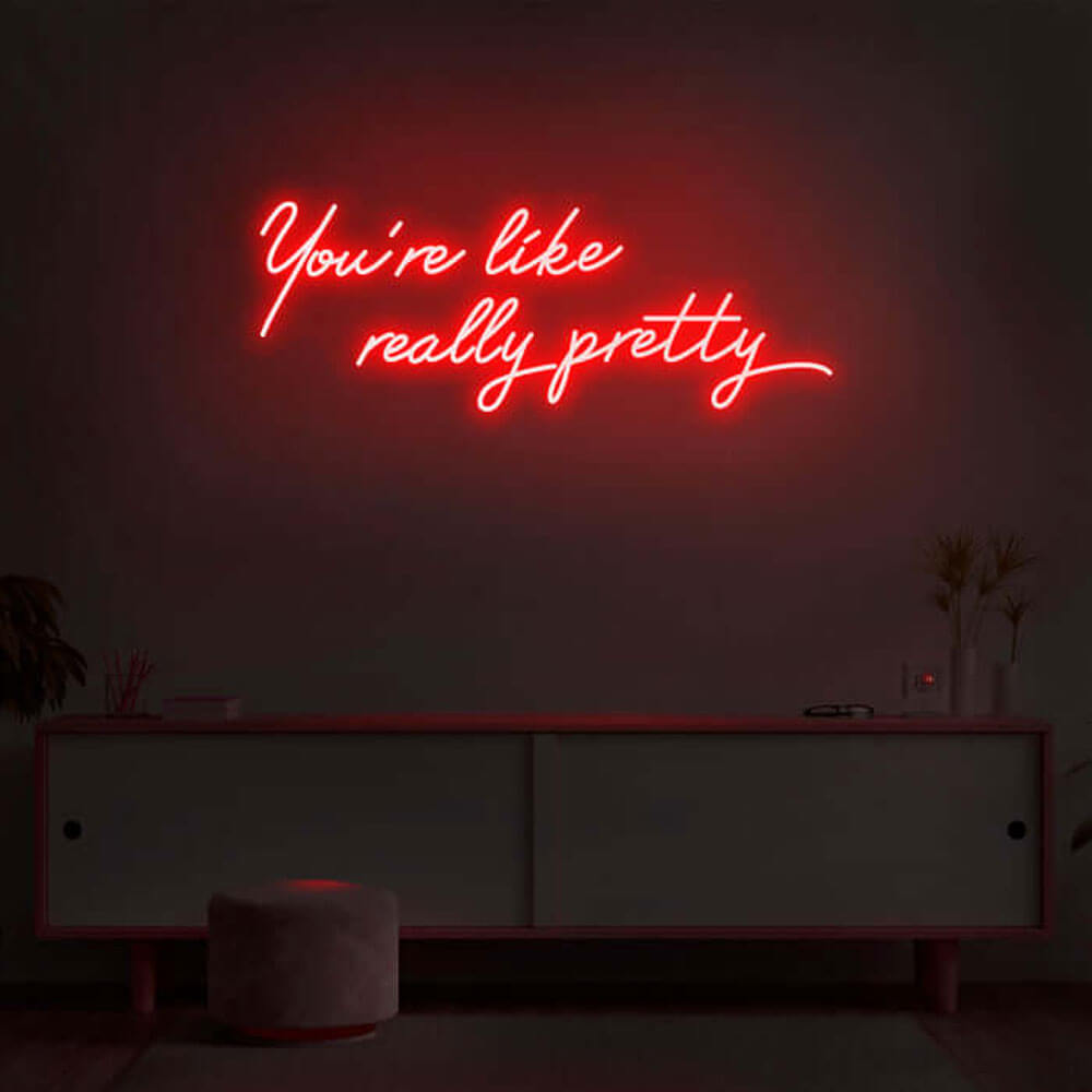
you’re like really pretty script

The compliment classic · pink

$368

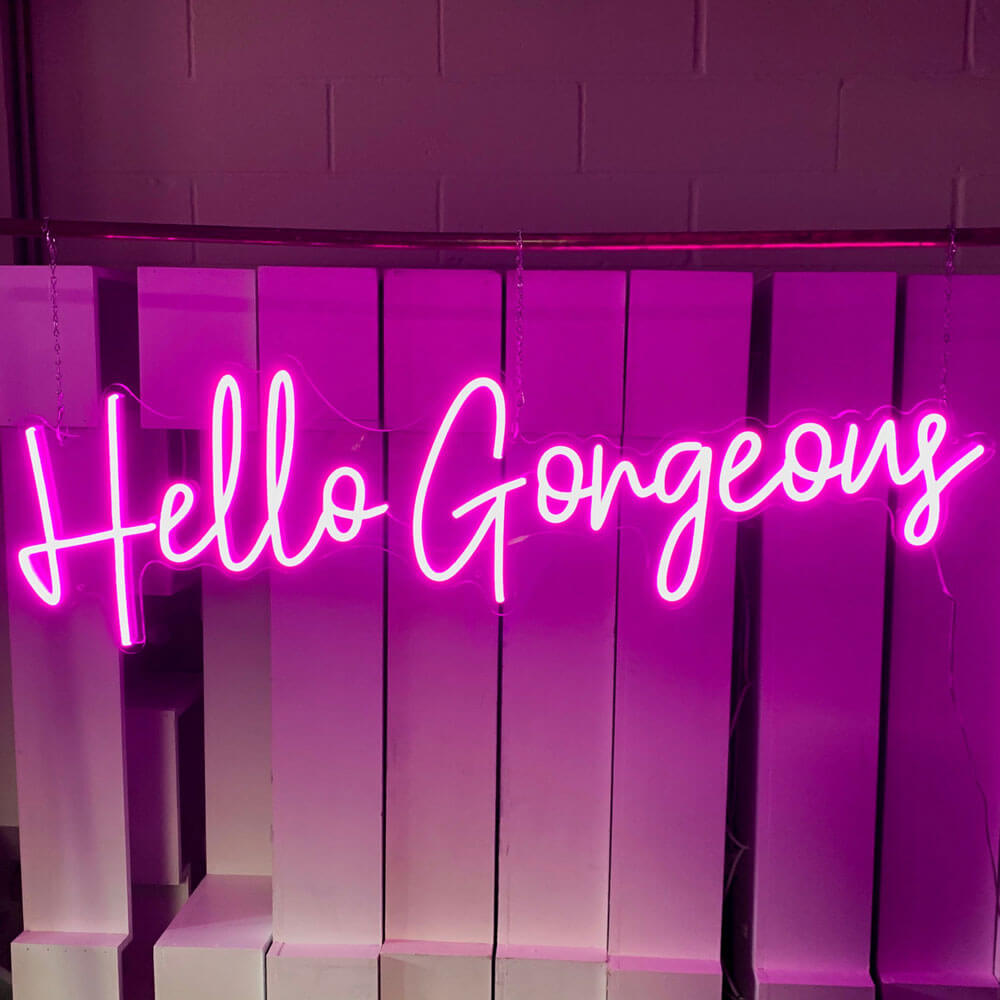
hello gorgeous script

Vanity greeting · warm white

$202

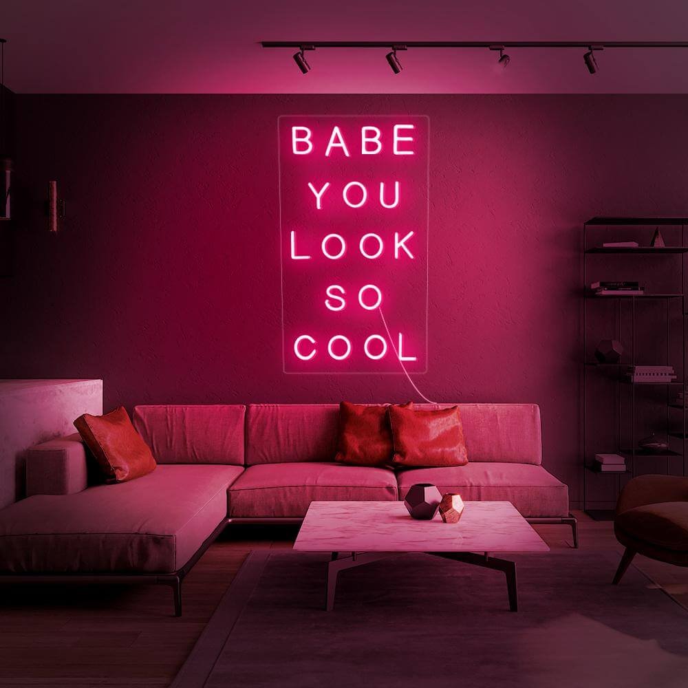
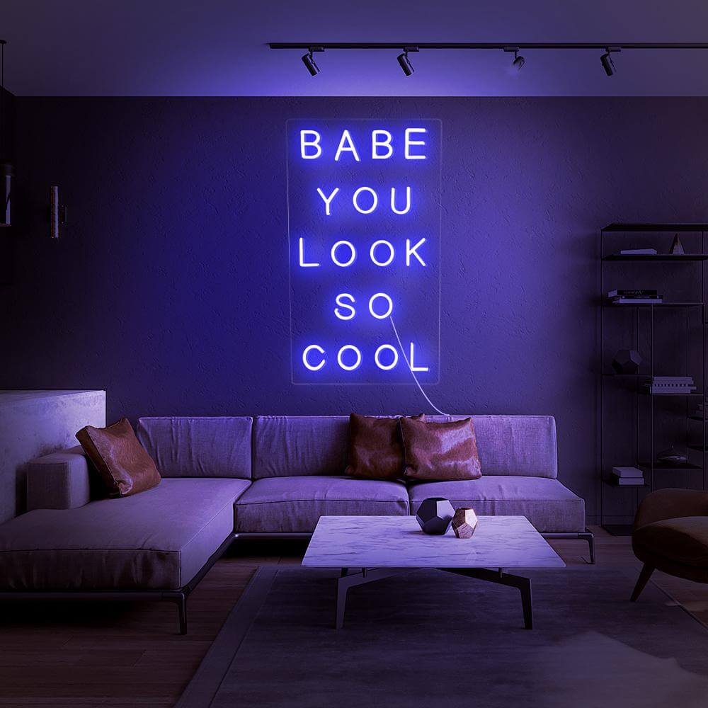
babe you look so cool script

Modern compliment · blue

$389

love you more script

Reply piece · pink glow

$206

i love you script

Simple declaration · red

$258

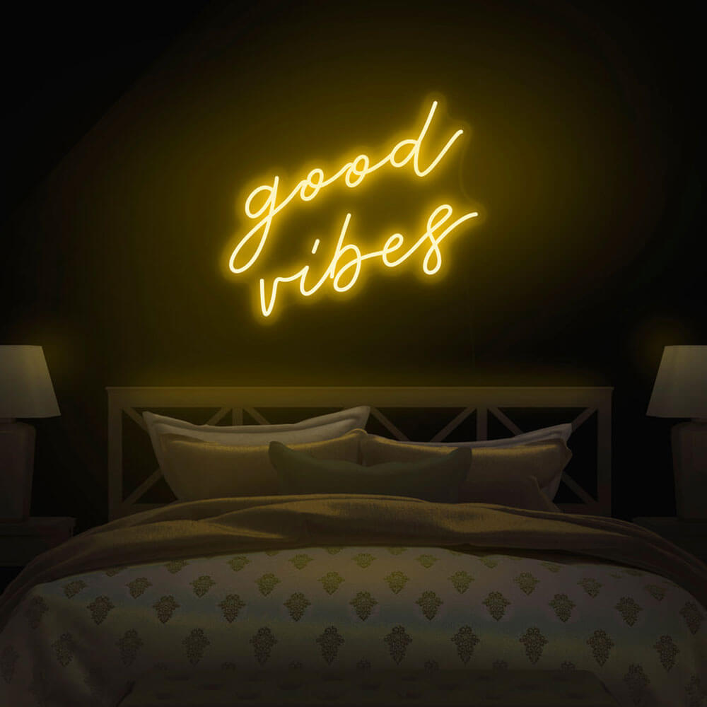
good vibes script

Positivity pairing · green

$242

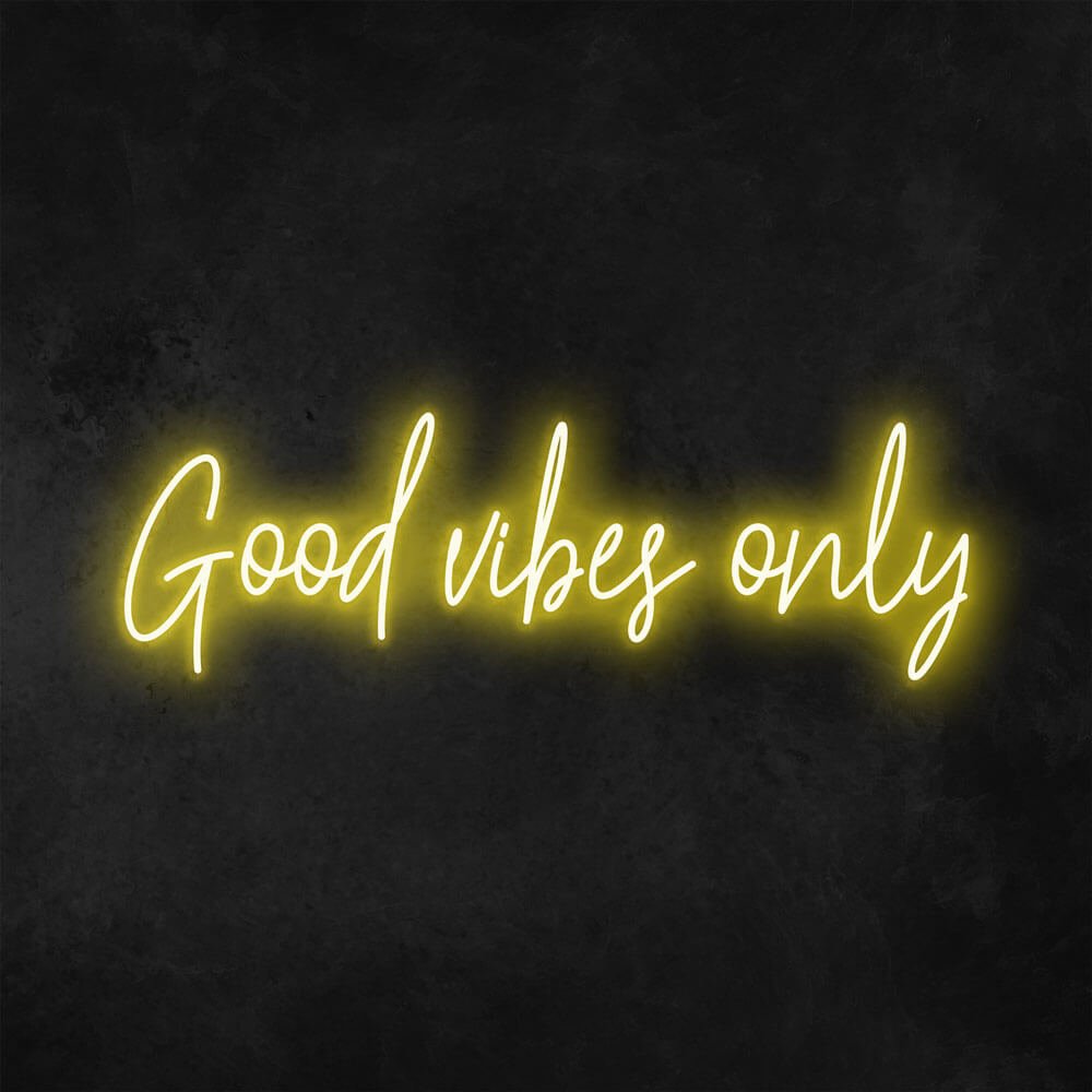
good vibes only letters

Rule-setting sibling · yellow

$203

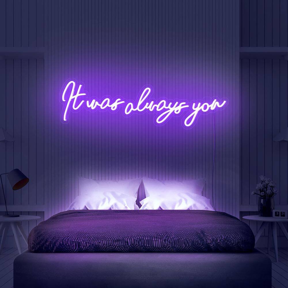
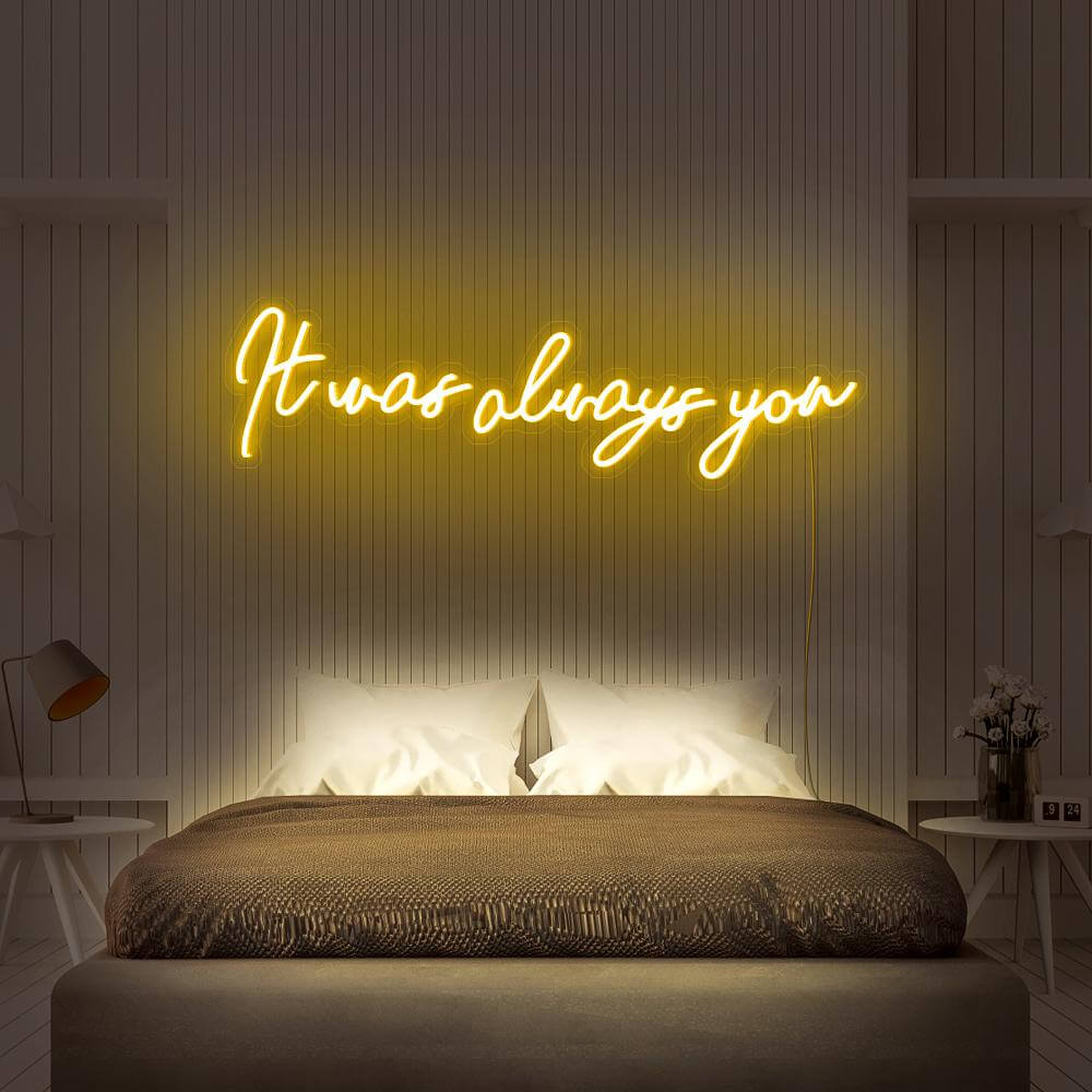
it was always you script

Romantic answer · white

$234

barbie script logo style

Pink icon piece · hot pink

$229

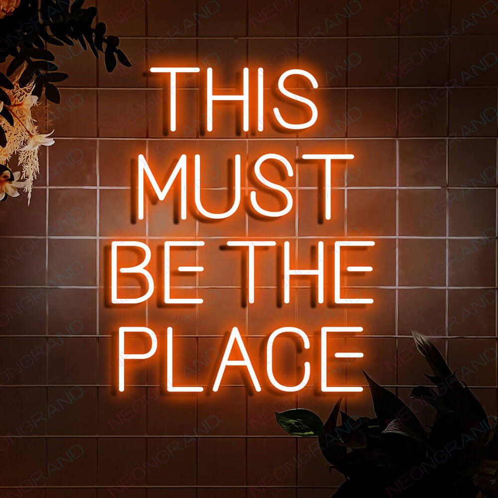
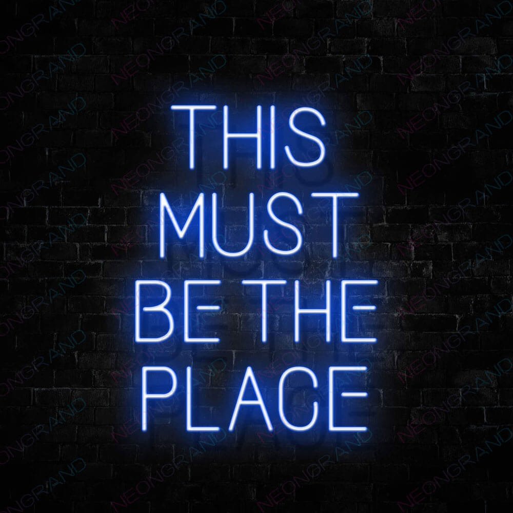
this must be the place script

Cozy companion · sage

$178

Buyer's Guide

How to Choose a You're Like Really Pretty Sign

This is the phrase that turned a compliment into a punchline and back into a compliment again. Placed right, it does the same thing on a wall: makes everyone who reads it smile, then pose. Here is how to pick the version that earns its spot above your mirror.

pink script glowing above a vanity mirror

1 · Where the phrase comes from

It entered the culture in 2004, delivered with a smile that was 60% sweet and 40% social warfare, and it never left. Two decades later the line survives as a genuine compliment between friends – the venom has aged out, the wordplay has not. That double register is exactly why it works as decor: your friends quote it the moment they see it, and every guest photo in front of it comes captioned. Unlike motivational phrases that take themselves seriously, this one winks – which is also why it pairs so well with spaces that don’t.

2 · Pink vs white: the colorway decision

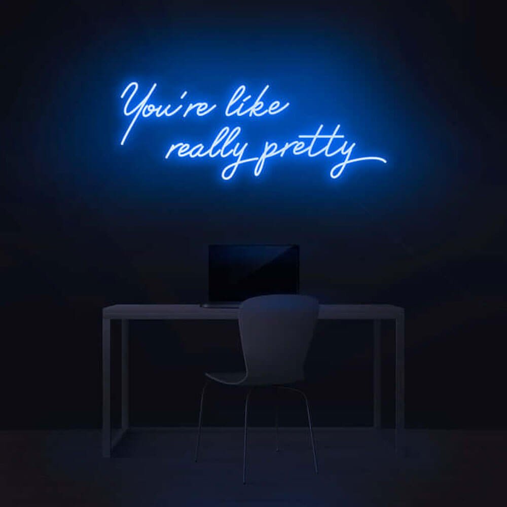
Pink is the canonical choice – it matches the source material’s aesthetic of aggressive femininity and reads instantly in photos. The pink sign page covers the full shade range from hot to blush. White and warm white are the sleeper picks: against a pink or blush accent wall, a white script reverses the expected palette and looks editorial rather than costume. Blue and purple versions exist as custom orders and suit rooms already loud with pink – one pink statement per room is the rule; two starts to look like a theme park.

sign paired with polaroid wall in a bedroom

white version over a dressing table

3 · Where it belongs: vanity, bedroom, dorm

The vanity table is the phrase’s natural habitat – it is, after all, a line about looking at yourself. Mount it above the mirror at a height where it frames your head in selfies, and the sign pays for itself in content. Bedrooms take it above the headboard or over a polaroid wall; dorm rooms and first apartments take it as the single statement piece that makes a rented space feel owned. Smaller 18–24 inch versions sit on vanity desks and shelves; the bedroom guide covers sizing across wall types.

4 · Script vs block fonts

Script is the default and the correct one: the phrase is conversational, and cursive reads like something a friend would say. Block capitals invert the joke – the compliment delivered as a public service announcement – which works in maximalist rooms that already commit to the bit. The middle path is script for the phrase with a small block underline for your name or handle beneath; that layout is a common custom order for content creators whose wall doubles as a backdrop.

gift box with the sign for a birthday

script detail against a blush accent wall

5 · Sizing for mirrors and selfies

Match the sign width to the mirror, not the wall: a sign 10–20% wider than the mirror above it reads as a frame; a sign narrower than the mirror looks like an afterthought. For the selfie use case, 24–36 inches keeps the full phrase legible in a front-facing camera at arm’s length; under 20 inches the words blur into a glow. Over a full-length mirror or a wide vanity, 36–48 inches restores the reading distance. When in doubt, size up – undersized script is the most common regret in compliment signs.

6 · Power, dimmers and mirror lighting

Vanity setups already run ring lights and mirrors, so power budget matters: LED neon-style signs draw less than a hair dryer on low – the electricity guide has the numbers. Use the dimmer in the evening when the ring light is doing the work, and run the sign at full output for photos – dimmed script photographs soft and loses the joke. Mount the cord along the mirror frame with clear clips; a dangling cord across a vanity is the one detail that cheapens the whole wall.

sign with ring light and beauty station

pink script glowing above a vanity mirror

7 · The gift that never misses

This is the rare decor phrase that works as a gift across ages – teenagers who know the reference, twenty-somethings who grew up quoting it, and mothers who caught the reruns. It suits birthdays, graduations, and the friend moving into her first apartment. Pair the sign with the moment: for a birthday, the birthday sign guide covers numbers-and-phrase combos. Order custom colorways two to three weeks out; stock designs ship in days.

8 · Why the compliment survived its own movie

The film was adapted from a nonfiction parenting book about clique dynamics – which is partly why the lines stuck: they were drawn from real cafeteria anthropology, and everyone recognized their own high school in them. But quotes detach from contexts, and this one traveled furthest. Strip away the power calculus of the original delivery and the sentence’s structure is genuinely sweet – the like and the really are the filler words of unguarded speech, the way people actually compliment when they are not composing a sentence. The stammer is the sincerity. Two decades of quoting wore the venom out entirely, and the wall version lands on the far side of that arc: an in-joke that doubles as a real compliment, where every guest smiles twice – once at the reference, once at the warmth underneath it.

pink script above a vanity mirror ringed by polaroid photos

sign at selfie height with a ring light and folded towels

9 · Vanity geometry and studio builds

Professional vanity installs share three measurements. Vertical: eight to twelve inches of air between the mirror’s top rail and the sign’s center keeps every mirror selfie composed while leaving hot tools their swing room below. Electrical: drawer-mounted power strips are the trade secret – the drawer hides the strip, the frame hides the run, and a compliment wall with a visible wire loses half its effect. Purpose-built rooms push further: beauty creators run the pink at full output as a permanent set caption and bolt a handle in block capitals under the script, while spa-style bathrooms prefer white on the gentlest dimmer. Sizing carries through every version – roughly ten to twenty percent wider than the glass below it.

Pink script, vanity-width, dimmer after dark – in that order. Start with the classic pink version or preview your own colorway free in the customizer. One pink statement per room, and the wall does the talking.

In the Wild

The Sign in Real Rooms

Photo 4:3

化妆桌上方粉色短语牌与圆形镜实拍

Photo 4:3

卧室宝丽来照片墙中央的暖白短语牌

Photo 4:3

宿舍书桌上小尺寸短语牌与台灯

Photo 4:3

生日礼物开箱瞬间的短语牌与花束

Photo 4:3

blush 主题墙前脚本细节特写

Photo 4:3

美妆工作室环形灯与短语牌组合

More Phrases & Spaces

More Phrases & Spaces

Compliments, vibes and destinations – the phrase wall continues.

FAQ

You're Like Really Pretty Sign FAQ

Q1 Is the you're like really pretty sign from Mean Girls?

The phrase entered pop culture in the 2004 film and has outlived its backhanded origins – today it is quoted as a genuine compliment. The sign itself is our own design: the wording as a cultural phrase, rendered in your choice of color and font. It is the most-gifted compliment sign in our range.

Q2 What size works over a vanity mirror?

Match the sign width to the mirror, not the wall – 10–20% wider than the mirror reads as a frame. For selfies at arm’s length, 24–36 inches keeps the full phrase legible; over wide vanities, 36–48 inches. Undersized script is the most common regret, so size up when torn.

Q3 Pink or white – which colorway is better?

Pink is the canonical choice and reads instantly in photos; the pink page covers the shade range. White reverses the palette against blush walls and looks editorial. One pink statement per room is the rule – if the room is already pink, go white or custom blue.

Q4 Does it work as a gift for a teenager?

It is one of the rare phrases that spans ages – the reference is quoted across generations, and the smaller sizes fit dorm rooms and first apartments. Pair it with a birthday theme using the birthday guide; stock designs ship in days.

Q5 How much power does it draw next to a ring light?

Less than a hair dryer on low – LED neon-style signs are vanity-friendly. Run the dimmer in the evening when the ring light works, and full output for photos. The electricity guide has the full numbers.

Q6 Can I get my name under the phrase?

Yes – script phrase with a small block underline (your name, handle or date) is a common custom order for creators. Preview the exact layout free in the customizer before committing.

Keep Exploring

Where to Next

Build Your Own Compliment Sign

Your phrase, your colorway, your name underneath – preview it free before it glows.

Say it in light.
She already knows.

The compliment classic in pink, white or custom colors – free preview, vanity-ready, gift-proof.