Positivity, No Policy
Good Vibes Neon Sign
The phrase that started every house rule, now without the rulebook. Green, yellow and white colorways for calm rooms that would rather invite a mood than enforce one.
Hero visual placeholder
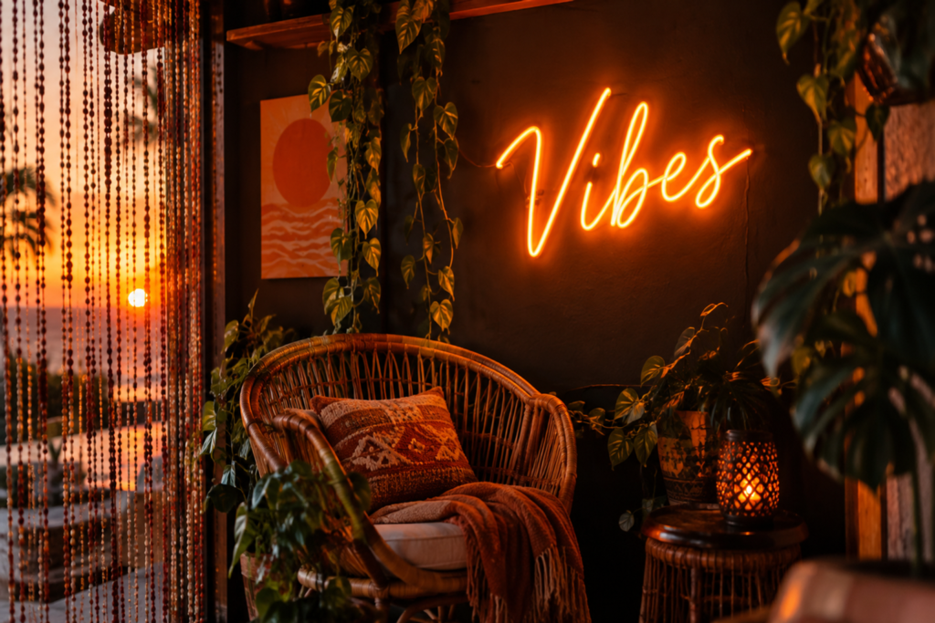
4:3 · green good vibes script glowing on a boho gallery wall with plants
Calmer than the rule
The open version – mood, not mandate.
Boho-native palette
Green and warm tones that live with plants.
Free design preview
Your font and color, mocked up free.
Light and renter-safe
Strip-mountable on smooth walls.
In-Stock & Custom
Vibe & Mood Sign Designs
Moods, welcomes and one-word reminders – the softer side of the positivity family.
good vibes script
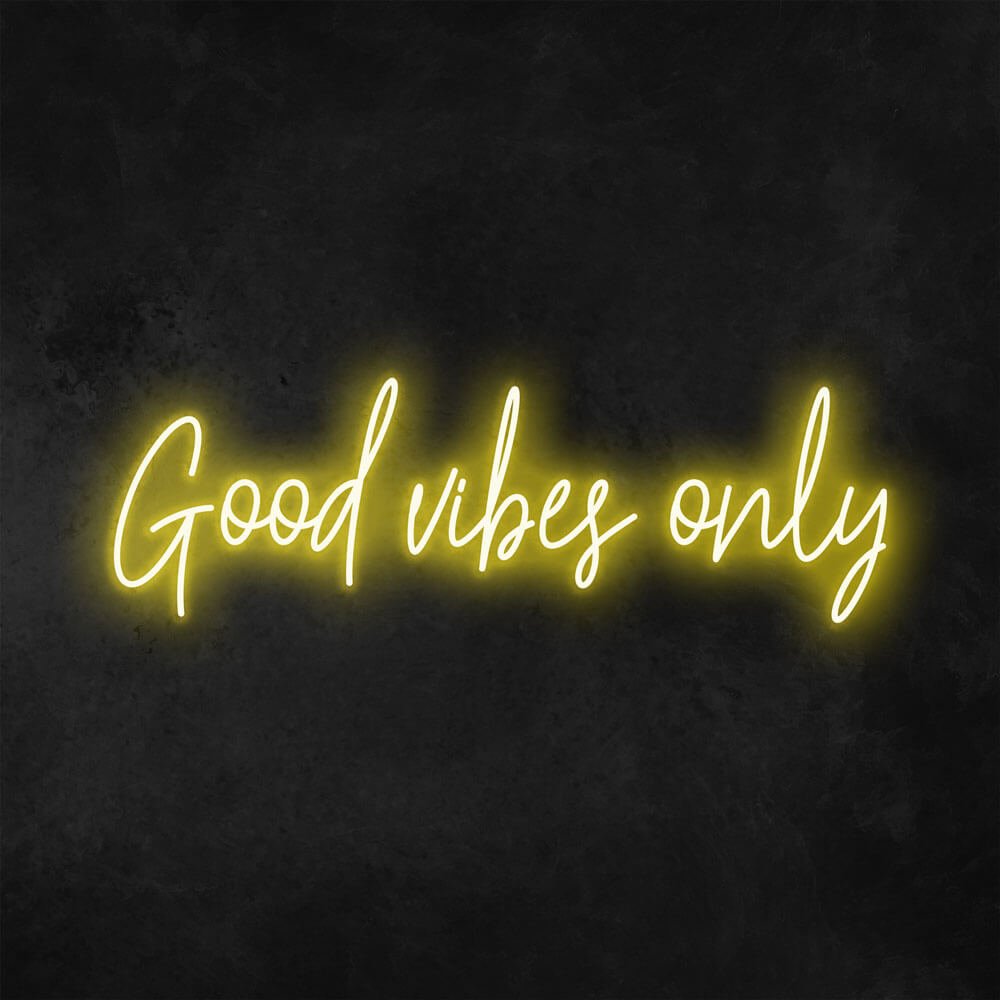
good vibes only letters
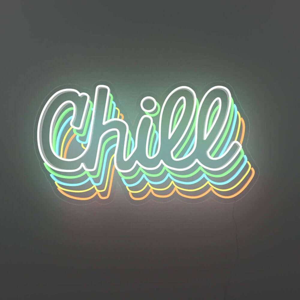
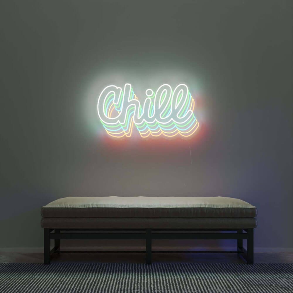
chill script letters
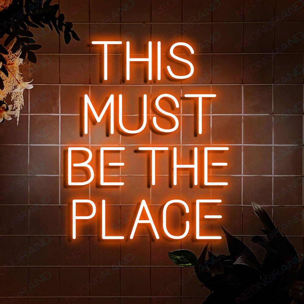
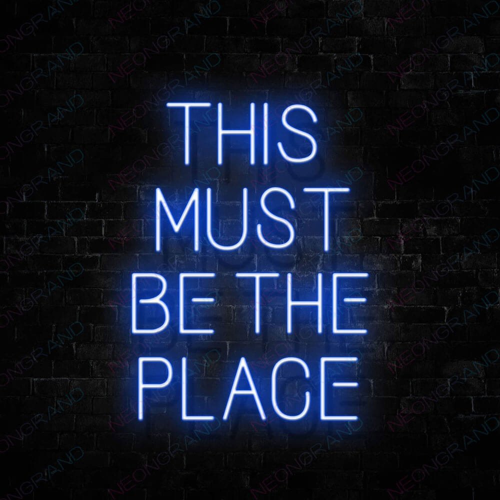
this must be the place script
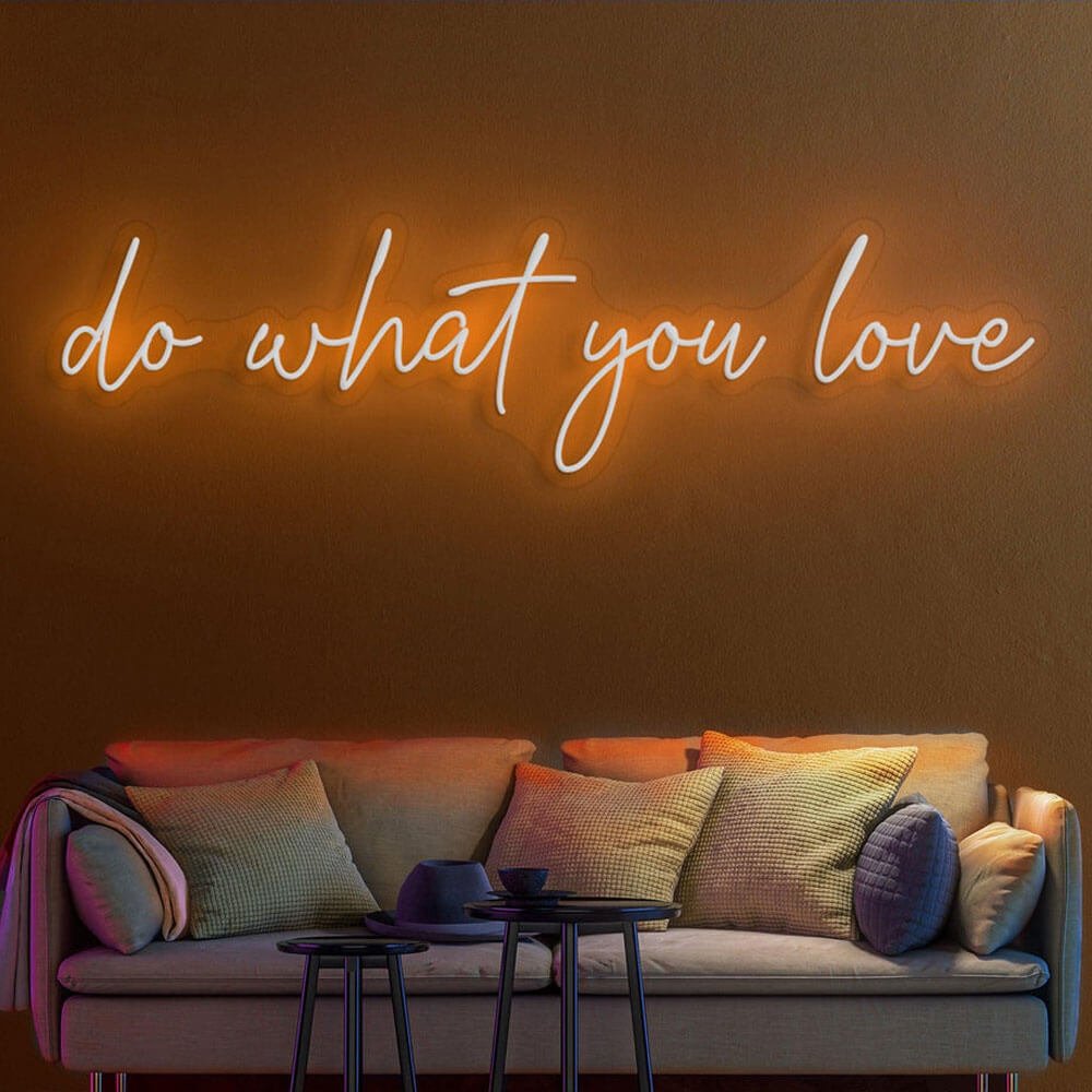
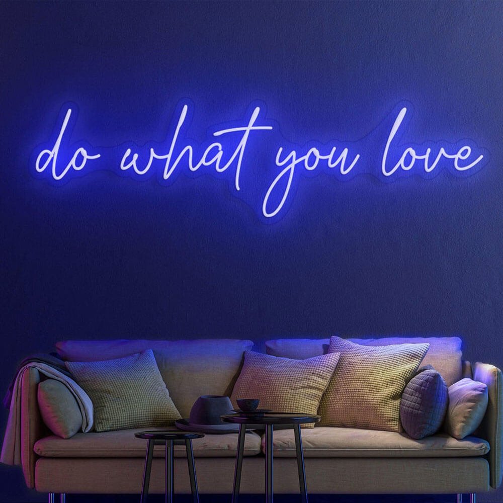
do what you love script
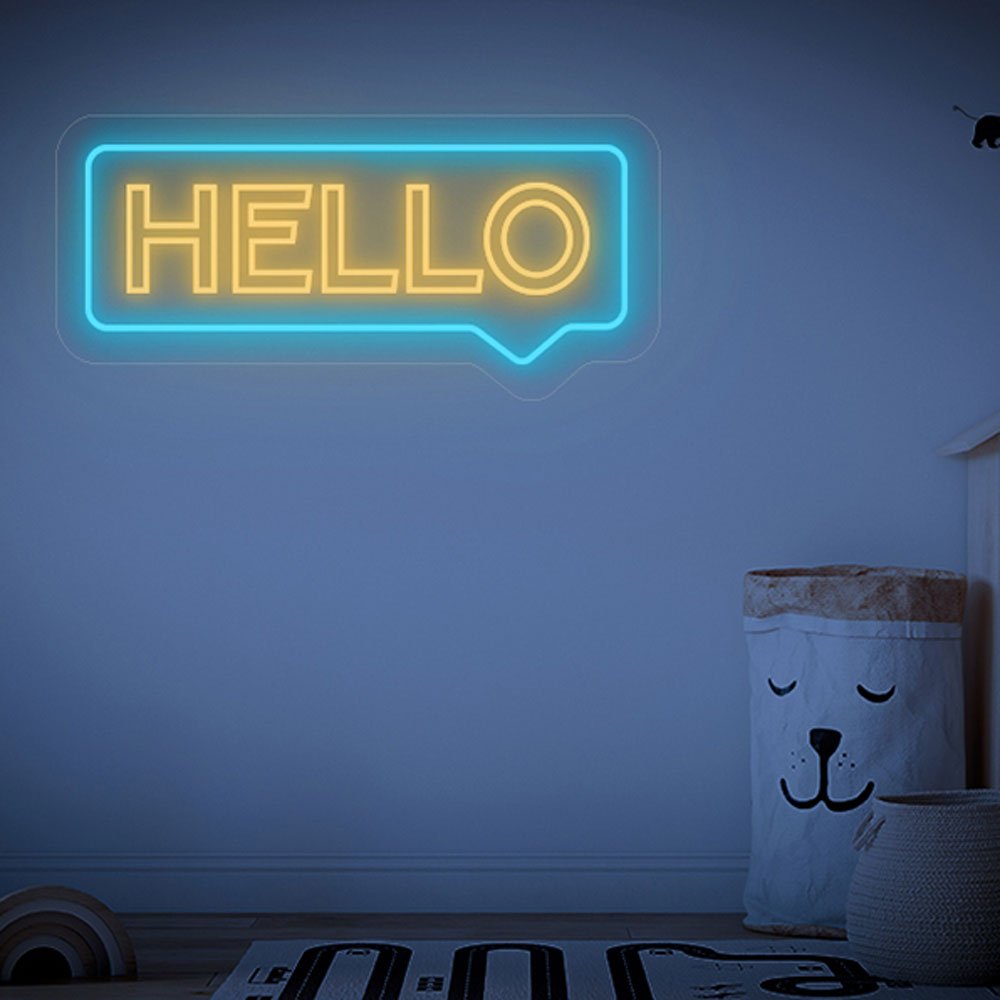
hello script letters
welcome script letters
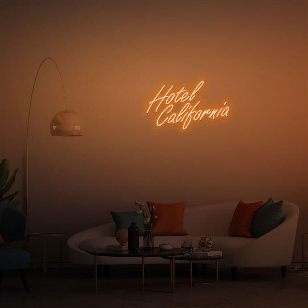
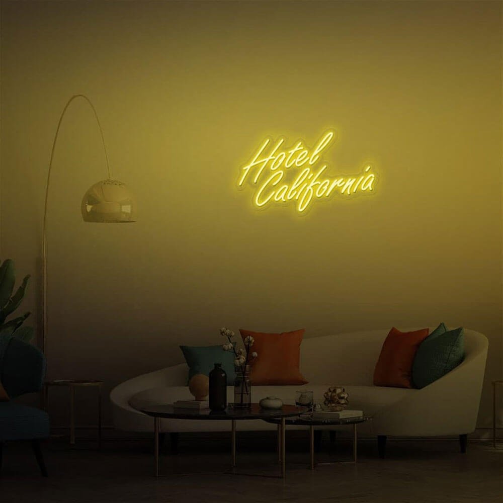
hotel california script
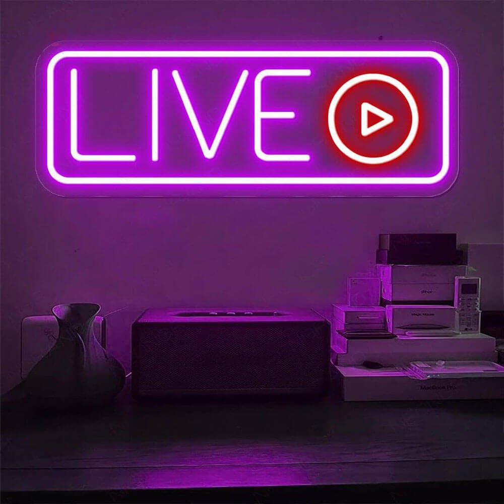
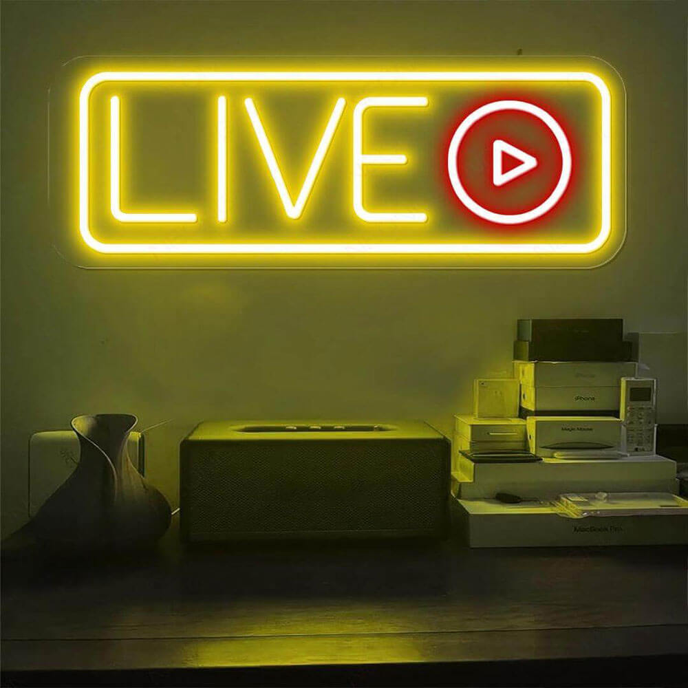
live script letters
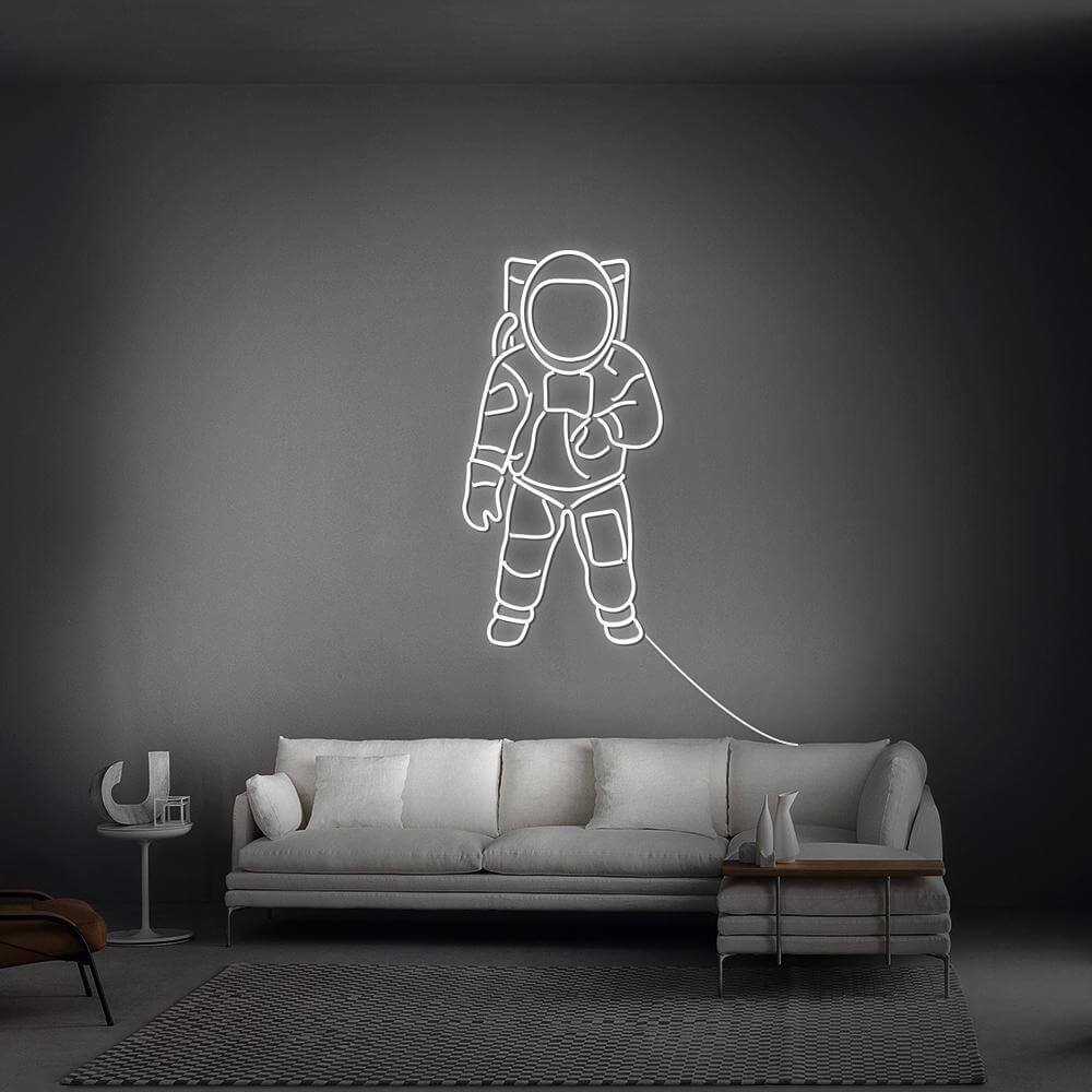
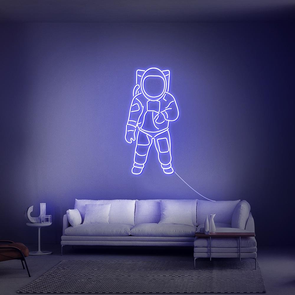
astronaut figure sign
Buyer's Guide
How to Choose a Good Vibes Sign
Good vibes – no only – is the phrase as it was first said: an observation about energy, not a law about it. This guide covers when the open version beats the rule, which rooms it owns, and how to size it for walls that already speak.
green script on a plant-backed gallery wall
1 · Why the open version exists
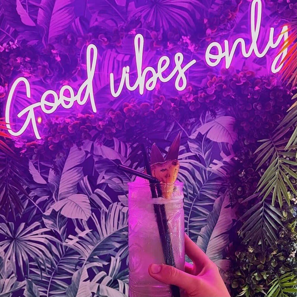
Strip the ‘only’ and the phrase changes register: from door policy to room temperature. ‘Good vibes’ says this is what lives here; ‘good vibes only’ says what is allowed. The open version suits rooms that set mood through layers – plants, textiles, candles – where the sign is one voice in a choir rather than the bouncer. Both phrases sell in our range as separate designs, and households frequently run the rule at the door with the open version deeper in the house – the rule page covers the sibling.
2 · Green and the boho register
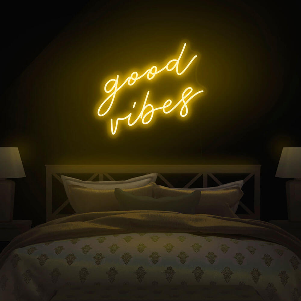
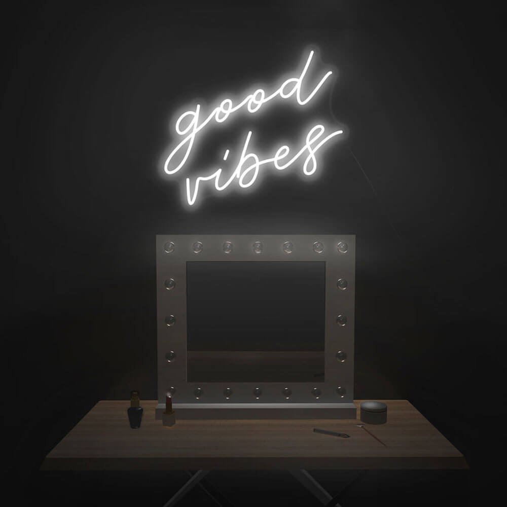
Green is the open version’s natural color: it sits inside plant palettes without competing, and at night it reads like bioluminescence among the leaves. The green page covers the shade range from sage to emerald. Warm white is the texture-room choice – against rattan, linen and wood it glows like a candle that never burns down. Yellow suits kitchens and breakfast corners where the morning mood is set; the yellow page covers the sunny register.
warm white version over a linen headboard
yellow script in a sunlit reading corner
3 · Rooms the open version owns
Bedrooms: above the headboard or on the wall visible from bed – the first thing you read at night and the last at morning; the bedroom guide covers height and sizing. Reading nooks and meditation corners take the green at low dimmer – the sign becomes a nightlight with a philosophy. Bathrooms with wood accents take the white; dorm rooms take any color at 18–24 inches. Kitchens run it near the coffee station, where morning vibes are manufactured.
4 · Script fonts and the layered wall
Script is the open version’s native font – cursive reads as atmosphere, which is the whole point of dropping the rule. On gallery walls, sandwich the script between two framed pieces at the same visual height; the glow becomes the wall’s brightest layer without dominating it. Block letters suit the kitchen and command the counter; small block versions under 16 inches sit on open shelving among plants. Custom variants – palm fronds, sun rays, a wave underline – preview free in the customizer.
sign woven between framed prints and macrame
green glow reflecting off a rattan headboard
5 · Sizing across room types
Above a queen bed, 30–40 inches centers nicely above the headboard without crowding the pillows. Reading nooks take 18–24; kitchens under-cabinet or counter-width at 24–36. Gallery-wall tiles run 16–24 inches to sit among prints. The open phrase is two words – it reads bigger than the rule version at equal width, so err small in compact rooms and let the glow, not the letters, carry the space.
6 · The dimmer as a mood dial
This is the sign class where the dimmer does the most work: low setting for evenings and wind-down, mid for everyday, full for guests and photos. Green at low dim against dark walls is the definitive calm-corner look. Running costs are candle-adjacent rather than lamp-adjacent – the electricity guide has the numbers – so leaving it on as a nightlight is a real option, not an extravagance.
small desk version beside a gratitude journal
green script on a plant-backed gallery wall
7 · Gifting the mood
The open version is the safer gift of the pair: no rule imposed on the recipient’s house, just a wish for its temperature. Housewarmings take green or white; birthdays take the recipient’s room color. Pair it with the chill sign for the friend whose couch is a public service, or with a this must be the place for the household everyone gravitates to.
8 · The word behind the phrase
Trace the noun back and you find physics class: vibrations, clipped to vibes by the coastal cultures that needed a word for energy you feel in a room before you can name its source. Surf breaks had them, studios had them, certain kitchens had them – and the vocabulary rode the wellness wave inland through the nineties and 2000s until the sensing felt ordinary everywhere. The dropped-word version of the phrase kept that detector grammar intact, which is why it sits so easily on walls: nothing is being demanded of anyone, the sign is simply reporting what the room already does after dark. Green tubing among plant leaves completes the metaphor – the glow reads organic at night, closer to bioluminescence than to lighting.
green script glowing softly among trailing pothos leaves
sign woven between framed prints and a macrame hanging
9 · The layered wall and the always-on mood
In done rooms the open version almost never hangs alone – it works as one voice in a layered wall. Sandwich it between framed prints and textiles with 16–24 inches of sign width, letting the script be the wall’s only light source while the flat pieces carry the texture; six inches of clear space each side keeps the glow from colliding with frames. When the wall also runs string lights or a small lamp, sequence the sources – sign at the low dimmer first, accent lights below it – or the layers blur into mush. The few-watt draw makes nightly service a real lifestyle rather than an extravagance, and the low setting is both the evening mood and the diode-friendly one; the electricity guide has the annual math.
Green for plant rooms, white for texture rooms, small for layered walls – in that order. Start with the classic green script or preview your variant free in the customizer. Set the temperature; skip the policy.
In the Wild
Good Vibes in Real Rooms
Photo 4:3
绿植墙前绿色脚本与藤编家具实拍
Photo 4:3
亚麻床头板上暖白版本与串灯
Photo 4:3
晨光厨房吧台上方黄色脚本
Photo 4:3
boho 照片墙中编织在相框间的脚本
Photo 4:3
冥想角低亮度绿色柔光与蒲团
Photo 4:3
开放式书架上小尺寸版本与绿植
More Phrases & Spaces
More Moods & Spaces
Rules optional, moods mandatory – the calm family in light.
FAQ
Good Vibes Sign FAQ
Q1 Good vibes or good vibes only – what's the difference?
The rule version posts a policy at the door; the open version sets a temperature deeper in the house. Households frequently run both: rule at the entry, open version in the bedroom or reading corner. Tone decides – some circles need the only, others find it bossy.
Q2 What color good vibes sign is best?
Green is the natural choice – it sits inside plant palettes and reads calm at night; the green page covers the range. Warm white glows like a candle against rattan and linen; yellow owns kitchens and morning corners.
Q3 Where should the open version hang?
Above the bed, in reading and meditation corners, on layered gallery walls, and near the coffee station. Anywhere the sign is one voice in a choir of plants and textiles – rather than the bouncer at the door.
Q4 What size above a bed or on a gallery wall?
Queen beds take 30–40 inches above the headboard; gallery-wall tiles run 16–24 inches among prints; kitchens 24–36 at counter width. The two-word phrase reads bigger than the rule version at equal width – err small in compact rooms.
Q5 Can it run all night as a nightlight?
Yes – running costs are candle-adjacent, and the low dimmer setting is designed for exactly that. Green at low dim against dark walls is the definitive calm-corner look; numbers in the electricity guide.
Q6 Which one should I gift?
The open version – it wishes the recipient a mood without imposing a rule. Green or white for housewarmings; pair with the chill sign for the friend whose couch is a public service.
Keep Exploring
Where to Next
Build Your Own Vibe Sign
Open phrase, your colorway, glow included – preview the design free.
Two words.
Zero rules.
Green, white or yellow – free preview, nightlight-grade glow, mood delivered.