

For Kitchens, Coffee Corners & Dining Nooks
Kitchen Neon Signs That Season the Room
Words that make the warmest room warmer: but first coffee, bon appétit and your family’s recipe line – low-heat LED placed smart, away from the splatter zone.
Hero visual placeholder
4:3 · warm amber coffee sign glowing in a breakfast nook
Free design preview
See the wording over your counter first.
Low-heat, kitchen-safe
Cool to touch near dining and prep areas.
Warm-light options
Amber tones that flatter food and faces.
Any recipe, any phrase
Grandma’s line, in lights.
In-Stock & Custom
Kitchen Sign Designs
From coffee-corner classics to custom family lines – this section loads live designs from our kitchen range.
Product photo 4:3
but first coffee script
But First, Coffee
Coffee range · amber
–
Product photo 4:3
eat script word
Eat
Simple range · warm white
–
Product photo 4:3
bon appétit script
Bon Appétit
Dining range · gold
–
Product photo 4:3
coffee cup icon
Coffee Cup
Icon sign · brown glow
–
Product photo 4:3
family recipe line custom
Grandma’s Recipe Line
Custom · free preview
–
Product photo 4:3
gather here script
Gather Here
Dining range · warm white
–
Product photo 4:3
fresh baked letters
Fresh Baked
Bakery range · orange
–
Product photo 4:3
wine o’clock script
Wine O’Clock
Evening range · purple
–
Product photo 4:3
avocado toast icon
Avocado Toast
Icon sign · green
–
Product photo 4:3
yum script word
Yum!
Fun range · pink
–
Buyer’s Guide
How to Choose a Kitchen Neon Sign
A kitchen sign works like good seasoning: small, deliberate, and matched to what the room already does. The right phrase warms a coffee corner or marks the table where everyone lands – placed where steam and splatter cannot reach it.
Guide image 4:3
wording options over counter and table
1 · Wording for the warmest room
Kitchen wording sorts into three families. Instruction words – eat, gather here, bon appétit – tell the room what it is for. Ritual words – but first coffee, wine o’clock, fresh baked – mark the moments the room actually revolves around. Heirloom words – a grandmother’s recipe line, a family saying in her handwriting – are the custom pieces nobody else can order. Choose by which family your kitchen already belongs to. A test borrowed from menu design: say the phrase out loud in the voice you use when calling people to dinner – if it sounds natural spoken, it will look natural glowing.
2 · Where it hangs: the splash-free zone
Physics rules the placement: keep the sign at least two feet sideways from the range and sink, and never directly over either. The safe real estate is the wall above the dining table, above the coffee station, over the sideboard, and any stretch of backsplash that sits behind decor rather than cookware. Grease travels with steam; a sign mounted out of the steam path stays clean for months, not weeks. Rental-friendly note: the whole mounting kit leaves two small anchor holes at most, and under-cabinet positions can hide even those from the deposit inspector.
Guide image 4:3
splash zones vs safe zones on kitchen wall
Guide image 4:3
coffee corner with amber sign and mugs
3 · The coffee corner
The coffee station is the kitchen’s best sign site: compact wall, daily audience, a ritual that already has ceremony. But first coffee in amber is the genre classic – sized 16–24 inches to sit between the machine and the mug shelf, run on the dimmer so early mornings get a soft pour of light. Add a cup icon piece beside it and the corner reads like a cafe you own. One rule from cafe design: keep the sign within arm’s reach of the machine but never above it – steam from the brew head is the enemy of any electronics.
4 · Warm light and appetite
Light changes how food looks, and kitchens should steal that trick. Amber, gold and warm white make plates and faces look their best – it is the same reason restaurants never use cool overheads. Cool tones have one kitchen job: the clinical, clean look that suits pro-style kitchens in white and steel. For most homes the warm side wins; browse yellow and orange sign pages for the appetite palette. A note for open-shelving kitchens: the sign can back the shelf itself – glowing behind plates and jars turns everyday ware into a styled display with zero extra styling.
Guide image 4:3
amber glow flattering dinner table
Guide image 4:3
sign sizes over table, nook, sideboard
5 · Size and the dining nook
Scale to the furniture, not the room. Over a dining table, a 24–36 inch script sits comfortably within the table’s span; over a two-seat breakfast nook, 16–24 inches reads right; the sideboard wall takes a wider, shorter word. Small kitchens do best with a single short word – eat, yum – placed where it is seen from the doorway, which is where most guests actually stand. For eat-in kitchens, hang at seated eye level over the table – the phrase gets read at breakfast, which is the only audience that matters.
6 · Steam, grease and cleaning
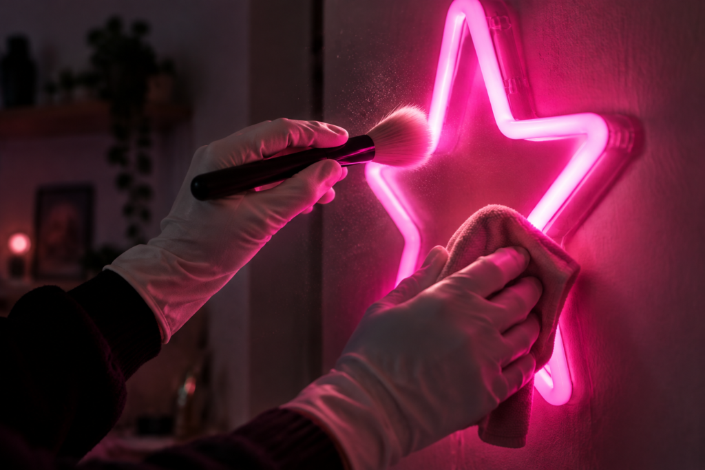
Kitchens are the second-hardest room a sign lives in. The routine is short: dry microfiber weekly, damp pass when the sheen dulls, and never spray cleaner directly at the face – the full method is in our cleaning guide. Placement does the rest of the work: above the steam path, the sign collects dust at living-room speed, not kitchen speed. Apartment trick: a small EAT piece on the narrow wall beside the fridge uses space no art fits – the sliver walls are free real estate.
Guide image 4:3
wiping sign face with microfiber
Guide image 4:3
open plan kitchen sign seen from sofa
7 · Open-plan: kitchen to living flow
When the kitchen shares air with the living room, the sign becomes zoning: it marks the cooking territory without a wall. Keep the color inside the home’s palette – an amber kitchen piece echoing warm lamps in the living zone makes the whole floor read as one designed space. Place it where it is visible from the sofa; the glow you see at night from the couch is the one you will enjoy most. If the palette runs cool elsewhere in the home, amber still works – kitchen warmth reads as function, not clash, in every open-plan photo we see.
In the Wild
Kitchen Signs in Real Homes
Photo 4:3
alt: 早餐角琥珀 but first coffee 牌与咖啡机
Photo 4:3
alt: 开放式厨房餐桌上方金色 bon appétit 牌
Photo 4:3
alt: 小型公寓厨房窄墙面白色 eat 牌
Photo 4:3
alt: 咖啡角定制家族菜谱句牌特写
Photo 4:3
alt: 面包房风格厨房橙色 fresh baked 牌
Photo 4:3
alt: 餐边柜上方暖白 gather here 牌与陶瓷陈列
More Spaces
Neon Signs for Every Space
Kitchen lit – carry the glow to the dining wall, the bar cart, the bedroom.
FAQ
Kitchen Sign FAQ
Q1 Is a neon sign safe in a kitchen?
Yes, with placement. LED pieces run cool on low voltage with sealed faces – the rules are simply two feet of sideways clearance from the range and sink, and never directly over either.
Q2 How do I clean grease off a sign?
Dry microfiber weekly, a damp pass when needed, and never spray at the face directly. The complete method, including what to avoid, is in our cleaning guide.
Q3 What size works over the dining table?
24–36 inches sits within most tables’ span; breakfast nooks read best at 16–24. When torn, size to the furniture the sign hangs above, not the room.
Q4 Will steam from cooking damage it?
Ongoing steam is a placement problem, not a product one – mount out of the direct steam path and the sealed LED face ages at living-room speed. Occasional cooking humidity is nothing it cannot shrug off.
Q5 What wording is most popular for kitchens?
But first coffee leads by a mile, with eat, bon appétit and gather here behind it. The most-loved pieces in real homes, though, are custom lines – a family recipe quote in the original handwriting.
Q6 Can I put my family’s recipe quote on a sign?
Yes – type any line into our customizer, pick the script that matches, and preview it free before it goes to production.
Keep Exploring
Where to Next
Build Your Own Kitchen Sign
Your recipe line, your ritual word – preview the design free before it is made.
The warmest room
deserves the warmest light.
Design a custom kitchen sign in minutes – free preview, low-heat LED, appetite-warm glow.