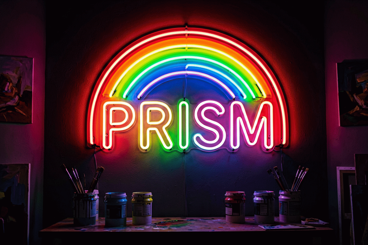
Neon Color Palettes: 15 Winning Combos
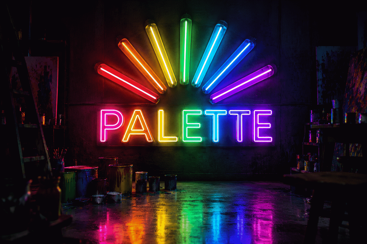
Anyone can pick one neon color. The craft is combining them — in a sign (multi-color designs), on a wall (sign plus decor), or across a room (the full glow scheme). Most combinations fail; a reliable set wins every time. This guide is the working palette book: fifteen combinations with the reasoning behind each, the pairing rules that generate more, and the classic mistakes that make rooms read carnival.
(For how each individual neon color is physically made — the gas-and-phosphor and LED story — that’s our what are neon colors guide. This one is purely about putting colors together.)
The Four Rules That Generate Every Good Palette
- Warm with warm, cool with cool. The neon palette splits cleanly: warm (pink, red, orange, yellow, warm white) and cool (blue, ice blue, green, purple, white). Combinations inside one temperature family almost always work; cross-temperature combinations need one of the structures below.
- One dominant, one accent, one neutral. Three-color palettes follow the 60-30-10 logic of interior design: a dominant glow, a supporting accent, a neutral (white, warm white, or the room’s own surfaces) that lets the eyes rest.
- Two glows maximum per room. Two glowing colors in one space is a scheme; three is a carnival. (The exception: a single sign that internally uses three fixed colors counts as one designed object, not three glows.)
- Analogous beats complementary. Neon’s saturation is extreme — complementary pairs (red-green, blue-orange) at full neon intensity fight. Neighboring hues (pink-purple, blue-green) blend.
The Fifteen Palettes
The Classics (proven everywhere)
1. Pink + Purple. The aesthetic default — the gradient family. Works because both are cool-pinks and purples share a blue undertone. The boudoir-to-Y2K register. Deep end: purple page.
2. Red + Warm White. The bar-and-diner classic — red glow, white script accents. The highest-energy pairing that still reads adult. Red shades covered separately.
3. Blue + White. The tech-and-gaming standard — clean, cool, camera-friendly. The safest palette in the book: no room it breaks. Blue family.
4. Orange + Warm White. The sunset-and-kitchen register — warmth without red’s aggression. Fall rooms, cafés, golden-hour vibes. Orange guide.
5. Green + White. The fresh-and-forward pairing — gyms, juice bars, the “go” register. Green shades.
The Statement Palettes (designed rooms)
6. Pink + Black. Noir: one pink glow against a black wall. The single most sophisticated two-color move in neon decor.
7. Ice Blue + Warm White. The winter-warmth paradox — cold glow, warm accent. The minimalist’s holiday palette and the Scandinavian room’s answer.
8. Purple + Green. The haunted-and-hybrid register — the Halloween formula and, softened, the witchy-aesthetic year-rounder. Works at low brightness; clashes at full.
9. Red + Blue. The Americana-and-sports register — deliberately loud. One must dominate (60-30); equal red and blue reads team-rivalry, not design.
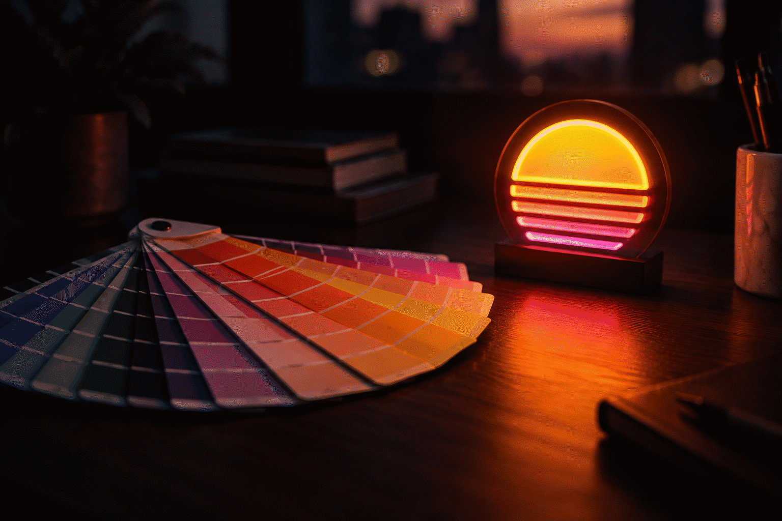
10. Yellow + Pink. The sunset core — yellow accent under pink glow, or the two-toned sunset sign. Softball-teams-and-summertime energy.
The Single-Hue Schemes (one glow, done right)
11. All warm white. The gallery scheme — monochrome glow, maximum elegance. The scheme for people who love neon but not color.
12. All blue, two depths. Blue sign plus a dimmer blue secondary — depth without a second hue.
13. All pink, two registers. Soft pink dominant, hot pink accent (one word in the phrase). The boudoir’s interior-design version.
The Multi-Color Sign Palettes (within one sign)
14. Three fixed colors in one design. The wedding tier’s pink-white-warm, the holiday tier’s red-green-white, the brand tier’s logo colors. The rule inside a sign: one dominant color at 60%+ of the design, the others as accents — never equal thirds.
15. RGB single-sign. One color-changing sign IS a palette system — every combination above on demand. The flexibility tier; the trade-offs are covered in our color-changing guide.
Palette to Room: The Matching Table
| Room | Best palettes | Avoid |
|---|---|---|
| Bedroom | 1, 6, 7, 13 | 9 (too loud), 3 at full brightness |
| Gaming/streaming | 3, 12, 15 | 4 (warm reads soft on camera) |
| Kitchen/dining | 4, 5, 11 | 1 in hot registers (candy-shop) |
| Home bar | 2, 3, 6 | 10 (unless summertime is the brand) |
| Kids’ room | 3, 5, 10, 15 | 6 (black walls) |
| Office/study | 3, 7, 11 | 1 (romantic register) |
| Café/retail | 4, 5, 11 | 8 outside October |
The Five Classic Mistakes
- All the colors, all the room. Four-plus glows in one space — the carnival failure. Two glows, full stop.
- Complementary at full brightness. Red-green or blue-orange both at 100% vibrate. Complementary pairs need one at half power.
- Choosing colors from separate product photos. Every listing’s photography white-balances differently. Build multi-color designs in one place — the custom builder renders all selections under one light, which is the only honest preview.
- Forgetting the wall. The wall is the palette’s biggest surface: pink glow on pink paint doubles down, on white paint behaves, on dark paint deepens, on strongly-colored paint (deep green, navy) mixes into a third color at night. Test the glow against the actual wall.
- Matching the trend, not the room. The palette serves the room’s register — a serene bedroom wants 6 or 13, not the loud pairing your feed showed. Trends rotate; the palette-logic doesn’t.
The Design-Theory Layer: Why These Rules Work
The color-science underneath the fifteen — the reasons, so you can generate your own:
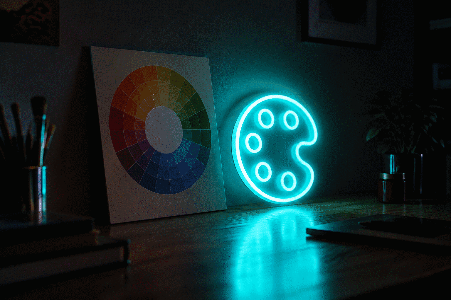
- Neon’s saturation is already at maximum. Ordinary decor advice (“add a pop of color”) assumes objects at partial saturation; neon signs are all pop. The consequence: neon-vs-neon combinations need more contrast discipline than paint-vs-paint — the two-glow rule isn’t a style preference, it’s saturation management.
- Color temperature is the strongest perceptual axis. The warm-cool split (the palette’s rule one) works because the visual system organizes hue-temperature before it organizes anything else — a warm-plus-cool neon room reads as “two zones” even at equal brightness. Working within one temperature family reads as one environment.
- Halo bleed is the medium’s physics. Each glowing letterform spreads its color outward — adjacent different-colored elements bleed into each other (the salmon zone between two pinks, the gray between blue-and-orange). Spacing (physical distance between glows) and value contrast (light against dark rather than hue-against-hue) are the mitigations.
- The eye adapts to one dominant hue. Rooms read “pink room” or “blue room” from their dominant glow — the 60-30-10 structure (from rule two) gives the adapting eye a hierarchy to settle into. The equal-thirds room fights the eye’s own organization.
- Context shifts every color. The wall’s color, the room’s other light, even the furniture’s finish — all shift the perceived glow (the blue-sign-on-navy-wall that disappears, the pink-on-forest-green that turns gray). The preview-against-your-actual-wall rule (mistake four) exists because the palette happens in your room, not in the catalog.
The Seasonal Palettes: Four Ready-Made Schemes
The calendar tier — the seasonal registers, pre-mixed:
- Autumn: orange + warm white (the harvest tier). The fall palette from our autumn guide — burnt orange glow, warm-white accents, the September-November register.
- Winter holiday: red + green (the classic) or warm white + ice blue (the modern). The December pair from the Christmas guides — one register per facade.
- Valentine’s: pink + red or pink + purple (the romance tier). The February registers (per the Valentine’s guide).
- Halloween: purple + green or purple + orange (the spooky tier). The October pair from the Halloween guides — the accent color sets the register (green = uncanny, orange = festive).
The seasonal palette strategy: one permanent neutral anchor (warm white or a soft color) plus one seasonal accent sign that rotates — the year-round room that dresses for the calendar at one-sign cost per season.
The Brand-and-Team Palettes
The identity tier — matching palettes that exist already:
- Team colors (the sports wall). The franchise registers (per the NFL guide’s division map) — one dominant team color plus white; the two-team household’s split-register compromise.
- Business brands (the storefront tier). The commercial registers (per the business colors guide) — the brand-matching decision tree.
- School colors (the college wall). The university registers (per the college guide) — the alma-mater palette, the est.-degree custom’s color system.
- The wedding palette. The event register — the couple’s colors rendered in the names-piece (per the wedding guide): the palette that gets archived in the home after the event.
The identity palette’s advantage: the colors are already decided (the team, the brand, the school chose them decades ago) — the matching question is solved by loyalty. The build: one identity anchor plus one neutral (warm white) — the two-glow rule, pre-optimized.
FAQ: Neon Color Palettes
What colors go well together in neon? Same-temperature pairs (pink-purple, blue-green, red-orange, warm-white-with-any-warm) plus the structured cross-temperature classics (red-blue with one dominant, purple-green at low brightness). Two glows per room maximum; analogous neighbors beat complementary opposites at neon saturation.
What is the most popular neon color combination? Pink + purple (the aesthetic default) and blue + white (the tech default) lead every category — bedroom decor and gaming respectively. Red + warm white is the perennial commercial tier.
How many neon colors should I use in one room? Two glowing colors maximum — one dominant, one accent. A single multi-color sign counts as one designed object and can hold three fixed colors internally if one dominates at 60%+.
What neon colors look good on white walls? All of them — white walls are the neutral canvas, and the glow effectively “paints” the wall at night. The boldest registers (hot pink, red) read their truest on white; dark walls deepen and moody everything.
Can I match a neon sign to my room’s existing colors? Yes — and it’s the pro move. Bring your room’s dominant color to the builder as the accent (or its complement as the pop); the custom maker renders your phrase in every shade against your choice live.
What’s the neon color chart? The standard catalog runs ten core shades — hot pink, red, blue, green, orange, purple, yellow, white, ice blue, warm white — plus blends (teal, coral, chartreuse, lavender). The full shade families with per-color pairings start at the colors guide and the individual color pages.
Pick Two, Glow Right
One dominant, one accent, one neutral — warm-with-warm or cool-with-cool — chosen against your actual wall in the custom neon maker. That’s the entire craft, and now you have the fifteen that already won.
Sources & Further Reading
- Mercury (U.S. EPA) — federal guidance on mercury exposure and safe handling.
- Neon sign (Wikipedia) — the consolidated public record of neon-sign history and technology.