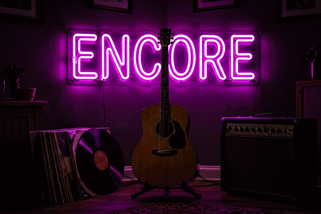
Metallica Neon Sign: Master of Puppets Glow
Four decades in, the band’s visual identity is inseparable from its severity: the severe serif logo, the white-on-black discipline, the grave-and-lightning imagery that thrash built. A Metallica wall piece is heavy metal’s whole design language compressed — and the fan-styled custom route (phrases, icons, and the aesthetic without the trademark) is where the wall gets built honestly.
This guide covers the metal glow: why the genre’s design rules are the strictest in music decor, the icon set that carries the wall, the phrase tier that does the licensed work’s job, the rooms the register owns, and the custom builds.
The Design Rules: Why Metal Reads Different
Heavy metal’s visual discipline explains why its neon pieces look nothing like the rest of the music catalog:
- White, red, and black. The genre’s near-universal palette — the white-on-black of the album covers, the red of the type and the blood. In glow terms: warm white and red pieces on black walls, full stop. The genre that runs a three-color discipline (the red guide covers the working hue) — a rainbow metal wall is a genre error, not a choice.
- The severe typography. Metal lettering runs sharp, tight, and aggressive — the opposite of neon’s script register. The genre’s pieces render in block and sharp-serif fonts; the script tier barely exists here, and that’s the point.
- Severity as the aesthetic. The genre’s imagery (skulls, lightning, blades, graves) is serious in a way the rest of the catalog isn’t. The metal wall doesn’t wink — its pieces mean what they say, which is exactly why the wall reads as committed rather than decorated.
The Icon Set: What Glows on the Metal Wall
- The skull. The genre’s flag — the register’s anchor piece. Our skull guide covers the shape’s full mechanics; the metal variant runs it in white outline or red on black, detailed or clean, always severe.
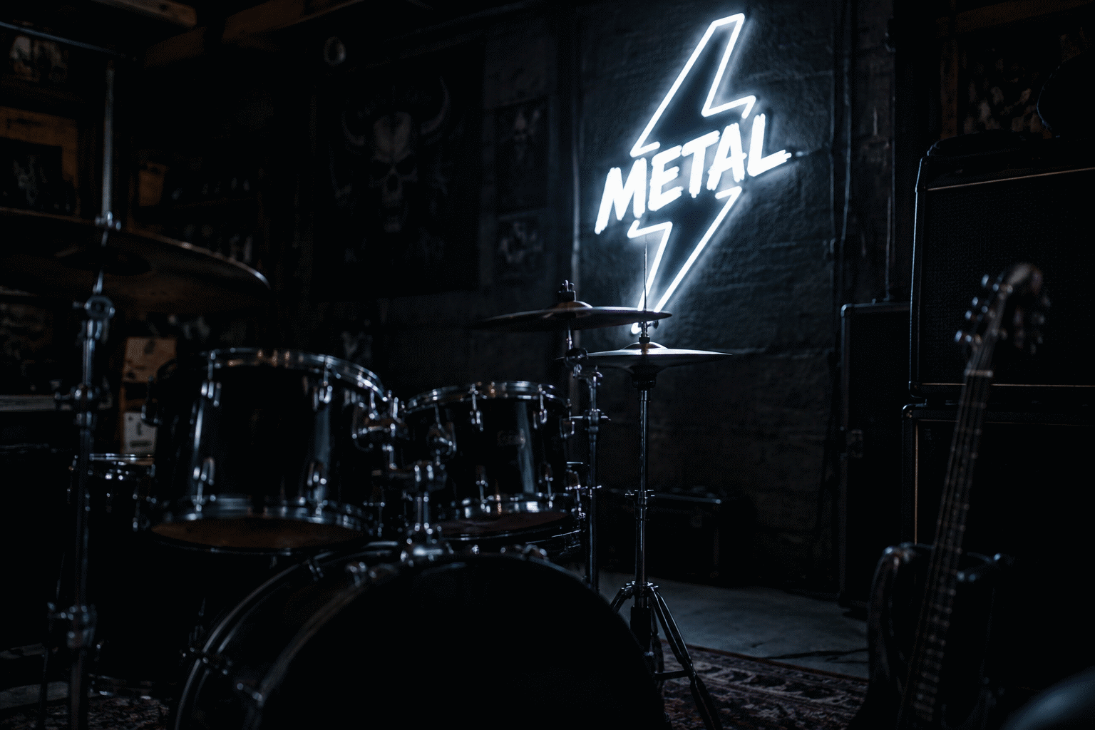
- The lightning bolt. The genre’s energy mark — the strike that means volume in any language. The bolt guide covers it; the metal wall runs it red or white, vertical, aggressive.
- The blade and the cross. The sword, the dagger, the inverted-and-upright crosses — metal’s heraldic tier. The custom route renders these beautifully (line-art media, severe shapes).
- The snake and the grave. The deep-icon tier — the imagery the genre has used since its album-cover golden age. Custom territory, one-of-one builds.
The Phrase Tier: The Fan-Styled Route’s Workhorse
The honest note every band piece on this site carries: custom builds are your text and your design — not licensed band merchandise. For the metal wall, the phrase tier is where that freedom sings, because the genre’s song and album titles are its real iconography:
- The album-title canon. “MASTER OF PUPPETS,” “RIDE THE LIGHTNING,” “…AND JUSTICE FOR ALL,” “SEEK AND DESTROY” — the titles that carry the wall without any logo at all. Rendered in the genre’s severe block, these are fan pieces in the purest sense: the words every fan already hears in guitar.
- The lyric tier. The lines that outlived their songs — “EXIT LIGHT, ENTER NIGHT” being the genre’s single most-ordered lyric build. Priced by width in the custom builder.
- The est.-tier. “FAN SINCE 1986” — the year the genre’s masterwork dropped, the wall’s documentation piece.
- The genre phrases. “HEAVY METAL,” “THRASH,” “METAL HEAD” — the words that aren’t any band’s property and mean all of them.
The Rooms
The music den (the native habitat). The metal wall among the instruments: the phrase piece over the amp stack, the guitar tier flanking. The music guide covers the wider wall; the metal variant runs it darker and louder than any other register.
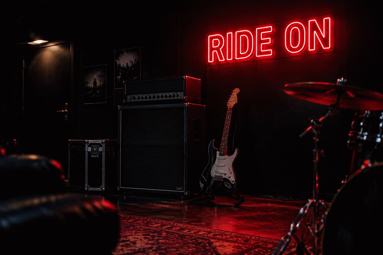
The band’s practice room. The garage-rehearsal wall — the phrase piece that faces the drummer (the room’s actual audience), in full-output red. The man cave integration applies when the garage doubles as the hangout.
The gym’s metal corner. The genre’s second home: heavy music and heavy lifts run on the same fuel. The severe phrase (“NO MERCY,” “RIDE THE LIGHTNING”) at the rack — the effort register, covered from the lighting side in our home gym guide.
The office-and-desk tier. The small skull or the lyric fragment at 12–14 inches — the fan’s quiet signal, in a genre that is not quiet.
The Genre Tree: Where the Wall Fits
The metal wall carries a lineage, and knowing it makes the phrase choices sharper:
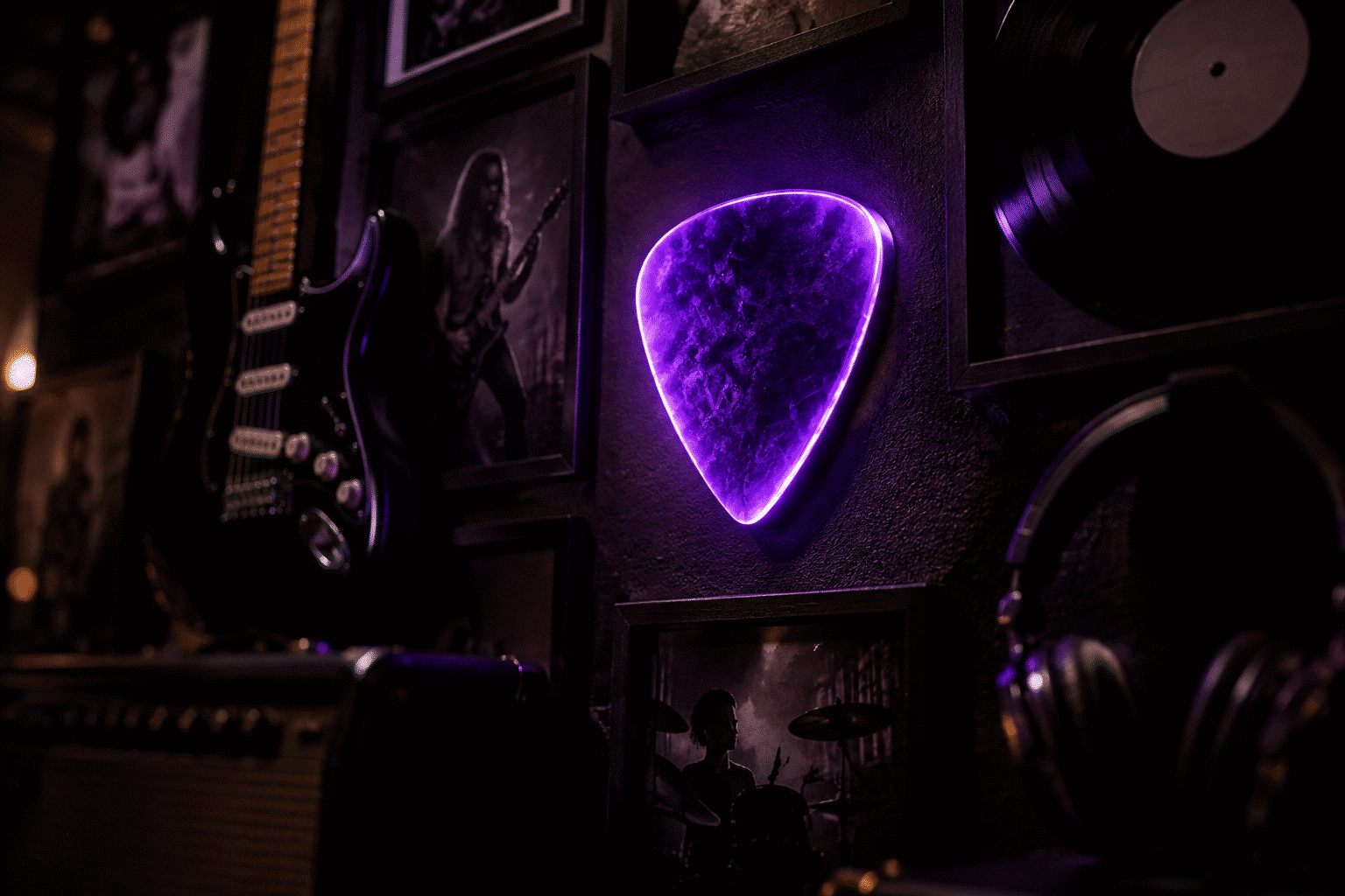
- The thrash origin (early 1980s, two coasts). The genre’s founding generation – the big four and their peers – built the visual grammar the whole register still uses: the severe logo, the white-red-black discipline, the grave-and-lightning icon shelf. A wall built on those rules reads as the genre’s canon regardless of which band name it says – or whether it says any.
- The subgenre branches. Death, doom, power, prog – each branch dialed the grammar differently (more ornament, more gothic, more fantasy), and the wall can too: the doom wall runs candle-tier warm white and heavy ornament; the power wall runs bright and heraldic.
- The modern crossover. The genre’s current decade runs the old imagery with new production – the streaming-era bands keeping the severe discipline on cleaner walls. The register’s present: black wall, one anchor phrase, no clutter – the original grammar at minimalist scale.
The takeaway for the builder: the wall does not need the band’s name to be a metal wall. The grammar carries it – severity, palette, icons. That is what makes the fan-styled route not a compromise but the genre’s own native form.
Sizing and the Wall’s Assembly
| Tier | Size | Register |
|---|---|---|
| The desk signal | 12-14 in | Offices, shelves |
| The lyric piece | 18-28 in | The den wall |
| The anchor phrase | 28-40 in | The band room, the gym |
| Icon customs | by design | The one-of-one tier |
The assembly rule for the full metal wall: one anchor (the phrase), one icon (the skull or bolt), black wall, two colors maximum. The genre’s severity is the aesthetic — the wall that adds a third color and a fourth piece stops being metal and starts being a novelty shop.
FAQ: Metallica Neon Signs
Where can I buy a Metallica neon sign? The fan-styled custom route is the register’s main street – the song and album titles, the genre’s icon set, your text in the severe block style, live pricing in the custom builder. Licensed pieces and vintage stock surface through retail and collector channels.
What should a Metallica-style neon sign say? The phrase tier carries the wall: MASTER OF PUPPETS, RIDE THE LIGHTNING, SEEK AND DESTROY – the titles every fan already hears in guitar. The words do the licensed work’s job without any logo at all.
What colors for a metal neon wall? White, red, and black – the genre’s near-universal discipline. Warm white and red pieces on black walls; the script register doesn’t exist here, and a rainbow metal wall is a genre error, not a choice.
What icons work on a heavy metal wall? The genre’s four: the skull (the flag), the lightning bolt (the energy), the blade and cross (the heraldic tier), the snake and grave (the deep cuts). Line-art severe shapes – the custom route’s natural language.
How much does a metal neon sign cost? Lyric and title pieces run $100-$220 by width; icon customs $80-$180; the anchor phrases (28-40 inches) $200-$350. The full wall – anchor, icon, black paint – assembles for $300-$500.
When do metal sign searches peak? The gift season, like the rest of the music register – December, with a secondary bump around tour announcements and festival on-sales (the genre’s summer circuit keeps a seasonal floor under demand all year). Order customs by early December; the anchor phrases are the builds that queue.
Can I hang a metal sign in a small room? Yes – the register actually suits small walls better than most: the genre’s severity reads at small scale where softer registers fade. One lyric piece at 18 inches on a black wall is a complete metal deployment; the genre never needed square footage, only commitment.
What font style for a metal neon sign? The genre’s severe block and sharp serif – tight letterforms, aggressive terminals, no rounded corners. Most custom builders carry a “rock” or “athletic” font tier that lands the register exactly; the one font family to avoid is script, which the genre has never used and which reads as a different genre entirely on the wall.
Where does the metal wall go? The music den (native), the practice garage (facing the drummer), the gym’s metal corner (heavy music and heavy lifts run on the same fuel), and the desk tier (the quiet signal, in the genre that isn’t).
Turn It Up
Four decades of severity, rendered in the medium that does loud natively. The phrase, the skull, the red — build the wall and let the room thrash.
More music glow: music rooms, guitar walls, the Grateful Dead register, skull mechanics.
Sources & Further Reading
- Neon sign (Wikipedia) — the consolidated public record of neon-sign history and technology.
Pricing based on CustomNeon’s current catalog (2026); custom quotes come live from the sign builder.