Akatsuki Neon Sign: The Red Cloud Wall
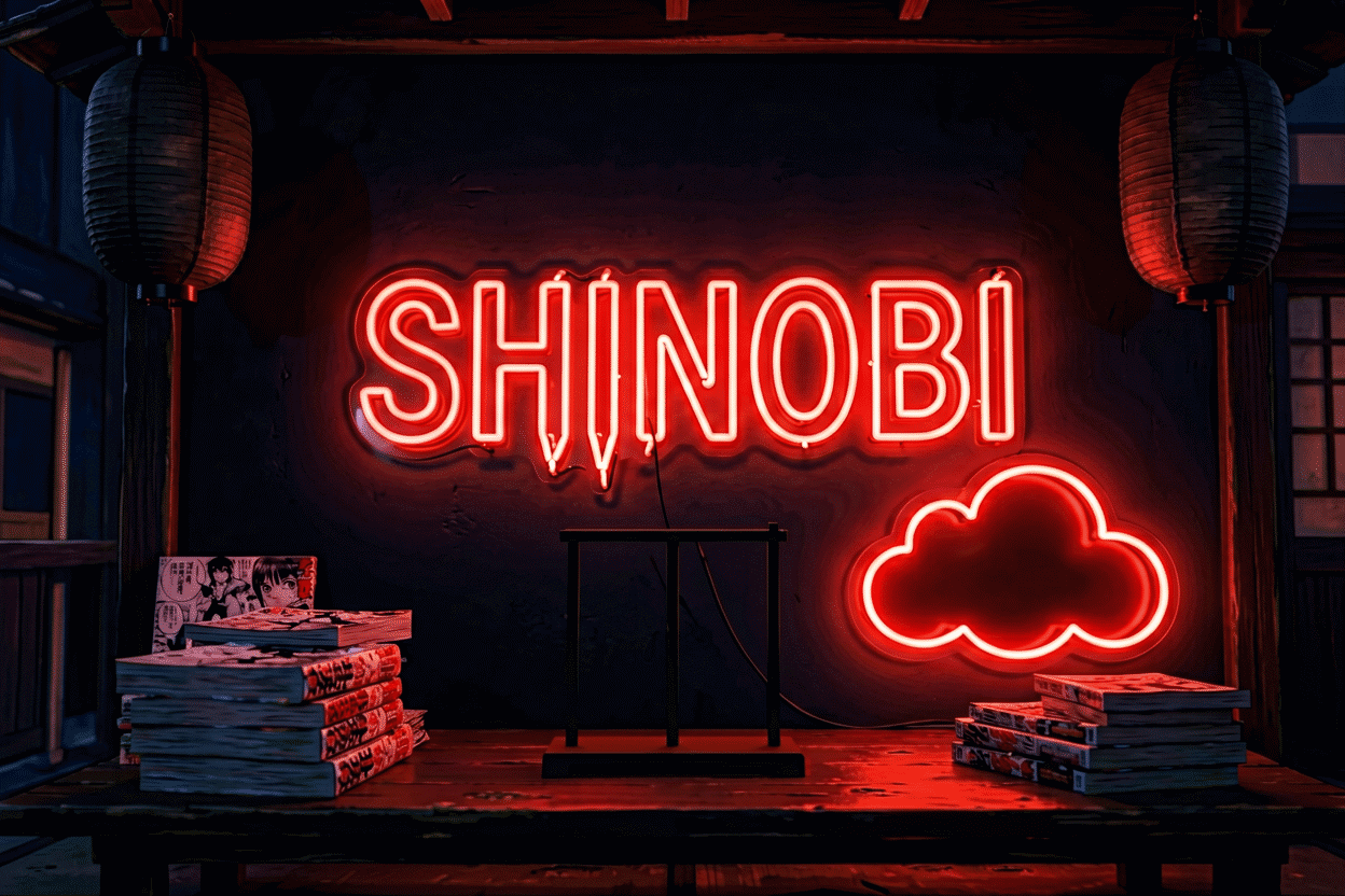
Every fandom has its villain aesthetic, and few in anime history hit like the Akatsuki’s: the black cloaks with red clouds, the organization that turned antagonists into icons. The red-cloud design is one of the medium’s most striking compositions — stark, symmetric, instantly legible — and it happens to be nearly perfect for neon: high contrast, bold shapes, a single commanding color.
This is the Akatsuki-specific canon — the icon, its formats, and why the villain wall runs different from the hero wall. The parent fandom’s guide lives at Naruto neon signs; the anime collection at anime neon signs.
The Icon
The red cloud — the organization’s cloud-and-outline mark: the single design that carries the whole antagonist aesthetic — a shape so strong it works with zero context as pure design and full context as deep fandom (the red register’s physics — the color was chosen for menace, and neon agrees).
The cloud reads in every format: single large (the wall’s centerpiece), scattered trio (the cloak’s composition logic, translated), or paired with the rings-and-slash register of the story’s later arcs. It’s the rare icon that scales from 12-inch desk piece to 48-inch wall anchor without losing anything.
The Formats
The single cloud — the icon alone, 18–36 inches: the entry piece and often the only one the wall needs — the minimal tier that carries maximal menace.
The cloud cluster — three clouds in the cloak’s arrangement: the composition tier — the piece that mirrors the source design’s own logic (the cloak’s scattered pattern was itself signage).
The character commissions — the organization’s iconic members in line art (preview): the devotion tier — the pieces that name a favorite in a fandom where the villains drew the deepest favorites.
The pairing pieces — the cloud with the Sharingan or the ring glyph: the composition tier for the walls that run the full register (the parent canon for the companion icons).
The Villain Wall’s Logic
The Akatsuki wall runs different physics from the hero wall: darker rooms (the aesthetic reads best against dark paint and dim glow — the villain register wants the 30% brightness the room systems cover), red-dominant palette (the icon carries it; the rest of the wall defers — one red anchor, everything else monochrome or dark), and the deliberate sparseness (the villain wall’s menace is in the negative space — the single cloud on the dark wall outreads the cluttered shrine).
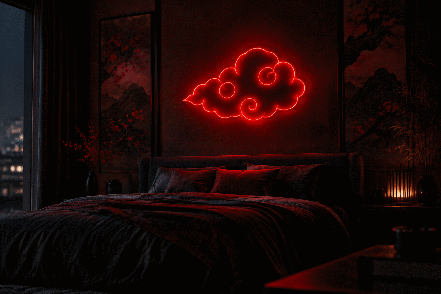
The gaming-room crossover (here) carries the households that run the aesthetic beside the setup — the red-on-dark composition is native to both. The hanging logic covers the mounting; the anime-room system covers the wider collection.
The Gift Logic
The Akatsuki piece is the Naruto fandom’s connoisseur gift: the icon that signals depth (the casual fan buys the leaf; the deep fan buys the cloud — the tier’s own internal logic) (the gift canon). The single cloud covers every budget; the character commissions carry the flagship wall.
The Villain Wall’s Aesthetic Physics
The Akatsuki wall runs the dark-room physics, and the physics deserve their full statement: the dark-wall advantage (the red cloud on the dark wall reads at twice the vividness – the luminance contrast with no competition, the glow logic); the sparse composition (the villain register’s menace lives in the negative space – the single cloud on the dark wall outreads the cluttered shrine by the full margin of restraint); the low-brightness protocol (the 30% setting that reads deliberate rather than dim – the villain wall’s glow is atmospheric, not energetic (the room systems)).
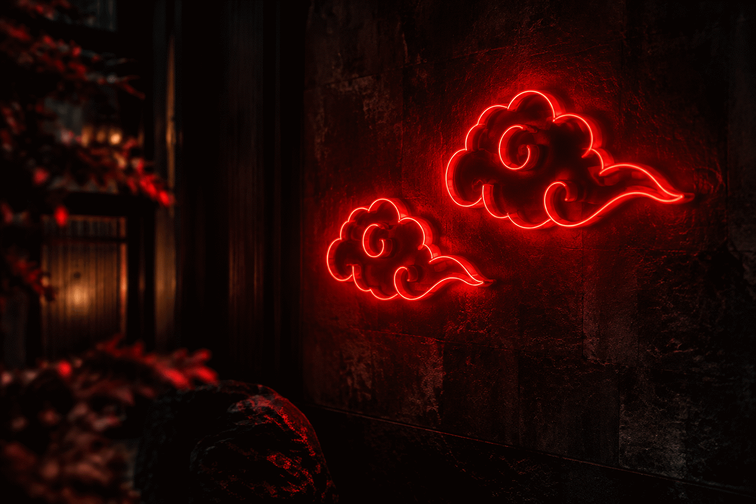
The physics’ application: the dark room (the painted-dark wall or the windowless corner), the single red anchor (the cloud at 24-36 inches), and the monochrome supports (the dark-palette pieces that defer) – the villain wall that follows the physics reads as the aesthetic choice it is; the villain wall that breaks them (the bright room, the full cast, the rainbow) reads as the costume it became.
The counterpart wall: the hero-and-villain composition (the leaf and the cloud, the paired icons – the parent canon) – the two-register wall that runs the story’s whole tension in two glyphs. The composition’s discipline: the paired icons at matched scale, the hero’s register in its warm-neutral, the villain’s in its red-on-dark – the wall that reads balanced rather than conflicted.
The Commission Tiers
The Akatsuki custom route’s pieces: the character commissions (the organization’s iconic members in line art – the villain-tier favorites that ran deeper than the heroes’ – preview), the paired-icon builds (the cloud with the ring glyph, the Sharingan-and-cloud composition), and the arc-specific commissions (the moments that defined the villain’s era). The commissions run $150-400 (the brackets) and land at the fandom’s connoisseur depth – the pieces that signal the tier below the tier (the gifting logic).
FAQ About Akatsuki Neon Signs
What’s the best Akatsuki neon sign? The single red cloud, sized to the wall — the icon that carries the whole aesthetic in one shape (the parent canon). The cluster format for the composition tier; the character commission for the flagship.
What color palette runs the Akatsuki wall? Red-dominant on dark: the icon’s native register — one red anchor, dark walls, monochrome supports (the color logic). The menace is in the contrast and the negative space.
Can I get a custom Akatsuki sign? Yes — the members’ portraits, the arc compositions, the paired icons (preview): the commission tier the deep-fandom walls run.
Why a villain wall instead of the hero tier? The aesthetic tier: the Akatsuki design is the fandom’s strongest pure composition — stark, symmetric, menacing — and the villain wall’s darker physics (the logic above) makes the room it lives in read deliberate rather than decorated.
What is the best Akatsuki neon sign? The single red cloud, sized to the wall – the icon that carries the whole aesthetic in one shape (the guide above): stark, symmetric, instantly legible, nearly perfect for neon. The cluster format runs the cloak’s composition logic; the character commissions (preview) run the devotion tier. The wall’s physics: red-dominant on dark, one anchor, the thirty-percent glow – the villain register’s menace lives in the contrast and the negative space, and the wall that follows the physics reads the aesthetic choice it is.
How much does an Akatsuki neon sign cost? The single cloud runs $60-180 (the icon tier – the entry piece that often completes the wall); the cluster format runs $120-280 (the cloak’s composition); the character commissions run $150-400 (preview) (the commission tiers above). The connoisseur-gift logic: the icon that signals depth – the casual fan buys the leaf, the deep fan buys the cloud – the tier’s internal language that makes the Akatsuki piece the knowing gift.
The Akatsuki Wall vs the Leaf Wall
The villain and hero walls, compared:
| Decision axis | The Akatsuki wall | The Hidden Leaf wall |
|---|---|---|
| The icon | The red cloud (the menace) | The leaf symbol (the home) |
| The palette | Red-dominant on dark (the physics above) | The warm neutrals (the village’s registers) |
| The brightness | The 30% deliberate dim | The household’s standard arc |
| The room | The dark corner or the painted wall | Any wall (the neutral’s flexibility) |
| The composition | The sparse (the negative space’s menace) | The standard shrine (the anchor-and-supports) |
| The connoisseur signal | The deep fan’s tier (the cloud says knowing) | The general fan’s (the leaf says the fandom) |
The two walls’ aesthetic difference, stated once more because it is the register’s whole point: the Akatsuki design is the story’s strongest pure composition (stark, symmetric, the menace in the restraint), and the wall that honors it runs its physics – the dark, the dim, the sparse – rather than the hero wall’s warm and standard registers. The villain wall done right reads the aesthetic choice it is; done wrong (the bright room, the full cast) it reads the costume it became (the physics above).
The two walls’ crossover piece – the Sharingan – serves both registers (the eye’s glyph reading to the hero’s story and the villain’s arc alike): the icon that bridges the two walls the way the character bridged the two arcs – the red wheel that spins in both directions. Where should an Akatsuki neon sign go? The dark wall – the villain register’s native ground (the placement logic above): the painted-dark corner or the windowless wall where the red cloud’s contrast doubles, the 30% brightness where the menace reads deliberate, and the sparse composition (the single anchor, the negative space) where the aesthetic’s restraint does its work. The gaming-corner crossover (the red-on-dark beside the setup – the gaming canon) serves the dual-identity rooms; the bedroom’s dark register serves the private walls. The placement’s one rule: the bright room is the Akatsuki piece’s enemy – the icon that means the dark aesthetic loses the meaning in the daylight palette, and the wall that honors the register glows it right.
Do Akatsuki cloud signs come in colors other than red? Commission shops bend the cloud in purple, black-lit blue, and even orange for the Pain-arc registers, but be ready for fandom side-eye: the red cloud is one of anime’s most color-locked icons, and alternate hues read as remixes rather than variants. The defensible off-register choice is the crossed-out cloud (the slash mark certain members carry), which changes the symbol’s meaning without touching its hue.
Sources & Further Reading
- Neon sign (Wikipedia) — the consolidated public record of neon-sign history and technology.
- Neon, element 10 (Wikipedia) — element properties: density, boiling point, abundance.
Pricing based on CustomNeon’s current catalog (2026); custom quotes come live from the sign builder.