Budweiser Bowtie Neon Sign: The Emblem in Light
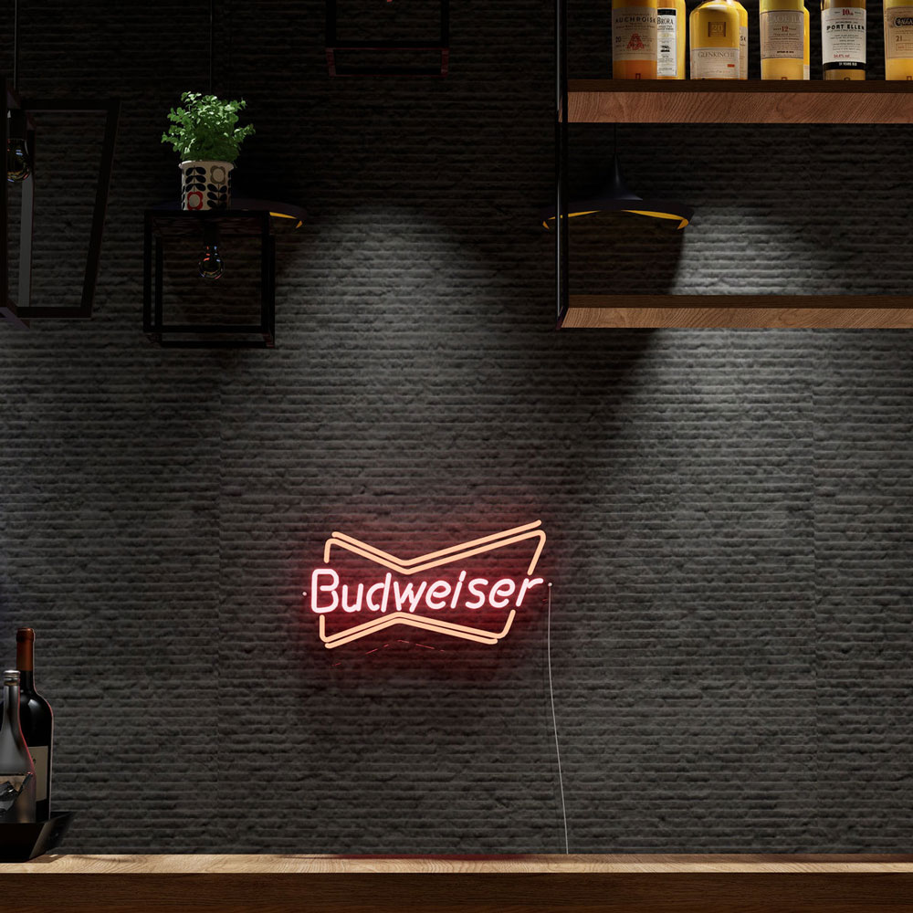
Some brand marks were drawn for signage and some were merely drawn — and the Budweiser bowtie is the former. The red emblem, slotted and symmetric, reads from across a barroom at a glance, which is exactly what it was engineered to do across a century of tavern walls. In neon, the bowtie is the brand’s most concentrated statement: no script, no scenery, just the mark itself in its native color, glowing.
This is the bowtie-specific guide — the design’s history, what the format does that the script doesn’t, sizes and prices from our shop’s builds, and where the piece works best. The full Budweiser canon (script, guitar, clydesdales, the collector tiers) lives in the main Budweiser guide.
Why the Bowtie Works in Neon
The emblem’s design advantages translate directly to the medium: symmetry (balanced compositions hang well anywhere — over a bar, flanking a doorway, centering a gallery wall), bold geometry (the slotted shape’s wide strokes read at distance the way fine script can’t), and single-color clarity (the mark was born red; red remains neon’s most commanding register — the color logic).
Where the script piece says the brand’s name, the bowtie piece says the brand itself — the difference between a signature and a seal. That makes the bowtie format the choice for the walls that want brand presence without text: the garage that already carries signage, the bar wall with phrases competing for attention, the collection that needs an anchor emblem rather than another word.
The Bowtie’s Design History
The bowtie mark’s lineage runs through the brand’s long identity evolution — the emblem appearing on packaging and point-of-sale through the twentieth century’s middle decades, becoming the condensed identifier it is today. The sign trade noticed early: the bowtie formats (often paired with the script or standing alone) became tavern standards precisely because the mark carried the brand without needing the full name’s letter-width.
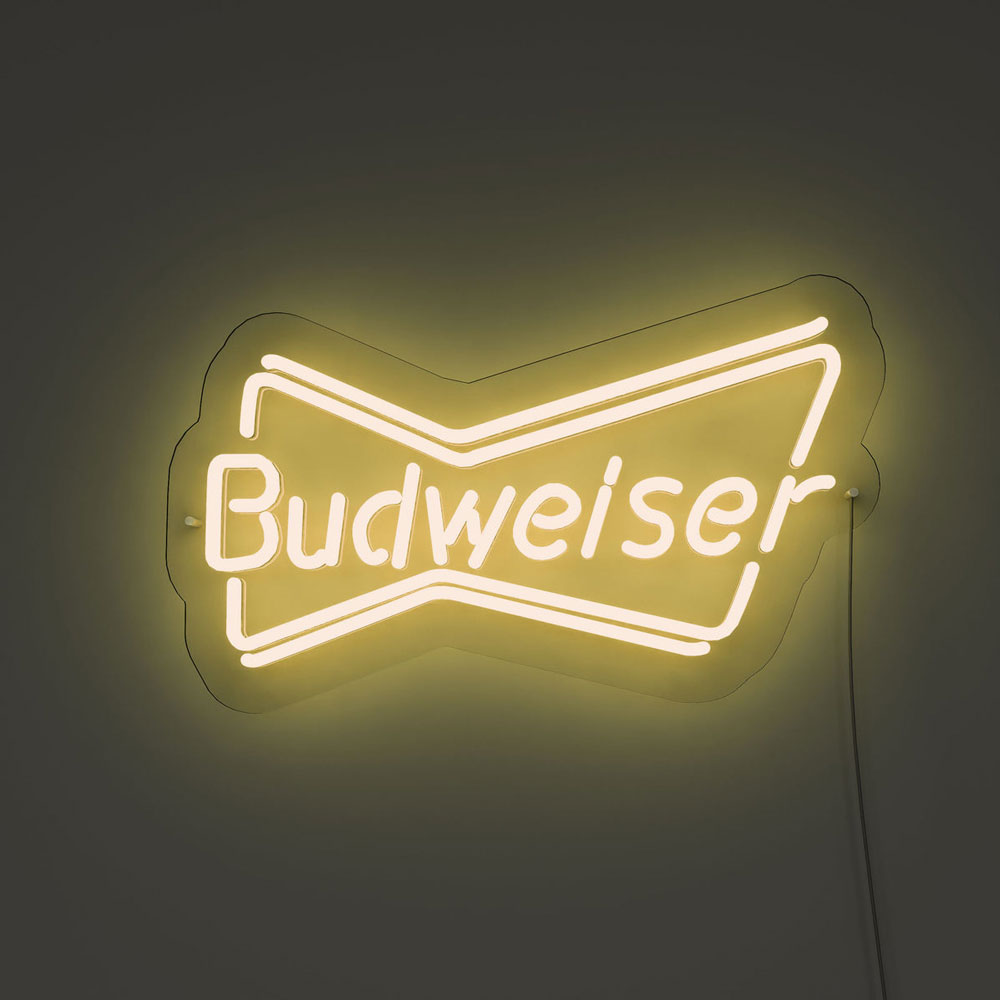
The modern LED versions carry the same logic forward: the emblem and (in some formats) minimal supporting text, sized for the home bar and the commercial wall alike. The design’s century of legibility work means nothing needs explaining — the shape does the recognition on its own.
The Formats
The emblem alone — the bowtie, red on clear backing, nothing else: the purest build, the collector’s format, and the strongest choice when the wall already carries text pieces.
Emblem + script pairing — the bowtie above or beside the brand script: the full-identity format, the bar-wall standard composition (the script builds cover the tier).
The bowtie-and-bottle formats — the emblem with the bottle silhouette: the point-of-sale classic reborn, the format that carries the most era-nostalgia per inch.
The companion builds — the guitar format for the tall walls, the Bud Light builds for the blue register’s counterpart: the family that flanks the bowtie on the collector’s wall.
Sizes and Prices
From our shop’s lineup, the honest brackets: the bowtie build runs 32 to 47 inches in its tall vertical format (with the size bands at $316/$411/$537 at last check — current pricing on the product page), and the family’s script formats bracket similarly (the cost logic). The vintage glass market runs its own course: mid-century bowtie pieces with intact tubes and working transformers live in the several-hundred-to-four-figure range, era and condition decided — the collector’s lane, covered honestly in the main guide.
The size call follows the wall: the vertical bowtie format fits the narrow wall beside a fridge or doorway (the format’s quiet advantage over wide scripts), while the wide script formats carry the long bar wall. The bar-wall logic covers the full composition math.
Where the Bowtie Belongs
The piece’s native rooms: the home bar (the emblem over the bottles — the bar canon tier), the garage (the bowtie beside the workbench — the man cave context), and the commercial wall (the tavern-register piece that doesn’t need the name spelled out). The format’s symmetry hangs well in threes — the bowtie centering two script pieces — and its single-color read keeps the composition calm where a wall of scripts would shout.
For the buyer choosing between script and bowtie: the script says the name (the louder, more complete statement), the bowtie shows the mark (the quieter, more designed one). The walls that carry both run the script at center and the bowtie in support — the brand’s own century-old composition logic, borrowed for the basement.
The Bowtie Wall: Three Compositions
The bowtie piece hangs three ways, and the compositions are worth naming. The solo emblem: the bowtie alone on the narrow wall – the format’s native use (beside the fridge, flanking the doorway), the pure-brand statement at its cleanest. The solo wall wants the vertical format’s height exploited – the tall wall that fits nothing else fits the bowtie perfectly. The anchor-and-flank: the bowtie centering the script and the guitar pieces – the emblem as the wall’s hub, the scripts as its spokes (the family in the classic composition). The collection’s centerpiece: the bowtie at the vintage wall’s center, the era pieces orbiting – the collector’s format, the emblem as the archive’s keystone.
The compositions’ common physics: the bowtie reads at distance better than script (the bold geometry’s advantage – the legibility logic in its home edition), so the emblem carries the wall’s far reads while the scripts carry the near ones – the division of labor that makes the family work.
The Collector’s Note: The Bowtie Across Eras
The bowtie mark spans decades of formats, and the collector’s wall can trace them: the mid-century emblem pieces (the chrome-framed era), the seventies-eighties flat scripts (the sports-bar survivors), and the modern LED renditions (the current tier – the build). The eras mix on one wall when the palette agrees (the all-warm collection spans decades gracefully – the collection logic), and the bowtie’s single-color simplicity makes it the easiest era-spanner in the brand’s canon.
The honest market note (repeated from the main guide because it bears it): the vintage glass market runs era-and-condition pricing, the working pieces command their premiums, and the modern LED tier delivers the emblem at the use-it-daily price – both tiers are legitimate, and the confusion between them is the market’s only real trap (the cost brackets).
Complete the Anheuser-Busch shelf: the Bud Light neon signs piece covers the volume king of the family, and our vintage beer neon signs guide frames the bowtie among the collectible classics.
FAQ About Budweiser Bowtie Neon Signs
What’s the difference between the Budweiser script and bowtie signs? Statement and seal: the script spells the brand (the fuller, louder piece), the bowtie shows the mark (the condensed, designed one). The best walls often run both — the script builds and the bowtie flanking.
What sizes does the bowtie sign come in? Our build runs a tall vertical format, 32–47 inches across the size bands — the narrow-wall advantage over wide scripts. The product page carries current sizes and pricing.
Is the bowtie a good first beer sign? For the text-heavy wall, yes — the emblem anchors without adding words. For the bare wall, the script leads and the bowtie supports (the bar-wall logic).
What about vintage glass bowtie pieces? A real collector lane — mid-century emblem formats with working tubes run several hundred into four figures (the honest market brackets). The LED tiers deliver the look at the use-it-daily price.
What is the difference between the Budweiser script and bowtie signs? Statement and seal: the script spells the brand (the fuller, louder piece – the bar wall’s default), and the bowtie shows the mark (the condensed, designed one – the narrow wall’s piece) (the formats above). The best beer walls run both – the script at center and the bowtie flanking – the brand’s own century-old composition logic, borrowed for the basement. The bowtie’s vertical format fits the walls the wide scripts cannot: beside the fridge, flanking the doorway, centering the collection.
The Solo Emblem vs the Family Wall
The bowtie piece’s two placements, compared:
| Decision axis | The solo emblem | The family wall |
|---|---|---|
| The statement | The mark alone (the pure-brand read) | The mark among the scripts (the family’s composition) |
| The wall | The narrow or the empty (the emblem’s geometry) | The beer wall (the collection’s center) |
| The budget | One piece ($316-537 in our lineup’s bands) | The family’s ($800-1,500 across the pieces) |
| The composition | The vertical format’s solo (the tall wall’s answer) | The anchor-and-flank (the compositions above) |
| The keeper weight | Total (the emblem is permanent) | Total (the family’s pieces ride together) |
| The collector’s read | The connoisseur’s (the mark without the words) | The collection’s (the brand’s whole canon) |
The two placements’ shared physics: the bowtie reads at distance better than script (the bold geometry’s advantage), so both compositions lead with the emblem’s far-read and let the scripts carry the near ones. The solo runs the advantage alone; the family runs it as the hub (the collection logic).
The solo’s special case – the collector’s format: the emblem alone, at the vintage tier (the market brackets context), reads the connoisseur’s piece – the mark as the artifact, the wall as the museum’s single exhibit. The family wall collects the canon; the solo wall honors the seal.
Sources & Further Reading
- Neon sign (Wikipedia) — the consolidated public record of neon-sign history and technology.
Pricing based on CustomNeon’s current catalog (2026); custom quotes come live from the sign builder.