Coca-Cola Neon Signs: America’s Most Famous Glow
If neon signage has a patron brand, it’s Coca-Cola. The drink was invented in 1886 by Atlanta pharmacist John Pemberton; the flowing Spencerian script came almost immediately; and by the twentieth century’s neon golden age, “Drink Coca-Cola” was glowing above more American storefronts than any other phrase in any other medium. The brand practically wrote the grammar of commercial light: red glow, white script, the contour bottle — three elements that have stayed legible for a century while everything around them changed.
The guide to the Coke wall: the history, the designs, the vintage market reality, and the legal route to the aesthetic.
The Design: Three Elements, A Hundred Years
The script. The Spencerian “Coca-Cola” wordmark — among the most recognized pieces of typography on earth. In glow form it renders exactly as the twentieth century rendered it: white tubes on a red field, or red glow alone.
The contour bottle. The 1915 bottle designed to be recognizable “in the dark” (the actual design brief) — the silhouette that glows as cleanly as any shape ever mass-produced. The bottle’s origin story is neon’s favorite irony: a package designed for darkness-identification, perfect for a light medium.
The red. Coke red is a corporate color like no other — and it glows like the era it dominated. The shade’s behavior by brightness is covered on the red neon sign page.
The Vintage Market: The Deepest One
Coca-Cola is the single most collected brand in American antiques, and its neon is the collection’s crown tier. The honest market picture:
- Golden-age pieces (1930s-1950s diner and drugstore signs) are serious antiques — four and five figures for lit, restored examples.
- The seventies-eighties era (the machine-and-menu-board pieces) is the accessible vintage tier, trading briskly.
- Condition law applies double: the red phosphor and painted metal field are the failure points; documentation and lit photographs are non-negotiable at every price level.
For most walls, the market reality makes the choice: vintage Coke is a collector’s game, and the aesthetic runs through other routes.
The Modern Route and the Trademark Picture
Coca-Cola’s marks are among the most aggressively protected in the world — this is not a gray area brand. The practical routes:
- Licensed reproductions exist through the brand’s own merchandise channels at collectible pricing.
- Custom builders decline the script and bottle. What they build: your own text in the diner register — the soda-fountain piece, the “Cold Drinks” tier, the family-diner name — legally clean, aesthetically adjacent.
- The vintage route: original pieces trade legally as antiques; that’s the collector’s lane and the price tags live there.
Your own diner-register piece — “Cold Sodas,” the kitchen’s fountain name, “Est. [year]” in script styling of your own — mocks live in the custom builder.
Where the Aesthetic Belongs
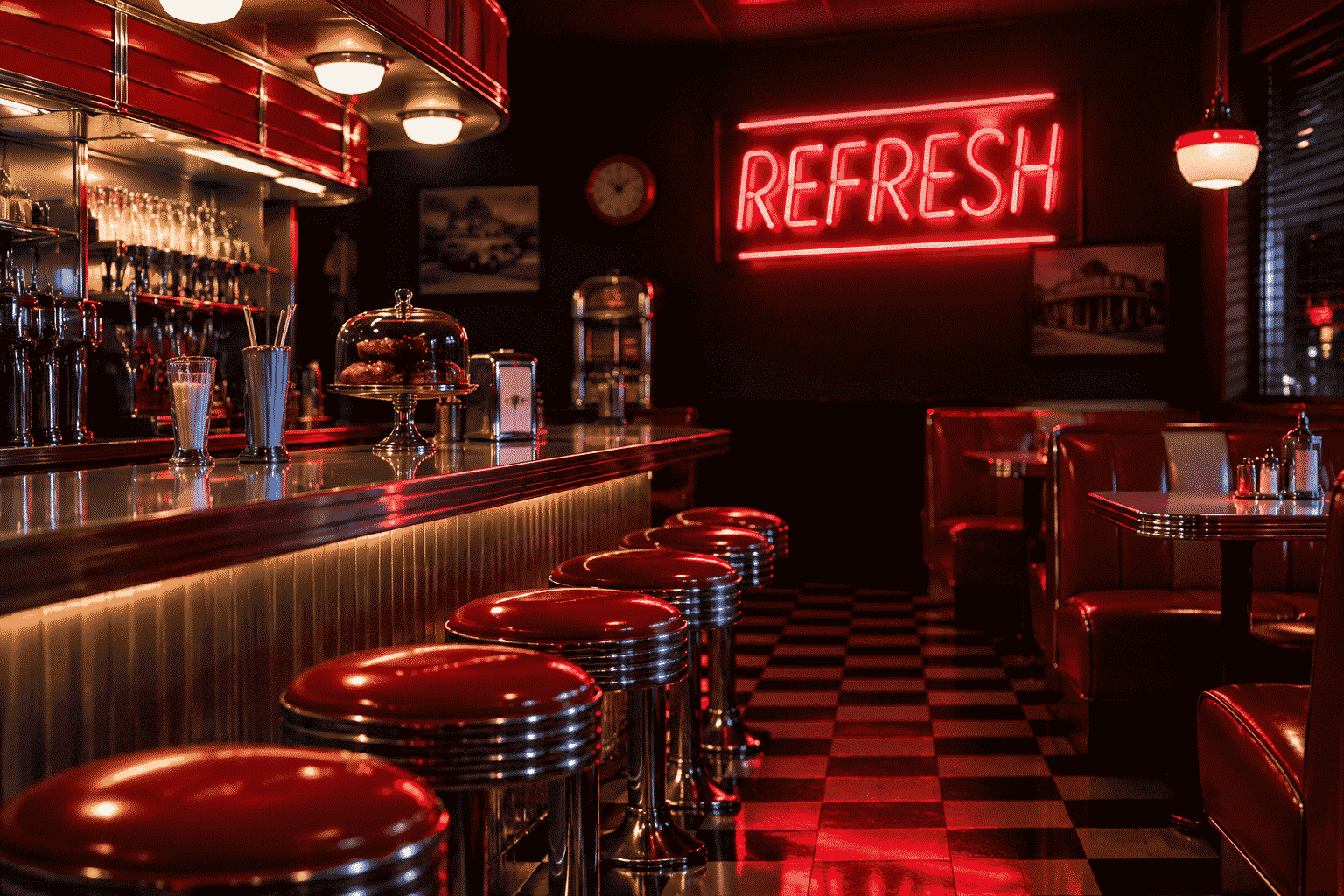
The retro kitchen. The diner register is the kitchen’s native glow — red-and-white, chrome, checkerboard. The kitchen neon signs page carries the architecture; the Coke-red register is its classic scheme.
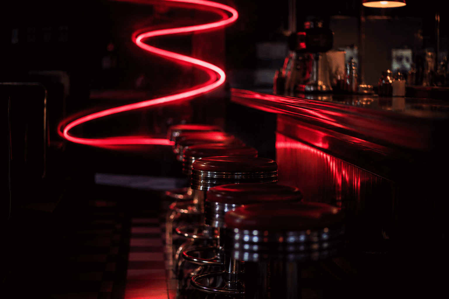
The diner-styled diner and game room. The fifties-Americana room — jukebox corner, chrome stools, the red glow over the soda cooler.
The vintage bar wall. Among the beer blues and whiskey ambers, the Coke red is the wall’s non-alcoholic anchor — the designated-driver’s brand, glowing warm. The bar wall architecture takes it as the Americana tier.
The collection wall. For the Americana collector, the diner tier starts at the catalog.
Why This Sign Outlives Trends
The two-word case: no other piece of commercial typography has stayed current for 130+ years while remaining essentially unchanged. A Coke-styled wall borrows that permanence — the red glow reads “always been here,” which is the effect vintage decor tries to fake and the real thing simply has. The diner aesthetic cycles in and out of fashion; the script never leaves.
The Script’s Story: Typography Worth Knowing
The wordmark every wall borrows from — the history in one minute:
- 1886: the pharmacist and the bookkeeper. John Pemberton concocted the beverage in Atlanta; his bookkeeper Frank Robinson named it, wrote the name in the flowing Spencerian script of the era’s formal penmanship — and designed the logo that has survived 140 years with essentially no redesign. The bookkeeper’s handwriting outlasting every redesign trend in commercial history is design’s greatest ROI story.
- The Spencerian register. The script style (the elaborate American penmanship of the 19th century, taught in business schools as the professional hand) — the flowing, connected, flourished lettering that read “quality and care” to its original customers. The neon script pieces inherit the whole register.
- The red disc. The brand’s red — standardized early (the company’s own accounts credit the colored labels’ differentiation at soda fountains) — became the most consistent commercial color in the world. The neon red’s behavior is the diner register’s foundation.
- The contour bottle’s brief. The 1915 design challenge: “a bottle recognizable by touch in the dark, or even shattered” — the brief that produced the fluted silhouette. A package designed for darkness-identification, later rendered in the medium of light: the bottle piece is the brief fulfilled twice.
The Diner Room: The Complete Americana Build
The room the Coke register defines — the fifties-Americana architecture:
- The chrome-and-checkerboard foundation. The diner’s visual grammar — chrome stools, checkered floors, red vinyl — the register the red glow completes. The wall piece is the room’s third act.
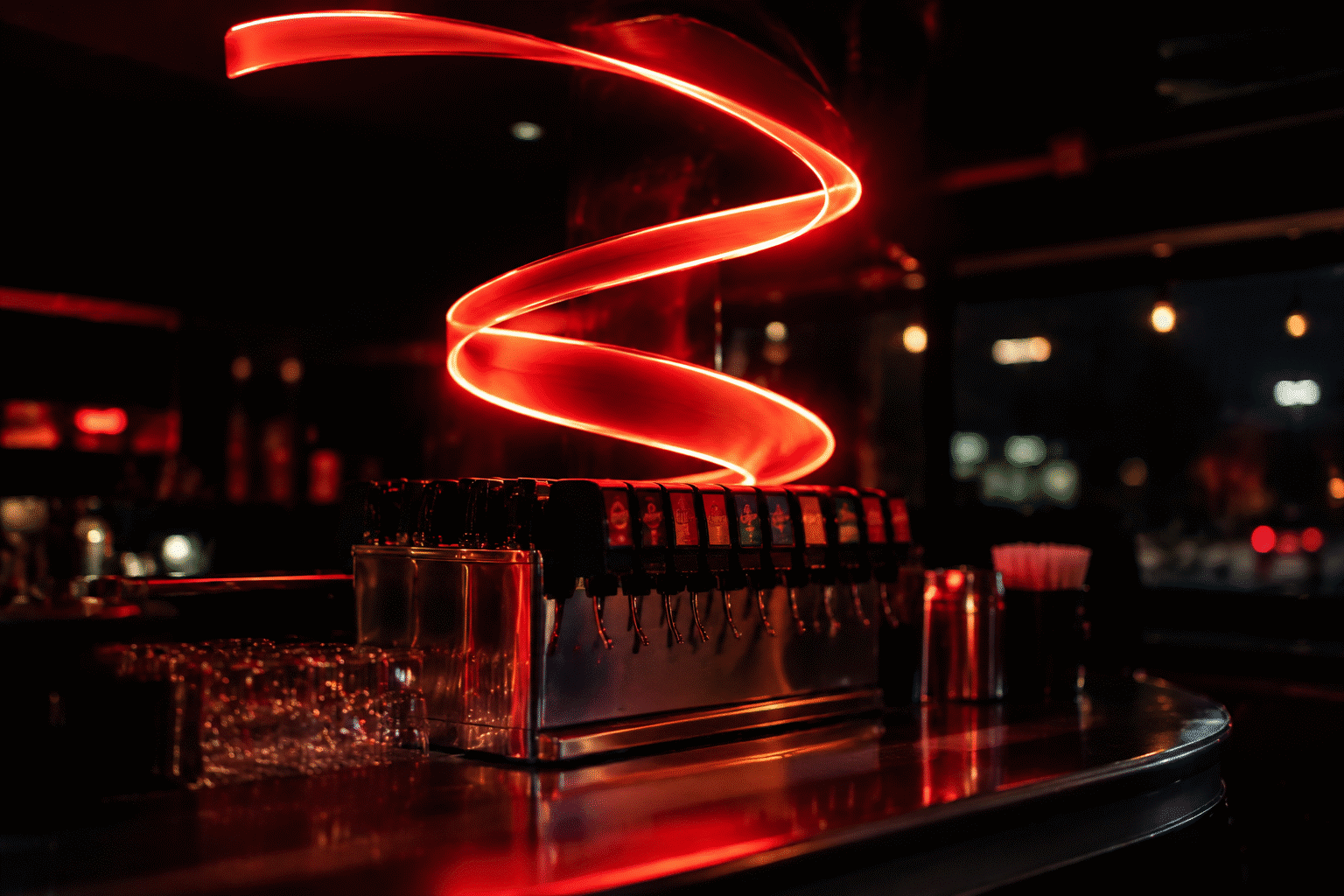
- The soda-fountain station. The kitchen version: the fountain-tier pieces (“Cold Sodas,” “Fresh Floats”) over the ice-cream-and-syrup station — the family diner’s dessert corner in light.
- The diner-and-gameroom tier. The arcade pairing — the red glow beside the jukebox-and-pinball register. The complete Americana game room runs all three; the man cave guide has the multi-station layout.
- The collector’s version. The original pieces (per the vintage section above) with the modern diner decor built around them — the authentic object as the room’s anchor. The serious route: buy one genuine antique, build the room to it, and let the custom-register customs fill the walls around it.
The Americana Wall: Coke’s Neighbors on the Wall
The full mid-century commercial register — the pieces the red glow keeps company with:
- The diner-food tier. The burgers-and-fries script pieces, the “EAT” register — the genre’s signage language (most of it now custom work in the diner style, since the originals are museum-tier).
- The Route 66 tier. The highway-Americana register — the motel-and-gas-station signage language, the neon-roadside tradition the whole genre descends from. The wall that runs a diner piece and a highway piece covers the commercial century.
- The soda-rival tier. The Pepsi-blue counterpoint — the cola wars rendered in wall form. The two-register wall is the argument; the one-register wall is the loyalty. Both stock in the diner aesthetic.
- The Christmas crossover. The Santa register — the brand’s own holiday imagery (the Sundblom Santa era that largely created the modern Santa visual) — the December tier of the Americana wall. The red glow transitions to the season without changing color: the Coke red IS the Christmas red, by history.
The Santa Connection: The Brand’s Holiday Legacy
The December crossover, explained — the Americana wall’s seasonal tier:
- The Sundblom Santa. The illustrator Haddon Sundblom’s Santa portraits (the campaigns from 1931 onward) — the red-suited, warm, grandfatherly Santa that largely standardized the modern image. The brand’s role in fixing Santa’s look is the commercial-art history the red glow carries every December.
- The Coke-red as Christmas-red. The color convergence (the brand’s red and the holiday’s red, fused through decades of seasonal campaigns) — the reason the register transitions to Christmas without changing color. The Americana wall’s December tier: the same red glow, the seasonal context — per the Christmas guide’s color system.
- The Santa-and-soda pieces. The vintage holiday advertising tier (the Santa-with-bottle glass, the mid-century seasonal campaigns) — the collector’s December grail tier. The licensed-reproduction route (per the trademark section) carries the imagery through the brand’s own channels.
- The modern holiday campaigns. The brand’s century-running seasonal advertising (the trucks-and-lights era) — the Christmas-adjacent Americana the household either runs or politely declines. The diner register’s December face: same wall, seasonal context, no changes needed — the red was always ready.
FAQ: Coca-Cola Neon Signs
What is a Coca-Cola neon sign? A glow piece rendering the brand’s century-old identity — the Spencerian script, the contour bottle, the red field. The most mass-produced neon subject in commercial history.
How old is Coca-Cola? 1886 — invented by pharmacist John Pemberton in Atlanta. The script followed within the first year, the contour bottle in 1915, and the neon golden age made “Drink Coca-Cola” the most-lit phrase in American commerce.
Are vintage Coca-Cola neon signs valuable? Seriously, yes — the most collected brand in American antiques. Golden-age diner pieces run four-five figures lit; seventies-eighties pieces trade accessibly. Authentication and lit photographs are non-negotiable.
Can I buy a new Coca-Cola logo neon sign? Only through the brand’s licensed channels — Coca-Cola enforces its marks as aggressively as any company alive. Custom builders decline the script and bottle; your own diner-register text (“Cold Sodas,” the fountain name) builds legally in the custom builder.
What colors for the diner register? Coke red and white — with chrome and checkerboard carrying the rest. The shade logic lives on the red page.
Where does the aesthetic fit? Retro kitchens, diner rooms, vintage bar walls — the Americana tier. The kitchen and bar guides carry the architecture.
Glow the Diner
The century’s most famous name in light, translated for your wall: your own diner-register piece — “Cold Sodas,” the family fountain, the est.-year script — glowing red in the custom neon maker tonight. Always the real thing, legally yours.
Sources & Further Reading
- Neon sign (Wikipedia) — the consolidated public record of neon-sign history and technology.