Blog
Cyberpunk Room Decor: Neon Rain for Your Setup
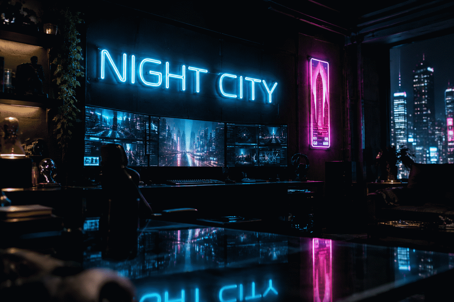
Cyberpunk is the one aesthetic that neon does not decorate — it defines. The genre’s entire visual language was built from neon’s vocabulary: rain-slick streets, layered signage, glow bleeding across every surface. A cyberpunk room isn’t a room with a neon sign in it; it’s a room designed as if neon had gotten there first.
The style has a precise recipe, and this guide gives it in order: the three-color discipline, the signage stack (including the kanji tier the genre can’t live without), the surfaces that make glow behave, and the difference between cyberpunk, its frequently-confused cousin synthwave, and a standard gaming setup. Same tube, three different centuries.
The Design Language: Three Colors, No Mercy
Cyberpunk’s palette is stricter than any other room aesthetic — three hues, fixed roles:
- Cyan — the tech register. The color of screens, holograms, and daylight in the genre’s night cities. Cyan glows read as machine light: the hue for text pieces, grid pieces, and anything that should feel like it’s running software.
- Magenta or hot pink — the human register. The genre’s other half: bars, noodles, pleasure-deck signage, the warm chaos against the cold tech. Magenta is the color of life in a machine city — spend it on the pieces that should feel human, loud, or slightly dangerous.
- Amber or warm yellow — the street register. The old-city layer: ramen-shop glow, aged signage, the pre-corporate stratum. Amber is the counterweight that keeps the room from reading as a hospital corridor in two colors.
The discipline: every piece picks one register and stays in it. A wall of mixed cyan and magenta with one amber accent reads as a city block; a wall of six different hues reads as a toy store. The genre’s menace comes from restraint.
The Signage Stack: What Goes on the Wall
The kanji or katakana piece. The genre’s signature. A single Japanese word — “dream,” “future,” “electric” — in vertical neon is the fastest cyberpunk statement a wall can make. Vertical mounting matters: the genre’s signage stacks, and a vertical kanji next to horizontal English signage is the layered-city effect in two objects.
The corporate-fake tier. Invented brand marks — a fictional noodle bar, a fake electronics shop, your own name styled as a megacorp. This is where custom neon earns its keep: the genre’s world-building lives in signage for places that don’t exist. A two-tier build (brand mark in cyan, tagline in magenta below) is the most-ordered cyberpunk custom.
The grid and glitch pieces. A cyan grid (the digital-space register), a glitch-styled word, a scanline band — the abstract tier that says “this wall has a machine under it.”
The city strip. A skyline silhouette or rain-streak band in mixed glow — the landscape tier, for the wall that wants depth rather than signage.
The honest copy tier. Genre-literate phrases: “high tech, low life,” “no futures,” “sleep is optional.” Lowercase, one color, small — the Easter-egg register that rewards the guest who knows the genre.
The Surfaces: Making Glow Behave Like Rain
Neon in a cyberpunk room needs surfaces to work against — the glow is only half the effect:

- Dark matte base. Charcoal or near-black walls; the glow needs night to land on.
- Reflective counterpoints. One glossy surface — a glass desk, a lacquered shelf, a monitor array — where the glow doubles. The genre’s “rain-slick street” effect is literally this: light plus reflection. Position the primary sign so its reflection lands on the gloss tier.
- The cable discipline. The aesthetic’s secret irony: cyberpunk rooms must hide their real cables with more care than any other style. Visible power bricks break the illusion instantly; the clean wire run is the genre’s load-bearing detail.
- Texture scatter. Concrete-look, brushed metal, or worn-leather textures at the furniture tier — the “lived-in future” that separates cyberpunk from a sterile sci-fi lab.
Cyberpunk vs. Synthwave vs. Gaming: The Three-Way Border
The three aesthetics share a tube and split a hair — worth getting right, because the rooms read completely differently:
- Cyberpunk is urban and forward. Night city, signage stack, cyan-magenta-amber, kanji tier. The room asks: what if the future never slept?
- Synthwave is coastal and backward. The eighties’ memory of the future: sunset gradients, chrome, palm silhouettes, pink-and-orange duotone. The room asks: what did 1984 think 2019 would look like? Our synthwave guide runs the full treatment — the two styles share a wall only if you’re deliberate about it.
- The gaming setup is equipment-first. Desk, monitor, RGB — a room organized around playing. Cyberpunk decor works beautifully in a gaming room (the gaming room guide covers the layout layer), but the gaming room’s neon serves the setup, while the cyberpunk room’s setup serves the neon.
The color test for which room you’re actually building: pink-and-orange sunset on the wall says synthwave; cyan signage over magenta says cyberpunk; RGB everything says gaming. All three are correct — just don’t let them blur.
The Setup Deployments
The full battlestation. The monitor-tier integration: a cyan word above the array, magenta kanji on the flank wall, amber accent at desk level. The purple gaming setup page covers the RGB-neon coordination; the blue gaming setup page is the monochrome-cyan route.
The bedroom variant. Scaled down: one vertical kanji or one glitch word, dimmer set to the 15% tier for sleep compatibility. The genre survives at low brightness better than any other aesthetic — it was designed for dark.
The corner build. One chair, one shelf, one sign: the cyberpunk reading corner. The single most achievable version — a 16-inch kanji and a reflective side table is a complete genre deployment.
Building the Pieces
Nearly everything in the cyberpunk catalog is custom work — the genre’s signage is fictional by definition. The custom builder handles vertical kanji, brand marks, glitch words, and grids at any width; two-color builds price on the color count, and the cyan-magenta pairing is the genre’s signature order. For the shade-side decisions, the purple sign guide covers the magenta family’s behavior on dark walls.
The Budget Tiers: Three Ways In
The style scales honestly across three entry points:
- The single-statement build (under $150). One custom kanji or one cyan word at 16-20 inches, one glossy surface to catch it. The complete genre deployment — the corner build — is a one-piece project.
- The signage stack ($150-400). Two or three pieces in the three-register discipline: the anchor kanji, the glitch or grid secondary, the amber street accent. This is the tier where the room starts reading as a place rather than a theme.
- The full street ($400+). The multi-wall build: the signage stack plus the city strip, reflection tier, and the cable infrastructure to keep it clean. The commitment tier — at this scale the room is a set, and the genre rewards it.
The upgrade path matters: the style is designed to accrete. Start with the anchor piece; the stack grows one register at a time, and each addition has a fixed color role to fill.
FAQ: Cyberpunk Room Decor
What colors make a room cyberpunk? The strict three: cyan (tech), magenta or hot pink (human), amber (street) — one register per piece. The discipline is the style; six random hues reads as a toy store, not a night city.
What’s the difference between cyberpunk and synthwave decor? Direction and palette: cyberpunk is the future-forward night city (cyan-magenta, kanji, signage stacks); synthwave is the eighties’ memory of the future (pink-orange sunset, chrome, palms). The full synthwave treatment is in our synthwave guide.
Do I need Japanese text for a cyberpunk room? No, but the kanji tier is the genre’s fastest signal — one vertical word does more genre work than any three English pieces. If kanji isn’t your lane, the corporate-fake brand mark tier carries the same weight.
How do I make neon look like the cyberpunk aesthetic and not just a gaming setup? Surfaces and restraint: dark matte walls, one glossy element for the light to double on, hidden cables, and the three-color rule. The gaming room guide covers the setup-first layouts — cyberpunk flips the priority.
Can a cyberpunk room be sleep-friendly? Yes — the genre was designed for dark. Run the signage at the 15–20% dimmer tier and the room reads as a night city viewed from a distance rather than standing in the street.
How many neon pieces should a cyberpunk room have? Three is the genre’s sweet spot — one anchor (kanji or brand mark), one secondary (grid or glitch), one accent (amber street tier). More than four pieces needs the signage-stack discipline of an actual storefront.
Welcome to Night City
The recipe is short: dark base, three colors with fixed roles, signage for places that don’t exist, and one reflective surface to catch the rain. Build the first piece tonight — a vertical kanji, a fake brand, a glitch word — in the custom builder.
More by register: synthwave rooms, retro gaming walls, gaming room layouts.
Sources & Further Reading
- Neon sign (Wikipedia) — the consolidated public record of neon-sign history and technology.
Pricing based on CustomNeon’s current catalog (2026); custom quotes come live from the sign builder.