18 Office Neon Sign Ideas From Cube to Corner Office

Workplace neon walks a line home neon never has to: it has to motivate without pandering, brand without vanity, and be funny without being the reason HR visits. The offices that get it right treat the sign as culture infrastructure — the piece that says what the team says about itself, hanging in light where nobody can un-see it.
Here are 18 ideas by the office’s zones — the company wall, the team areas, the focus corners, and the fun tier — with the corporate-context placement notes that keep it professional. The working-from-home canon lives at home office neon signs, and the customer-facing storefront tier lives at the open signs hub.
The Company Wall: Ideas 1–5
- The logo piece — the company mark in brand colors over the reception or the all-hands wall: the anchor build that every growing company eventually commissions (customizer, logo upload included).
- The mission word — the one word the company actually runs on (“Ship.” “Care.” “Move.”): more durable than the full mission statement, and legible from the snack area.
- “Est.” + founding year — the heritage register; strongest in startups old enough to have a founding year worth glowing.
- The values wall — three to five single-word pieces (integrity, craft, speed) run smaller in a row: the tier that works when the words are short and the culture is real.
- The tagline — the marketing line the team actually quotes; internal branding that doubles as the office’s best photo background.
The Team Areas: Ideas 6–10
- The team-name piece — “THE WOLFPACK” or “TEAM CHAOS”: the squad marker that makes the pod feel like a franchise.
- “Good Vibes Only” (the piece) — the neutral-culture register; the piece that sets a floor without imposing a ceiling.
- The metric board accent — “10K Customers” or the quarter’s number in neon: the trophy tier that gets updated (and celebrated) each milestone.
- “Innovation Lab” / “Think Tank” — the project-room markers; the names that make the meeting room book faster.
- “Do Not Disturb — Deep Work” — the focus-room signal (the status logic): the piece that protects the calendar’s only sacred block.
The Focus & Craft Corners: Ideas 11–14
- Hustle — the sales-floor register; runs in red for quarters and blue for fiscal years.
- “Stay Curious” — the R&D corner’s motto; the learning-culture register in warm white.
- The craft piece — a shape of the actual work (a bracket for engineers, a waveform for audio, a whisk for the test kitchen): the trade-honor tier.
- The motivational canon, curated — one strong piece beats five posters (the archive for the full list); the office that picks one has better culture than the office that hangs all.

The Fun Tier: Ideas 15–18
- “It’s 5 O’Clock Somewhere” — the universal closer; hangs where the founders can see it, which is the joke.
- “Coffee First” — the kitchen’s constitution; the most-agreed-upon sign in any workplace.
- “TGIF” — the Friday register; runs on a smart plug that only knows one day.
- The celebration piece — “Congrats [Name]!” as a reusable custom: the promotion-and-award marker that makes the moment and then waits for the next. The office’s best-traveled sign.
Placement and Professional Judgment
The corporate context changes the placement physics: traffic zones get the brand tier, work zones get the quiet tier, and the fun tier stays out of the client path. Reception and all-hands walls carry the logo and mission pieces (48+ inches, brand colors, mounted where the room photographs — every company photo op uses them). The open floor stays restraint-only: warm-white pieces at low brightness, nothing that blinks, nothing that competes with the monitors (the color logic maps the professional registers).
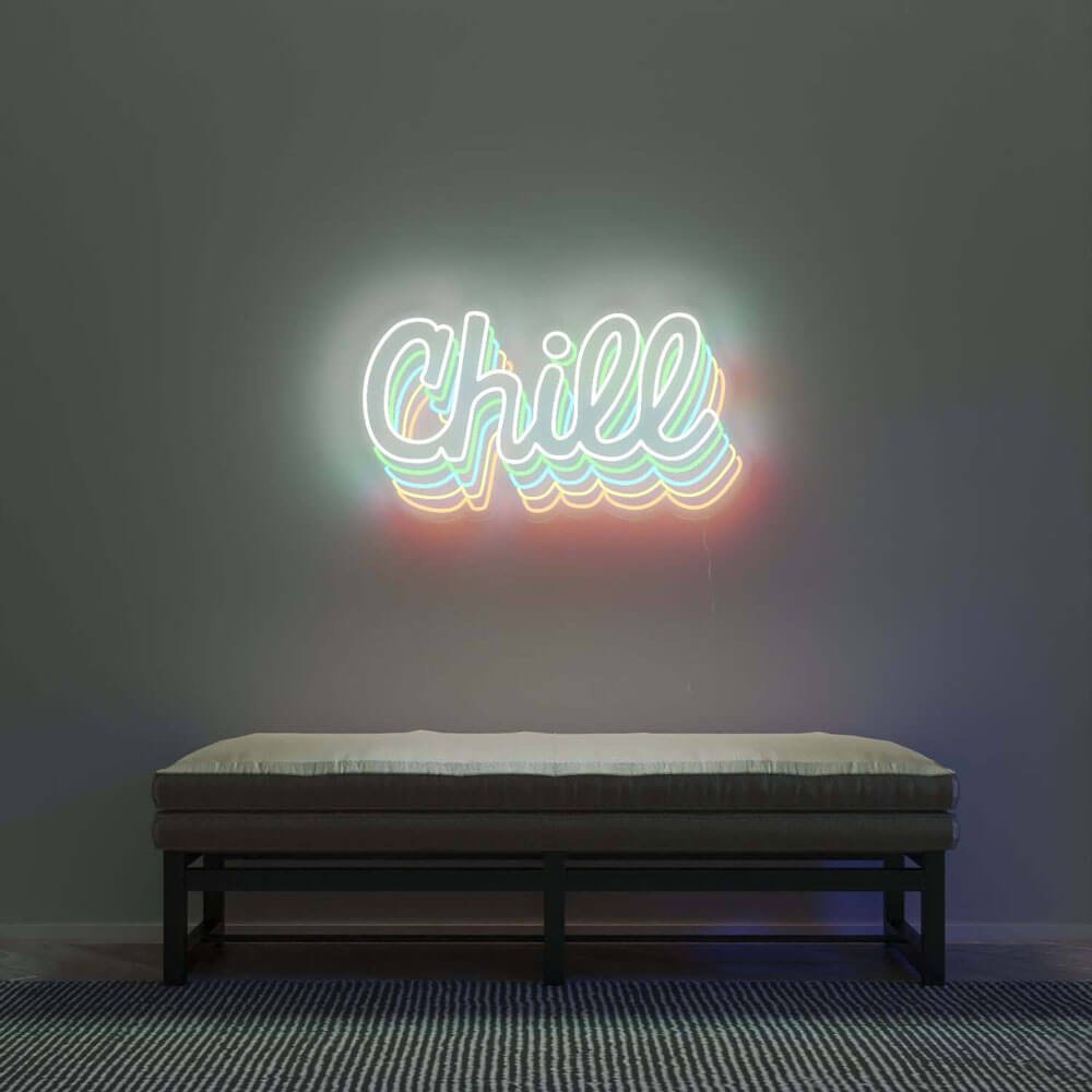
The meeting rooms and focus pods get the status and motto tiers at seated eye level; the kitchen and the social corners get the fun. And the facilities realities — commercial walls, fire codes, landlord approvals — run through the hanging guide and a facilities email before anything mounts.
The Corporate Purchase: Getting It Approved
The workplace neon’s first hurdle is organizational: the piece that needs facilities’ blessing and the boss’s sign-off. The working playbook: frame it as brand (the logo piece and mission word are identity infrastructure, not decoration – the language the approval process understands), start with the reception (the client-facing wall where the spend is justifiable to everyone), and bring the spec sheet (the power draw – a few watts – and the mounting method – the no-penetration options for leased spaces, both from the hanging guide).
The fire-code and facilities realities: commercial spaces run stricter rules than homes – the pieces want the safety-certified adapters, the mountings want the facilities-approved methods, and the exterior anything wants the permit tier (the B-end logic). The ten-minute facilities email (with the spec sheet attached) precedes every corporate mount – the approval that takes a day beats the re-mount that takes the sign down.
The team-buying playbook: the team pieces (the squad name, the metric board) buy through the manager’s budget as culture spend; the celebration pieces (the reusable “Congrats”) run through HR’s recognition line; the fun tier (the kitchen’s “Coffee First”) is the office manager’s discretion – three budgets, one program, and the offices that know which piece buys from which line run the whole catalog without a single approval fight.
The Office Budget by Company Stage
The startup ($150-400): the mission word and the team piece – the culture that fits the loft, priced for the runway. The scale-up ($400-1,000): the reception logo, the values wall, the metric board – the identity infrastructure that grows with the headcount. The established company ($1,000-3,000): the full program – the lobby’s brand tier, the floor’s culture pieces, the event calendar’s celebration system (the small-business playbook runs the economics).
The honest corporate note: restraint reads professional at every stage. The one-logo-and-one-word office outcultures the five-joke-piece office at every company size – the culture that has to be spelled in neon is the culture that isn’t (the office register above sorts the tiers).
FAQ About Office Neon Signs
What’s the best neon sign for an office? The company’s one word or its logo — the pieces that brand the room and outlast reorgs. Team and fun tiers come second; they’re the culture’s seasoning, not its structure (the customizer takes logo files).
Are neon signs appropriate for a corporate office? One well-chosen piece is current-era professional — reception logos and mission words run in offices of every size now. The risk is register drift: three joke pieces and a beer sign is a frat house, one logo and one motto is a company.
What sign works for a team area? The team-name piece or “Good Vibes Only” — identity markers that include everyone. The metric-board accent is the ambitious version; the business color guide keeps the palette professional.
How do we hang signs in a leased office? Freestanding mounts, track systems, and landlord-approved anchors — the hanging guide covers the no-penetration options most commercial leases require.
How do I hang neon signs in a leased office space? The no-penetration toolkit: the track and stand-off systems that mount to the existing furniture and fixtures, the freestanding easels for the lobby pieces, and the command-hook tier for the lightweight supports (the hanging guide’s commercial methods). The lease’s signage clause (the landlord’s approval rights and the restoration obligations) gets read before the mount – the ten-minute document review that prevents the move-out surprise. The glass-partition offices get their own method: the suction-and-frame tier that turns the partition into the mount, and the sign that travels to the next lease intact.
How do I convince my boss to approve office neon signs? The three-line case that works: the brand argument (the logo piece and the mission word are identity infrastructure, not decoration – the language the approval process understands), the cost sheet (the few watts, the decade lifespan, the one-time spend against the recurring marketing lines), and the proof (the reception’s pilot piece – the $300 test that photographs well and answers every question the committee has). The approval playbook (the corporate logic above) runs the sequence: start with the client-facing wall (the spend everyone justifies), bring the spec sheet (the mounting, the safety certifications – the facilities language), and let the pilot do the arguing.
Do office neon pieces belong in client-facing space or the back office? Both, with different registers: client-facing walls carry the brand-calibrated pieces (logo mark in brand colors, the founding date, the mission phrase) at gallery height, while the back office earns the culture tier — the inside-joke script, the team’s project codenames, the ping-pong scoreboard. The mistake is swapping them; clients don’t need the joke, and the team doesn’t need the mission statement staring at them at 6 p.m.
How does leased-office signage handle the move-out clause? Choose mounting that reverses clean: French cleats, adhesive strips rated for the paint type, or freestanding floor easels — and photograph every wall at move-in so the deposit conversation has evidence. The sign program that survives a lease is the one designed to relocate: pieces sized for standard wall segments, no hardwiring, and the brand script mounted on a cleat that comes down in ten minutes with two people.
The Startup Office vs the Corporate Office
The workplace’s two registers, compared:
| Decision axis | The startup | The corporate |
|---|---|---|
| The register | The loft’s culture pieces (the mission word, the squad names) | The lobby’s brand tier (the logo, the values) |
| The budget | $150-400 (the runway’s price) | $1,000-3,000 (the identity infrastructure) |
| The approval path | The founder’s afternoon | The facilities email and the brand review |
| The risk tolerance | High (the culture that experiments) | Low (the identity that can’t wobble) |
| The pieces’ lifespan | The pivot’s mercy (the culture pieces rotate) | The decade’s permanence (the brand pieces stay) |
| The humor tier | Welcome (the kitchen’s “Coffee First”) | Quarantined (the break room only) |
The two registers’ shared discipline: the restraint that reads professional – the one-logo-and-one-word office outcultures the five-piece pile at every company size (the corporate logic above). The startup’s version runs the restraint at the entry tier; the corporate’s at the commission tier – the same hierarchy, different brackets (the cost guide).
The scale-up’s transition (the startup becoming the corporate) runs the program’s graduation: the mission word surviving the rebrand (if it’s true), the logo commission replacing the vinyl, and the culture pieces earning their permanence – the office program that grows up without losing the reason it worked (the trends logic for the era’s register).
Sources & Further Reading
- Solid-State Lighting (U.S. Department of Energy) — DOE reference on LED efficacy and lifetime.
- Mercury (U.S. EPA) — federal guidance on mercury exposure and safe handling.
Pricing based on CustomNeon’s current catalog (2026); custom quotes come live from the sign builder.