Open Sign Guide: Types, Costs, Placement, Rules

The open sign is retail’s oldest electric conversation: the sign says “yes, come in,” the street answers, and the whole exchange has run on the same three letters for a century. It’s also the single highest-ROI sign a storefront buys — the one piece whose job is literally converting passersby into customers, which is why the open-sign decision deserves a real guide rather than a checkout-page guess.
This is that guide: the sign types, the real costs, the placement physics, the rules most buyers miss, and the mistakes that keep good signs from working. The shopping tier lives at open signs; the idea variants at open sign ideas.
What an Open Sign Actually Does
Three jobs, in order: visibility (the street reads “OPEN” from across it at driving speed), status (open-now versus closed — the information the searcher needs at the exact moment they pass), and brand (the sign’s color and quality are the business’s first impression). Most open-sign failures are failures of the first job: the sign that reads only from the sidewalk, or only at dusk, or only when the competing window signage is off.
The economics justify the attention: an open sign runs for pennies (the electricity math — a few dollars a year), lasts years, and works every hour the business is open. No other marketing asset has that cost-to-exposure ratio; the sign is the ad that never bills again (the full case).
The Types
LED neon-style — the modern default: flexible LED tubing on acrylic, in the classic neon look without the glass, the gas, or the power draw. Runs $60–200 for standard open formats (the cost brackets), handles temperature swings, and ships pre-mounted. This is the tier 90% of new buyers should choose.
Traditional glass neon — the heritage option: real bent glass, real gas, real presence — and real fragility, real power draw, and real maintenance. Worth it for the businesses whose brand IS the vintage register (bars, barbershops, diners); overkill for everyone else.
LED board (writeable) — the erasable-message tier: the open sign plus daily specials in one. Works for menus-driven businesses; reads less premium than neon-style.
Animated LED panels — the chasing-border and blinking formats: higher visibility, lower perceived quality — the tier that reads bargain-store unless the business is one.
The Formats and Features
- “OPEN” alone — the minimum viable sign; works at every scale.
- “OPEN” + hours — the format that answers the second question (when?) — the smartest cheap upgrade.
- Open/closed flip — the two-sided or sliding formats; the honest tier for businesses with irregular hours.
- “OPEN 24 HOURS” — the always-on tier (the ideas guide covers the variants).
- Remote-dimmable — the brightness control that matters for the businesses that run the sign through evening hours and residential-adjacent streets.
- Color: blue and red — the traditional pair (the business color logic): blue reads “open” at greatest distance, red reads “urgency and appetite.” Green serves the pharmacy/food registers; white the premium ones.

Sizing and Placement Physics
The sizing runs by street type: pedestrian streets carry 18–24 inch signs at window-center; parking-lot businesses want 24–36 inches facing the lot’s approach; arterial roads need 36+ inches because the sign is being read at 35 mph. The placement physics: window-center at eye level from the street’s dominant approach, never blocked by inventory or blinds, and mounted where the sign’s glow doesn’t wash out against interior backlighting (the sign faces outward, the interior faces in — the two light plans must not compete).
The common placement mistakes: the sign too high (readable from across the street but not from the sidewalk’s approach angle), the sign competing with the window’s other content (three window signs is zero window signs), and the sign left running after close — the open sign that lies destroys the sign’s only asset, which is that it’s believed.
The Rules
Electrical and mounting: indoor window signs plug into standard outlets (the mounting methods); exterior-mount signs want weather-rated enclosures and installer-grade mounting. Local sign codes: many municipalities regulate exterior sign size, brightness, and animation — the permit tier is real for exterior installations, and the ten-minute call to the city saves the re-mount (the permit logic). ADA and egress: the sign never covers egress paths or required visibility lines — the window’s lower half often belongs to code, not marketing.
The Mistakes File
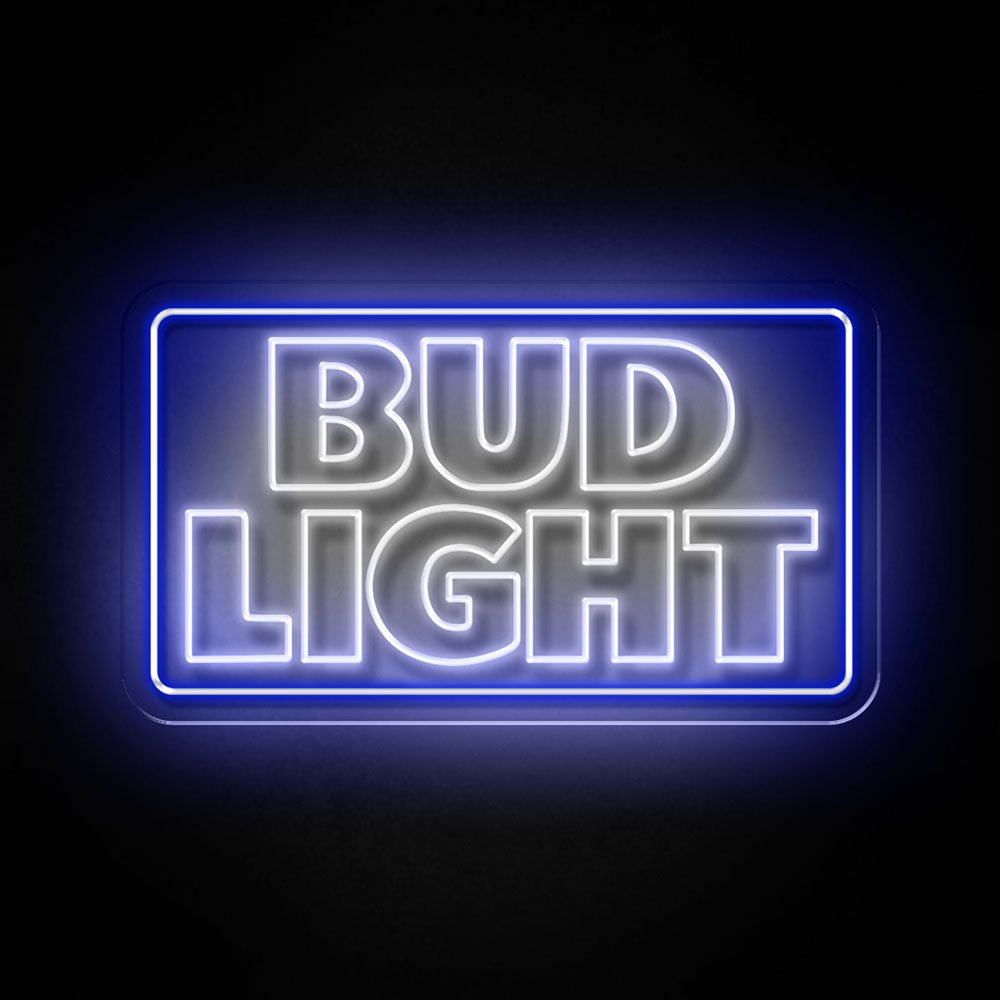
From a century of storefronts, the five that repeat: (1) the lying sign — left on after close, trusted by no one after twice; (2) the buried sign — three window messages deep, invisible; (3) the undersized arterial sign — unreadable at driving speed, the most common sizing failure; (4) the washed-out sign — interior backlighting stronger than the sign’s output, inverting the message; (5) the wrong-color sign — green for a non-food business, pink for a hardware store: the register mismatch that reads as error (the color guide maps the trades).
The Buyer’s Checklist
Before the open sign purchase, the five questions that decide it right. One: what speed reads my storefront? (Pedestrian 2-3 mph, parking 10-15, arterial 35+ – the answer sets the size and letter height, the chart logic.)
Two: what does the code allow? (The municipal call – area caps, brightness rules, animation restrictions – the permit tier; ten minutes before the budget, not after the mount.)
Three: what register does my trade run? (Blue-red the default, green the food-and-pharmacy registers, white the premium – the trade palette.)
Four: what hours does the sign work? (The business’s open hours set the sign’s running schedule – the honest sign that’s believed is the only asset worth having.)
Five: what’s the wall’s power situation? (The outlet’s location, the cord’s route, the timer’s tier – the engineering that makes the sign turnkey.)
The checklist’s output: a spec (size, color, features) that shops against the open-sign tier rather than browsing it – the difference between the sign that converts and the sign that glows.
The Upgrade Path: From First Sign to Full Program
The open sign is the first purchase, and the program builds from it: the open sign first (the conversion tier – $60-200, the walk-in’s beacon), the name-or-logo piece second (the brand tier – $150-400, the photographable identity), the trade phrase third (the voice tier – $100-300, the canon), and the interior program as the budget matures (the playbook). Each tier feeds the next: the open sign’s traffic justifies the brand piece, the brand piece’s photographs justify the interior, and the program compounds (the case).
The upgrade path’s timing discipline: one tier per quarter is the pace that lets each piece’s return fund the next – the program that builds in a year at its own pace outperforms the program that buys everything in a weekend and measures nothing (the measurement logic).
FAQ About Open Signs
What’s the best open sign for a small business? A 24–36 inch LED neon-style “OPEN” with hours, in blue or red (the shopping tier), window-centered on the street’s approach. The business color guide fine-tunes by trade.
How much does a good open sign cost? $60–200 for the LED neon-style standard tier (the brackets); glass neon runs several multiples for the heritage registers. The sign repays itself in captured walk-ins within weeks.
Are LED open signs expensive to run? No — a few dollars a year at business hours (the math). The sign is the cheapest employee: works every open hour, never takes lunch.
Do I need a permit for an open sign? Interior window signs almost never; exterior-mounted signs often (the permit guide). The ten-minute call before the mount is the cheapest insurance in signage.
What is the best open sign for a small shop? A 24-36 inch LED neon-style “OPEN” with hours, in blue or red, window-centered on the street’s approach (the buyer’s checklist above) – the format that converts the walk-by at the small shop’s actual traffic speed. The trade palette fine-tunes (green for food, white for premium – the color logic); the hours-honesty completes it (the sign that never lies is the sign that’s believed). The $60-200 tier covers the whole decision, and the walk-ins it captures repay it within the first month’s business.
What is the brightest color for an open sign? Blue and red – the classic pair’s physics: the blue reads “open” at the greatest distance (the wavelength’s visibility), the red reads “urgency and appetite” at the approach (the color logic) (the guide above). The green serves the food-and-pharmacy registers (the freshness read), the white the premium (the quiet read), and the multi-color tier serves the visibility-foremost placements (the arterial roads where every wavelength helps). The brightness’s honest ranking at the street: the full-saturation blue-red at the 24-36 inch size outreads every creative variant – the century-converged format that the ideas tier decorates but never replaces.
What makes an open sign visible from a parking lot? Letter height against distance is the whole game: a sign read at 80 feet wants 8-10 inch letters, and the contrast choice (blue or red tubing against a window’s daylight) beats brightness tweaks every time. The second factor is the window itself — tinted glass and anti-glare coatings eat output, and those storefronts size up one tier; the test is squinting from the farthest parking spot before the sign gets ordered.
Are animated open signs worth the premium? Animation earns its cost in two cases — high-speed corridors where motion catches the eye of passing drivers, and evening-dominant trades (late-night food, bars) where the chase-and-flash register matches the venue’s energy. For daytime professional storefronts, animation reads downmarket and the static piece is the better spend; the animated tier is a tool matched to street context, not an upgrade for its own sake.
Sources & Further Reading
- Neon: Strong Lines (NIST Physical Reference Data) — the standard reference for neon’s emission wavelengths.
- Solid-State Lighting (U.S. Department of Energy) — DOE reference on LED efficacy and lifetime.
- Neon sign (Wikipedia) — the consolidated public record of neon-sign history and technology.
Pricing based on CustomNeon’s current catalog (2026); custom quotes come live from the sign builder.