How to Photograph a Neon Sign: Phone to Pro
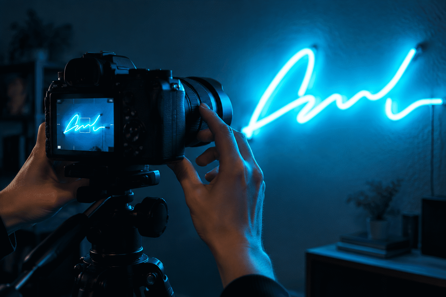
Neon photographs badly for exactly one reason: your camera meters for the room, and the sign — hundreds of times brighter than everything around it — blows out into a glowing smear. Fix the exposure first (tap the sign, drag the brightness down, shoot), and every other neon photography skill is refinement. This guide covers both tracks: the phone routine that gets 90% of the way in three taps, and the camera settings (aperture, ISO, the long-exposure world) for when neon is the whole point of the shot.
Why Neon Breaks Cameras (The Sixty-Second Physics)
A lit LED neon sign is the brightest object in almost any room — often by a factor of hundreds. Camera exposure systems average the frame and protect the majority: the room reads correctly and the sign’s letters clip to pure white with all color detail gone. Conversely, exposing for the sign renders the room pitch black. The entire craft is managing that gap: expose for the glow, then decide how much room to bring back with light or shadow.
The second physics fact that matters: dimming is exposure control you own. A sign at 60–70% brightness sits closer to the room’s brightness range and photographs with more color saturation and edge definition than the same sign at 100% — one of the quiet reasons pro shoots dim everything (the full dimming guide covers the control layer).
The Phone Routine (Three Taps, 90% There)
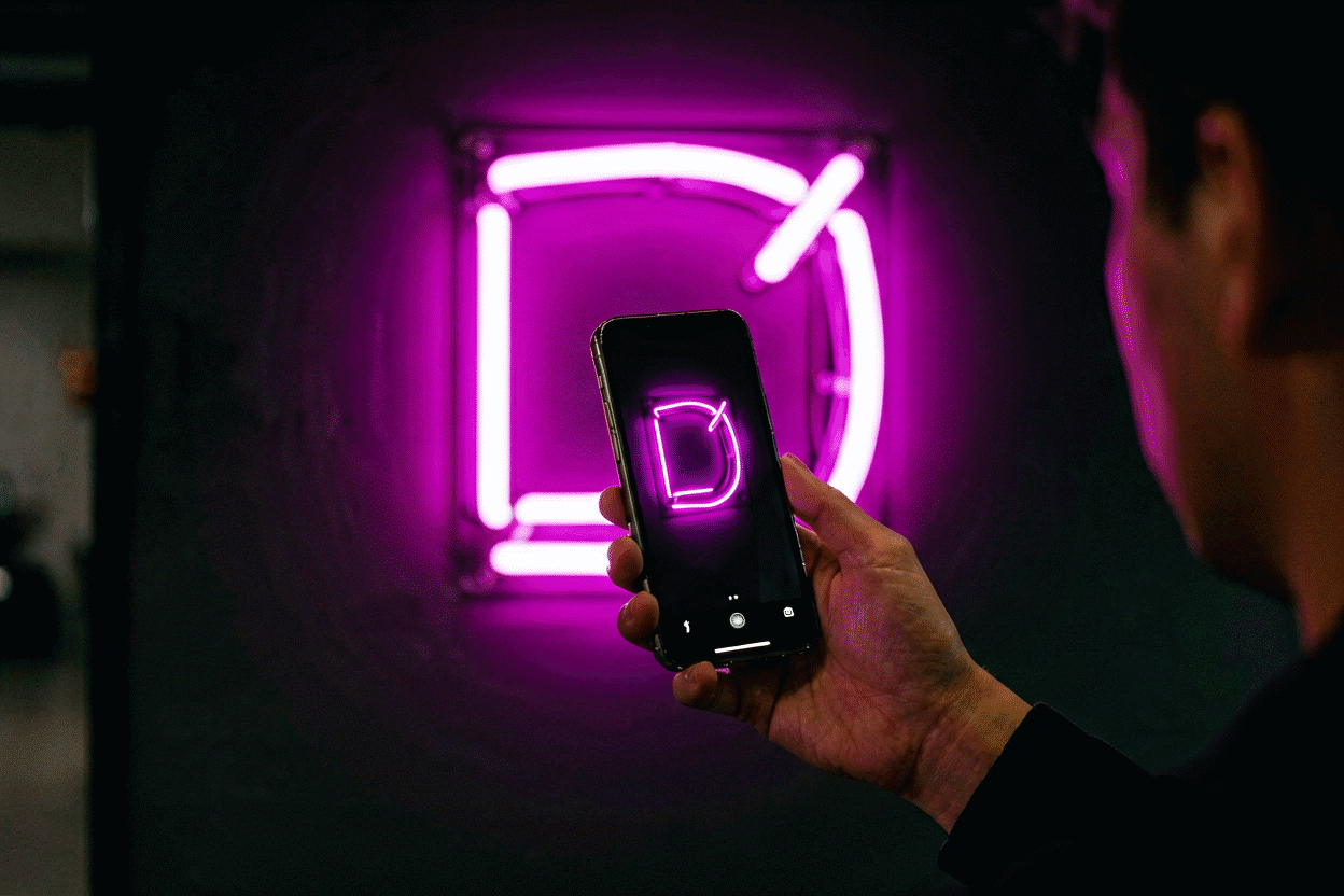
- Tap the sign in the viewfinder — exposure now meters the glow, not the room.
- Drag the sun icon down until the letters show their actual color with defined edges (the histogram in your head: letters colorful, background dark-but-present).
- Lock exposure and focus (long-press on iPhone, or AE/AF lock on Android) — recompose without the camera re-averaging.
Then the four phone-level refinements:
- Turn off night mode for signs — its multi-frame brightening lifts the room and re-blows the sign; manual exposure beats it for glowing subjects.
- Shoot at 0.3×–1×, not 2×+ digital zoom — walk closer instead; digital zoom mushes exactly the fine letter edges you’re exposing for.
- Clean the lens — the pocket film that softens every phone photo is fatal on point-bright subjects.
- Burst for handheld night frames — take five, keep the sharpest.
The Settings, If You Want Them (Phone Pro Mode / Camera)
| Control | Where it lands | Why |
|---|---|---|
| ISO | 100–400 | Kills the noise neon’s high contrast amplifies |
| Shutter | 1/60–1/250 handheld | Freezes glow flicker and hand shake |
| Exposure comp | −0.7 to −2 EV | The drag-down, made precise |
| Aperture (camera) | f/2–f/4 | Glow-sharp letters, softly dark rooms |
| White balance | Set, not auto | Auto chases the glow’s color and lies — fix it to match the room’s actual light |
| RAW | On, when offered | The glow’s highlight recovery lives in the file |
The long-exposure world (tripod, 1–10 second frames) is for special effects — light trails, motion blur of passersby, halos written large — not for sign documentation; a crisp 1/125 beats a romantic 4-second smear when the sign itself is the subject.
Scene One: The Sign in Its Room (The Listing/Show-off Shot)
The default photo: sign on the wall, room visible enough to place it.
- Expose for the sign, then let one lamp in the frame carry the room — a single warm practical bulb bridges the brightness gap and gives the camera a mid-tone to anchor on.
- Dim the sign to 60–70% for this shot specifically; the room survives and the color deepens.
- Shoot straight-on for signage, 15–30 degrees off-axis for decor context (the angle shows backing depth and wall interaction).
Scene Two: The Portrait With Neon (The Instagram Classic)
Person in front of the sign, glowing — the aesthetic era’s signature frame.
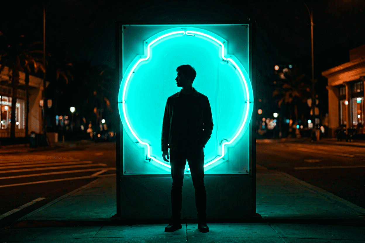
- Exposure compromises toward the face: tap the person, drag down until the sign’s color holds behind them. The sign tolerates slight overexposure when it’s the backdrop; faces don’t tolerate underexposure.
- Front-light or side-light the subject softly (window, lamp, or a modest LED panel): the sign alone backlights people into silhouettes — beautiful occasionally, unusable as the default.
- Warm signs (pink, red, amber) flatter skin; cool signs (blue, green) want more fill light on the face — the aesthetic layer of this physics lives in our color psychology guide.
- The classic poses: shoulder-turn toward the sign, or the over-shoulder composition where the sign frames the head. Both keep the glow as rim light rather than backlight.
Scene Three: The Detail Shot (Letter, Joint, Texture)
Close on the craft — the tube’s bend, the letter joint, the glow’s edge on the backing.
- Macro or close focus, exposure dragged well down, ISO low.
- The detail shot is where backing type shows (cut-to-shape vs. panel) — shoot slightly off-axis so the acrylic’s edge catches light and defines the structure.
Scene Four: The Content-Creation Wall (Stream and Video Setup)
- Fixed manual exposure — auto exposure on a glowing wall hunts and pumps during streams; lock it (camera) or lock AE/AF (phone) once and never let it drift.
- Sign at 60–70% on camera — full brightness blooms on sensors and eats letter edges; the streaming setups guide shows the finished look.
- Hide the cords before the wide shots — the one thing every viewer’s eye finds (cord discipline).
Scene Five: Night and Street (Outdoor and Window Neon)
- Blue/golden hour beats full dark: sky still holds color while the sign reaches full presence — the exposure gap narrows to photographable.
- Rain and puddles are gifts — reflections double the neon and give the frame its foreground.
- Steady the phone against anything (pole, frame, friend’s shoulder) at night; the 1/15-second shutter you’ll be dragging needs it.
The Failure Modes (Why It Looked Bad)
- Letters white and detail-free — exposure too high: tap the sign, drag down. The #1 failure by distance.
- Room pitch black — overcorrected: raise toward the room until the letters just hold their color, or add a practical lamp.
- Colors wrong (pink reads orange, blue reads purple) — auto white balance chasing the glow: set WB manually, or fix in edit with the sign’s known hex as reference (color codes).
- Fuzzy letters — digital zoom, dirty lens, or shutter too slow. Walk closer, wipe, and check.
- Banding/rolling stripes on video — shutter speed fighting LED PWM dimming: nudge shutter (e.g., 1/60 to 1/50) or raise the sign’s brightness one step; the stripes are a beat-frequency artifact, harmless and fixable.
- The sign looks dimmer in photos than life — shoot at full brightness for documentation shots (dim only for aesthetic scenes) — and remember screens reproduce glow less generously than eyes.
And When You’re Shooting to Share
The aesthetic compositions that travel: the pink aesthetic vocabulary (warm glow, soft contrast, faces flattered), symmetry shots of centered wordmarks, and the flatlay-adjacent wide angle where the sign anchors a styled room. Every one of them starts with the three taps — expose for the glow, then compose.
Your own sign, photographed well, is the best reason for the next sign: design it here, dim it to 70%, and tap where the letters glow.
Photo Sessions: Three Shoots, Decoded
The photography method applied to three real sessions:
The listing shoot (the sign-seller’s session). A maker documenting a finished custom piece: the setup ran the full discipline — darkened room, sign dimmed to 65% (the saturation logic), phone locked on the sign’s glow with AE/AF, ISO dragged to base, one practical lamp feathering the room’s context. The frame decisions: three angles (straight-on for the lettering’s accuracy, 25 degrees off-axis for the backing’s dimension, the room-context wide). The keeper set: eleven photos from forty. The session’s sharpest lesson: white balance locked manually — the auto-WB chased the pink glow and turned the room’s gray walls lavender until the lock fixed them to neutral.
The birthday portrait (the person-plus-sign session). A candid brief: the celebrant in front of their gift sign, glowing. The exposure compromise ran toward the face — tapped on skin, dragged down until the sign held color behind them (the portrait method), with a window’s soft fill doing the front-lighting work (the sign alone backlit every frame into silhouette — physics, confirmed). The warm pink’s flattery earned its reputation on camera: skin tones stayed kind through the whole set. The keeper: the over-shoulder composition where the sign’s script framed the smile — the aesthetic era’s signature frame, built in one take.
The nighttime street session (the outdoor genre). The urban shoot: surviving signage on a two-block walk, shot at blue hour (the timing logic) when the sky still carried color against the signs’ full presence — the exposure gap narrowed to photographable. The technique stack: phone braced against a parking meter (the shutter speeds wanted it), rain-slicked pavement composed into the foreground (reflections doubling the neon — the genre’s gift), and the exposure dragged per-sign (each facade’s glow demanded its own setting — the session’s rhythm). The keeper set: nine frames, two of them genuinely good — the hit rate that rewards the genre’s patience.
The three sessions’ shared spine: expose for the glow, then negotiate everything else around it — the listing’s accuracy, the portrait’s face, the street’s atmosphere all ran the same physics in different directions. The method is one sentence; the sessions are its dialects (the full guide).
FAQ: Photographing Neon Signs
How do you take pictures of a neon sign? Tap the sign to meter its glow, drag exposure down until letters show true color with defined edges, lock focus and exposure, and shoot — optionally dimming the sign to 60–70% first, which improves color saturation and edge definition dramatically.
Why do neon signs look bad on camera? The sign is hundreds of times brighter than its room, so auto-exposure (averaging the frame) blows the letters into white smears. Manual exposure set for the sign fixes it in seconds; dimming narrows the brightness gap further.
What are the best camera settings for neon photography? ISO 100–400, shutter 1/60–1/250 handheld, exposure compensation −0.7 to −2 EV, aperture f/2–f/4 for glow-sharp letters, white balance set manually — and RAW when the camera offers it, for highlight recovery in the glow.
How do I photograph a person in front of a neon sign? Expose for the face with the sign slightly over, add soft front or side fill (the sign alone backlights people into silhouettes), and prefer warm-colored signs for skin flattery — the classic over-shoulder pose uses the glow as rim light.
Should I dim my neon sign for photos? For aesthetic and room shots, yes — 60–70% brightness photographs with deeper color and cleaner edges. For documentation (listing the sign, recording its condition), shoot at 100% with exposure pulled down.
Why does my neon video have stripes across it? The camera’s shutter is beating against the LED dimmer’s pulse frequency. Change shutter speed slightly or raise the sign’s brightness one step — the banding is an artifact, not a fault.
Sources & Further Reading
- Neon sign (Wikipedia) — the consolidated public record of neon-sign history and technology.
- Neon, element 10 (Wikipedia) — element properties: density, boiling point, abundance.