Neon Color Combinations: Pairs That Work
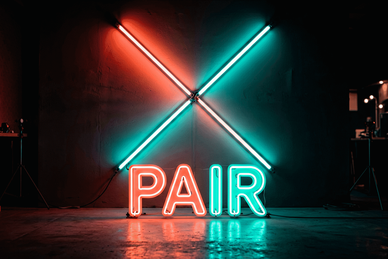
Neon color combinations follow three laws: contrast pairs (opposite-register hues that sharpen each other), gradient pairs (neighboring hues that blend moods), and anchor pairs (any glow plus white or black, which discipline everything). Work within the laws and most pairs succeed; break them and even great colors fight. This guide covers the fifteen combinations that carry real rooms and businesses, why each works, and the practical craft of running two colors on one sign.
The multi-color palette methodology (three-plus hue systems) lives at neon color palette; the meaning system each hue brings at neon color meaning. This page is the pairing science.
The Three Laws (Sixty Seconds)
- Contrast pairs: hues from opposite registers (warm/cool, light/deep) create maximum pop — pink+blue, red+cyan, yellow+purple. Energy and attention; use where the sign must excite.
- Gradient pairs: neighboring hues on the wheel (pink+purple, blue+green) create blend and mood — the sunset and nightfall effects. Atmosphere over attention; use where the room should feel rather than shout.
- Anchor pairs: any single glow + white (for clarity) or black/dark (for drama) — the discipline combinations that make everything else readable (the black rules).
The Fifteen Pairs That Work
The classics (most-ordered, most reliable):
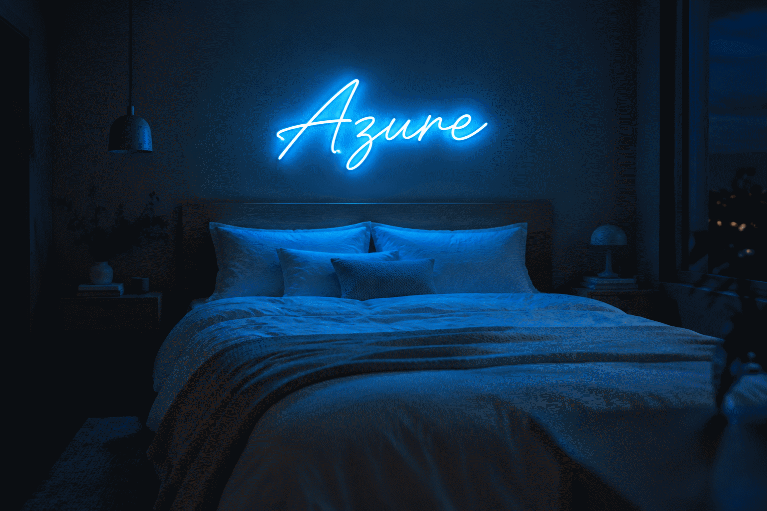
- Pink + blue — the synthwave sunset: nostalgia plus romance; content walls and aesthetic bedrooms (the blue guide)
- Red + warm white — the diner standard: appetite energy with clean contrast; kitchens and retro schemes
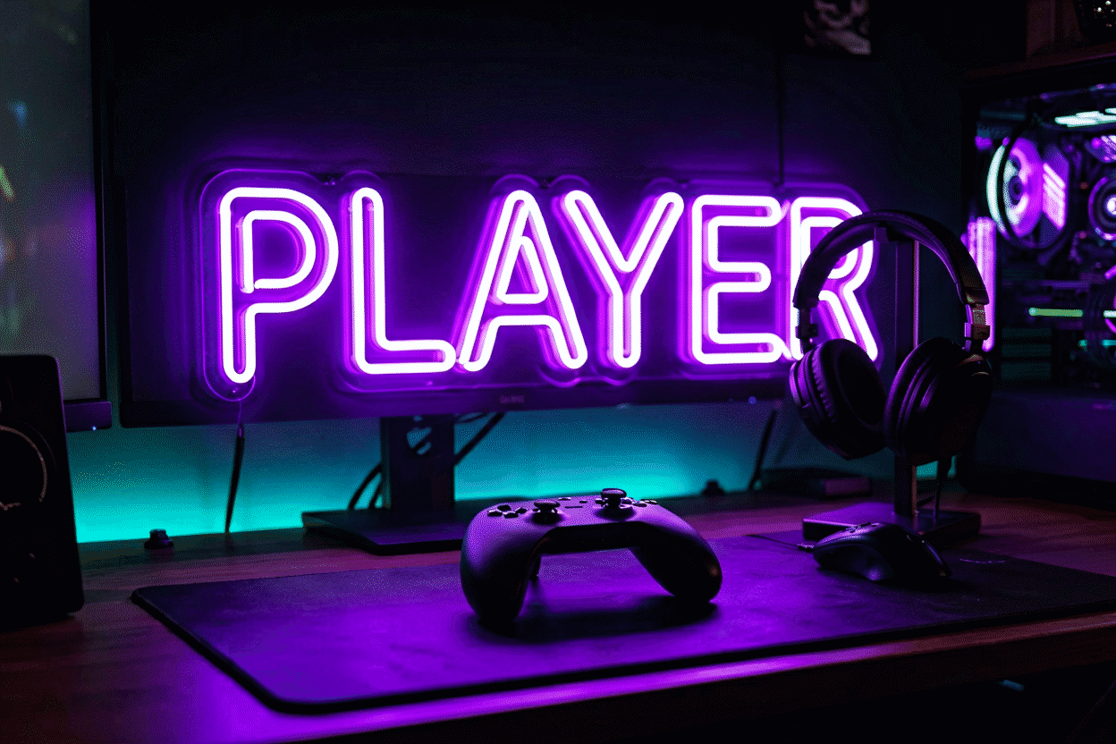
- Purple + blue — the nightfall gradient: mystic calm; gaming caves and moody bedrooms
- Green + pink — the garden chord: alive plus sweet; plant corners and playful salons
- Orange + yellow — the sunrise pairing: maximum warmth and cheer; kids’ rooms and breakfast spaces
The sophisticated set:
- Warm white + anything — the premium anchor: white carries clarity, the partner carries mood — boutiques and weddings (white guide)
- Emerald + gold/amber — the jewel look: saturated richness; luxe lounges and editorial rooms
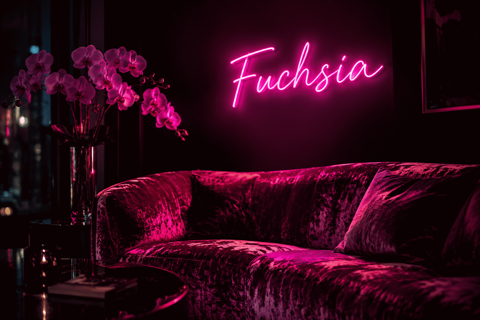
- Navy + magenta — the midnight statement: berry against deep blue; bars and boudoirs
- Burgundy + cream — the vintage-romantic: wine depth with softness; wedding-adjacent and vintage schemes
- Charcoal/black + any single glow — the noir frame: drama with discipline; everywhere evening lives (black guide)
The bold experiments (they work — with care):
- Red + cyan/electric blue — the poster pairing: maximum-contrast pop; sports and event signage
- Yellow + purple — the complementary shock: high-energy creative spaces and stage looks
- Lime + ice blue — the tech-fresh pairing: energetic clean; fitness and startup aesthetics
- Mint + dusty rose — the pastel pairing: soft-serve charm; dessert shops and nurseries
- Deep-tone monochrome (e.g., burgundy + crimson) — the layered single-hue: sophistication with depth; the connoisseur’s move
How Two Colors Live on One Sign
The practical formats for bi-color designs:

- Word + icon split: the phrase in one hue, the icon in the other — the most common and most readable format (e.g., white script + pink heart)
- Line + accent: main lettering monochrome with a single colored underline, border, or punctuation
- Dual-tone words: first line one hue, second line the other — works for names + dates and stacked phrases (wedding formats)
- Color-change RGB: one physical sign, both (or many) colors on demand — the flexible version (the RGB layer)
The craft rule: one hue dominates, one accents. Fifty-fifty splits read as indecision; 80/20 reads as designed.
Pairing to Room and Message
Match the pair to the job (the meaning system):
- Excite (events, gyms, launches): contrast pairs — red+cyan, yellow+purple, lime+blue
- Soothe (bedrooms, spas): gradient and anchor pairs — purple+blue, warm-white anchors, mint+dusty-rose
- Sell appetite (food, bars): warm classics — red+warm-white, orange+yellow, burgundy+cream
- Signal premium (boutiques, salons, weddings): jewel and anchor sets — emerald+gold, white anchors, navy+magenta
- Read as tech (gaming, startups): cool pairs — purple+blue, lime+ice, blue+white
The Failure Modes (What Breaks Pairs)
- Two energies, no anchor: lime + red + nothing to rest on — vibration without design
- Adjacent same-register hues (red+orange at full saturation): reads as one muddy glow at distance rather than an intentional pair
- Forgetting the wall: the room’s color is always the third member of every pair — pink+blue on a pink wall is a pink sign (the palette method)
- Full-brightness everything: pairs especially want dimming discipline — the evening setting is where good combinations become great (dimming)
Building Your Pair
- Pick the message (excite / soothe / sell / premium / tech)
- Shortlist from the fifteen above
- Test against the wall color and room materials
- Choose the format (word+icon, dual-tone, or RGB flexibility)
- Assign dominance (80/20)
- Preview both hues on your actual words — live, side by side — in the custom builder
Combination Pitfalls: The Failure Gallery
How good pairings go wrong — the six recurring failures, each with its fix:
The vibration failure. Two high-saturation adjacent-energy hues at full brightness (red-plus-orange at 100%, both hot) — the eyes can’t settle; the wall buzzes. The fix: separate by register (one warm, one cool), or drop one hue’s dominance to accent status (the anchor law).
The mud failure. Two hues at distance that blend in the halo zone — purple-plus-red reading as one bruised magenta at the boundary. The fix: physical separation (different signs, not adjacent sections) or an anchor between them (white lettering, black backing).
The rainbow creep. The two-color sign that became three (“just one more accent”) — each addition halving the design’s clarity. The fix: the one-dominant-one-accent discipline enforced at order time (the format rules); add-a-color impulses route to the RGB flexibility instead.
The wall betrayal. The perfect pink-plus-blue pairing mounted on a pink wall — now a pink sign with blue accent, one-third of the design AWOL. The fix: the wall enters every pairing decision as the third color (the palette method); against colored walls, pair through neutrals (the glow plus white or black, letting the wall provide the second hue).
The brightness mismatch. Two hues ordered at their native brightness where one out-glows the other (yellow-plus-purple: the yellow dominates the pair’s identity at any distance). The fix: preview at distance (the verification) and rebalance — the dimming layer can tune the mismatch at install (the control), or the brighter hue takes the accent role instead.
The meaning collision. Perfectly harmonized hues carrying clashing messages — appetite red beside trust blue on a restaurant sign saying both “eat now” and “professional services” (the meaning layer). The fix: pairs inherit both meanings; choose combinations whose messages compose (“appetite plus clean” = red plus warm white) rather than collide.
Every failure above was preventable at the preview stage — which is the combinations guide’s recurring moral (render your pair before it exists).
FAQ: Neon Color Combinations
What neon colors go well together? The reliable pairs: pink+blue (synthwave), red+warm-white (diner), purple+blue (nightfall), green+pink (garden), emerald+gold (jewel), and any single glow anchored by white or black — fifteen proven combinations with room matches above.
Can a neon sign have two colors? Yes — word+icon splits (the standard), dual-tone lines for stacked phrases, accent details on monochrome lettering, or RGB color-changing signs that switch both hues on demand (the RGB guide).
What’s the best two-color combination for a bedroom? Purple+blue for moody nights, pink+blue for the aesthetic register, or warm-white + any single glow for designed calm — gradient and anchor pairs over high-contrast ones (the bedroom method).
What neon colors go together for a business? Match the message: red+warm-white for appetite, blue+white for trust, emerald+gold for premium retail, purple+blue for lounges and beauty — the commercial mapping runs the full logic (business guide).
Do complementary neon colors like yellow and purple work? Boldly — maximum-contrast complements create the highest-energy looks. They suit creative spaces, stages, and events; residential rooms usually prefer the gradient and anchor families.
How do I match neon colors to my wall? The wall is the third color in every pair: dark walls carry saturated and deep pairs, white walls want brights plus an anchor, and colored walls either match the glow family or go neutral-black. The full method is the palette guide.
The combinations summary: three laws (contrast, gradient, anchor), fifteen proven pairs, the dominance discipline, and the failure gallery’s six preventable endings — pairing is where neon design happens or doesn’t (render your pair). One hue is a choice; two is a composition; three-plus is a risk the arcade tier earned. Compose deliberately, preview at distance, and let the wall’s color hold the deciding vote. What two-color neon sign is most popular? Pink plus blue — the synthwave sunset pairing leads custom orders by visible margin (the classics list): the era’s default energy combination, camera-proven, and forgiving of both wall types. Red plus warm white (the diner standard) and purple plus blue (the night gradient) complete the podium — three pairs covering most of the duotone market, all following the same dominance discipline.
Fifteen pairs, three laws, one dominance discipline — and the preview that renders your specific pair before it exists; combination design is complete when those four assets are all you carry to the order.
Sources & Further Reading
- Neon sign (Wikipedia) — the consolidated public record of neon-sign history and technology.