Neon on Black Background: Readability and Design Rules

Neon on black is the medium’s maximum-contrast configuration — the physics is simple (dark surfaces absorb the halo spill that light surfaces scatter, so letters gain knife-edge definition) — but designing for it has real rules: hues perform differently against darkness, letterforms need different weights, and the black itself comes in three implementations (backboard, wall, room) with different consequences. This is the engineering guide; the style-and-inspiration side of the same look lives at black neon sign aesthetic.
Rule 1: Know What Black Actually Does (The Physics in Brief)
Every glow produces two lights: the letter’s core and the halo that spills around it. Against white walls, the halo scatters and softens edges — glowing but slightly veiled. Against black, the halo dies at the letter’s boundary: edge acuity maximizes, perceived saturation deepens, and the sign reads crisply from further away. Three practical consequences:
- Signs read at larger distances and brighter rooms (sizing implications)
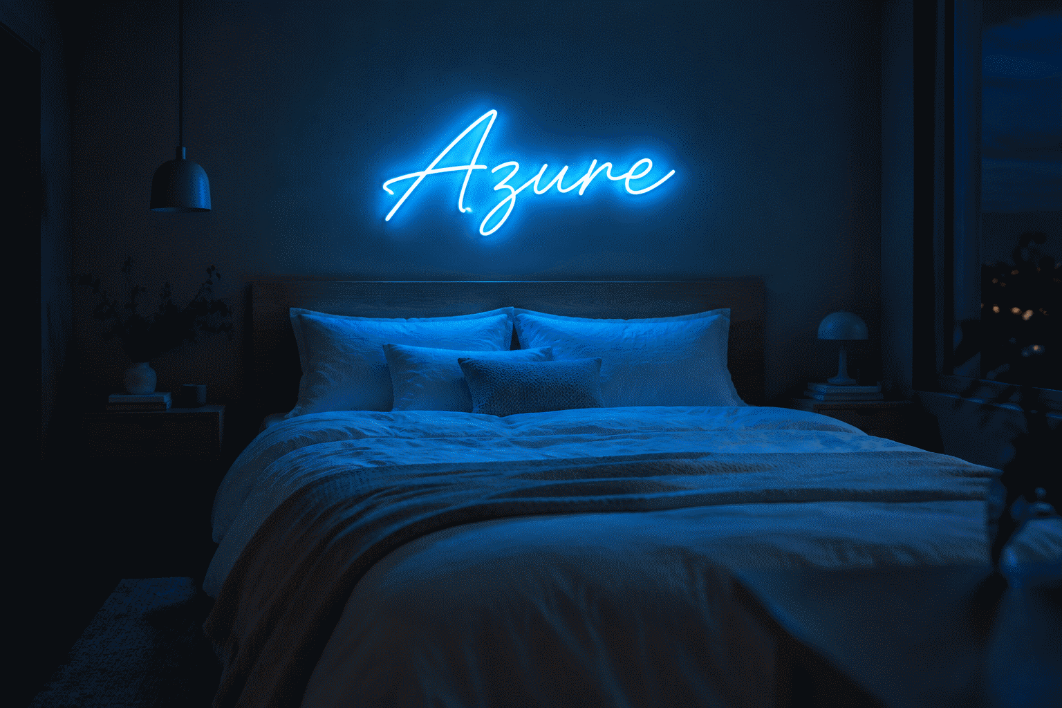
- Colors hit their most-saturated visual register — pinks pinker, blues deeper (the color system)
- Dimming behaves differently: a dark-room sign at 15% reads like a light-room sign at 40% — set levels accordingly (dimming)
Rule 2: Choose Hues for the Dark (They Don’t Perform Equally)
How the core neon families rank on black:
| Family | On black | Notes |
|---|---|---|
| Hot pink | Exceptional | The genre’s favorite for a reason |
| Electric blue/cyan | Exceptional | The cyberpunk standard |
| Red/crimson | Outstanding | Noir native; deep reds glow richest |
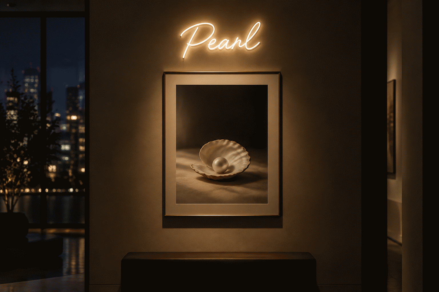
| White/warm white | Outstanding | Maximum elegance; the dark-minimal choice |
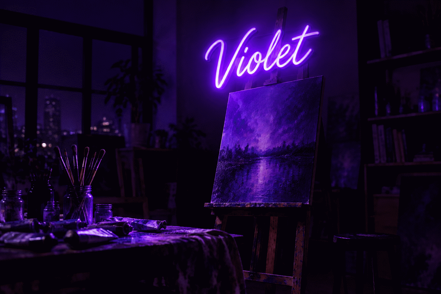
| Purple/magenta | Very strong | Mood with full saturation |
| Green | Very strong | Matrix native |
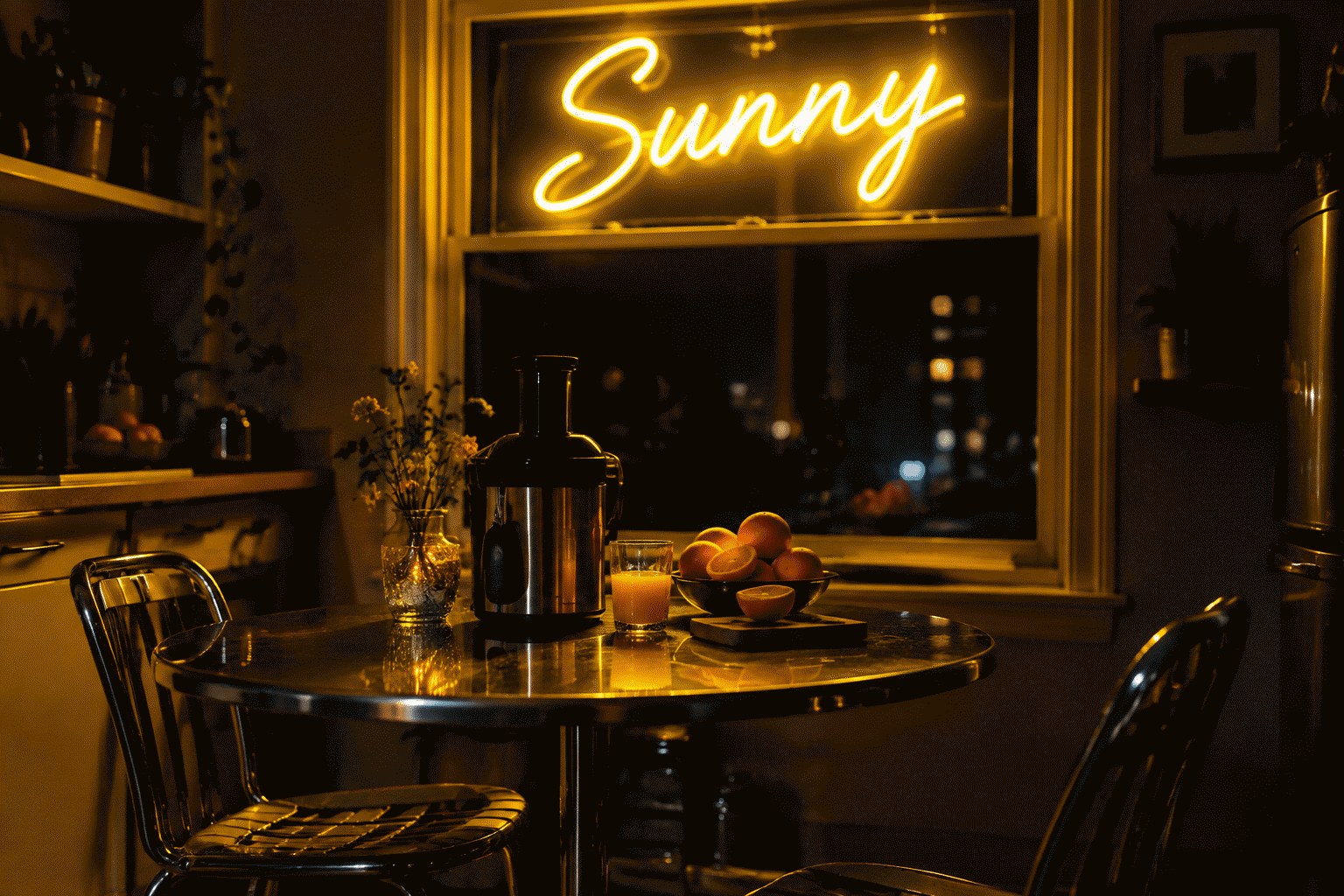
| Yellow/gold | Strong and dramatic | Sun-at-night |
| Ice blue/pastels | Soft | Read but lose their airy character — pastels want light surroundings |
| Orange | Good | Warmer read than on white |
The pattern: saturated hues thrive; pastels dim. Pale colors built for airy rooms lose their identity on black — the soft end of the palette prefers white walls (the pastel logic).
Rule 3: Adjust Letterforms for Contrast (Weight and Space)
The readability craft for dark backgrounds:

- Favor medium-to-bold strokes: hairline script loses its delicacy’s payoff on black and can ghost; solid letterforms use the contrast they’re given
- Wider letter-spacing: on black, halos define edges tightly — spacing that’s generous by screen standards reads perfectly at wall distance (the font guide’s spacing rule doubles here)
- Bigger minimum sizes for fine type: delicate scripts on black want ~30% more letter height than on light walls to hold presence
- One hue for text-critical signs: multi-hue letters on black vibrate; reserve color-play for icon-and-word splits (combinations)
- Negative-space awareness: on black, the unlit parts of the design (black backing showing through) are doing compositional work — dark gaps read as intentional, so keep them clean
Rule 4: Pick Your Black Implementation (Three Options, Different Trades)
The black backboard (guide): the sign carries its own darkness — a framed panel with maximum built-in contrast on any wall, rentals included. Daytime presence is a bold black panel; best for statement pieces and any wall that isn’t committing to dark.
The black wall with cut-to-shape sign: the floating-glow look — letters hanging in space with no visible hardware. The committed version: the room has decided. Daytime presence depends on the sign’s unlit appearance (acrylic reads subtle on dark paint — deliberate for some, invisible for others; test expectations).
The dark room (charcoal walls, low ambient light): the full noir environment — maximum halo absorption plus dim-setting sophistication. The premium version; also the dust-showing version (the cleaning routine).
The Photography Bonus (Why Black Reads So Good on Camera)
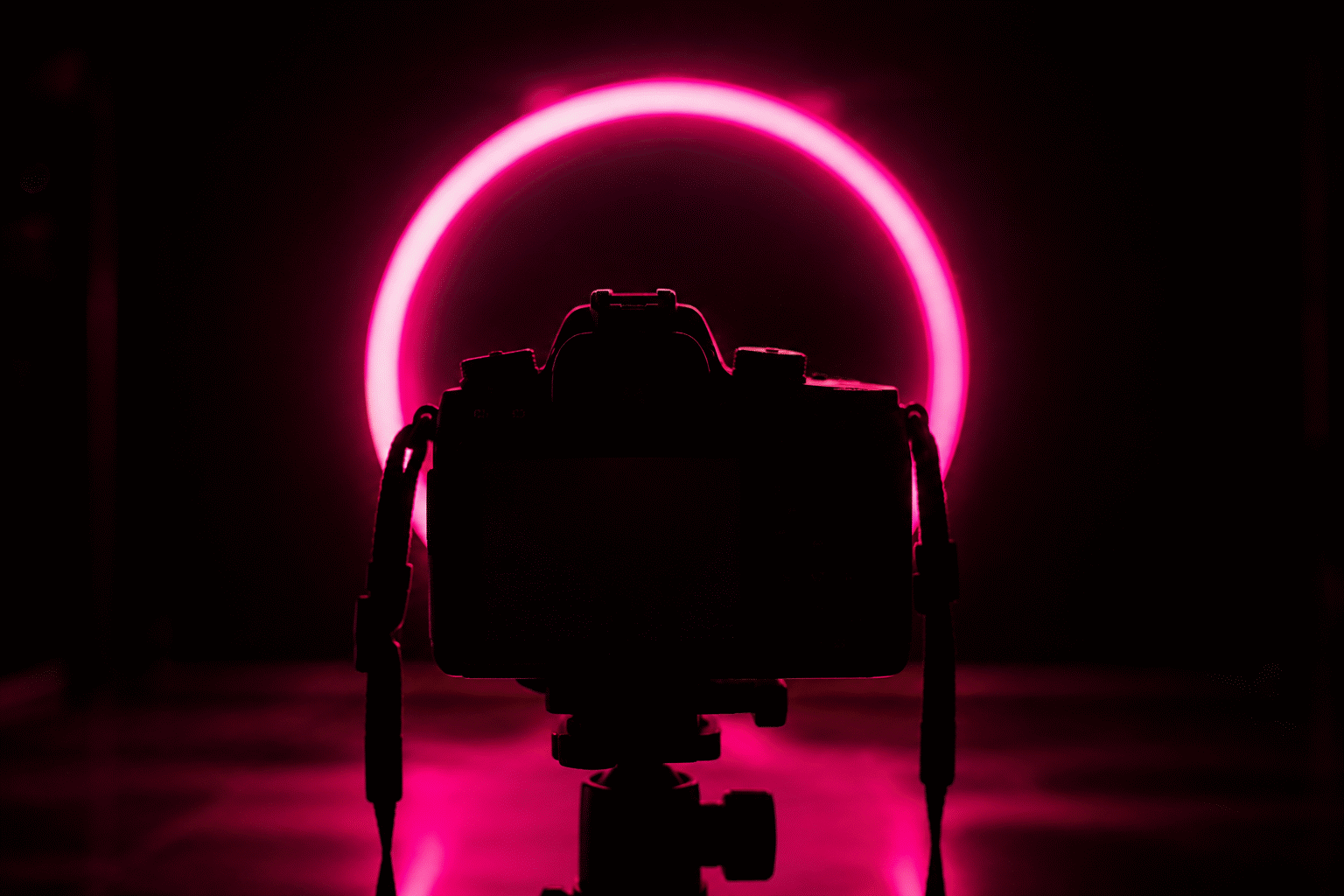
Dark-background neon photographs at the palette’s ceiling: contrast does the exposure work, saturation holds on sensors, and the frame needs no fill (the method). If the sign’s destiny includes content — streams, posts, product shots — black backgrounds are the camera-native choice.
Designing It (Order of Operations)
- Choose the black implementation by commitment level: backboard (any wall) → black wall (committed room) → dark room (full noir)
- Pick a saturated hue from the top of the performance table — pastels need not apply
- Bump the letterform weight and spacing for dark-field craft
- Plan the dim register remembering dark-room perception (settings read brighter than the dial)
- Preview on black in the builder — the custom builder renders every hue against dark backings, the honest preview of Rule 2’s rankings on your own words
The Black-Background Order Sheet
Specifying a black-background sign — the order-form version of the rules:
The backing specification. Black backboard builds: confirm the board’s edges (painted-black acrylic reads seamless; raw-cut edges show clear lines — specify painted/finished edges for the floating look), the mounting hardware (standoffs in black, invisible from front), and the daytime appearance (the board is the sign’s unlit identity — a designed panel, not hardware (the backing guide)).
The hue specification. On black, order saturated: the chart’s hot pink, electric blue, reds, whites, and purples (the performance table) — and preview the exact hue on black in the builder before committing. The pastel warning repeats because orders repeat it: ice blues and mint tones underperform on darkness; their airiness needs light walls.
The letterform specification. Dark-field lettering wants weight: medium-to-bold strokes, wide tracking, script at +30% height (the readability rules). The order-time check: the preview at arm’s-length on your phone — if the lettering holds its shape squinted, it holds on the wall.
The dimming specification. Black-background builds always order dimming (the dark-room perception): the same dial reading delivers more perceived brightness against darkness, so the evening register lives at 10–20%. Signs without dimming on black walls run permanently over-bright — the one spec omission this format can’t absorb.
The wall-specification (for floating builds). Cut-to-shape on black walls: confirm the wall’s finish (matte black absorbs spill best — the physics working for you (the black rules)), the sign’s unlit visibility plan (acrylic reads subtle on dark paint — deliberate), and the mounting method (standoffs, not adhesive — the float needs dimension).
The order sheet’s summary line: saturated hue, weighted letters, finished board, dimming included — four specs, one dramatically correct sign (specify it).
FAQ: Neon on Black
Why does neon look better on a black background? Contrast physics: dark surfaces absorb the glow’s halo spill instead of scattering it, giving letters knife-edge definition, deeper perceived saturation, and longer readable distance — every color’s most intense self.
Which neon colors show best on black? Saturated hues: hot pink and electric blue (the genre standards), red and crimson (noir native), white and warm white (maximum elegance), purple and green (mood with full saturation). Pastels underperform — they want light surroundings.
Should I get a black backboard or paint my wall black? Backboard for flexibility — maximum contrast on any wall, rentals included, dramatic daytime panel. Black wall for commitment — the floating-glow look for rooms that have decided. The full trade analysis is in the backing guide.
Do neon signs need different fonts on dark backgrounds? Craft-wise, yes: medium-to-bold strokes over hairlines (delicate type ghosts on black), wider letter-spacing, and ~30% more height for fine script — the readability rules above.
How does dimming behave on black backgrounds? Dark rooms perceive brightness generously: a 15% setting reads like a light room’s 40%. Start lower than instinct — the sophisticated evening look on black lives at surprisingly low levels.
Is neon on black good for photos and streams? It’s the camera-native configuration: contrast handles exposure, saturation holds on sensors, and no fill light is needed — the choice behind most content-wall black setups (the method).
The black-background summary: contrast physics doing the design work — dark surfaces sharpening every hue to its maximum self, the readability rules (weight, spacing, saturated-only), the three black implementations, and the dimming perception that dark rooms reward (specify it). The black-glow sign done right is the medium at its most elemental: light defined by darkness, letters floating at knife-edge — the format noir invented and every content era has re-shot since. Why does my neon sign look different on my black wall at night versus day? The two lighting regimes activate different layers: daylight shows the sign’s physical self (acrylic, unlit letters, the black board’s texture), night activates the glow’s full contrast physics — and rooms transition between them at dusk, the hour when black-background signs do their best work (the layer anatomy). Design for the night register, accept the day’s quiet, and the transition becomes the show.
What is the best neon color for a black wall specifically? Hot pink and electric blue (the maximum-contrast standards — the performance table), with warm white as the elegance pick and red as the noir choice; the pale pastels underperform on darkness and want light walls. On black, saturation is the entry requirement — the saturated hue you love will out-glow the pale one you liked.
The rules compress to one line: saturated hue, weighted letters, honest black, dimming from day one — the rest is physics working for you.
Black is where glow becomes graphic — and the rules above are simply the typography of light on darkness, learned in a century and applied in one order.
Sources & Further Reading
- Neon sign (Wikipedia) — the consolidated public record of neon-sign history and technology.
- Neon, element 10 (Wikipedia) — element properties: density, boiling point, abundance.