Red Neon Sign Aesthetic: Bold Glow Room Ideas
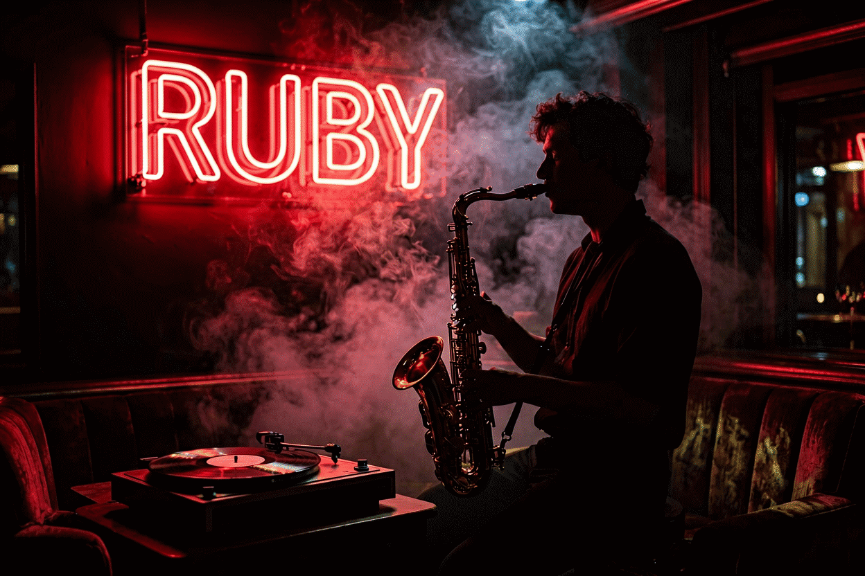
Red neon is the original — literally: pure neon gas glows red-orange, making red the only color the medium had for its first years, the color of 1912 Paris and 1920s Broadway and every dive bar since. A century of that history loads the aesthetic: red neon reads as energy, danger, appetite, and retro authenticity all at once. It’s the loudest glow in the palette — the one that turns a sign into a statement just by being on — and the discipline of using it well is the discipline of restraint.
The physics and history of red’s primacy live at what makes neon red; this is the aesthetic guide: red’s registers, where it belongs, how to keep it from overwhelming, and the darker shade’s own lane at dark red aesthetic.
What Red Does (The Loaded Glow)
Red arrives pre-loaded with more cultural wiring than any other hue:
- Energy and urgency — the attention color; the reason “OPEN” is red by default (the business lineage)
- Appetite — the food-and-drink industry’s century-long choice: red glow moves beer and late-night menus (the bar vocabulary)
- Retro authenticity — the motel-and-diner register; red script means 1950s America on sight (the vintage look)
- Danger and edge — the noir register: red-light districts, horror imagery, the transgressive-glam vocabulary
That loading is why red is the most powerful and least neutral glow: nothing in a red-lit room reads as “just decor.”
Where Red Wins (The Room Matrix)
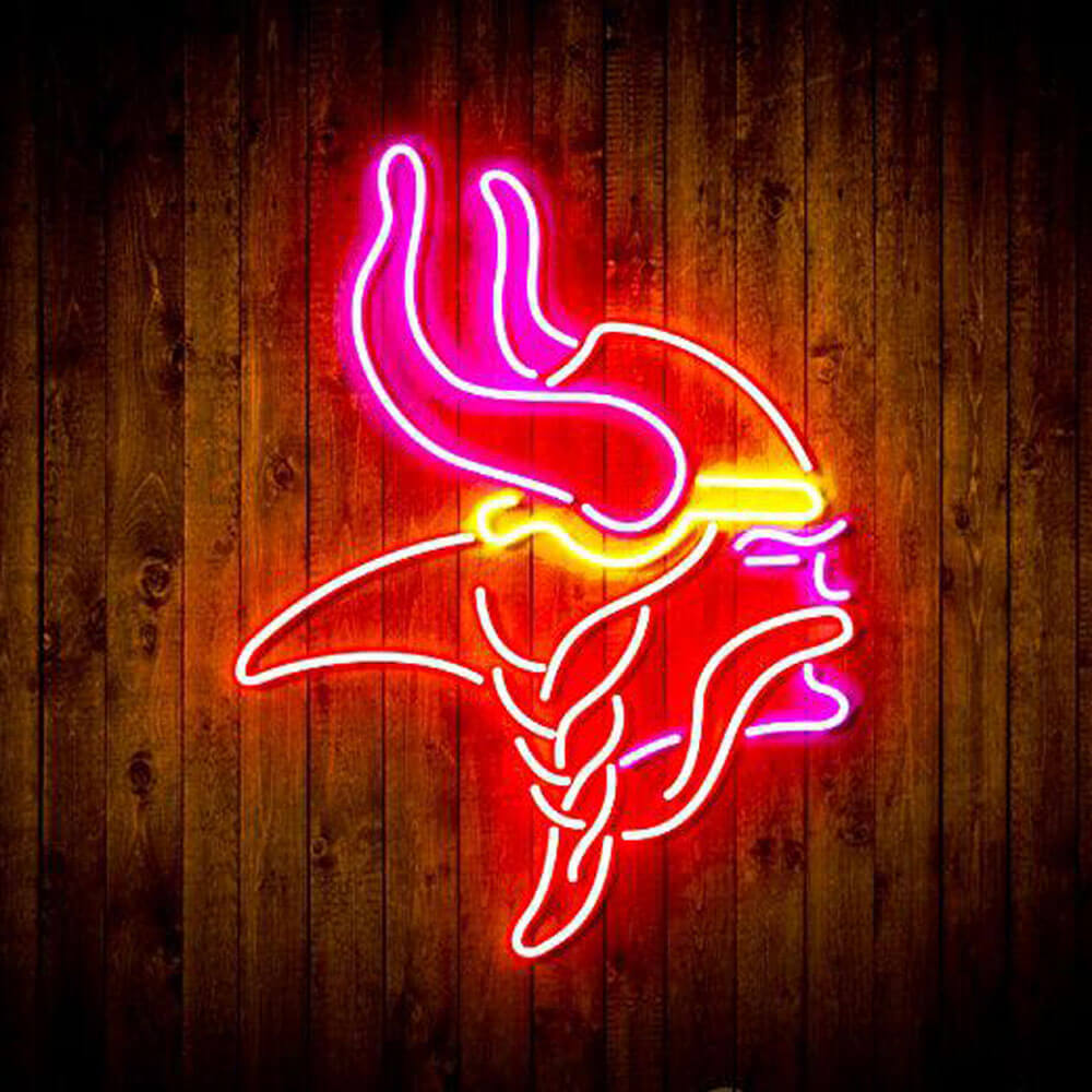
Bars, pubs, and man caves. Red’s commercial home turf — beer vocabulary, sports iconography, whiskey-corner scripts (man cave collection). Red plus dark wood is the pub aesthetic, complete since 1935.
Retro and vintage schemes. Diner kitchens, motel-chic corners, Americana walls: red script and arrows are the era’s authentic voice (the retro guide).
The noir bedroom. The moody use: deep red script over black walls — the cinematic register, half romance and half danger. Red at 15% dim is candlelight-adjacent (placement).
Kitchens and dining corners. The appetite glow: red in kitchens is diner-nostalgic and dinner-flattering (kitchen ideas).
Garages and workshops. The automotive register: red on pegboard walls carries the filling-station vernacular.
Using Red Without Being Overwhelmed
Red is the palette’s highest-saturation attention magnet, which makes discipline the aesthetic skill:
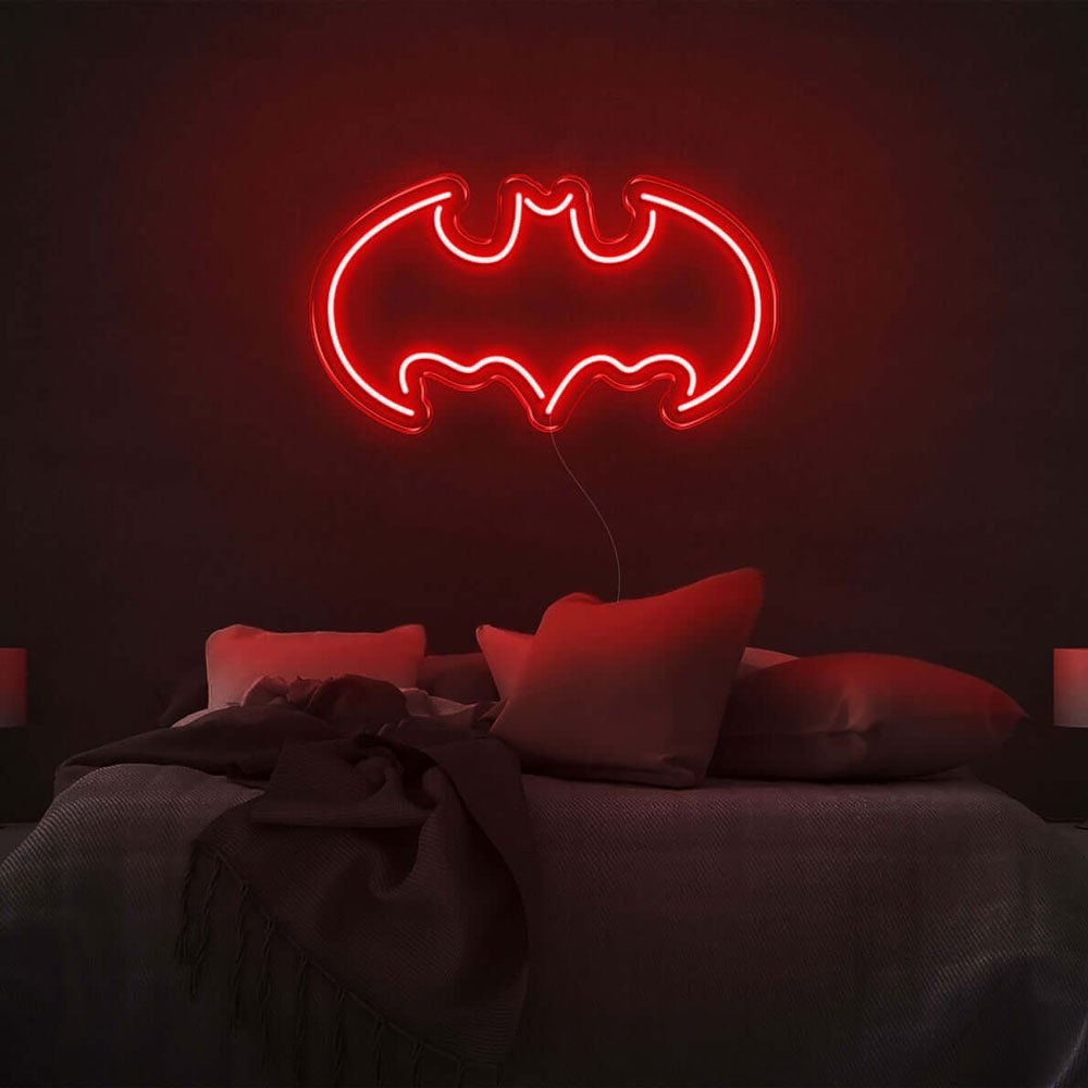
- One red statement per room — two red signs compete; three become a district (charming in theory, loud in practice)
- Give it dark or neutral surroundings — black, dark wood, and gray let red speak; competing colors make it shout
- Size down, not up — red reads larger than its dimensions; a modest red wordmark carries a big wall (sizing math)
- The dimmer is the aesthetic tool — full red is Vegas; 30% red is lounge; 15% red is a secret. Choose your volume deliberately (dimming)
- Pair with materials, not colors — leather, brass, dark wood do more for red than any second hue
The Shade Range
- Classic neon red — the original: red-orange glow, the historical authentic
- True red — the contemporary saturated version: cleaner, poster-red on camera
- Crimson/dark red — the moody deep end (its own guide)
- Red-orange — the warm crossover toward amber: friendlier, diner-forward
The Pairings That Work
- Red + black — the noir standard; the most contrast the palette offers (the black-glow rules)
- Red + dark wood + brass — the pub trinity; authenticity does the design work
- Red + white — the diner sign classic: crisp, retro, daylight-friendly
- Red + cyan/blue — the maximum-contrast pop pairing; poster energy
- Red + warm white — the layered warmth: white for light, red for statement
The Sign Vocabulary in Red
- Beer and spirits vocabulary: brand-era scripts, “BEER,” tap-list headers (the bar collection)
- OPEN and business vernacular: the century-old defaults, still unbeaten (open signs)
- Retro script: cursive words, arrows, stars — the motel-diner lexicon
- Hearts and lips: romance register, at full saturation or crimson
- Automotive and sports: the garage/man-cave iconography
- Single powerful words: red suits the one-word statement (LOVE, HUSTLE, NO) better than any hue — it commits
Building the Red Room (Order of Operations)
- Decide the register: retro (classic red), noir (true/dark red), appetite (red-orange), edge (full-sat statement)
- Audit the room’s darkness: red rewards dark surroundings disproportionately
- Pick one statement piece and size it modestly
- Stage the materials: wood, leather, brass before any second color
- Set the dim schedule — the volume knob is the whole aesthetic
- Preview the exact shade and word in the custom builder — red’s variants are meaningfully different glows
The full galleries live at red neon sign and the dark red aesthetic pages; the all-color method at neon room aesthetic ideas.
The Red Worksheet: Register and Restraint
Red’s decision sheet — the two calls that determine everything:
Which red, by register? The family runs: classic neon red-orange (the historical original — retro, diner, appetite (the parent guide)), true red (saturated contemporary — the poster energy), and the dark trio — crimson, burgundy, blood-red (the deep end) for noir, romance, and edge respectively. The register test: what should the room feel at 10 pm — energized (true), nostalgic (classic), or cinematic (dark)? The answer names the shade.
How much red can the room hold? The restraint math: red’s attention weight means one sign per sightline, sized one notch below instinct (red reads larger than measured — the sizing logic), against dark or neutral surroundings. Rooms with competing colors get red as accent (icon or single word); monochrome rooms earn red as centerpiece. The pub formula — red script over dark wood and brass — remains the highest-authenticity combination in the medium’s century.
The materials pre-check. Red rewards material staging more than any hue: leather, dark wood, brass, and velvet make red signs look expensive; bare drywall and plastic make the same signs look like arcade overflow. Audit the room’s materials before the shade — often the room tells you which red it can support.
The dim plan, non-negotiable for red. Full red is Vegas energy; 30% is lounge; 15% is candlelight-adjacent — red’s dim range is the widest in emotional distance per step (the dimming guide). Set the evening level the day the sign mounts; red without dimming discipline exhausts rooms (and their occupants (the arousal science)).
The one-format recommendation. If choosing blind: a single powerful word in classic red, cut-to-shape, over dark wood or charcoal, dimmed to the 25% register — the configuration that has worked since 1935 and still photographs like heritage (the vintage vocabulary). Everything else is variation on its theme (compose yours).
FAQ: Red Neon Aesthetics
What does a red neon sign say about a room? Energy with history: red is the medium’s original color (pure neon glows red), so it carries a century of bar, diner, and Broadway loading — appetite, urgency, retro authenticity, and edge, all at once.
Is red neon good for bedrooms? In the noir register — deep red script over dark walls, dimmed low — red is the cinematic bedroom glow. It’s an energizing hue at full brightness, so the dimmer does the aesthetic work.
What goes with red neon? Black (maximum contrast), dark wood and brass (the pub trinity), white (diner crisp), cyan (poster pop), and warm white (layered warmth) — but materials serve red better than second colors do.
What’s the best red neon sign for a bar or man cave? Beer and spirits scripts, sports iconography, and brand-era vocabulary in classic red over dark wood — the register pubs have run for a century (the collections).
How do you keep red neon from overwhelming a room? Restraint mechanics: one statement per room, modest sizing (red reads bigger than it measures), dark or neutral surroundings, and deliberate dimming — the volume knob is the design tool.
What’s the difference between red and dark red neon? Classic red is the historical red-orange original — retro and appetite-forward; dark crimson is the moody, romantic-noir depth end. They’re different aesthetics, each with its own guide.
Red’s summary, a century compressed: the original color (pure neon’s own glow), the loudest register, the appetite-and-heritage loader — and the hue that rewards restraint most, sized down, staged dark, dimmed to candlelight (compose the statement). The red room done right has been the medium’s masterpiece since the 1930s: one word, one glow, dark wood, and everything else in the room getting out of the way. Everything in this guide is variation on that discipline, and every variation still works. What rooms should avoid red neon? Task-focus rooms (offices, homework corners — the arousal register fights concentration (the psychology)) and rest-adjacent spaces at full brightness; red’s home turf is the social and evening rooms — bars, dining, lounges, the noir bedroom — where its energy and romance registers belong. Every hue has rooms it serves; red’s are simply the loudest and the most deliberate.
Red’s rooms are the loudest and the most deliberate in the palette — and the discipline this guide teaches is simply the century’s accumulated wisdom about keeping both qualities worth having.
Every red room worth remembering ran the discipline; every one that wasn’t skipped it — the guide’s last line and its first.
Sources & Further Reading
- Neon: Strong Lines (NIST Physical Reference Data) — the standard reference for neon’s emission wavelengths.
- Neon sign (Wikipedia) — the consolidated public record of neon-sign history and technology.