Neon Color Psychology: How Glows Affect Mood
Neon colors affect mood through three mechanisms working at once: wavelength arousal (cool blues and greens calm, warm reds and yellows energize — the basis of a century of lighting research), temperature association (warm glows read as intimacy, cool glows as focus), and conditioned meaning (a lifetime of signage and screens has trained responses to each hue). Add the medium’s own amplifier — saturation pushed to maximum, the glow that makes color more itself than pigment ever manages — and neon becomes applied psychology you hang on a wall.
This is the mechanisms and evidence guide. The what-each-color-says decoder lives at neon color meanings; the practical applications — bedrooms and businesses — have their own pages.
Mechanism 1: Wavelength and Arousal
The foundational finding of environmental lighting research: light’s color composition influences physiological arousal — cooler, shorter wavelengths (blues, at the ~480nm range particularly) shift people toward alertness and suppress melatonin; warmer, longer wavelengths (reds, ambers) leave sleep architecture comparatively undisturbed. The practical neon translations:
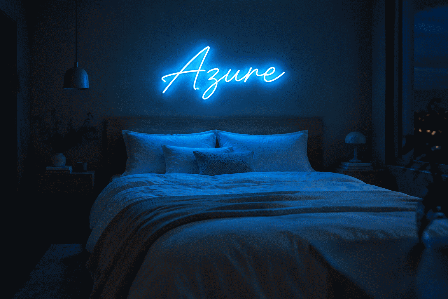
- Blue and ice-white signs are evening-alerting: gorgeous at dusk, wrong at midnight. Bedrooms running blue want dimming discipline or warm alternatives for late hours.
- Red, amber, and warm white are the sleep-compatible glows: the candlelight-adjacent register — why the coziest night setups converge on warm hues (the bedroom color method).
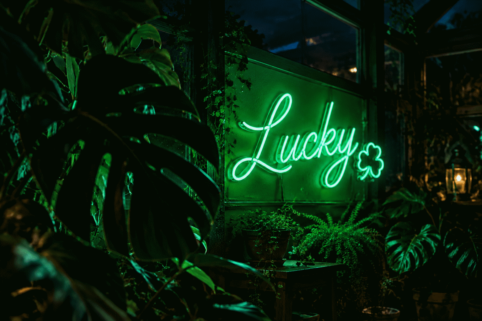
- Green sits mid-spectrum — calm-leaning with freshness; the least disruptive of the saturated hues.
- The dimmer is the psychology tool: brightness modulates all these effects — a blue sign at 15% is ambient; at 100% it’s a signal. (The control layer.)
[Status of the science: short-wavelength evening light’s alerting effect is well-established (the screen-time consensus); neon-decor-specific studies are sparse — the practical guidance extrapolates established lighting research to the medium. Marked as inference where it does.]
Mechanism 2: Temperature and Body Sense
Beyond wavelength, color temperature carries learned associations that behave reliably:
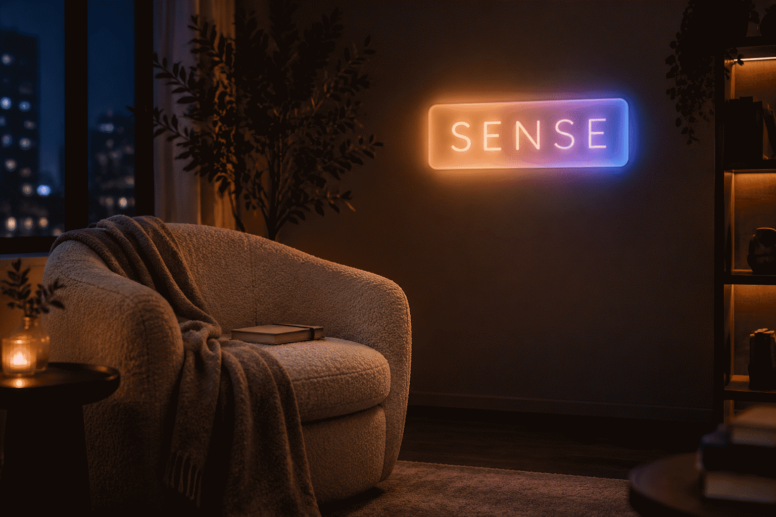
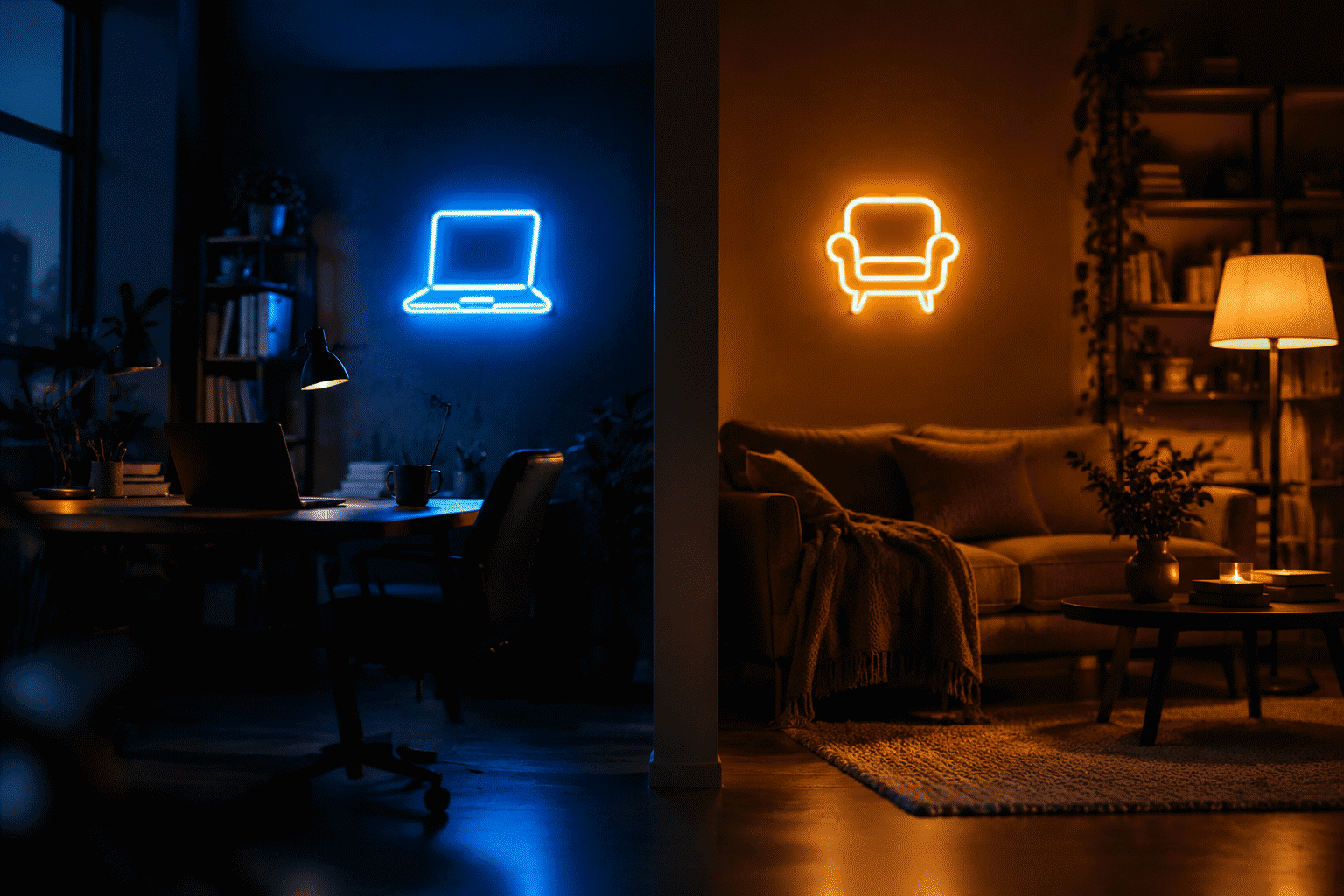
- Warm registers (reds → warm whites) read as intimacy, comfort, enclosure — the fire-and-candlestick inheritance. Warm neon flatters skin (continuous-spectrum kindness), relaxes posture, and slows rooms down: the boudoir-and-bar physics.
- Cool registers (blues → ice whites) read as spaciousness, precision, cleanliness — sky, ice, and clinical inheritance. Cool neon sharpens focus and reads hygienic: the studio-and-spa physics.
- The neutral zone (true whites) reads as order — the gallery register, neither arm.
This is why the color temperature choice within “white” alone changes a room’s whole behavior — temperature is psychology operating below the level of color names.
Mechanism 3: Conditioned Meaning (The Century of Signs)
The third mechanism is cultural training: a hundred years of neon commerce coded responses into the population —
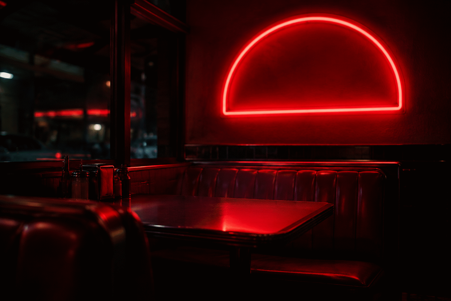
- Appetite conditioning: red-and-orange signage has accompanied food for so long that the hues themselves prime appetite — the fast-food palette is applied conditioning (the commercial logic).
- Trust conditioning: blue’s century in institutional and tech branding lends any blue glow a competence halo.
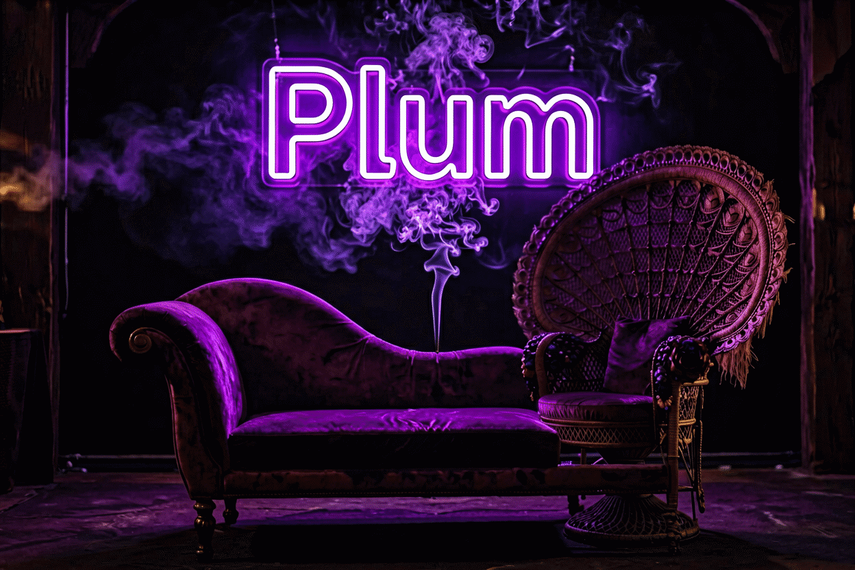
- Luxe conditioning: purple’s rarity in nature and cost in history (the royal dye) still prices the hue’s feel upward.
- Social conditioning: pink’s decade as the aesthetic-feed’s signature means it now reliably signals photogenic space — the color pre-promises the photo (the pink guide).
These aren’t universal laws — they’re trained associations, strong in the cultures that ran the training. [Inference: the associations travel with media exposure rather than biology — different cultures with different signage histories would weight the codes differently.]
The Amplifier: Why Neon’s Versions Hit Harder
Pigment reflects; neon emits. The difference matters psychologically:
- Saturation at maximum: neon hues sit at the top of perceivable saturation — emotional loudness turned up
- The glow effect: emitted light halos and breathes where paint sits flat — attention capture is structural, not stylistic (the physics)
- Ambient spill: the sign colors its whole corner — the room receives the psychology, not just the wall behind the letters
This is also the medium’s risk profile: neon’s intensity means its mood effects are stronger than paint’s equivalents — which cuts both ways (a blue that energizes a studio over-alerts a bedroom).
Applying It (The Two Disciplines)
For homes: match glow to room-function — warm/dimmable for bedrooms and evening rooms, cool for focus spaces, neutral-white for designed minimalism; respect the late-hour warm rule; and let the meaning layer (decoder) pick between finalists. The room-by-room map: bedroom color guide.
For businesses: use the conditioned meanings deliberately — appetite hues for food, trust hues for professional services, arousal hues for gyms, luxe hues for beauty (the full commercial map). The signage industry’s century of split-testing is your dataset; the psychology is load-bearing.
For content creators: the camera-adjacent psychology — warm glows flatter faces (skin-continuous spectra), cool glows grade cinematic, and the pink-photogenic conditioning does marketing work in every frame (shooting glow).
The Honest Caveats
Color psychology’s effect sizes are real but moderate — context, brightness, and duration modulate everything; no hue “causes” a mood single-handedly. The practical wisdom isn’t “blue is forbidden in bedrooms” but “blue at full brightness, late, is fighting your biology — dim it, warm it, or time it.” The medium’s intensity deserves respect, not fear.
Choose with the mechanisms in mind, then verify the feeling in the rendering — every psychological consideration above compresses into the moment you see your words glowing in the right hue, in the custom builder.
Psychology in Practice: The Applied Cheat Card
The three mechanisms, converted to daily practice — the card worth keeping:
The evening wind-down card. Warm hues (red, amber, warm white) at 15–20% dim, scheduled via smart control (the automation) — the sleep-compatible configuration the wavelength science supports. Cool hues in evening rooms: dim a step lower than the warm-rule (the alerting physics) or schedule them off at the wind-down hour.
The work-focus card. Cool whites and natural tones at working brightness for task hours — alertness without the blue-overdose of screens-plus-signs; then the evening transition to warm at the same hour the lamps shift. The two-scene discipline (the dimming profiles) is applied psychology, not just mood.
The social-flattery card. Warm registers for rooms where people gather and photograph — pink and warm white’s continuous-spectrum kindness (the flattery physics), red and amber’s appetite conditioning (the meaning layer) for food and drink contexts. The party mode: full brightness for the event hours, back to living levels after.
The content-creation card. Camera-facing signs at 60–70% (the photography lock), hue chosen for the feed’s psychology — cool for cinematic grades, warm for flattering lifestyle, pink for the photogenic conditioning (the social layer).
The honest-caution card, restated. Effect sizes are moderate; context rules; no hue causes anything alone. The card’s rules are defaults, not laws — the household that loves a blue bedroom sign at midnight has made a valid trade (the glow they love against the alerting they tolerate), and psychology’s role is informing the trade, not banning it.
The whole discipline in one line: hue sets the tendency, brightness sets the volume, schedule sets the habit — three dials, one deliberate owner (set all three in the builder, where every psychological consideration renders live).
FAQ: Neon Color Psychology
How do neon colors affect mood? Three stacked mechanisms: wavelength arousal (cool hues alert, warm hues calm — the established lighting-science finding), temperature association (warm = intimate, cool = focused), and a century of conditioned meaning from signage culture — amplified by neon’s maximum saturation and emitted glow.
Which neon colors are calming? Warm whites, reds, and ambers (the candlelight register) plus mid-spectrum greens and lavenders at low dim. Blues and ice whites are the alerting end — energizing for studios, worth dimming discipline in bedrooms.
Can a neon sign affect sleep? Yes, through hue and brightness: cool-blue light at night suppresses melatonin (the screen-time consensus applied to decor), while warm glows at low dim leave sleep architecture intact. The bedroom formula: warm color, 15–20% dim, or off.
Is color psychology for neon signs actually proven? The foundations are established lighting science and color-association research; neon-decor-specific studies are sparse, so practical guidance extrapolates. The effects are real but moderate — context, brightness, and duration modulate everything.
What’s the psychology behind pink neon’s popularity? Conditioned photogenicity: a decade of pink-dominant aesthetic feeds trained the association pink-space = photographable-space, layered on pink’s flattering continuous-spectrum kindness to skin — social reinforcement plus physics.
How do businesses use neon color psychology? Deliberately matched to message: appetite hues (red/orange) for food, trust hues (blue) for professional services, arousal hues for gyms, luxe hues (purple) for beauty — a century of signage split-testing applied (the commercial map).
The psychology summary: three mechanisms (wavelength arousal, temperature association, conditioned meaning) amplified by the medium’s saturation — real effects, moderate sizes, honest caveats, and three controllable dials (hue, brightness, schedule) that turn the science into living preference (set the dials). The glow you choose and the way you run it are applied psychology whether intended or not — the deliberate owner simply gets the effects they chose rather than the defaults they inherited. Can neon signs improve mood? As environmental lighting, they carry the same mood effects as any light source — and the deliberate owner compounds them: warm glows at evening levels for calm (the wavelength logic), bright saturated hues for energy rooms, personal words adding meaning on top of mechanism. A sign won’t fix a bad day; it reliably makes good rooms better, which is the honest version of the claim.
Sources & Further Reading
- Neon: Strong Lines (NIST Physical Reference Data) — the standard reference for neon’s emission wavelengths.
- Neon sign (Wikipedia) — the consolidated public record of neon-sign history and technology.
- Mercury (U.S. EPA) — federal guidance on mercury exposure and safe handling.