Purple Neon Sign Aesthetic: Moody Glow Ideas
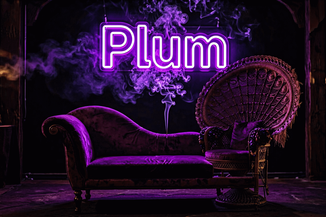
Purple neon is the aesthetic’s depth charge — the glow of mystery, royalty, and after-hours. It’s the color that made “moody” a room style: darker and richer than blue, more enigmatic than pink, purple turns a wall into a mood rather than a decoration. The witchy corner, the midnight gaming cave, the lounge that feels like 2am at any hour — purple neon doesn’t light those rooms, it is those rooms.
Where the glow physically comes from is its own story at what makes neon purple; this is the aesthetic guide: purple’s three registers, the rooms it owns, the pairings that make it sing, and the sign formats that carry it best. The adjacent ultraviolet territory (blacklight-adjacent glows) is covered at UV neon signs.
Purple’s Three Registers
Every purple room is running one of three programs:
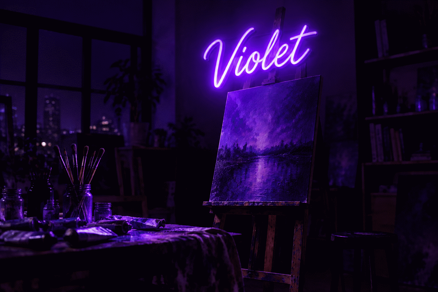
Mystic purple. The witchy-spiritual register: moons, stars, tarot iconography, third-eyes. Purple is the occult’s native hue for a century of good reasons — it reads as the color between worlds (the zodiac connection). This purple pairs with crystals, velvet, and dark wood.
Royal purple. The luxury register: deep saturated violet over leather and brass — the lounge, the whiskey corner, the statement piece that says expensive without saying anything. Royal purple is maximalist by instinct; it wants dark walls and gold accents.
Millennial-adjacent purple. The softer lavender-violet register: the aesthetic-era bedroom, the selfie wall, the pastel-leaning glow. Lighter, playful, social — closer to pink’s energy with purple’s undertow.
Knowing your register before buying matters because the shade and the room follow from it: mystic wants depth, royal wants saturation, millennial wants air.
The Rooms Purple Owns
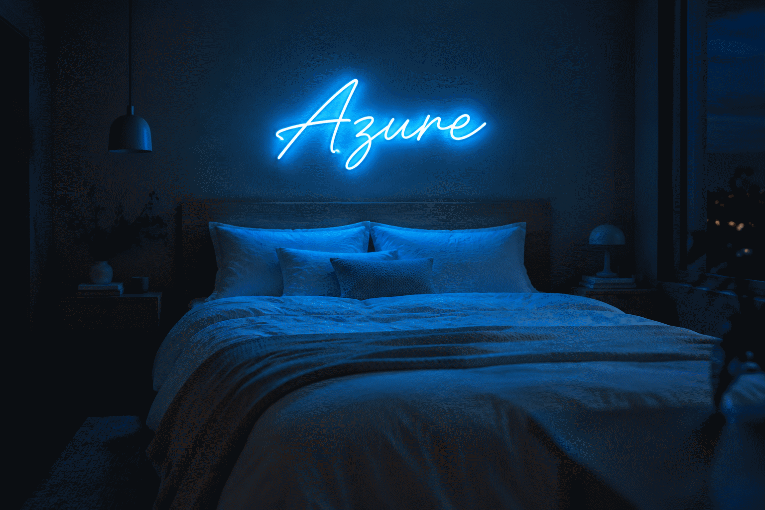
Dark-walled bedrooms. Purple’s home stadium: against charcoal, deep green, or aubergine walls, a purple wordmark doesn’t decorate the room, it completes it. Warm-purple script over a dark headboard is the single most-pinned purple setup (bedroom placement).
Gaming caves and streaming corners. The purple-plus-neon genre: deep violet glow, RGB accents, moody frame — purple out-performs blue for the after-dark stream aesthetic (the gaming color guide).
Lounges, hookah corners, music rooms. The commercial register: purple reads lounge-luxe in bars and listening rooms — the color of velvet-roped rooms (the lounge vocabulary).
Witchy and boho altars. The spiritual-corner format: moon-phase pieces, celestial icons, tarot motifs in violet — purple’s mystic register doing what it has always done (the witchy aesthetic).
Reading nooks and night gardens. The soft use: lavender glow at 20% dim over a reading chair — the cozy-adjacent purple, for people who want moody without darkness.
Shade and Pairing
The purple range, matched to rooms:
- Deep violet — dark rooms, royal register, maximum mood
- True purple — the all-purpose middle: gaming, bedrooms, icons
- Lavender/lilac — airy rooms, millennial register, daylight presence
- Violet-pink crossover — where purple meets the bachelorette energy (dark pink adjacent)
The pairings that work:
- Purple + black — the moody default; maximum depth (the black-glow rules)
- Purple + gold/brass — royal luxury; hardware does half the work
- Purple + blue — the night gradient; content-wall staple
- Purple + pink — the dreamy gradient; softer rooms
- Purple + silver/gray — the modern-mystic; cool and clean
The Sign Vocabulary in Purple
- Celestial icons: moons (all phases), stars, saturns — purple’s native iconography
- Script wordmarks: mystical vocabulary (DREAM, MANIFEST), names in violet script over dark walls
- Witchy motifs: tarot symbols, eyes, hands, botanicals — the mystic register’s full lexicon
- Lightning and energy: purple bolts read storm-magic rather than tech (blue’s version)
- Music vocabulary: waveforms, genres, artist references — the lounge register
- The dim layer: purple at 15–20% is the deepest cozy in the palette — arguably the best low-dim glow of any hue

Building a Purple Room (The Order of Operations)
- Pick the register first (mystic / royal / millennial) — everything downstream follows
- Audit the walls: purple wants darkness; white walls only work with the lavender register
- Choose shade by wall depth: darker walls, deeper purples
- One celestial-or-script statement, not a scatter of purple objects — the color’s power is concentration
- Velvet, brass, and candles as the supporting cast — purple is the most material-sensitive glow in the palette
- Preview the exact shade against your words in the custom builder — purple’s range is wide enough that “purple” alone isn’t a spec
The finished looks across every purple register live in the purple neon sign collection; the all-colors method at neon room aesthetic ideas.
The Purple Worksheet: Register, Shade, Room
The purple purchase’s decision sheet — the three questions that configure everything:

Which of the three registers is the room running? Mystic (celestial icons, velvet, crystals — the spiritual corner), royal (leather, brass, saturated depth — the luxe statement), or millennial (lavender air, pastel pairings — the soft room)? The register names the shade family: mystic and royal want true-to-deep purples, millennial wants lavender (the registers). Rooms straddling registers pick the dominant furniture mood, not the aspirational one.
How dark is the wall, honestly? Photograph it at evening lamp-hour and look: purple’s power multiplies against charcoal, aubergine, deep green, and black — the same sign demotes against bright white unless the lavender register carries it. The dark-wall purple room is the aesthetic’s canon for a reason: contrast physics doing the drama (the black-glow rules).
What carries the room — icon or word? Purple splits its formats cleanly: the celestial icons (moons, stars, saturns) run the mystic register; script wordmarks run the boudoir-romantic; music vocabulary runs the lounge. Choose the carrier before the words, because purple’s icons are the palette’s best (the icon vocabulary) — a violet moon outperforms most words.
The pairing pre-check. Purple wants one committed partner: gold/brass for royal (hardware does half the work — combinations), blue for the night gradient, black for maximum moody, pink for the dreamy. Silver-gray is the modern-mystic wildcard. What it never wants: three-hue scatter — purple’s depth dissolves in company.
The dim expectation to set. Purple at full brightness is a statement; purple at 15% is arguably the palette’s best low glow — deep, cozy, zero glare (the dimming layer). Plan to live at the low end and visit the top; bedrooms discover this within a week.
Run the sheet, then render: every purple variant against your words, live, in the custom builder — the purchase’s last decision is usually the preview making it for you.
FAQ: Purple Neon Aesthetics
What does a purple neon sign say about a room? Depth: moody, mysterious, a touch luxurious. Purple turns rooms into moods rather than decorations — the witchy corner, the lounge, the midnight gaming cave. Its three registers (mystic, royal, millennial-soft) each read differently.
Is purple neon good for bedrooms? It’s the dark-bedroom specialist: purple over charcoal or aubergine walls is the moody standard, and at 15–20% dim it’s arguably the coziest low-level glow in the palette. White-wall bedrooms want the lavender register instead.
What goes well with purple neon? Black walls (maximum mood), gold and brass (royal luxury), blue (the night gradient), pink (the dreamy gradient), and velvet, candles, and dark wood as the supporting materials — purple is the most material-sensitive glow.
What shade of purple neon should I choose? By register and wall: deep violet for dark rooms and the royal look, true purple as the all-purpose middle, lavender for airy and daylight-friendly rooms — preview exact shades in a builder before ordering.
What are the best purple neon sign designs? Celestial icons (moons, stars, saturns), mystical script wordmarks, witchy motifs (tarot, eyes, botanicals), storm-violet lightning bolts, and music vocabulary — each register’s native lexicon above.
Is purple neon the same as UV or blacklight? No — standard purple neon is visible violet glow; UV/blacklight signage is ultraviolet-emitting (the fluorescent-reactive genre). They pair aesthetically; they’re different products (the UV guide).
The purple summary: three registers (mystic, royal, millennial) naming three rooms, the depth palette’s moody champion, the dark-wall specialist, and the best low-dim glow in the house — purple rewards commitment more than any hue, which is why its rooms photograph like moods rather than spaces (render your register). Choose the register honestly, stage the materials deliberately, dim into the evening register, and the purple room becomes what the aesthetic era keeps pinning: depth with glow, mystery with warmth, a room that feels like 2am at any hour you choose. Is purple neon good for small rooms? Yes, with the shade-math respected: small rooms amplify glow saturation, so compact spaces take lavender or mid-purple happily but want deep violets at dimmed levels or smaller sizes — a 16-inch deep-violet moon in a reading nook is the genre done right, while a 36-inch statement in the same space overwhelms. Match the shade depth to the room’s cubic footage and purple scales from powder-room jewel to loft-scale drama without losing its register (size logic).
Is purple neon good for streaming setups? It is the after-dark stream register’s co-favorite (with electric blue): purple grades cinematic, holds saturation on camera, and pairs with the gaming wall’s black-and-RGB aesthetics (the gaming schemes). Daylight-streamers lean blue or white instead — purple’s depth reads best in the moody-frame genre the evening hours own.
Sources & Further Reading
- Neon sign (Wikipedia) — the consolidated public record of neon-sign history and technology.