Dark Red Aesthetic Neon Signs: Crimson Glow
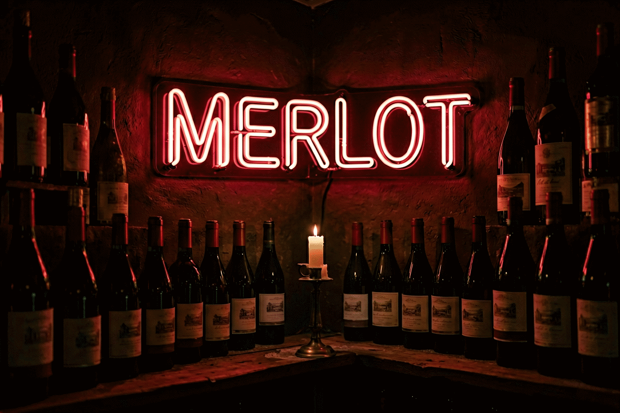
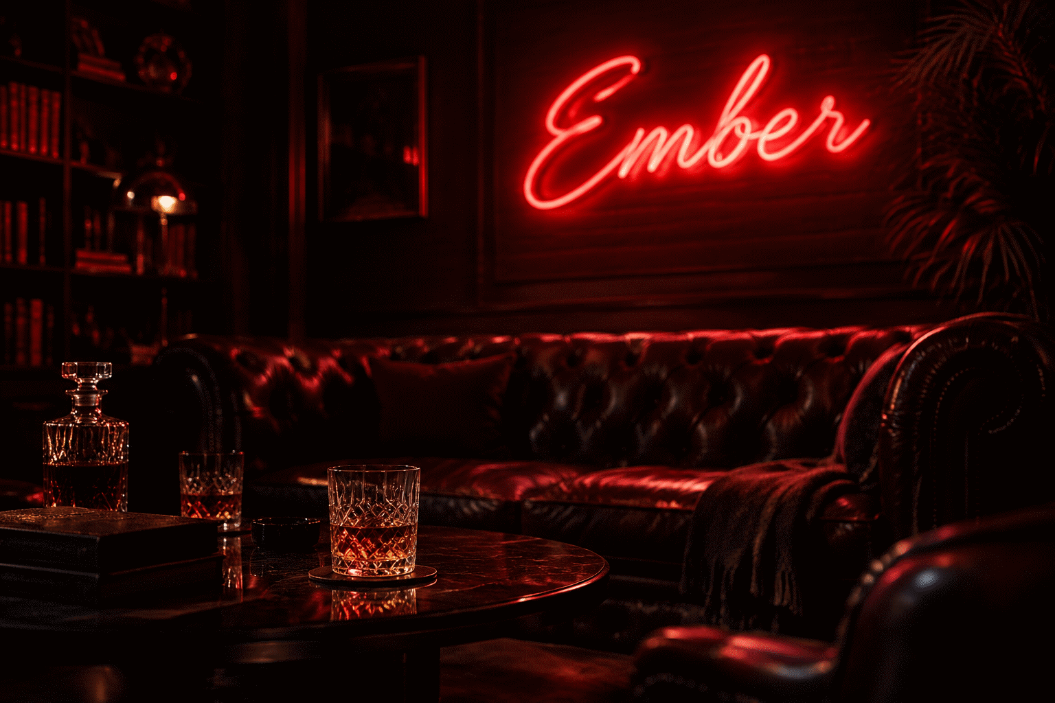
Dark red neon is red’s midnight register — crimson, burgundy, and blood-deep glows that trade the classic red-orange’s retro energy for depth, romance, and noir. Where classic red says diner and open, dark red says after hours: the velvet-room glow, the cinematic bedroom, the mood-lit bar corner. It’s the shade family that made “red neon aesthetic” mean something sultrier than signage.
The parent hue’s full story — history, psychology, retro registers — lives at red neon sign aesthetic; this is the depth guide: the three dark-red families, the rooms they own, and the discipline of the palette’s most atmospheric red.
The Three Dark Reds
Crimson — the true deep red: saturated, serious, romantic. Crimson scripts read as passion with weight rather than urgency; it’s the shade of the cinematic bedroom and the wine-bar statement.
Burgundy/wine red — the brown-shifted end: the darkest practical neon red, reading almost solemn. Burgundy pairs with leather and dark wood as a peer, not an accent — the library-and-lounge register.
Blood red — the vivid-dark hybrid: deep but electric, the horror-adjacent and rock-adjacent end of the family. Blood red suits the edge registers — gothic schemes, band walls, Halloween-adjacent permanence (the spooky vocabulary).
Calibration against the parent: if classic neon red (the red-orange original) is a 1930s diner at 7 pm, crimson is the same room at midnight — and that’s the entire aesthetic difference. (Shade physics and the red family’s history: the parent guide.)
What Dark Red Does
- Romance without sweetness — the passion register with the candy stripped out; dark red pairs with velvet and candles rather than hearts-and-pink
- Noir cinematography — dark red glow grades like film: the femme-fatale palette, moody content’s native red (photographing it)
- Appetite, adult version — red moves food and drink; dark red specifically moves wine, whiskey, and late menus (the bar logic)
- The deepest dim — dark red at 10–15% is the closest neon comes to candlelight; the evening setting is the aesthetic (dimming)
The Rooms Dark Red Owns
Cinematic bedrooms. The signature: crimson script over charcoal or aubergine walls — half romance, half film set. One word (a name, LOVE, a lyric) carries the whole room (placement).

Wine bars, whiskey corners, speakeasies. Dark red’s commercial home: the glow over the bottles and the leather stools — the “crafted evening” register (bar vocabulary).
Gothic and occult schemes. Blood red’s territory: tarot iconography, ravens, moons — the darker mystical register (purple’s gothic kinship).
Music rooms and band walls. The rock register: dark red on black, lyrics and iconography — the garage-studio canon (man cave adjacency).
Romantic dining corners. The two-seat table’s glow: burgundy at low dim — the restaurant-romance convention, home edition.
The Pairings That Work
- Dark red + black — the noir default; the palette’s most cinematic combination (the rules)
- Dark red + burgundy/wine interiors — the monochrome-deep look: glow matching the room’s own reds
- Dark red + brass/gold — the vintage-luxe pairing: candlelight logic with hardware
- Dark red + deep green — the Christmas-adjacent-turned-editorial pairing: rich, historical, jewel-toned
- Dark red + cream/ivory — the vintage-romantic balance: depth against softness
- Dark red + charcoal/gray — the modern-noir: moody without going full black
The Sign Vocabulary in Dark Red
- Romantic scripts: names, LOVE, French vocabulary — in crimson rather than the classic red-orange
- Wine and whiskey words: the bar-corner standards in their native shade
- Occult iconography: moons, eyes, hands, tarot motifs — the gothic lexicon (the eye genre)
- Music vocabulary: lyrics, genres, band iconography — the rock register
- Single heavy words: dark red suits commitment language (SOUL, STAY, VOW) better than any shade but white
- Rose and botanical outlines: the romantic flora, deepened (the rose genre)

Using Dark Red Well (The Discipline)
Dark red inherits red’s power and adds depth’s intensity — the restraint rules double:
- One statement per room, sized modestly — dark red reads even larger than classic red (sizing)
- Dark or textured surroundings — black, charcoal, velvet, dark wood; dark red against pastels is a category error
- The dim schedule is the design — plan the 10–15% evening setting from day one; it’s the glow’s best self
- Materials over colors — brass, leather, velvet serve dark red better than any second hue (pairings)
Choosing Your Red (The Fast Decision)
Classic red-orange for retro, diner, and appetite registers (the parent guide). Crimson for romance and cinema. Burgundy for libraries, lounges, and leather. Blood red for gothic and rock. And when the room is dark and the evening is the point — dark red, whichever shade matches the velvet.
Preview every shade against your words — the four darks are different glows entirely — in the custom builder; finished examples across the family live at red neon sign.
The Dark-Red Workbook: The Deepest Discipline
The dark-red purchase’s decision sequence:
Which dark — by evening intent. Crimson for romance-and-cinema (the passion register with weight); burgundy for leather-and-library rooms (the solemn luxe — pairs with wood and brass as a peer); blood red for gothic and rock (the electric-dark edge — the shade map). The intent test: what does 11 pm in this room feel like — cinematic (crimson), literary (burgundy), or electric (blood)?
The staging requirements, doubled. Dark red inherits red’s restraint rules and adds depth’s intensity: one statement per room, sized a notch down (the parent discipline), against black, charcoal, or wine-toned surroundings — dark red against pastels is the register error. Materials carry it: velvet, brass, dark wood, leather (the pairing set).
The vocabulary fit. Dark red’s native formats: romantic scripts and names (crimson), wine-and-whiskey words (burgundy’s bar corner), occult iconography and music lyrics (blood red’s gothic and rock registers — the vocabulary map), single heavy words (SOUL, STAY, VOW), and botanical outlines deepened. The shade and the word choose each other — the workbook’s order: pick the evening’s feeling, then the shade, then let the vocabulary suggest itself.
The dim plan — the deepest register in the palette. Dark red at 10–15% is candlelight (the dimming layer); its evening range is the medium’s most atmospheric. What full brightness is for: the first-impression hour and the photography session (the noir grading). Plan both; live at the bottom.
The one-config recommendation. A single name or heavy word in crimson, cut-to-shape, floating on a charcoal wall, dimmed to the 10% register — the cinematic bedroom in one purchase (compose it). Everything else in the dark-red family is that config with the dial turned toward library, gothic, or rock.
FAQ: Dark Red Neon
What is a dark red neon sign? The depth family of neon red: crimson (romantic-saturated), burgundy (wine-dark, leather-pairing), and blood red (electric-dark, gothic and rock registers) — red’s after-hours register where the classic red-orange is its diner daylight.
How is dark red neon different from regular red neon? Regular neon red is the historical red-orange — energetic, retro, appetite-forward. Dark reds trade that energy for depth and mood: romance without sweetness, noir cinematography, the velvet-room glow.
What rooms suit dark red neon best? Cinematic bedrooms (crimson script over dark walls), wine bars and whiskey corners, gothic and occult schemes, music rooms, and romantic dining corners — everywhere the evening register outranks the daytime one.
What goes with dark red neon? Black (the noir default), brass and gold (vintage luxe), deep green (jewel editorial), cream (vintage romantic), and materials — velvet, leather, dark wood — which serve dark red better than any second color.
Is dark red neon good for bedrooms? It’s the cinematic-bedroom specialist: crimson at 10–15% dim is the closest neon comes to candlelight. The discipline is dark surroundings and one modestly-sized statement.
What words look best in dark red neon? Romantic scripts and names, wine and whiskey vocabulary, occult iconography, music lyrics, single heavy words (SOUL, STAY), and botanical outlines — the register’s full lexicon above.
The dark-red summary: red’s midnight register — crimson, burgundy, and blood-red naming romance, library, and edge; the deepest dim in the palette; the materials-first staging that makes it luxury rather than loud (dim into it). The dark-red room done right is cinema: half romance, half noir, fully deliberate — one heavy word or one wine-dark script floating on charcoal, glowing at the level where rooms become scenes. The register Claude’s century never quite named but always photographed. Is dark red neon good for restaurants? It’s the register’s heritage: the appetite physics of red (the business logic) deepened to the crafted-evening mood — wine bars, steakhouses, and speakeasies run crimson and burgundy for exactly the upscale-appetite combination. QSR energy stays classic red-orange; sit-down atmosphere goes dark — two reds, two dining models, both a century proven.
What is the difference between crimson and burgundy neon? Crimson is red with saturation (the vivid-romantic deep — energy preserved at depth); burgundy is red with darkness (the wine-brown register — solemnity at depth). The room test: velvet-and-romance takes crimson, leather-and-library takes burgundy; both are red’s adult registers, separated by whether the evening whispers or broods (the shade map).
Choose the evening’s feeling first — cinematic, literary, or electric — and the shade names itself; that inversion is the dark-red workbook’s entire method.
Sources & Further Reading
- Neon sign (Wikipedia) — the consolidated public record of neon-sign history and technology.