Neon Sign Backing Boards: Clear, Black, Cut-to-Shape
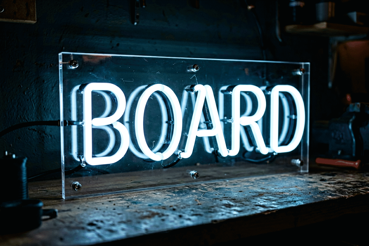
Every neon sign rides on a backing board — the acrylic layer between the glowing tubes and the world — and that board is a bigger design decision than it looks. The three types (cut-to-shape clear, full clear panel, and black backboard) change how the sign mounts, how it reads against your wall, how its light falls, and even how you clean it. Choosing right takes two minutes of understanding; choosing wrong is the most common “I didn’t know that was a choice” regret in custom signage.
This is the backing decision guide — types, trade-offs, and the matching rules — with mounting mechanics covered at how to hang a neon sign and the black-glow aesthetic explored separately in neon on black backgrounds.
What the Backing Actually Does
Four jobs at once:
- Structure — the tubes or LED flex mount to it; it’s the sign’s chassis.
- Mounting — the screw holes live here; the board is what meets the wall.
- Light physics — clear backings pass the glow’s spill (halo onto the wall); black backings absorb it, sharpening the sign’s edge contrast.
- Protection — the board keeps the flex from direct contact with walls, furniture, and hands.
None of these jobs dictates one material — which is why the choice is genuinely open, and why the three standard types each own different use cases.
Type 1: Cut-to-Shape Clear Acrylic (The Default)
The backing is routed to follow the sign’s outline — letters and shapes get their own acrylic silhouette, with the clear board essentially invisible at viewing distance.
Why it’s the most popular backing in custom signage:
- The floating look: nothing visible between the letters and your wall. The wall’s own color becomes the design’s backdrop — which is why this type dominates bedroom and living-room installs.
- Wall color becomes a design input: the same warm-pink sign glows differently on charcoal, sage, and off-white walls, and all three read correctly.
- Lighter overall, which every mounting method appreciates (drywall anchors, strips, stands).
The trade-offs: alignment during install is slightly more demanding (no panel edges to square against — use the paper template), and the routed edge between letters is the part that shows fingerprints over years (the cleaning routine handles it).
Choose it when: the wall is a feature (color, texture, brick), the sign is a wordmark or organic shape, and you want maximum light-spill onto the wall around the letters.
Type 2: Full Clear Panel
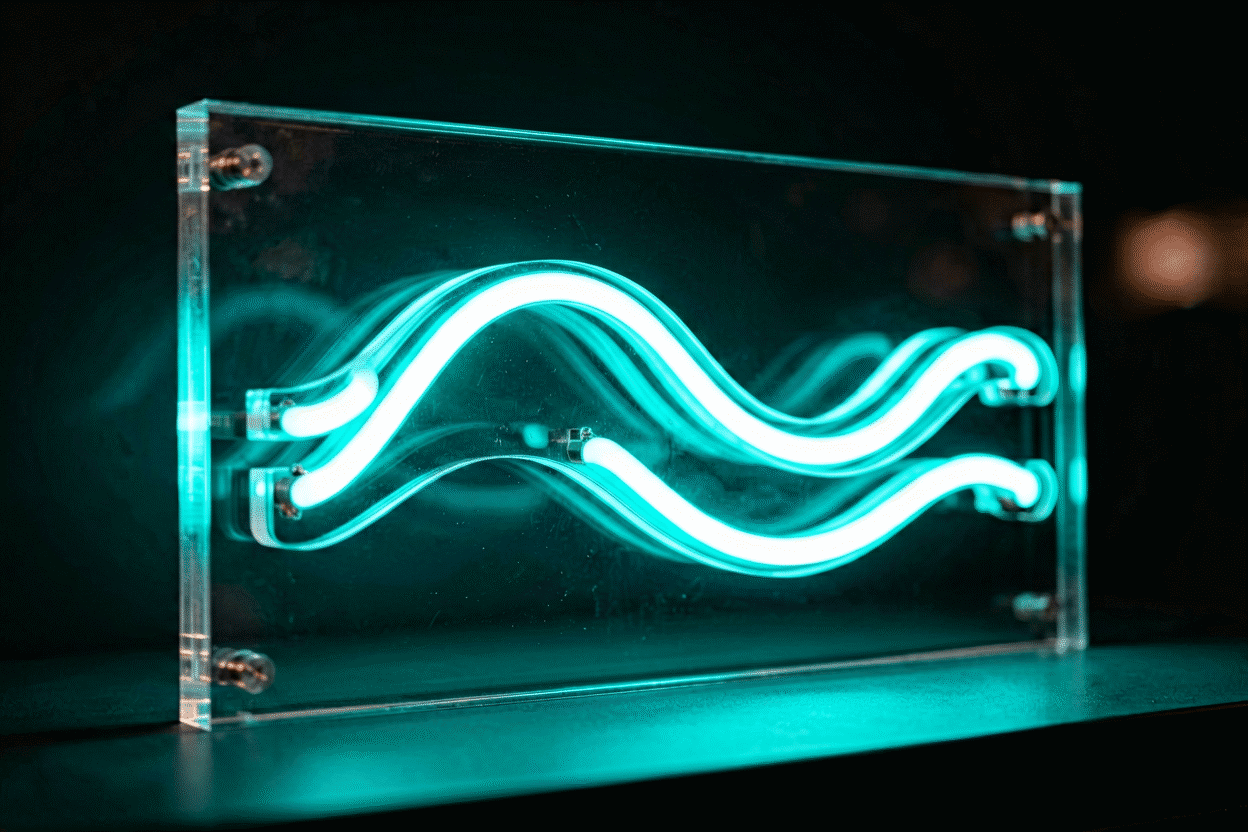
A complete rectangular (or shaped) acrylic sheet behind the whole design — letters mounted on a continuous clear field.
Its advantages:
- Easy, forgiving installation: panel edges give you built-in leveling references and consistent standoff spacing.
- Better for complex multi-piece designs: logos with detached elements, signs with many parts — the panel holds the registration that cut-to-shape would struggle with.
- Sturdier handling: one panel is more rigid than a routed silhouette; better for signs that travel (events, trade shows) or mount freestanding.
- Slightly brighter perceived output: the panel catches and diffuses a touch of the glow.
The trade-offs: the panel edge is visible as a rectangle on the wall (fine and even handsome when deliberately aligned with architecture — shelves, beams, tile lines; awkward when it sits at a random angle to everything), and reflections from room light sources can appear on the larger clear surface.
Choose it when: the design is complex or logo-like, the sign travels or mounts on stands, or your wall texture is so busy (rough stone, heavy grass-cloth) that letters floating directly against it would lose definition.
Type 3: The Black Backboard
Acrylic painted or laminated black behind the design — the dramatic option with a distinct visual physics.
What black changes:
- Edge contrast: the glow’s spill lands on black and dies, so letters read with knife-edge definition — maximum “sign” presence. The design principles behind this effect have their own piece in neon on black backgrounds.
- The frame is built-in: no wall color coordination needed — the board is the frame, which makes black backboards the neutral-choice for gallery walls, salons, and shops where the sign must look finished independent of its backdrop.
- The vintage-adjacent look: black-backed pieces echo classic motel and bar signage’s painted-panel era, pairing naturally with red, green, and amber glows (the vibe is documented in our aesthetic guides).
The trade-offs: the board’s edges are a hard rectangle of black on your wall — a stronger visual commitment than clear anything; daytime (unlit) appearance is a black panel, not invisible hardware; and wall-heat in direct sun is slightly higher (black absorbs).
Choose it when: the sign must own its zone regardless of wall color, the glow color is warm or saturated, the piece is for a business or gallery context, or the wall behind is something you don’t want visible through the design.
The Decision Table
| Priority | Backing |
|---|---|
| Floating, wall-color-forward look | Cut-to-shape clear |
| Complex/multi-part design, logo | Full clear panel |
| Travel, events, freestanding use | Full clear panel |
| Maximum edge contrast, framed look | Black backboard |
| Wall unknown/changing (rentals, staging) | Black backboard |
| Brick, textured, feature walls | Cut-to-shape clear |
| Warm glow colors (red/amber/pink) | Black (drama) or cut-shape (softness) |
| Cool glow colors (blue/white/green) | Cut-to-shape clear |
Backing and Brightness: A Subtle Interaction
The halo effect differs by type: cut-to-shape spills the most glow onto the wall (rooms get a soft ambient wash of the sign’s color — lovely in bedrooms), full panels spill slightly less and more evenly, and black boards contain the glow entirely (the room stays neutral; only the letters speak). If you’re choosing a sign partly as room lighting, prefer clear backings and warm colors; if you’re choosing it as a crisp design element, black sharpens everything.
Dimming interacts too: halo effects fade faster than letter brightness as you dim, so a black-backed sign holds its look deeper into the dim range — relevant to the settings mapped in the dimming guide.
Backing Care and Longevity
- Clear acrylic: microfiber and minimal moisture (the full technique in the cleaning guide); acrylic scratches, so no paper towels, ever.
- Black boards: same method, plus they show dust more — the monthly wipe matters visibly.
- Edges and corners are the structural weak points on all types: overtightened mounting screws crack acrylic (snug, not torqued — the hanging guide covers the quarter-inch-proud rule), and drops kill panels regardless of type.
Specifying the Backing When You Order
Every custom order includes the backing decision, and the sign builder shows each design on its available backing options — the honest way to choose is to see your actual words in all three. Two ordering notes from the repair-desk files: multi-line wordmarks with tight line spacing read best on full panels (the panel keeps visual order), and any sign destined for a stand or easel (see freestanding formats) should specify the panel for rigidity.
Backing Choices in Real Rooms
The backing decision traced through four real installations:
The brick loft (cut-to-shape, warm white). Exposed 1920s brick, and the owners wanted the wall reading through the letters — the classic cut-to-shape case (the type guide). The install detail that mattered: standoffs were specified at 0.75 inch, enough air for the brick’s texture to shadow behind the letters without the backing touching the wall’s high points. Two years of temperature cycling later: zero issues, and the wall’s character survives in every photo.
The logo wall (full panel, corporate). A business’s multi-element logo needed exact registration — detached letterforms, an icon, a registered mark — the full-panel case (the panel logic). The panel did its job holding geometry that cut-to-shape couldn’t, with one lesson learned in ordering: the panel was specified in the brand’s corporate gray rather than clear, which turned the mounting hardware invisible against it and made the sign read as a designed object rather than hardware-plus-letters. Custom panel colors are an underused option.
The bar back-bar (black board, red glow). The dramatic case: classic red script on a black backboard, mounted in the back-bar’s shadow zone (the black-glow rules). The choice’s payoff compounds at night: the board’s edges disappear into the bar’s darkness, and the letters float at knife-edge contrast — the “sign as pure glow” effect that black backs deliver. The daytime counter-effect is honest and accepted: the board reads as a black panel until 5 pm, which the bar considers pre-show quiet.
The nursery (cut-to-shape, pale pink). The soft case: a name in pale pink, cut-to-shape on the crib wall (the nursery placements). The parents’ reasoning traced the guide’s logic: the wall’s soft sage paint was the room’s palette, and a panel (even clear) would have broken its continuity; the cut shape lets the name float on the color itself. The practical addition from experience: the mounting used all six backing holes — the over-the-crib discipline — with anchors rated at eight times the sign’s two-pound weight (the drywall math).
The pattern across the four rooms: the backing choice followed the wall’s role in each — walls that feature (brick, sage paint) got cut-to-shape; walls that serve (corporate, shadow zones) got panels and boards. The backing is the sign’s answer to the wall’s question, and every room above asked it differently.
FAQ: Neon Sign Backings
What is the backing on a neon sign? The acrylic board the tubes mount to — available cut-to-shape (routed to the design’s outline, the floating look), full clear panel (a complete sheet behind the design), or black backboard (painted acrylic for maximum contrast).
What’s the difference between cut-to-shape and panel backing? Cut-to-shape follows the letters and disappears visually — the wall shows through and becomes the backdrop. A full panel is a continuous clear sheet: easier installation, more rigid, better for complex designs, with a visible rectangular edge.
Why choose a black backing board for a neon sign? Black absorbs the glow’s spill, giving letters knife-edge contrast and a built-in frame that works against any wall color — the strongest “finished sign” look, and the natural partner for warm saturated glows in businesses and galleries.
Does the backing affect how bright a neon sign looks? Yes, subtly: cut-to-shape spills the most ambient glow onto the wall, full panels slightly less, and black boards contain all spill — brightest perceived wash with clear shapes, sharpest letters with black.
Can you change a neon sign’s backing? Not practically on completed signs — the flex mounts to the board permanently. It’s a design-time decision, which is why previewing your design on each backing type in the builder before ordering matters.
Which backing is best for renters and staging? Black backboards: they look finished against any wall, so the sign works wherever it lands without wall-color coordination. Cut-to-shape is the choice when the wall itself is the feature.
The Backing Decision, Summarized
The three types compress into a placement logic: cut-to-shape when the wall is the design (feature walls, painted colors, brick — the sign floats and the wall speaks through it), full panel when the design is complex or the sign travels (logos, multi-part pieces, event work — the panel holds geometry and survives handling), and black board when the sign must own its context (any wall, drama-forward, framed by the board itself (the black logic)). Between clear types, brightness spill is the tiebreaker — cut shapes wash the wall with ambient glow, panels carry slightly more containment; black contains entirely (the interaction physics). Order the backing with the same deliberation as the words: it is half the sign’s visual behavior, it cannot be changed afterward, and the preview that shows your design on each option (the builder) is the cheapest design consultation available.
Sources & Further Reading
- Neon sign (Wikipedia) — the consolidated public record of neon-sign history and technology.