How to Design a Neon Sign: Word to Proof
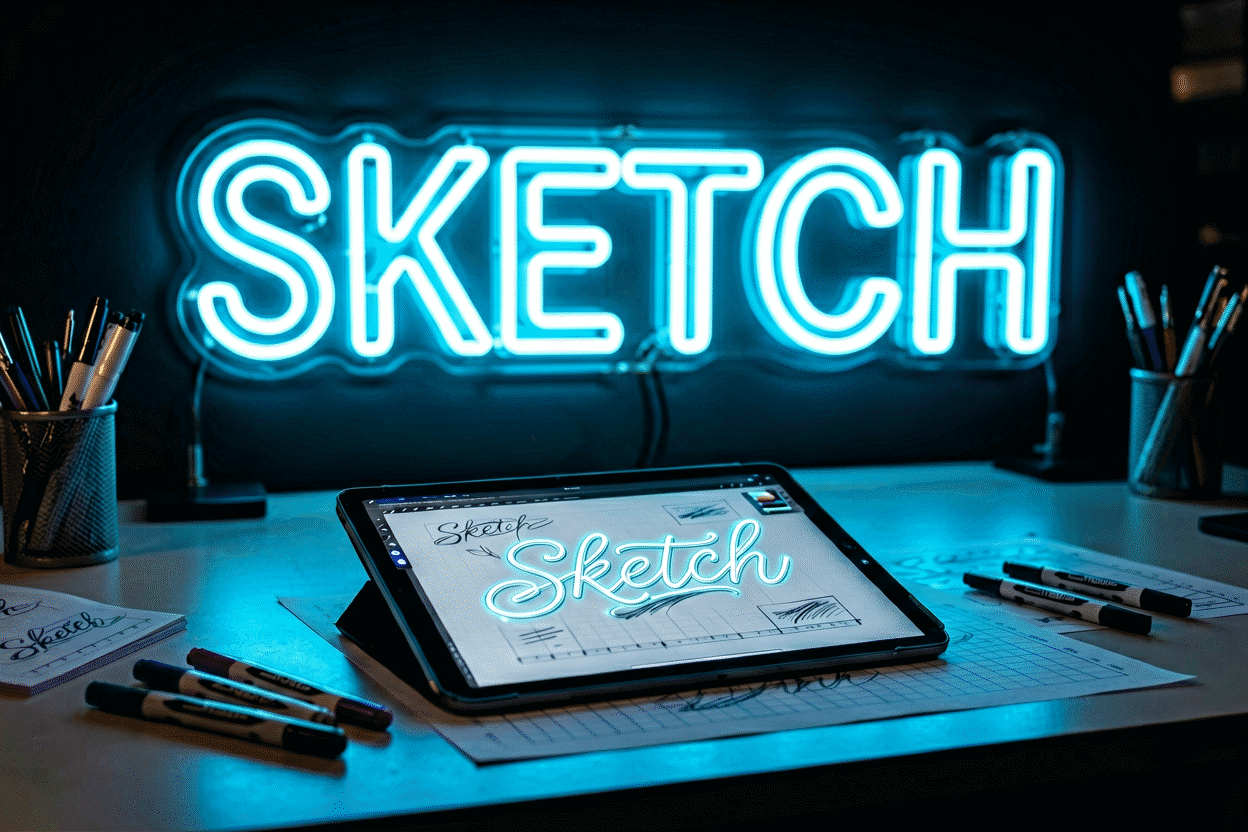
Designing a neon sign is a five-step sequence — choose the words, set the type, pick the glow, size it to the wall, and verify everything in a live preview before committing — and the difference between signs that look designed and signs that look generated happens at exactly two of those steps: the words and the preview. The typography and color theory mostly take care of themselves once the first and last steps are honest.
This is the design workflow itself, from blank page to approved proof. The materials-and-manufacturing side of what you’re designing for lives in how are neon signs made, and the full buy process in the buying guide.
Step 1: The Words (Where 80% of Design Actually Happens)
Everything downstream inherits from this decision, so give it real thought:
Say something specific. The neon that lasts is personal: names, dates, the phrase you actually say, the word that means your brand. Generic motivational vocabulary works in showrooms and ages badly at home. Test: will this still be true — and still be yours — in five years?
Budget your letters. Longer text means smaller letters at any given width (the math in the measurement guide). One to four words is the sweet spot for glow-with-presence; sentences need multi-line layouts and even then fight physics. If the message must be long, split it: the two-sign solution (a wordmark plus a small supporting icon) often beats one crowded sign.
Words shape layout. A single word runs horizontal and bold. Two words invite stacking (each line bigger). Names-and-dates form the classic three-tier wedding layout. A phrase with a natural break (“Good Vibes” / “Only”) wants the break honored, not hyphenated across a line.
Icons do sentences’ work. A heart, bolt, moon, or star says a clause in a letter’s width — often the difference between cramped and composed. One icon maximum per sign; two is a pattern, three is a poster.
Step 2: The Type (Set It Once, Right)
The full typeface analysis lives in the font guide; the design-session version:
- Script fonts: personal, feminine, decorative — and demanding: they need 20–30% more height for legibility and punish long words (the crossover loops that make script beautiful on paper make it muddy in glow at small sizes). Script for one short word or a name; block for everything longer.
- Block and sans-serif: the reliability tier — maximum legibility per inch, modern read, scale-tolerant. When in doubt, block.
- Serif and retro faces: character pieces — work beautifully for single statements in context (bars, studies, vintage schemes) and exhaust attention in phrases.
- Mixing fonts: one display face per sign, full stop. Two-typeface signs read as accidents.
Letter-spacing: err wide. Glow spreads — letters set tight merge their halos into blobs at distance. If the preview looks even slightly tight, it’s too tight; spacing wants to read generous on screen to read correct on the wall.
Step 3: The Glow (Color as Function)
Color is the most-emotionally-loaded and most-preview-able decision — the methodology lives in the color palette guide; the workflow version:
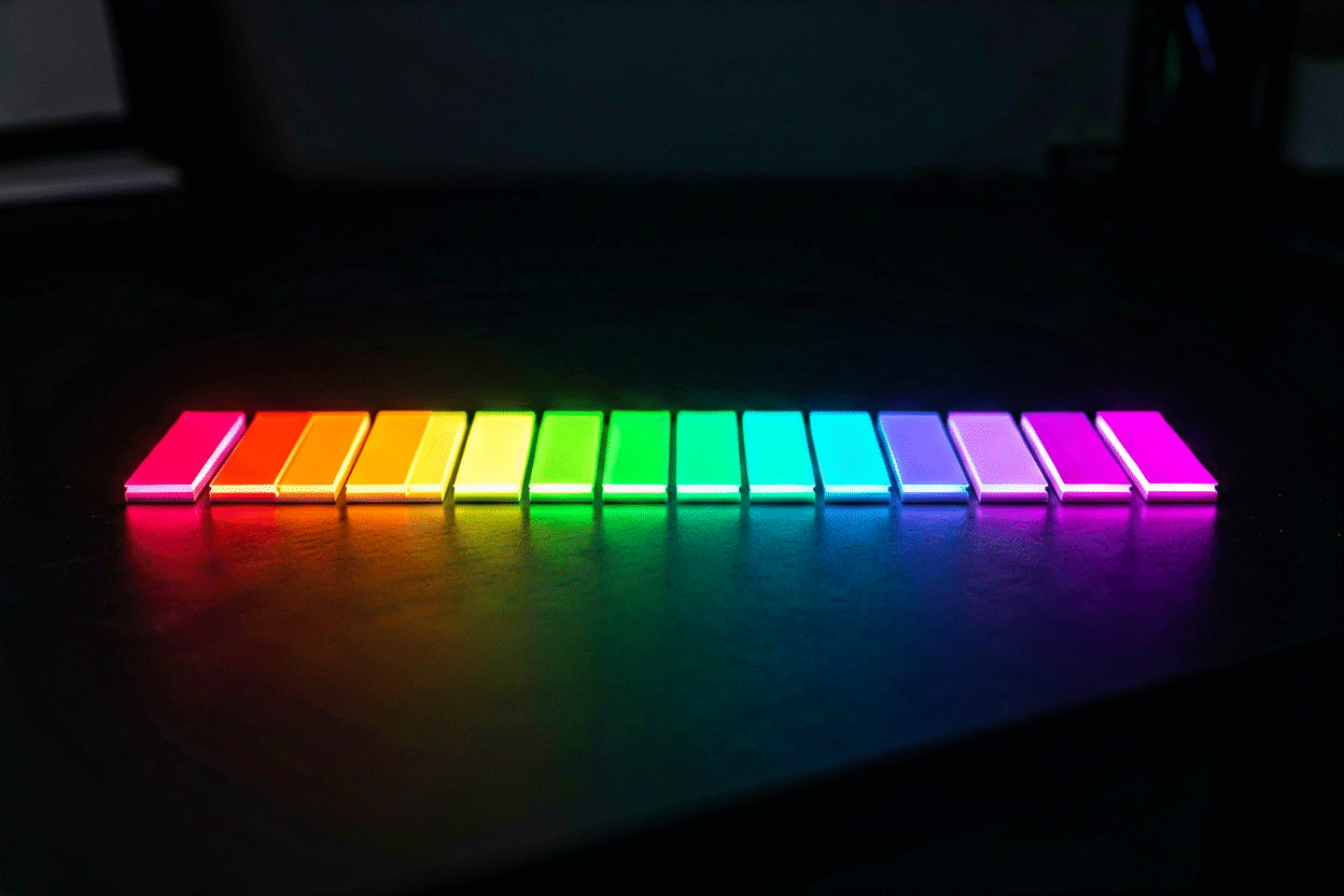
- Start from the wall, not the sign: dark and colored walls carry any glow richly; white walls want high-saturation colors (hot pink, electric blue) that don’t wash out; warm woods and earthy palettes want warm glows (amber, warm white, pink).
- Start from the mood, then check the physics: warm colors flatter people and read cozy (bedrooms, salons, events); cool colors read tech and calm (gaming, studios, bars). The psychology map covers the full vocabulary.
- One color per sign, or a deliberate two: single-color signs read as design; two-color combos (word in white, icon in pink) read as branding; three-plus colors read as arcade. The deliberate exceptions are documented in the combinations guide.
- Warm white is the champion nobody leads with: reads as premium architectural lighting rather than signage — the default for minimalist interiors.
- RGB only when the use case is actually multi-color (content walls, events) — the color-changing guide covers what you’re signing up for.
Step 4: The Dimensions (Design in Real Space)
Neon is physical — design at true size, not screen scale:
- Measure the wall first (usable width between true boundaries), then design into the number: the measurement guide walks it.
- Letter height from viewing distance (1 inch per 10 feet) sets your floor; the wall sets your ceiling.
- Paper mockup before ordering anything custom — the five-minute newspaper test that catches every scale mistake cheaply.
- Design the sign for its wall, including the backing: cut-to-shape floats against feature walls; panels organize complex designs; black boards frame and dramatize (the backing guide).
Step 5: The Verification (What the Preview Is For)
The live preview in the custom builder is the design’s final exam — not a decoration, a checklist:
- Legibility at distance: view the preview on your phone at arm’s length — that’s roughly how the sign reads across a room. If it mushes, the letters are too small or the font too fine.
- Color against the real wall: hold the previewed color against a photo of your wall (both on the same screen — consistent rendering makes the comparison honest).
- The harness check: squint. The shape that survives a squint is the sign that survives a glance; the one that dissolves needs contrast or size.
- The cord-and-power plan: where does the power exit relative to your outlet? (wire planning). Designing the exit corner now saves routing later.
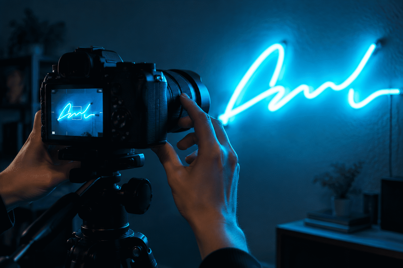
- The photography test: if it’ll appear on camera (content wall, business), screenshot the preview into a mock of the frame — full brightness blooms; plan the 60–70% dim level into your expectations (photography guide).
Five checks pass, order. The proof the maker sends is confirmation, not redesign — approve same-day and the production clock runs clean.
The Rookie Mistakes (All Fixable at Step 5)
- Too many words → cut to the essential phrase, move the rest to a second small sign or drop it.
- Fine script too small → switch to block or grow the sign; script below 3-inch letters rarely survives.
- Tight letter-spacing → widen; glow will merge everything tighter.
- Three colors because they’re available → commit to one (or a deliberate two).
- Designed to the screen instead of the wall → numbers, mockup, preview-on-phone. Every time.
Start Designing
The whole workflow compresses into one session with the right tool: the custom sign builder renders your words live in every font and glow color at true dimensions with live pricing — Steps 2 through 5 happen on screen, in minutes, with the design decisions this guide walked through. Room-specific starting points live in our collections: bedroom, bar, wedding, business.
Design Sessions: Four Signs Designed Out Loud
The five-step design flow on four real commissions:
The anniversary piece. Brief: thirty years, one phrase. Step one ran the test protocols: the couple’s actual saying (not the generic “Happy Anniversary”) survived the five-year filter — “Still Us” made it through. Step two set it in a clean block font at 3.5-inch letters (the legibility floor from an 18-foot sofa distance — the sizing law). Step three chose warm white over their initial pink instinct (the wall’s sage paint made the call — the palette logic). Step four: 28 inches of wall-measured width. Step five, the verification surprises: the preview-on-phone arm’s-length test revealed the ampersand idea crowding the phrase (dropped — the two words carry it), and the cord-exit corner got pointed at the outlet side at order. The finished piece, a year on: “Still Us” has become the household’s shorthand.
The shop logo conversion. Brief: a bakery’s established logo — script wordmark plus a wheat icon — into glow. The flow’s adaptations for brand work: step two honored the existing typeface (brand consistency outranks font-shopping — the logo is the design), step three mapped the brand’s two colors to glow equivalents (the preview against a competitor’s RGB approximation showed why native hues were worth specifying — the fidelity logic), and step five’s checklist added brand-accuracy verification (side-by-side against the style guide before approval). The lesson filed: logos design faster and verify harder than personal work — the brief arrives pre-made, and the discipline is fidelity.
The gamer’s second attempt. Brief: redo the first sign “properly.” The first attempt’s diagnosed failures (per the five checks): too many words (a full sentence at 24 inches — squint-test failure), three colors “because available” (arcade verdict), and no dimming ordered. The redesign: the gamertag alone in ice blue at 4-inch letters, one accent icon, dimming integrated, the preview verified at stream framing (the camera checks). The session’s summary from the designer’s notes: “Same wall, same budget band, different discipline — the second sign works because of what we removed.”
The nursery name piece. Brief: the baby’s name, timeless. The flow’s shortest session: step one, the name (the brief was finished before it started); step two, a classic script chosen for grow-with-her legibility (script’s demanding geometry checked at 4-inch letters — above the script floor (the font rules)); step three, pale pink against the sage wall; step four, 22 inches measured between the window and the closet; step five, the mockup’s surprise — the name’s final letter needed 2 inches more width than the preview suggested, caught by newspaper before the order. The file’s closing note: the design took forty minutes; the mockup took five of them and earned the most.
The four sessions’ pattern: the five steps scale to any brief — personal, brand, corrective, or minimal — because they’re really one question asked five ways: is this sign, as designed, the thing that should glow on that wall? (Start your own session.)
FAQ: Designing Neon Signs
How do you design a neon sign? Five steps: choose short personal words, set them in a legible font (block for phrases, script only for short words), pick one glow color from wall-and-mood, size to the measured wall with letter-height-for-distance rules, and verify everything in a live preview before ordering.
What should my neon sign say? Something specific to you — names, dates, your own phrase, your word — one to four words with presence. Specificity ages well; generic motivational vocabulary ages badly. An icon can carry what words would crowd.
What font is best for a custom neon sign? Block and sans-serif for maximum legibility per inch; script for one short word or a name (it needs 20–30% more height); serif and retro faces as single-statement character pieces. One typeface per sign.
How do I pick a neon sign color? Start from the wall (dark walls carry anything, white walls want saturation) and the mood (warm flatters, cool calms), commit to one color or a deliberate two, and consider warm white — the premium-lighting read. The full palette method is in the color guide.
How big should a neon sign be? Wall width between real boundaries sets the maximum; viewing distance sets minimum letter height (1 inch per 10 feet). Verify with a paper mockup and the preview-on-phone arm’s-length test before ordering.
Can I see what my neon sign will look like before buying? Yes — the custom builder renders your exact text, font, color, and size live with real pricing, and the maker’s proof confirms the final design at order. Preview-on-phone at arm’s length approximates across-room legibility.
Sources & Further Reading
- Neon sign (Wikipedia) — the consolidated public record of neon-sign history and technology.