Black Neon Sign Aesthetic: Dark Glow Ideas
“Black neon” is the palette’s productive paradox: black is the absence of light, so a black neon aesthetic is always a combination — the glow plus its dark counterpart, in one of three forms: the black backboard with colored letters, the black wall with a floating sign, or the blacked-out letter outline with light escaping its edges. All three trade on the same physics: against darkness, every glow reaches maximum contrast, and the room reads as mood itself — which is why the black-neon look owns gothic, cyberpunk, and dark-minimalist interiors outright.
The readability engineering of glow-on-dark lives at neon on black backgrounds; this is the aesthetic guide — the three black formats, the style registers they serve, and how to build a dark room that glows.
The Three Black Formats
Format 1: The black backboard sign. Colored flex mounted on a black acrylic panel — the sign carries its own darkness (the backing guide). This is “black neon” as a product: maximum edge contrast, built-in frame, works on any wall regardless of the room’s color. The dramatic default.
Format 2: The black wall with floating sign. Cut-to-shape signs (no visible backing) on black or charcoal walls — the “floating glow” look (mounting methods). The wall does the absorbing; the letters appear to hang in space. The minimalist-dark version.
Format 3: The blacked-out letter. Sign designs where parts of the letters or shapes render in black acrylic against the glow — half-lit words, silhouette-on-light inversions, the designer’s trick piece. The rarest and most editorial format.
The Style Registers Black Serves
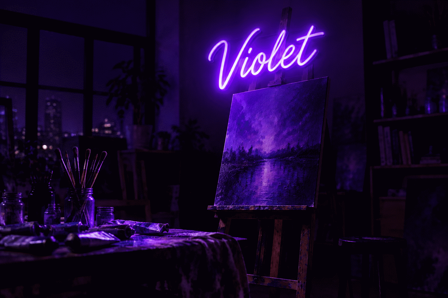
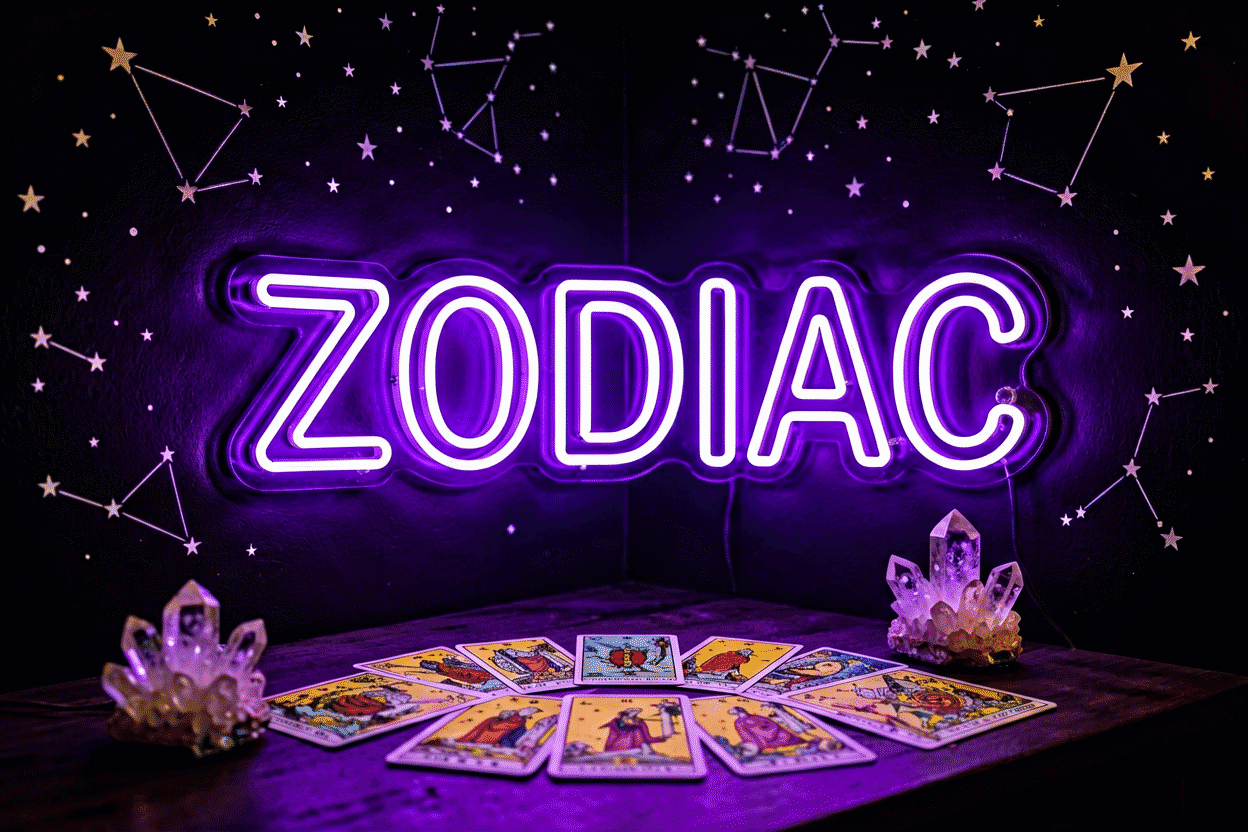
Gothic and dark-academia. The ornate register: black backboards, deep reds and purples, script fonts with weight — tarot motifs, ravens, moons (the moody purple kinship). Black is the velvet of lighting.
Cyberpunk and tech-noir. The neon-noir register: black walls, cyan and magenta glows, katakana pieces, grid iconography — the genre cinema built (the aesthetic lineage). Black makes the genre’s contrast physics literal.
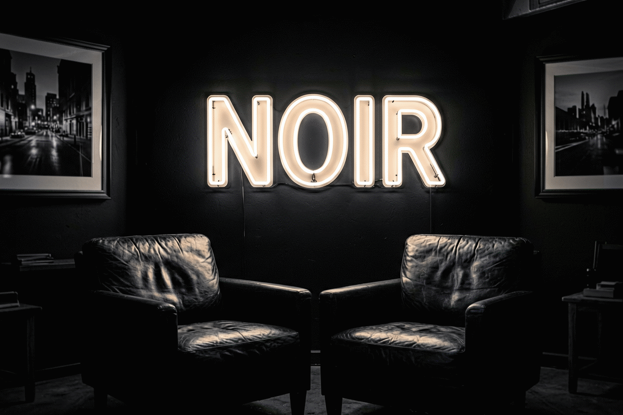
Dark minimalism. The contemporary register: charcoal rooms, one white or warm-white script (the white kinship), nothing else — the “gallery after hours” look. The most livable black format.
Bachelorette-and-black. The party register: hot pink or red on black backboards — the contrast-maximal version of festive (the pink pairing).
Why Black Works (The Contrast Physics, Briefly)
Every glow reads brightest against its darkest background — dark surfaces absorb the halo spill that light surfaces reflect, giving letters knife-edge definition (the full mechanics). Practical consequences for dark rooms:

- Signs read from further away and survive ambient light better
- Colors hit their maximum saturation visually — pinks pinker, blues deeper
- Dimming works differently: a dark room’s sign at 15% reads like a light room’s at 40% — plan settings accordingly (dimming)
The costs, honestly stated: dark rooms show dust on signs more (the wipe routine), unlit signs nearly vanish on black walls by day (the backboard format solves this), and all-black schemes ask for one disciplined glow rather than scattered accents.
The Rooms Black Owns
Media rooms and home theaters. The functional dark: signage that contributes mood without fighting screens — dimmed, minimal, monochrome (placement near screens).
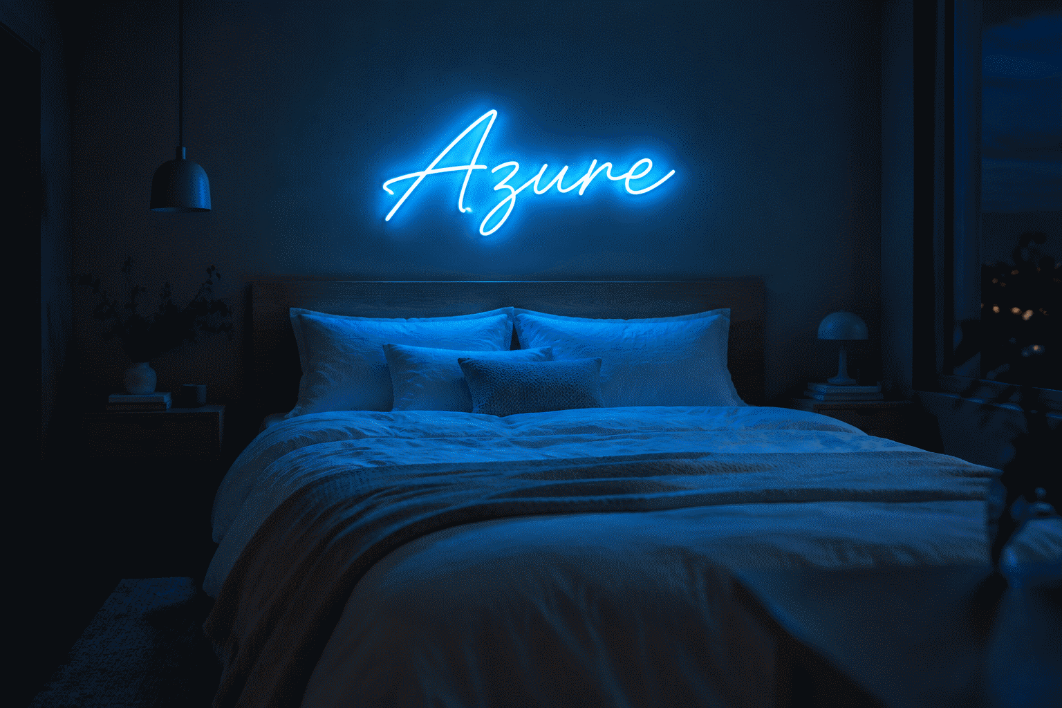
Dark bedrooms. The noir registers: red-on-black romance, purple mysticism, white minimal — the three dark-bedroom dialects (placement).
Bars, speakeasies, and lounges. The commercial home: black walls plus glow is the cocktail-bar visual formula (the bar vocabulary).
Gaming caves. The battlestation’s dark end: black-plus-neon as the default tech aesthetic (gaming colors).
Statement entryways. The single-use drama: one black-backed sign in an otherwise neutral space — the room’s one dark note.
The Pairings That Work
- Black + any single glow — the contrast dividend applies universally; choose the hue for register
- Black + hot pink — the party standard, maximum pop
- Black + red — noir and romance (the red register)
- Black + cyan/magenta — cyberpunk’s dual-tone signature
- Black + warm white — dark minimalism’s discipline (the pairing logic)
- Black + gold/brass hardware — the luxe-dark: materials carry the richness

The Sign Vocabulary in Black Formats
- Wordmarks on black boards: the framed statement — single powerful words benefit most
- Tarot and occult iconography: moons, eyes, hands — gothic’s native icons (the eye genre)
- Katakana and code text: the cyberpunk lexicon
- Celestial outlines: black-wall floating moons and stars
- Half-lit letter designs: the designer’s inversion pieces — the editorial rarity
- Song lyrics and poetry: the moody-romantic script, red or white on black
Building the Black Room (Order of Operations)
- Pick the format: backboard (any wall), black wall (committed rooms), or designer inversion (statement pieces)
- Pick the register and its glow: gothic (red/purple), cyber (cyan/magenta), minimal (white), party (pink)
- Commit to one glow statement — dark rooms punish scatter
- Stage materials: velvet, brass, dark wood — black rewards texture like no other scheme
- Plan the dim for dark-room physics — settings read brighter than the dial suggests
- Preview your word on black in the custom builder — every color against the dark, live
Galleries: neon on black backgrounds for the design rules; neon room aesthetic ideas for the whole method.
The Black-Format Workbook: Three Choices
The black-aesthetic purchase’s decision sequence:
Which black implementation — the commitment ladder. The black backboard (any wall, rentals included — the sign carries its own darkness (the backing guide)); the black wall with floating cut-to-shape (the committed room’s maximum look); the dark room itself (the full noir environment). Each step up multiplies drama and maintenance (dust visibility, dimming physics — the honest costs); choose the rung the room’s tenure supports.
Which glow carries the black? The contrast table rules: hot pink and electric blue (the genre standards), reds and crimsons (noir native), whites and warm whites (maximum elegance — dark minimalism’s pairing), purples (mood at full depth). What black asks in return: one committed hue, saturated — pastels underperform on darkness (the shade logic).
Which register does the room serve? Gothic (tarot icons, script weight, deep reds and purples — the purple kinship); cyberpunk (cyan/magenta, katakana, grid iconography); dark-minimal (one white script, nothing else — the gallery-after-hours); bachelorette-and-black (hot pink pop — the pairing guide). The register’s word-and-icon vocabulary is pre-built in each guide above.
The engineering notes black rooms need. Dimming reads brighter on darkness (settings go lower than instinct — the perception physics); the monthly dust wipe is visual maintenance, not optional (the routine); and unlit daytime presence is the black-board format’s advantage over black-wall floating pieces (the board shows; the floating sign naps until dark).
The one-config recommendation. A single word or icon in hot pink or warm white on a black backboard, mounted centered, dimmed to the 20% evening register — the full noir effect in the one purchase that works on any wall, in any lease (compose it).
FAQ: Black Neon Aesthetics
What is a black neon sign? One of three formats: colored glow on a black backboard (the product form), a floating sign on a black wall (the room form), or blacked-out letter elements against glow (the designer’s inversion) — “black neon” is always the glow-plus-darkness combination.
Why does neon look better on black? Contrast physics: dark surfaces absorb the glow’s halo spill instead of reflecting it, giving letters knife-edge definition and colors their maximum visual saturation — the full mechanics are in the black-background guide.
What colors go best with black neon aesthetics? Any single committed glow: hot pink (party pop), red (noir romance), cyan and magenta (cyberpunk), purple (gothic depth), warm white (dark minimalism) — the discipline is one statement, not scatter.
Is a black neon aesthetic good for bedrooms? The dark-bedroom dialects — red-on-black romance, purple mysticism, white-on-black minimal — are among the most-pinned bedroom looks; plan dimming for dark-room physics (settings read brighter) and expect the coziest low-dim glow in the palette.
What’s the difference between a black backboard and a black wall? The backboard travels with the sign — maximum contrast on any wall, works in rentals and redesigns. The black wall is the room’s commitment — the floating-glow look for spaces that have decided who they are.
Do black neon signs show dirt? More than any other scheme — dark surfaces display dust prominently. The monthly microfiber routine matters visually in dark rooms, not just optically (the method).
The black-format summary: three implementations (backboard, wall, room) on the commitment ladder, every saturated hue at its maximum contrast, the gothic-cyber-minimal registers served in one format family, and the dust-wipe honesty that keeps the drama honest (mount the drama). The black room done right is the medium’s most photographed register for physics reasons — contrast doing the design work, the glow doing nothing halfway. One statement, one hue, one dark stage: the formula noir established and every era since has re-shot. Can I paint my existing backing board black? Yes — acrylic takes matte black paint cleanly (light sanding, spray application, two coats), and the result performs identically to factory black boards at arm’s length. The honest caveats: edge coverage takes care (visible edges show the conversion), and warranty terms may classify it as modification (the boundary) — a fair trade for salvage projects, a factory-black order for everything new.
Sources & Further Reading
- Neon sign (Wikipedia) — the consolidated public record of neon-sign history and technology.
- Neon, element 10 (Wikipedia) — element properties: density, boiling point, abundance.