21 Open Sign Ideas Beyond the Basic Blue
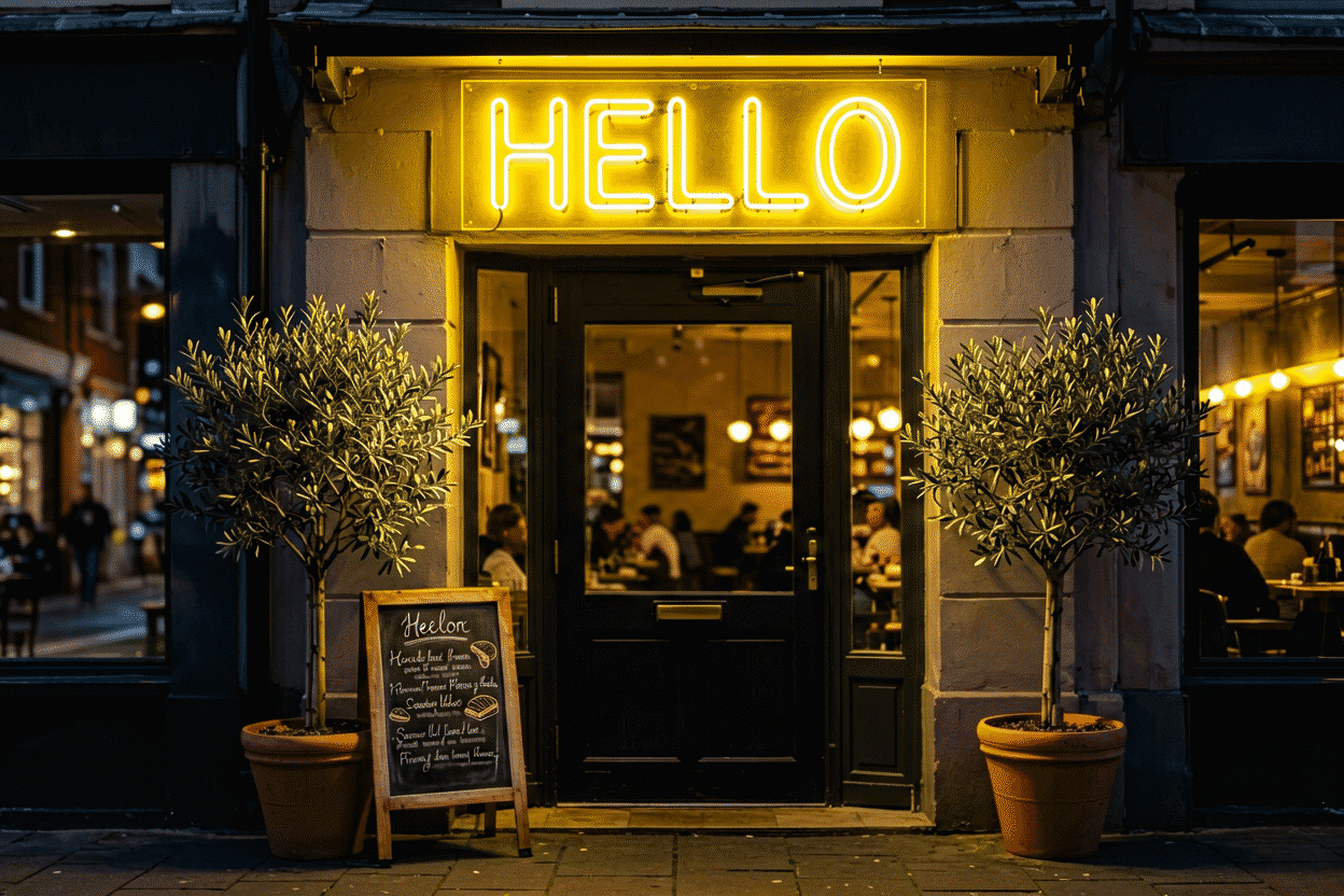
The standard open sign — blue script, red accent, window center — works because it’s a century-learned pattern. But the pattern is a floor, not a ceiling: the businesses with the best street presence run open signs that do the standard job (readable, believable, visible) while saying something the standard sign can’t. This is the idea tier: 21 open-sign concepts by register, from the classics to the customs that turn a status sign into a brand piece.
The decision tier — types, costs, placement physics — lives at the open sign guide; the shopping at open signs.
The Classics, Done Right: Ideas 1–4
- “OPEN” in trade colors — the standard format with the palette matched to the business (the color logic): blue-red for the defaults, but green for food, white for premium, orange for the friendly trades.
- “OPEN” + hours — the honest upgrade: the format that answers both street questions at once, and the cheapest credibility any sign buys.
- The open/closed pair — two states, one frame: the flip or slide format for the businesses whose hours run irregular (the guide’s rules tier).
- “OPEN 24 HOURS” — the always-on format: for the businesses that never close, the sign that never lies.
The Trade Registers: Ideas 5–9
- The bar’s open piece — “BAR OPEN” in amber and ice blue (the bar canon): the evening trade’s street presence.
- The gym’s open sign — blue “OPEN” plus the 24-hour marker (the gym canon): the fitness trade’s before-dawn beacon.
- The ice cream cone “OPEN” — the icon-flanked format (the ice cream tier): the sign whose shape sells while its text informs.
- The liquor store’s register — “OPEN” with the bottle silhouette (the tier): the trade-sign shorthand.
- The coffee cup “OPEN” — the steam-and-cup icon plus the word: the café’s morning signal, legible before the street’s fully awake.
The Wordless & Icon Tier: Ideas 10–12
- The glow-alone signal — an icon with no text (the shop’s symbol, lit): the businesses whose brand is known enough to drop the word — the confidence tier.
- The arrow open sign — “OPEN →” pointing at the door: the format for the entrances that hide around corners.
- The neon-eyes emoji tier — the winking-face icon with “OPEN”: the social-era register for the businesses whose customers photograph everything.

The Custom & Brand Tier: Ideas 13–16
- The logo-open hybrid — the business’s mark with the word: the brand-plus-status format, custom-built (preview).
- The name-open combo — “[BUSINESS NAME] — OPEN”: the two-fer that brands while it informs, strongest for the new businesses that need both.
- The script-register custom — “Come In, We’re Open”: the friendly phrase tier — the open sign with the door’s actual voice (the full range).
- The trade-humor piece — “OPEN (Yes, Really)” / “We’re Open, You’re Not”: the registers that carry the personality-forward trades.
The Modern Formats: Ideas 17–19
- The remote-dimmable open sign — brightness by hour: full for the morning commute, softer for the evening street (the guide’s features tier).
- The color-changing open — the RGB format that runs the seasonal registers: green at Christmas, pink in October, standard blue the rest (the color logic).
- The animated-border classic — the chasing border around “OPEN”: the highest-visibility format, used once per storefront and honestly.
The Placement & Program Tier: Ideas 20–21
- The two-surface program — window sign for the sidewalk, wall sign for the parking approach: the two-audience system most storefronts actually need (the physics).
- The open-plus-content pairing — the open sign above the daily-message board: the status tier plus the content tier, the composition that keeps the window working every hour it’s lit (the full case).
The Register Discipline
The idea tier’s discipline: creativity serves legibility, never replaces it. The trade-humor piece that’s unreadable at 30 mph is a worse sign than the plain blue; the icon-tier confidence sign for an unknown business is a riddle. The sequence is status → visibility → brand: get the first two right (the guide covers the physics), then let the register ideas do their work on the third.
The color runs by trade (the business palette), the size by street type (the guide’s speed-reading math), and the customs preview free at the customizer — the open sign that says the standard thing unusually well beats the unusual thing badly.
The Trade Register Table
The creative tier’s discipline in one table – the trade, the register, the piece that works.
| Trade | The register | The ideas that land |
|---|---|---|
| Food & drink | Warm-appetite | The coffee cup, the slice, the trade phrases (the restaurant canon) |
| Beauty | Pink-chrome | The compliment pieces, the script registers (the salon canon) |
| Retail | Style-matched | The boutique script, the streetwear block (the retail canon) |
| Nightlife | Bold-saturated | The marquee pieces, the genre markers (the club canon) |
| Fitness | Energy | The motivation registers, the 24-hour blue (the gym canon) |
| Professional | Warm-white restraint | The quiet tiers, the trust registers (the office canon) |
| Trades & services | Utility-bold | The offering lists, the honest hours (the garage canon) |
The table’s use: the trade sets the register, the register sets the palette (the logic), and the creative tier works inside them – the novelty piece that survives its trade’s register converts; the novelty piece that breaks it costs the credibility the sign exists to build.
The Creative Ceiling: What Originality Can and Can’t Do
The ideas tier’s honest limits: creativity optimizes the third job (brand – the piece that photographs, the phrase that quotes), but the first two jobs (visibility and status) run on physics and honesty (the guide). The creative piece that’s unreadable at speed fails the first; the creative piece that’s wrong about the hours fails the second; and no amount of wit recovers either. The sequence is status, visibility, brand – the creative tier arrives last and works only after the first two are secured.
The ceiling’s encouragement: within the secured physics, the creative tier is where the small business out-signs its chain competitors – the custom phrase, the trade’s own joke, the logo-open hybrid (preview) – the pieces no franchise can approve. The street’s best signs are always the independents’, and the ideas tier is why.
FAQ About Open Sign Ideas
What’s a creative open sign that still works? The trade-icon format — the coffee cup, ice cream cone, or bottle beside “OPEN” — creative enough to brand, legible enough to convert (the trade registers). The humor tier for the personality trades.
Should my open sign match my business colors? If the brand colors read at distance, yes (the logic); if they’re subtle (the pastel tier), keep the open sign’s high-contrast default and let the interior carry the brand.
Are novelty open signs worth it? When the trade is personality-forward (tattoo, bar, boutique) — the novelty registers convert. When the trade is trust-forward (pharmacy, dental), the classic formats win: novelty reads as instability where stability is the product.
Can I custom-design my open sign? Yes — the logo-open hybrid and name-combo formats are the standard customs (preview); the custom route’s value is the brand tier doing the status tier’s job in the same square footage.
What is the most effective open sign design? The classic “OPEN” in blue-red at the window’s center, sized to the street’s speed – the century-converged format that still outconverts every creative variant (the guide’s physics). The effective-creativity tier: the trade icon beside the word (the cup, the slice, the cone – the piece that pre-qualifies while it informs) and the logo-open hybrid (preview) for the brand-forward. The ineffective tier: the unreadable novelty (the creative piece that sacrifices legibility has sacrificed the sign’s only job), and the animated bargain register that reads discount-store at any distance.
How much does a creative open sign cost? The standard tier runs $60-200 (the blue-red classic and the hours format); the trade-icon tier runs $100-300 (the cup, the slice, the cone beside the word); the custom hybrids run $150-500 (the logo-open and the name-combo builds – preview) (the cost brackets). The creativity’s honest pricing: the trade-icon piece costs the same as the plain piece it upgrades – the icon is a design choice, not a price tier. The creative ceiling’s advice: spend the custom budget on legibility before wit – the readable-novelty piece outperforms the witty-unreadable one at every budget.
Can an open sign be custom made? Yes – the logo-open hybrid and the name-combo formats (preview): the business’s mark joined to the “OPEN” (the brand doing the status’s job in the same square footage) or the name and the word composed (the two-fer the new business needs). The custom’s brackets run $150-500 (the cost guide) against the stock tier’s $60-200 – the premium buying the brand integration the catalog can’t. The custom’s disciplines: the legibility first (the word readable at the street’s speed – the guide’s physics) and the brand second (the mark that joins it), because the custom open sign that sacrifices the read for the brand has sacrificed the sign’s only job.
What’s the current style beyond the classic OPEN script? The register has split into three currents: the vintage arrow (retro script with a pointing chevron, the diner lineage), the minimal lowercase (“open” in small warm-white, the café lineage), and the illustrated icon (a steaming cup, scissors, a dumbbell) that lets the symbol carry the message. The classic red-blue oval still sells — mostly to trades whose customers expect it — but new storefronts are choosing lineage-specific registers that match their interior.
Should the open sign double as the brand sign? For small storefronts, one dual-duty piece (brand name above, “OPEN” beneath, both on one backing) saves window real estate and budget — but the combination works only when the name is short and legible at street distance. Longer names or detailed logos belong on their own piece; cramming a wordy brand mark into a dual sign produces two unreadable messages where one clean one would have worked.
Sources & Further Reading
- Neon sign (Wikipedia) — the consolidated public record of neon-sign history and technology.
Pricing based on CustomNeon’s current catalog (2026); custom quotes come live from the sign builder.