
Blog
How to Decorate a Kitchen with Neon: 10 Glow Ideas
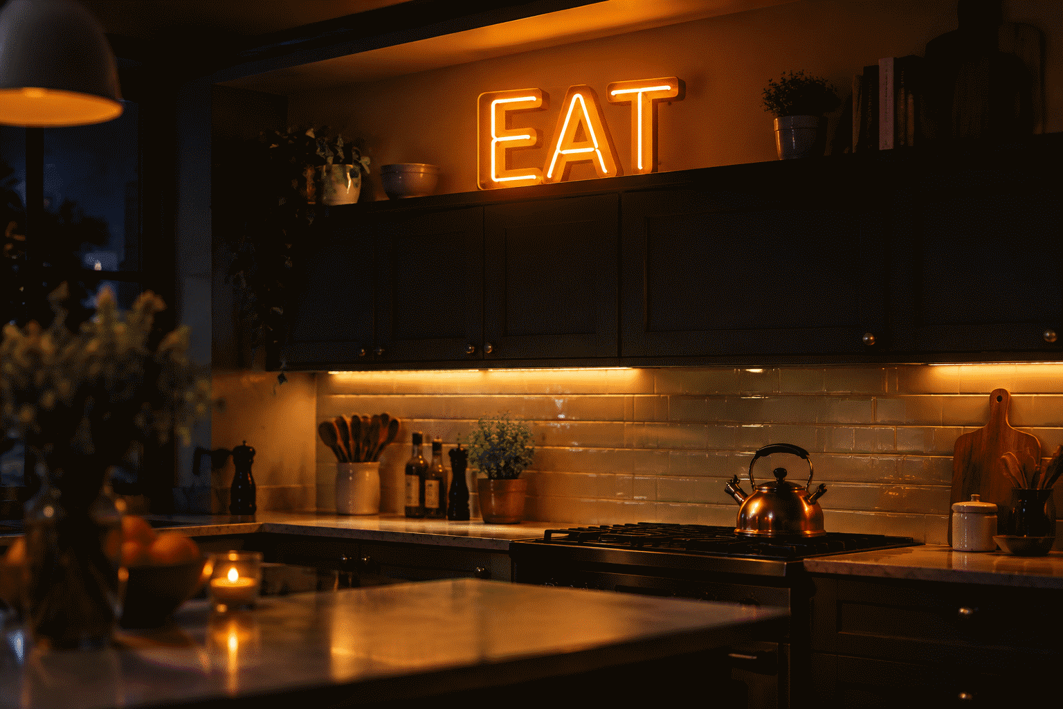
A kitchen is the hardest room to decorate well, and everyone who has tried knows the three reasons: the walls are small and interrupted (cabinets, hood, window, fridge), the air is hostile (steam, oil, splatter), and the room’s real decor is already decided by the counters and appliances. That is why kitchens accumulate either nothing or clutter.
The shortcut through all three problems is a small LED neon sign. It owns the one wall section kitchens actually have free, shrugs off the atmosphere (more on the honest steam rules below), and works the hours kitchens matter — the dark morning corner and the evening wind-down when the overheads are off. This guide covers where a kitchen sign goes, what it says, what color behaves best near food, and the ten configurations that work in real kitchens, from the studio galley to the open-plan wall.
The Kitchen’s Four Rules (Read Before Buying Anything)
Kitchens break decor the way bedrooms and living rooms never do. Four constraints decide everything:
Rule 1: The working radius is sacred. Map the zones where heat, water, and knives live: the 30-inch halo around the range, the splash arc of the sink, the landing zones beside each appliance. Decor goes outside those arcs — which usually leaves exactly three candidate walls: above the cabinets, the side of a cabinet run or fridge, and the eating-area wall. This is not a limitation; it is the room telling you where the sign goes.
Rule 2: Steam is a spectrum, not a wall. Standard LED neon builds handle kitchen humidity fine at the eating wall and cabinet-top positions. Direct proximity changes the math: the zone within a couple of feet of the range hood and over the kettle is where grease film and sustained steam live, and that zone wants nothing mounted in it — neon or otherwise. The eating wall and above-cabinet tier are the standard installations; directly behind the stovetop is the one spot nobody should mount anything.
Rule 3: The wipe-clean test. Kitchen decor collects the room’s air. LED neon passes the kitchen’s maintenance test better than canvas, fabric, or paper decor: the acrylic face wipes down with a damp cloth, and there is no grille or shade to trap grease. Run the wipe test on any candidate object — if it can’t be cleaned in thirty seconds, it can’t live in a working kitchen.
Rule 4: One glow source per room. Kitchens already have the brightest lighting plan in the house. A kitchen neon sign is not the room’s light — it is the room’s evening mode, the tier that takes over when the task lights go off. Choose and place it like a lamp, not like a light.
Where It Goes: The Three Kitchen Positions
Above the cabinets (the classic). The 12–20 inch strip between cabinet tops and ceiling is dead space in 90% of kitchens — and it is the perfect neon run. A long, low sign (a word at 36–60 inches wide, 10–14 inches tall) laid flat against the wall up there glows down across the cabinet faces. Dust is the only enemy; the position is outside every working arc by definition.
The eating-wall tier. The breakfast nook or eat-in counter wall is the kitchen’s “living room wall” — seat height sightlines, safe distance from cooking, and the spot where faces sit. A sign here is at conversation distance, so it can carry more text: phrases work on the eating wall where a single word wins everywhere else. This is also the position where a dimmer earns its keep; the nook sign at 30% output is the kitchen’s candle mode.
The fridge side or narrow gap wall. The 18–30 inch vertical sliver beside the fridge or at the end of a cabinet run — useless for anything with depth — suits a small vertical script or a single symbol piece. The accent tier: a tiny piece that makes the kitchen feel designed rather than equipped.
What It Says: The Kitchen Text Canon
The kitchen’s most-decorated word is the room’s own — “EAT,” “KITCHEN,” “COOK” — and it survives because it works. The fuller canon by tier:

- The one-word classics. EAT, BREW, BAKE, YUM. The above-cabinet run is their native habitat. Safe forever, reads from every angle, and forgives every font.
- The functional phrase. “But First, Coffee.” “Fresh Is Best.” “Eat Drink & Be Merry.” Eating-wall tier — phrases live where people linger.
- The family register. The family name over the eating nook, the “EST.” year with it — the kitchen is the room where the family-name piece actually fits (it can read as design rather than as a proclamation in a way living-room name signs rarely pull off).
- The unit of measure. “Table for Two.” “Serves 4.” The witty tier — a phrase that only makes sense in a kitchen.
- The symbol piece. A coffee cup, a rolling pin, a chili, a lemon — the no-word option for kitchens whose text quota is already spent on art or tile. Symbols also age better than jokes, if you plan to keep the piece a decade.
The one-word test before ordering anything longer: say the phrase out loud in the sentence “welcome to my kitchen.” If it sounds like a mug you’d buy, it will read like a mug in eight months. The classics pass that test permanently.
What Color: The Science of Glow Near Food
Color in a kitchen is appetite design, and the science is settled enough to design by:
- Warm white. The kitchen’s default, and the correct one for most rooms: it flatters food tones, matches the under-cabinet lighting most kitchens already run, and makes 11 p.m. water-run trips gentle. The full behavior of the white family is covered in our white sign guide.
- Orange and amber. The appetite colors — the same register as restaurant signage and sunset light. Orange glow near food is the most widely used commercial kitchen trick, and it works at home for the same reason (the mechanics of the hue itself are in what makes neon orange; our orange kitchen ideas covers the full room treatment).
- Yellow. The bright-morning register — lemon, butter, daylight. Works in white and wood kitchens as the single warm accent; our yellow kitchen guide does the shade-by-shade breakdown.
- Green. The fresh register — herbs, produce, farmers-market. The color of “real food,” which is why it dominates cafe and market branding; the green kitchen sign page covers its room behavior.
- Blue and purple: the one honest warning. Saturated cool tones are appetite suppressants — the reason fast-food interiors almost never run them. Fine for a bar nook or a bold design kitchen; wrong for the eating wall of a room where picky eaters live.
The kitchen landing page carries the full range of ready designs by color and text — kitchen neon signs.
The Ten Kitchen Configurations That Work
- “EAT” above the cabinets — the classic run, 40+ inches wide, warm white.
- Coffee-corner piece — a cup symbol or “But First, Coffee” at the machine station; small, amber.
- Nook phrase — the eating-wall tier at conversational scale, dimmable.
- Family name + EST. year — over the breakfast nook; the kitchen’s heirloom position.
- The narrow-gap script — a vertical word in the fridge-side sliver.
- Open-plan divider sign — on the wall/peninsula that separates kitchen from living space, marking the zone (bar-side register).
- Cafe menu board glow — a frame or shelf lit by a small sign behind it, for the wall that holds the household’s actual paper clutter.
- Herb-green accent — a green leaf or market symbol by the window wall, paired with real plants.
- The pantry door piece — “PANTRY” or a symbol on the door itself; the door becomes the decor.
- The bar shelf runner — a low sign under the open shelf where glassware lives; the after-dinner register.

Each starts as a custom build — create yours at the width your wall section gives you.
The Small-Kitchen Tier
The studio galley and apartment kitchen get the same system at the smallest scale: one symbol piece or a three-to-five-letter word at 14–18 inches, eating-wall or above-cabinet only, warm white or amber. The small kitchen’s sign is doing one job — making a utility room feel chosen — and a small piece does it. Resist the galley’s one temptation: nothing over the stovetop, however blank that wall looks.
Complete the daily-room set: the how to decorate a bedroom walkthrough covers the calmer sibling room, and our how to hang a neon sign guide handles the mounting step this plan ends on.
FAQ: Kitchen Neon and Decor
Is a neon sign OK in a kitchen? Yes, at the right positions — the eating wall, above the cabinets, the fridge side. LED builds run cool and wipe clean. The zone to avoid is direct proximity to the range and kettle, where sustained steam and grease film live.
What should a kitchen neon sign say? The one-word canon (EAT, BREW, BAKE) on working walls, phrases on the eating wall where people linger, family name + year for the heirloom tier, or a food symbol where the text quota is spent.
What color neon is best for a kitchen? Warm white for most rooms, orange and amber as the appetite register, yellow for morning brightness, green for the fresh-market look. Saturated blue and purple suppress appetite — save them for bar corners.
Where do you hang a kitchen sign? Above the cabinets (the long-run classic), the eating nook wall (conversation distance, dimmable), or the narrow gap beside the fridge. Working arcs — range halo and sink splash — stay empty.
How do you keep a kitchen sign clean? A damp cloth on the acrylic face, done in seconds — no grille or fabric to trap grease. It is the same wipe-clean quality that makes neon the rare decor category rated for kitchen air.
Can a kitchen sign run on a smart plug? Yes, and it should — LED builds are friendly to standard smart plugs and timers. The kitchen’s two scheduled modes do themselves: the morning tier at breakfast brightness, the evening tier dimmed to the candle register after dinner.
How big should a kitchen sign be? Above-cabinet runs go long and low (36–60 inches); eating-wall pieces sit at 18–30 inches; gap-wall accents at 14–18. Measure the wall section first — kitchens give you exact widths between cabinets and windows, unlike living rooms, and the sign should respect those boundaries to the inch.
Light the Room That Feeds the House
The kitchen decor problem was never ideas — it was the room’s constraints. Pick the wall section your kitchen actually gives you, match the register above, and build the piece at that width. The evening kitchen, solved.
More by room: kitchen sign designs, orange kitchen ideas, yellow kitchen ideas.
Sources & Further Reading
- Mercury (U.S. EPA) — federal guidance on mercury exposure and safe handling.
- Neon sign (Wikipedia) — the consolidated public record of neon-sign history and technology.