20 Neon Wall Art Ideas Beyond the Words
Strip the words out and neon becomes something older: pure drawing in light. A neon line, bent by hand or engineered to mimic it, does what a brushstroke does — it describes a form in one gesture. The wordless piece is neon’s high-art register, the one galleries noticed decades before living rooms did, and it solves the decorator’s hardest problem: art that carries a wall without saying anything the room has to agree with.
Here are 20 ideas in the shape-and-line register — icons, forms, abstractions, and the two custom categories that changed the market — with the composition logic that keeps a glowing shape reading as art. The text tier lives across the guides; the full catalog lives at neon signs for sale.
The Celestial Tier: Ideas 1–4
- The crescent moon — the most-hung shape in neon history: warm white over beds and reading corners, the icon that flatters every style from boho to minimalist.
- The sun-and-moon face — the celestial-pair classic; the drawing that carries a whole wall in two forms.
- The planet with ring — Saturn as a single line: the space register’s most-photographed object (the space tier family).
- The constellation set — three to five small stars plus one connecting line: the wall that maps a sky, and the night light that doubles as it.
The Botanical Tier: Ideas 5–7
- The single-line flower — one continuous stroke from stem to petal: the minimalist’s botanical, in warm white or soft pink.
- The cactus — the desert icon, arms and all: the boho and southwest registers’ shared signature.
- The fern or leaf outline — the botanical tier’s softest option; pairs with living plants so well the joke is intentional.
The Figure & Form Tier: Ideas 8–10
- The single-line face — the continuous-line portrait: the gallery-era piece that made neon-wall-art a phrase; hangs where a print would, glows after dark.
- The hand or eye — the mystical-form register (the eye tier adjacent): the icon that reads spiritual without committing to a doctrine.
- The dancing figure — the kinetic form: one body mid-motion, the piece that makes a static wall move.


The Icon Tier: Ideas 11–14
- The heart — the universal form, from outline to melting (the heart archive runs the phrase versions); the shape that never needs translation.
- The lightning bolt — the energy form: rock-and-roll’s shorthand and the gaming corner’s accent in one stroke.
- The smiley — the mood icon, softened to outline: the anti-seriousness piece for rooms that take themselves too lightly.
- The skull — the rock register’s icon (the tier context): the shape that carries a garage or studio wall in any color.
The Object & Place Tier: Ideas 15–17
- The palm tree — the vacation form: sunset colors optional, the mood mandatory (the palm tier context).
- The guitar — the music room’s icon (the format shows the brand-fusion version): the shape that plays the wall.
- The skyline — your city in one continuous line: the hometown piece, the memory piece, and the most-customized shape in the category (preview yours).

The Abstract & Custom Tier: Ideas 18–20
- The wave or arc — pure form, no icon: the oversized arc over a sofa is the minimalist living room’s strongest single move.
- The scribble — the deliberate-non-deliberate line: the contemporary-art register, hung like the gallery piece it imitates.
- The custom drawing — your child’s doodle, a pet’s portrait, the family’s handwriting (the customizer takes any line): the category’s emotional ceiling — the piece that is unbuyable anywhere else because it’s yours.
Composition for Wordless Neon
Shape-tier composition runs stricter than text because there’s no message to carry the weight: the form must own its wall’s negative space. One oversized shape (36 inches up) on a clean wall reads as art; three small shapes in a balanced cluster read as a collection; the same three scattered read as clutter (the size guide covers the ratios).
Color runs quieter than the text tier: warm white and single-accent colors dominate — the shape is the statement, and the palette’s job is restraint (the color logic). Brightness at 30–50% for living rooms, 15–20% for bedrooms: shape neon is the dimmest register in the house, which is exactly why it reads gallery. And mounting runs the art-standard mechanics from the hanging guide — centered, level, cord-invisible — because a crooked glowing line is a crooked drawing, and the wall will not forgive it.
The Shape Tier’s Placement Physics
Wordless neon runs its own placement physics – tighter than text, because the form carries the whole statement.
The one-form rule: a single shape at 36+ inches on a clean wall reads as art; the same shape at 18 inches reads as a gadget. The shape tier’s scale runs bigger than intuition suggests – the form’s simplicity is what permits (and demands) the size. The arc at 48 inches over a sofa is the minimalist living room’s strongest single move; the arc at 24 is a knickknack (the sizing logic).
The cluster composition: three small shapes in a balanced arrangement (the constellation set, the botanical pair plus single) reads as a collection when the spacing runs deliberate – the triangle’s geometry, the even negative space, the consistent scale. The same three shapes scattered read as clutter; the composition is in the spacing, not the pieces (the wall-decor method covers the geometry).
The negative-space frame: the shape tier wants 12+ inches of clean wall on each side – the form reads because the wall lets it. The shape squeezed between the shelf and the window loses the statement the size was buying; the shape centered on the empty wall carries the room (the wall-art logic above develops the case).
The Commission Tier: From Photo to Glow
The custom-drawing route (the child’s doodle, the pet’s portrait, the handwriting) runs a simple process: the line art converts (any clean line drawing – photo references for the portraits, the original for the doodles – the customizer previews the conversion before the build), the stroke simplifies (the neon tube draws in continuous lines; the drawing’s shading becomes the designer’s simplification, previewed for approval), and the piece scales (the drawing’s proportions hold; the size runs by the wall, not the paper).
The commission tier’s budgets: the pet portraits and doodles at $150-350 by size (the pet canon’s flagship), the handwriting conversions at $120-300 (the personalized logic), the skyline and place pieces at $200-450 (the wall-art range). The commission’s value proposition is singular: the piece that exists nowhere else – the drawing that outgrew the fridge, the hand that outlived the pen – and the price of uniqueness has stayed remarkably reasonable (the brackets).

FAQ About Neon Wall Art
What’s the best neon shape for a living room? The oversized arc or wave — pure form, warm white, 36 inches up: the minimalist’s strongest single move. The single-line face and moon carry the quieter rooms; the living-room canon has the full placement logic.
Can you turn a drawing into a neon sign? Yes — custom shops take any line drawing (a child’s doodle, a pet portrait, handwriting) and bend it in light; the customizer previews the conversion. It’s the category’s most-gifted tier and its emotional ceiling.
How big should a neon art piece be? The wall’s anchor furniture minus 20–25%, same as text — or oversized deliberately (48+ inches) when the wall is empty and the form is simple. The size guide has the chart.
Is neon wall art tacky or classy? The execution decides, and the physics is consistent: the wordless warm-white shape at scale reads gallery (the single line-art face, the oversized arc – the pieces the minimalist living rooms run), while the small bright novelty shape reads dorm. The class signals, ranked: warm white over bold color, outline over fill, oversized over small, dimmed over full-power, and one focal over the scatter. The shape tier that follows the signals reads classy in every room type; the tier that breaks three of them reads tacky in the same rooms – the medium is neutral, and the execution is everything (the composition logic above).
What is the best neon shape for a minimalist room? The single continuous line: the one-stroke face, the wave, the arc – the form that carries the room’s restraint while completing it (the shape tier above). The piece runs warm white at thirty-to-fifty percent, sized oversized (thirty-six inches up – the minimalism that wants the one piece to be the right piece), and hung at the gallery standard with the cord invisible. The minimalist’s test: if the piece disappeared, would the room look better or worse? The answer better means the room was finished; the answer worse means the piece was doing its job.
Can neon count as fine art or is it decor? The museum world settled this decades ago — light works sit in permanent collections from LACMA to the Neon Museum’s gallery wing, and the medium’s artist tier (bent-glass commissions, programmed color fields) trades at art prices. The home-tier distinction is simpler: a commissioned one-of-one piece with the artist’s hand reads as art; a production quote from a catalog reads as decor, and both belong on walls that want them.
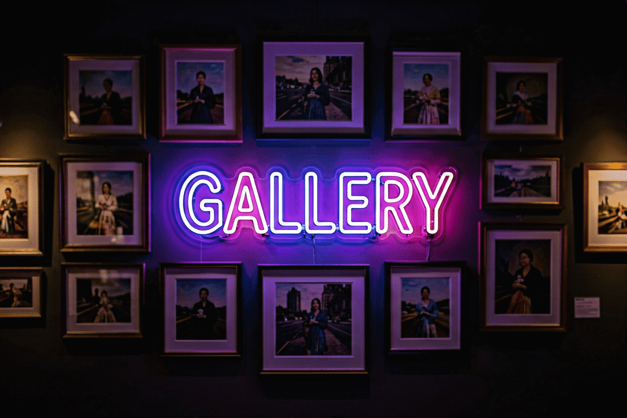
What pairs with neon on a gallery wall? Give the glow piece the anchor slot and build quiet around it: matte prints, ceramics, textiles — materials that don’t emit or reflect. The pairing rule is contrast of light behavior; neon next to gilt frames fights for the same attention channel, while neon beside flat black-and-white photography makes both read stronger. Frames in black or natural wood disappear respectfully; mirrored and chrome frames start a brawl.
The Shape Piece vs the Script Piece
The wordless decision, compared:
| Decision axis | The shape piece | The script piece |
|---|---|---|
| The statement | The form (the meaning without the words) | The words (the meaning stated) |
| The room’s agreement | None needed (the shape is neutral) | The phrase’s register must match (the decoder) |
| The sizing | The oversized rule (36 inches up) | The anchor-furniture math |
| The palette | The quiet registers (warm white dominant) | The full range |
| The dating risk | Minimal (the forms are timeless) | Real (the phrases trend – the style cycles) |
| The gallery pairing | The shape among the frames (the glow’s anchor) | The script as the wall’s statement |
The comparison’s decision input: the room’s agreement capacity. The shape works in the room that hasn’t decided its voice (the form is neutral – the moon and the wave mean nothing the room has to own), and the script works in the room that has (the phrase’s register is the room’s declaration) – the wordless tier as the style-proof default, the text tier as the style-committed statement (the shape logic above).
The two formats’ combination – the script anchoring with the shape accenting (the phrase at center, the form at the corner) – runs the wall’s full register: the stated and the suggested, the room’s voice and its silhouette, in one composition at the two-piece budget.
Wall art lives with its neighbors: bedroom walls, kids rooms and the kitchen each want a different scale of piece, and birthday walls borrow the same rules. Measuring is covered in the measurement guide, hanging in the drywall guide, and word choice in the font guide. The wallpaper pairing guide completes the flat-plus-glow look.
Sources & Further Reading
- Neon sign (Wikipedia) — the consolidated public record of neon-sign history and technology.
- Neon, element 10 (Wikipedia) — element properties: density, boiling point, abundance.
Pricing based on CustomNeon’s current catalog (2026); custom quotes come live from the sign builder.