How to Choose a Neon Sign: 7 Decisions
Choosing a neon sign is seven decisions, and they run in an order that matters: where it goes, what it says, how big it is, what color glows, what it’s built on, how it’s powered, and who builds it. Get them in sequence and each answer narrows the next; get them out of order and you end up re-deciding everything when the sign you fell in love with doesn’t fit the wall you have.
This is the decision framework — each step points to its deep-dive guide, and the whole thing ends at the buying guide for the purchase mechanics (seller vetting, pricing, shipping timelines).
Decision 1: Placement — Choose the Wall First
The wall chooses half of everything downstream. Before any browsing:
- Which room, which wall? Bedrooms want warm dimmable pieces; bars want bold; storefronts want size and daylight-visible brightness; kids’ rooms want safe mounts and soft colors.
- What are the constraints? Outlets (cord runs), furniture (scale anchors), sunlight (washes out brightness — see outdoor and window considerations), and damp rooms (bathroom installs need rated signs).
- What’s the viewing distance? This quietly decides letter size in Decision 3.
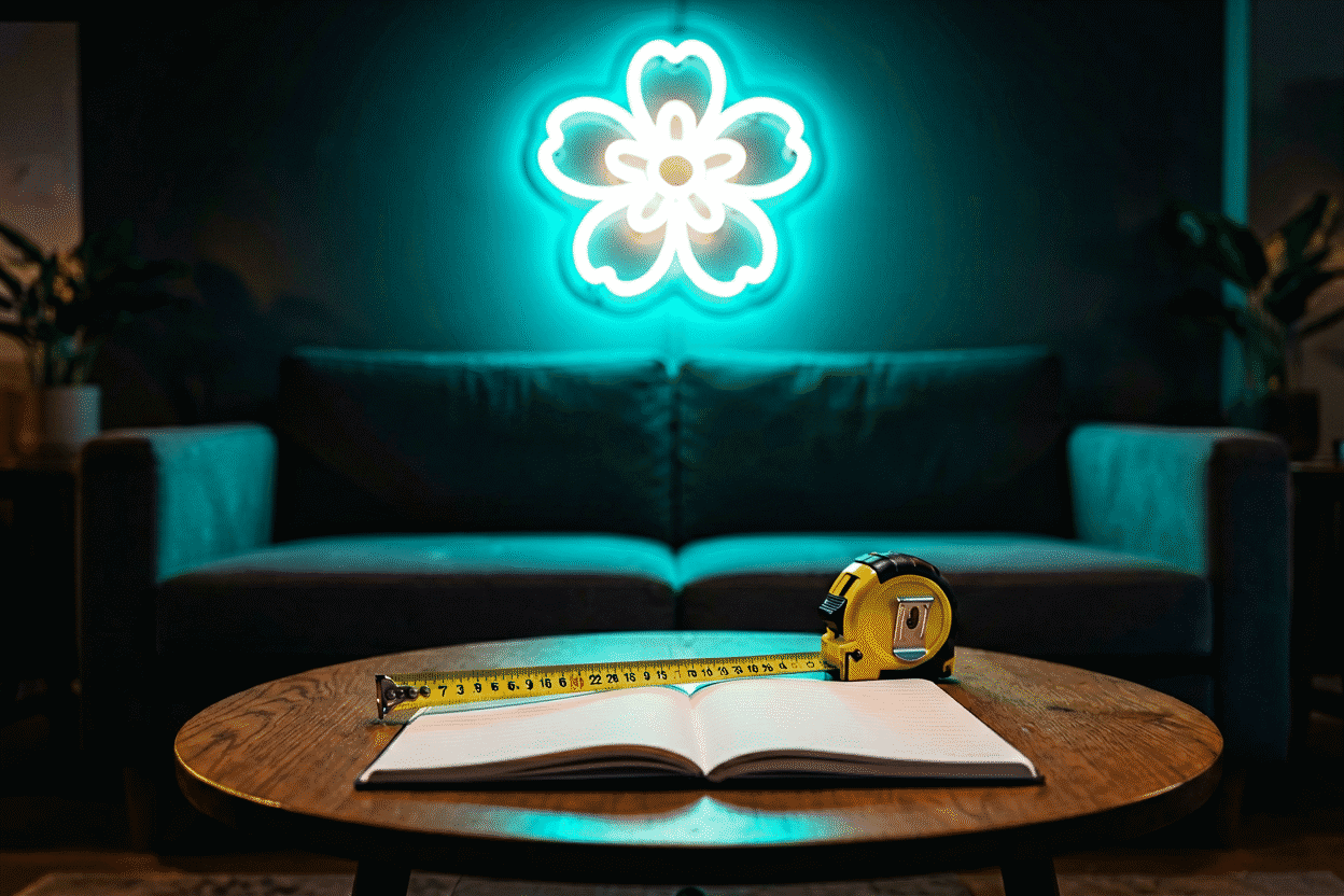
The pro move: photograph the wall and measure it now, before falling in love with anything. Empty-wall photos are how every good sign decision starts.
Decision 2: The Message — Choose Words That Earn Their Letters
The text is the part you live with longest. The patterns that hold up:
- Short beats long: 1–4 words with presence outperform sentences. Every added word shrinks every letter (the sizing math is in the measurement guide).
- Say it in your own vocabulary: names, dates, inside jokes, lyrics you actually stream, the word you’d want glowing when you walk in. Generic “LIVE LAUGH LOVE” energy ages badly; personal specificity doesn’t.
- Names-and-dates is the most-ordered custom format for a reason — it’s the wedding, nursery, and anniversary format in one.
- Icons carry meaning cheaply: a heart, lightning bolt, or star says a sentence in a letter’s worth of width.
One test worth applying: will this phrase still be true in five years? Bedrooms and homes change; “NEW APARTMENT” has a shelf life, “STILL MAGNOLIA” doesn’t.
Decision 3: Size — The Mockup Rule
Sizing is a two-sided constraint: the wall sets the maximum, the viewing distance sets the minimum letter height (1 inch of letter per 10 feet of distance). The full method — measuring, the paper mockup, listing dimensions decoded — is the measurement guide‘s job, and the scene tables (bed, sofa, bar, storefront) live in the size guide.
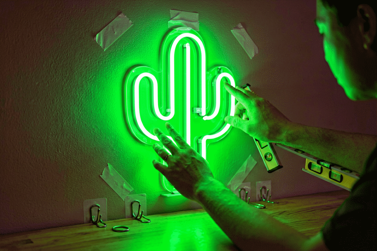
The one-sentence version: tape newspaper at true size to the wall and live with it a day. Nothing you read on a screen communicates scale like the paper on the wall.
Decision 4: Color — The Glow Chooses the Mood
Color is the most photographed decision and the most reversible to get wrong. The framework:
- Warm vs cool is the first fork: warm colors (pink, red, orange, amber, warm white) flatter people and rooms — bedrooms, salons, events. Cool colors (blue, ice blue, green, purple) create tech and mood — gaming, bars, studios. The psychology behind each is mapped in our color meaning guide.
- The wall colors you own: dark walls carry every color richly; white walls love high-saturation choices (hot pink, electric blue) that don’t wash out.
- White is the quiet champion: warm white is the most-ordered color family — it reads as premium lighting rather than signage, which is why it owns minimalist interiors (see white neon aesthetics).
- Multi-color when the use case demands it: RGB color-changers for gaming walls and event pieces — the color-changing guide covers what the mode options actually do.
Room-specific palettes: the bedroom color guide and the business color guide each map hues to outcomes.
Decision 5: Font — Legibility With Personality
Three notes that cover 90% of font choice:
- Script fonts are beautiful and demanding — they need 20–30% more letter height to stay legible, and they shrink poorly. Long phrases in fine script are the #1 custom-order regret.
- Block and sans fonts are the workhorses — maximum legibility per inch, modern read, and they survive distance and glare.
- Novelty fonts are seasoning, not meals — retro, brush, and display faces work for single words with meaning; they exhaust attention across sentences.
The full typeface analysis with pairing rules lives in the font guide.
Decision 6: The Build — Backing, Brightness, and Dimming
The hardware decisions that separate signs you keep from signs you replace:
- Backing: cut-to-shape acrylic (the floating look, most popular) or full clear panel (easier alignment, better for multi-piece). The backing board guide covers the trade-offs and the black-backboard aesthetic variant.
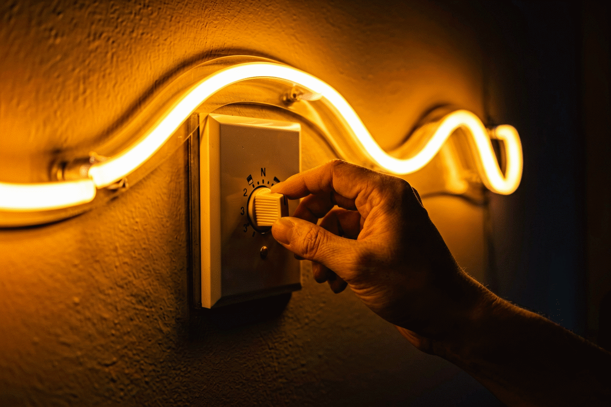
- Dimming is not optional in practice: the sign you love at noon is too bright at midnight. Order dimming — remote or app — with the sign. The dimming guide explains why this is the most-used feature after on/off.
- Brightness tier: signs with premium LED densities glow more evenly and photograph better; budget-tier builds show dark spots and color drift. You see it in the product photos if you look at the letter joints.
- Power: standard adapter for walls; battery-ready and outdoor-rated options exist for the edge cases — the power supply guide has the decision table.
Decision 7: The Builder — Who Actually Makes It
The vendor decision filters everything above through reality: build quality, accurate color rendering, safe certified electricals, honest timelines, and a warranty that answers emails. The complete vetting framework — red flags, price benchmarks, shipping reality — is our buying guide, with the quality check as its companion for evaluating what arrives.
The short version: real product photos (not renders), stated LED specs, certified adapters, published production and shipping times, and reviews that mention what happened when something went wrong.
Putting It Together in One Session
The efficient order of operations, start to finish in an evening:
- Photograph and measure the wall (15 minutes).
- Paper mockup the scale (10 minutes, per the measurement guide).
- Draft the message — write three candidates, sleep on it once.
- Preview all three in a builder at true size — the custom sign builder renders live text in every color with real pricing, which converts Steps 3–5 from imagination to comparison.
- Check the pre-order checklist in the buying guide and order.
Browse the finished examples by room in our collections — bedroom, bar, gaming, wedding — then run your own seven decisions. The sign you chose on purpose is the one that still feels right glowing at midnight a year later.
Decision Examples: Four Buyers Walk Through
The seven-decision framework applied to four common buyer situations:
The first-apartment couple. Decisions one through three took ten minutes with a tape measure: the living-room wall above the sofa (57 inches of usable width), the shared phrase they still liked after a week on the fridge, and a paper mockup at 36 inches that survived a full weekend. Color ran two evenings — his instinct was electric blue, her mood-board ran warm — and the resolution was the two-color rule: warm white script with a small blue moon icon, 80/20 dominance (the combinations logic). Budget tier: the $180 band. The decision they’re happiest with a year later: ordering dimming — “the 10 pm version of our sign is the one we actually live with.”
The bar-owner upgrading from glass. A pub replacing a dying 1970s glass piece with the modern equivalent of its look. The seven decisions ran in reverse priority: builder first (a maker with commercial-tier builds and a real portfolio — the buying guide), then the vintage register mapped to specifics (classic red, script font, arrow motif), size from the fascia’s proportions, and the build spec upgraded for hours-of-operation duty (higher LED density, sealed connectors, dimming for the evening rhythm). The choice that mattered most commercially: keeping the original’s wording — a neighborhood landmark re-lit is worth more than a new message.
The streamer’s second wall. The first sign (a gamertag, full brightness, no dimming) taught the lessons that shaped the second: decisions six and seven dominated. The build spec this time: integrated dimming locked at 65% for camera work (the photography logic), RGB for seasonal palettes, and the smart plug for schedule automation. Decisions two through five took minutes because the wall’s constraints (placement behind the mic arm, size for the frame, cool register for the content genre) were already known. The pattern worth copying: your first sign teaches you your preferences; budget for the second one accordingly.
The nursery gift. Grandparents, one shot at getting it right, deadline before the shower. The seven decisions compressed: placement by the parents’ photo of the crib wall, message from the name registry, size conservative (22 inches — nursery walls shrink fast with furniture), color warm white (the sleep logic), dimming non-negotiable for the night-light years, build from a gift-experienced maker (the gifting notes), and — the decision that saved the deadline — ordering at T-minus four weeks (the production calendar) so the rush premium stayed unspent.
The pattern across all four: the framework’s order holds (wall, words, size, color, font, build, builder), but each buyer’s controlling decision differs — the couple’s was color negotiation, the bar’s was builder, the streamer’s was dimming, the grandparents’ was timeline. Knowing which decision is yours is half the framework’s value.
FAQ: Choosing a Neon Sign
How do I choose a neon sign? Work seven decisions in order: placement (which wall, which constraints), message, size (mockup-verified), color (warm for people-rooms, cool for mood-rooms), font (legibility first), build (backing, dimming, brightness tier), and builder (vetted vendor). Each decision narrows the next.
What color neon sign should I get? Warm colors — pink, red, amber, warm white — for bedrooms, salons, and spaces that flatter people; cool colors — blue, ice blue, green, purple — for gaming walls, bars, and studios. Warm white is the most versatile single choice for minimalist interiors.
What size neon sign should I choose? Let the wall set the maximum and the viewing distance set the minimum letter height (1 inch per 10 feet). Above a queen bed, 30–45 inches wide with 4–6 inch letters; over a sofa, 36–60 inches; desk walls, 18–30 inches. Verify with a paper mockup before ordering.
What’s better: script or block fonts for neon? Block fonts for legibility per inch and multi-word phrases; script for short personal words (names, single words) where you can afford 20–30% more letter height. Fine script at small sizes is the leading cause of illegible custom signs.
Should I pay extra for a dimmable neon sign? Yes — dimming is the most-used feature after on/off. The brightness that looks right in daylight is too bright at night, and the remote or app dimmer solves it in one press. Retrofit dimmers work but cost more than ordering it integrated.
How much should a good custom neon sign cost? Quality custom LED signs run roughly $100–$400 for typical home sizes, scaling with size, color options, and build tier — the full price anatomy with red flags is in the buying guide.
Sources & Further Reading
- Neon sign (Wikipedia) — the consolidated public record of neon-sign history and technology.
- Mercury (U.S. EPA) — federal guidance on mercury exposure and safe handling.
Pricing based on CustomNeon’s current catalog (2026); custom quotes come live from the sign builder.