How to Measure for a Neon Sign (Wall to Order)
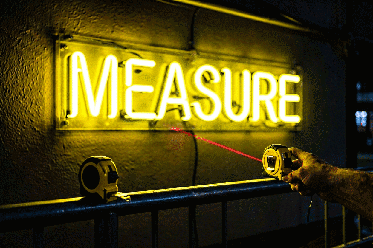
Measuring for a neon sign takes three numbers and a piece of paper: the width of the wall space (measured between the things that constrain it — furniture edges, outlets, door swings), the height you want the letters to read at, and the viewing distance. Then you tape a paper mockup at true size to the wall before ordering anything — the five-minute step that prevents the two classic mistakes (the sign that drowns a small wall, and the beautiful phrase that’s illegible from the sofa).
The scene-by-scene size recommendations — what dimensions work above beds, bars, and storefronts — live in the neon sign size guide. This page is the measuring itself: how to get the numbers, how to sanity-check them, and how they translate into the two dimensions you actually order.
What You’re Measuring: Width and Letter Height
Custom signs are specified in two dimensions, and understanding their relationship is the entire game:
- Sign width (the widest point of the finished piece, letters plus any shape elements)
- Letter height (the capital letter size, which drives legibility distance)
The subtlety: for a fixed width, more letters mean smaller letters. “DREAM” at 36 inches wide carries huge, legible letters; “DREAM BIG AND LIVE LOUD” at the same 36 inches shrinks each letter to a whisper. The fix isn’t always more width — it’s fewer words or two lines. This one relationship explains most sign-size regret, and it’s why the paper mockup step exists.
Step 1: Measure the Wall Space
Measure the usable width, not the wall’s total width:
- Identify the boundaries the sign lives between: furniture edges, shelving, window trim, outlets, light switches, and anything the sign visually collides with.
- Measure between boundaries, then subtract 10–15% of breathing room — a sign pressed edge-to-edge between dressers reads cramped in a way the tape measure doesn’t show.
- Note the vertical zone too: above a headboard, the practical zone is headboard-top to ceiling minus a hand’s width of clearance; on open walls, center zone is 57–66 inches from floor for standing viewing.
Write the numbers down with the phone photo of the space. You’ll want both at order time, and photos beat memory at everything.
Step 2: Apply the Legibility Rule (Letter Height Math)
The field rule for display lettering: letter height of 1 inch per 10 feet of viewing distance, minimum. In room terms:
| Viewing distance | Minimum letter height | Reads as |
|---|---|---|
| 6 ft (bedside, desk) | 1–2 in | Intimate, fine script OK |
| 10 ft (bedroom wall to door) | 2–3 in | Standard bedroom sign |
| 15 ft (living room wall to sofa) | 3–4 in | Statement legibility |
| 20–30 ft (large room, bar wall) | 4–6 in | Room-anchoring |
| 50+ ft (storefront, venue) | 8–12 in+ | Commercial scale |
Working backward from the sofa: if your couch sits 15 feet from the wall and you want the sign readable in the room’s normal state, letters under 3 inches will blur into a glowing texture rather than a word. This is the check most people skip — they size the sign to the wall and forget to size it to the viewer.
Fine print on fonts: script and thin-stroke fonts need roughly 20–30% more height than block fonts for the same legibility. A 2.5-inch script reads like a 2-inch block — the font guide covers which typefaces survive sizing pressure.
Step 3: The Paper Mockup (The Five-Minute Insurance)
Before ordering any custom sign:
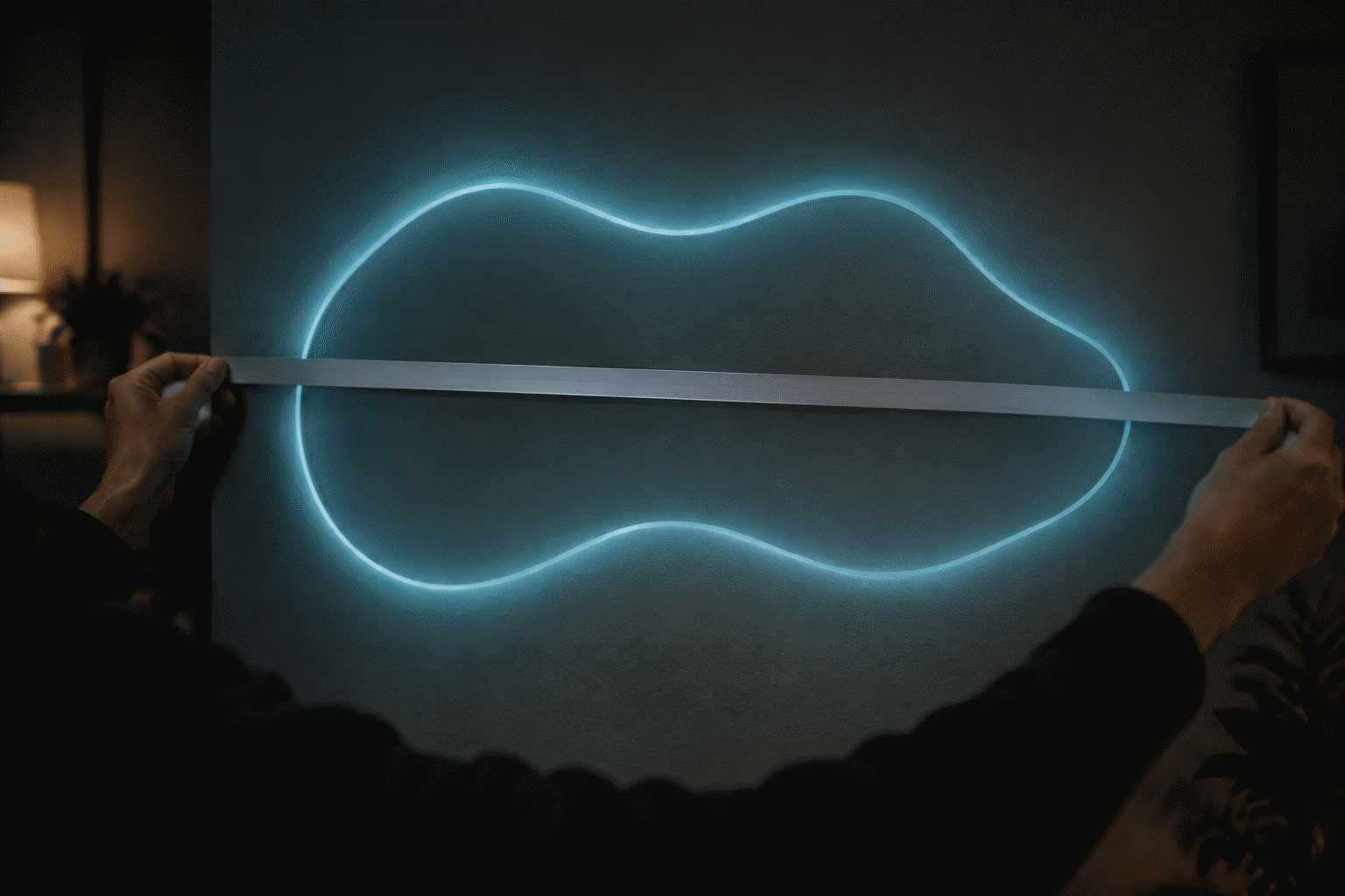
- Tape together newspaper, kraft paper, or wrapping paper to the exact width × height you’re considering.
- Write the word(s) on it in thick marker at the letter size implied (rough is fine — you’re checking scale, not typography).
- Tape it to the wall in position. Live with it for a day. Look at it from every place you actually sit or stand, including the doorway and the bed.
The mockup answers the two questions numbers can’t: does it fit the room’s scale, and does it read from where you live? Roughly a third of mockups get adjusted — bigger, smaller, or re-worded — which is exactly the point. Adjusting paper costs nothing; adjusting a custom-built sign costs a reorder.
Photograph the approved mockup on the wall. That photo is your order reference and, later, your installation template — the same paper becomes the drill guide.
Reading Sign Listings: Width vs. Total Dimensions
When you order or browse, decode the numbers sellers give:
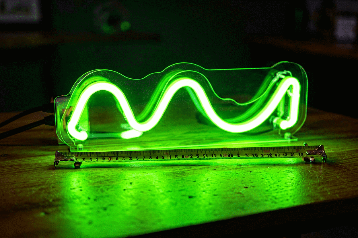
- “Width” on custom builders is the sign’s widest finished point. Letter height is derived from your letter count — the builder’s live preview shows the actual letter size as you type (the custom builder does this continuously, which makes the whole mockup step half-visual).
- Shape elements count: a phrase plus a heart icon measures the icon’s outermost points. If the listing gives overall dimensions, the letters inside are smaller than the phrase-only equivalent.
- Backing adds a hair: cut-to-shape backings add roughly 0.5–1 inch around the letters; full-panel backings add 2–3 inches to each dimension. For tight fits between furniture, order by backing dimensions.
- Multi-line layouts trade height for width: two lines at 30 inches wide beat one line at 30 inches for legibility — same footprint of wall, twice the letter height. The best long-phrase compromise nearly everyone lands on.
The Space-by-Space Quick Reference
Measured and mockup-verified numbers that work (expanded tables in the size guide):
- Above a queen bed: 30–45 in wide, letters 4–6 in — the bed frame anchors the scale. Full placement rules in the bedroom guide.
- Over a sofa: 36–60 in, about two-thirds the sofa’s width reads deliberate rather than leftover.
- Desk/content wall: 18–30 in, letters 2–3 in — camera framing wants the sign visible in a head-and-shoulders shot without dominating.
- Home bar: 24–40 in between the shelf and the ceiling line.
- Storefront window: measured in the window’s pane, letters at 8 in+ for street legibility — the open signs line is sized for exactly this.
Before You Click Order: The 60-Second Checklist
- Usable wall width measured between true boundaries, with breathing room subtracted?
- Letter height ≥ 1 inch per 10 feet of the room’s main viewing distance?
- Paper mockup survived a full day on the wall from every angle you actually use?
- Backing style chosen with its extra dimension accounted for in a tight fit?
- Photo of approved mockup saved as the order reference?
Five yeses: order with confidence. The builder’s preview — create your sign here — is the last visualization, showing your exact text, size, and color at the dimensions you measured, with live pricing that updates as you scale.
Six Real Walls, Measured and Mocked Up
The measurement method applied to six actual room situations:
The queen bedroom, 11-foot wall. Usable width between the bedside tables: 68 inches. The mockup verdict at 42 inches wide: correct. At 55: crowded the lamps. The letter-height check from the 14-foot door viewing distance demanded 2.8-inch minimum letters; the 42-inch sign carried 5.5-inch letters — comfortably over floor. Ordered at 42. The lesson: the furniture set the width, not the wall.
The studio apartment, awkward soffit. A ceiling soffit cut the wall’s usable height by 14 inches. The measurement that mattered was vertical: from soffit line to the desk below, 34 inches — which reclassified the sign from “over the desk” to “centered in the soffit’s shadow,” sized 30 inches wide with letters at 4 inches. Obstacles redefine usable space; measuring around them beats measuring through them.
The double-height living room. The cathedral-ceiling temptation: size up dramatically. The mockup’s discipline: the seating’s viewing distance (16 feet) wanted 4-inch letters minimum, but the room’s human zone ended at 8 feet of wall height — above that, the wall belongs to architecture. A 48-inch sign centered at standing eye level read intentional; the 72-inch version read like it was escaping. Vaulted ceilings are a legibility opportunity, not a size mandate.
The nursery, crib-wall placement. Safety geometry set the numbers: the crib’s rail height (measured: 35 inches) defined the sign’s floor; the ceiling-mounted curtain track defined its ceiling; the zone between: 26 inches of wall. A 22-inch piece with 3.5-inch letters fit the zone with breathing room and will survive the toddler years at that height (the kids-room setups).
The bar, behind the bottles. The shelf’s top edge cut the sign’s bottom line at 62 inches; the ceiling’s duct soffit capped the top at 92. Thirty inches of working height, minus pouring clearance — the final call was 36 inches wide by 14 tall, letters at 4 inches, positioned left of center where the shelving broke (the bar vocabulary). The measurement captured what the eye had missed: the wall wasn’t symmetric, and the sign shouldn’t have been either.
The storefront window. The glass measured 44×72 inches; the street-viewing distance from across the road set letters at 8 inches minimum (the commercial sizing). The 36-inch-wide sign that fit the glass beautifully failed the street test at mockup — newspaper letters at true size, viewed from across the street, dissolved. The reorder: 40 inches wide, letters at 9 inches, single line. The lesson commercial buyers get taught by their streets: measure from the viewer’s position, not the glass’s frame.
Six walls, one constant: the paper mockup found the adjustment every single time — three downsizes, one upsize, one reposition, one asymmetric placement. The five-minute step earned its keep at a 100% intervention rate.
FAQ: Measuring for Neon Signs
How do you measure for a neon sign? Measure the usable wall width between real boundaries (furniture, trim, outlets), subtract 10–15% breathing room, pick letter height using 1 inch per 10 feet of viewing distance, then tape a paper mockup at true size and live with it before ordering.
What size neon sign do I need? For bedrooms, 30–45 inches wide with 4–6 inch letters over a queen bed; 36–60 inches over a sofa; 18–30 inches for desk walls. Match letter height to viewing distance first — the wall only sets the maximum, the viewer sets the minimum.
How are neon signs measured? By overall width (widest finished point including shapes and backing) and letter height (capital letter size). More text at fixed width means smaller letters — the central tradeoff in sizing any custom sign.
Does the backing add to a neon sign’s size? Yes — cut-to-shape backings add about an inch around the letters; full clear panels add 2–3 inches per dimension. For tight fits between fixed objects, order by the backing’s outer dimensions.
Is a paper template really necessary before ordering? It’s five minutes that prevents the two most common custom-order regrets — scale surprises and illegibility from real viewing distances. About a third of mockups lead to a size or wording change, which is exactly what they’re for.
What’s the minimum letter height for a neon sign? Practically, 2 inches for intimate viewing distances (bedside, desk) and 1 inch of letter per 10 feet of viewing distance beyond that. Script fonts need 20–30% more height than block fonts to read equally well.
Sources & Further Reading
- Mercury (U.S. EPA) — federal guidance on mercury exposure and safe handling.
- Neon sign (Wikipedia) — the consolidated public record of neon-sign history and technology.