20 Retro Room Decor Ideas, Neon Era by Era
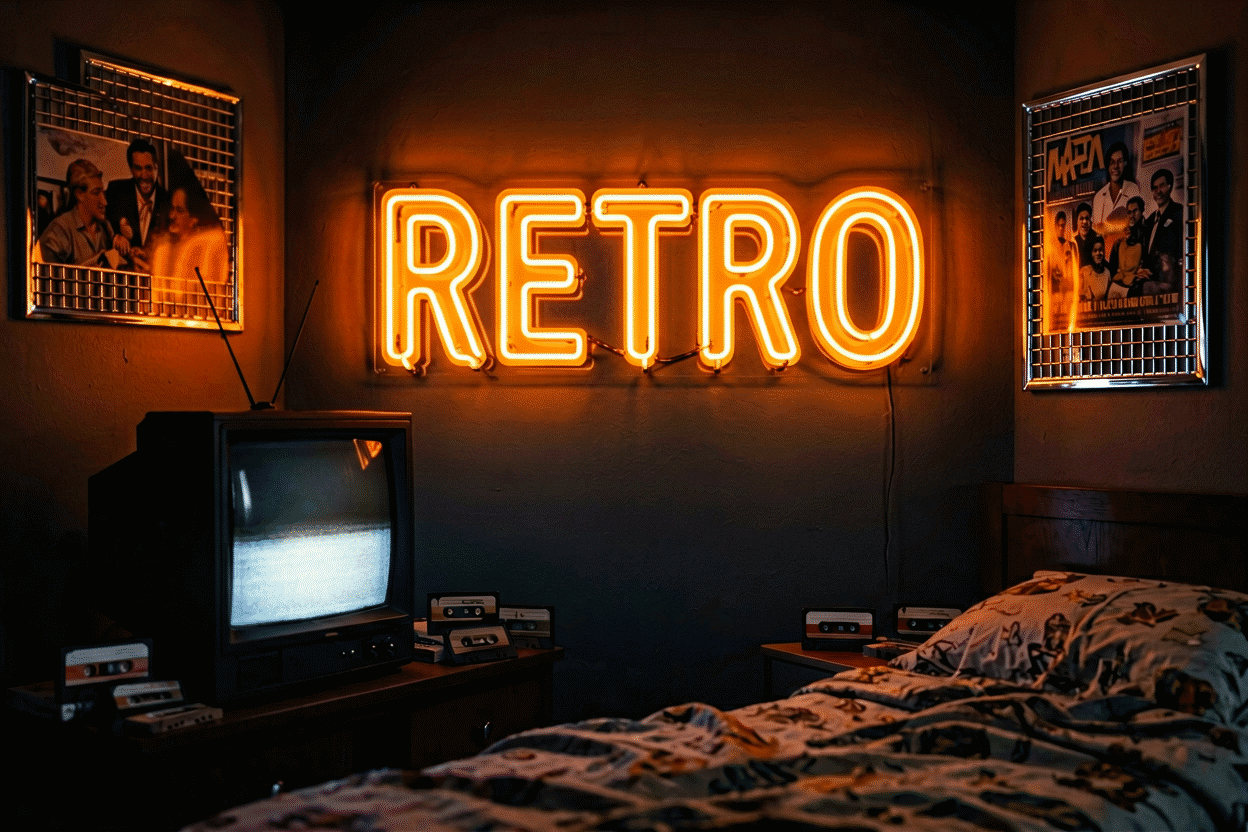
“Retro” is three different rooms wearing one word. The 70s ran earth tones and amber glow; the 80s ran chrome, airbrush, and electric everything; the 90s-to-Y2K ran candy plastic and frosted tech. Neon was there for all three — and it’s the one decor element that can switch the room’s decade with a single swap, because each era’s palette was so specific that the glow does the time travel on its own.
Here are 20 ideas organized era by era — the decade’s signature neon, the palette physics, and the crossover pieces — so the room commits to its decade instead of blending them into costume. The Y2K era has its own full guide (here); this one covers the deeper past.
The 70s Room: Ideas 1–6
Wood paneling, macrame, and amber forever.
- Burnt-orange script — the era’s signature color (the orange register) on a cursive phrase: the single most authentic 70s neon move.
- The rainbow in earth tones — the arc in mustard, rust, and avocado: the era’s rainbow, which is to say brown-adjacent.
- A sunburst piece — the iconic 70s sun, glowing amber: the decade’s own logo.
- “Groovy” / “Keep On Truckin’” — the era’s catchphrases: the phrase tier that needs lava-light context.
- The vintage brand script — the Coca-Cola treatment and the beer-script archive: the era’s commercial glass, still glowing in basements that earned it.
- The fern-bar register — green neon over the hanging plants: the decade that domesticated the fern, lit correctly.
The 80s Room: Ideas 7–12
Chrome, neon-grid, and maximum confidence.
- The neon grid — the horizon-grid piece in purple-pink: the decade’s signature image (the retro-futurism that defined it), and the era’s most recognizable single object.
- The palm-tree-and-sunset piece — Miami palette, chrome frame: the decade’s postcard, glowing.
- Electric purple everything — the decade’s power color: purple anchor, pink accent, the palette that ate 1985.
- The arcade tier — Pac-Man ghosts, space invader glyphs (the gaming archive context): the era’s childhood, lit.
- The airbrush-and-neon combo — the sunset-landscape piece: the mall-kiosk register, gloriously unashamed.
- “TOTALLY” / “RADICAL” — the era’s intensifiers: the phrase tier that says the decade in one shouted word.
The 90s Room: Ideas 13–16
Grunge flannel and cyber-optimism, simultaneously.
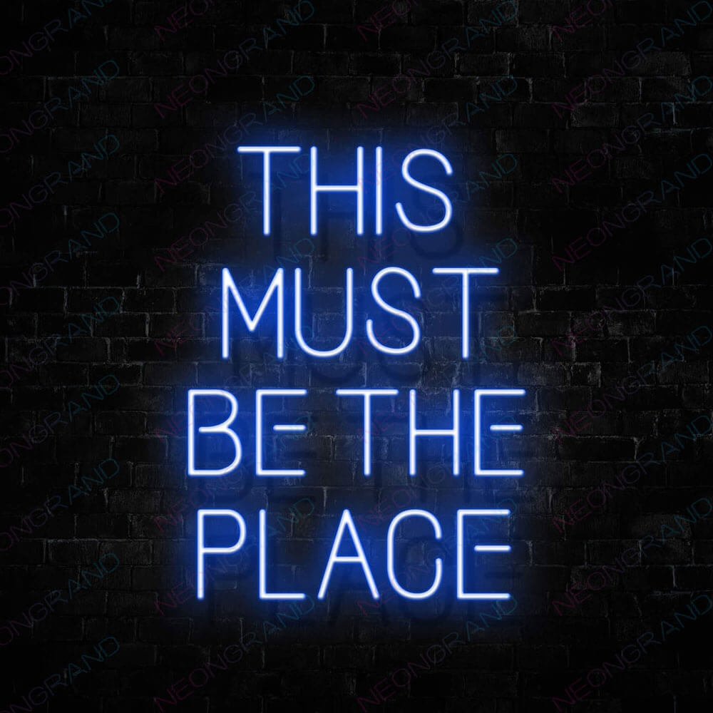
- The fluorescents-adjacent tier — hot pink and acid green pieces against poster walls: the decade’s saturation register.
- The smiley-tier revival — the acid-face icon in neon: the rave register, lit.
- The grunge-adjacent piece — one deliberately un-flashy piece (a plain white script): the decade’s anti-decor decade, honored with restraint.
- The early-web tier — the pixel heart, the “ONLINE” piece: the decade’s ending, glowing toward Y2K.
The Crossover & Collector Tier: Ideas 17–20
- The era-authentic vintage piece — real old glass, if the budget and the electrician agree (the vintage guide covers the market honestly).
- The modern-LED homage — today’s builds in yesterday’s palettes: the practical route, at brightnesses the originals never offered safely.
- The era-mash warning — one era per room: the 70s-80s-90s blend reads costume-party, not curated (the palette logic explains why the eras clash).
- The man-cave crossover — the retro garage and basement tier (the man-cave canon): where the eras’ commercial glass has always lived.
Era Physics
Each decade’s glow runs its own temperature: the 70s at amber-and-low (the era’s light was incandescent-warm, and the neon should agree), the 80s at full-electric (the decade that invented confidence in lighting), the 90s at saturated-and-scattered (the poster-wall era, glow distributed), and Y2K at candy-or-cyber (its guide covers the split). The room’s non-neon decor picks the era; the neon confirms it; and the brightness dial is the decade’s volume knob.

Placement notes: the 70s room runs low-and-layered (the glow joins the texture), the 80s room runs high-and-focal (the glow IS the decor), and the collector’s wall runs museum rules — era-grouped, spaced, and dusted (hanging guide for the methods; the vintage glass gets the careful treatment).
The Era Commitment: Building One Decade Well
The retro room’s single discipline: one era, committed. The room that runs the 70s completely (the amber glow, the wood tones, the macrame, the sunburst) reads curated; the room that mixes decades reads costume-party – the era’s palettes clash at the physics level (the color logic) and no amount of affection bridges it.
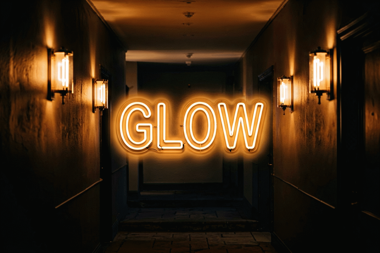
The 70s commitment: burnt orange, harvest gold, avocado green; the amber glow at low brightness; the wood paneling honored rather than painted. The era’s neon palette runs the warm registers exclusively – the decade’s light was incandescent and the glow agrees. The commitment’s shopping list: the era script (the orange register), the earth-tone rainbow, the sunburst piece, and the vintage brand scripts (the archive) where the budget runs.
The 80s commitment: purple-pink-electric; the neon grid; the chrome-and-glass surfaces; the full brightness. The decade’s confidence runs in its glow – the 80s room that dims loses the era’s whole point. The shopping list: the grid piece, the palm-and-sunset register, the arcade icons, and the era’s brand glass.
The 90s commitment: acid saturation, the fluorescents-adjacent palette, the poster-wall glow distributed. The decade’s irony runs in its scatter – the 90s room that commits to minimalism has committed to the wrong decade.
The Vintage Route and the Modern Route
The vintage route (the real glass): the collector’s path – the era-authentic pieces with the provenance, the patina, and the price (the honest market guide). The route’s requirements: the budget (several multiples of modern), the electrician’s blessing (the old wiring and the modern code), and the collector’s patience. The route’s rewards: the authenticity no reproduction matches – the glass that was actually there.
The modern route (the LED homage): the practical path – today’s builds in yesterday’s palettes, at the brightnesses the originals never offered safely. The route’s honesty: these are era-styled, not era-made – and at 20% of the cost with none of the maintenance, they carry the look for the 95% of retro rooms that want the aesthetic rather than the artifact (the comparison runs the full decision).
The hybrid most collectors land on: one real piece (the room’s anchor – the authenticity signal) surrounded by the modern tier (the supports, the era palette at safe brightness) – the room that means the era and lives in the present, which is what every good retro room actually does.
FAQ About Retro Room Decor With Neon
How do I make my room look retro with neon? Pick the decade first, then its palette: 70s amber-orange, 80s purple-pink, 90s acid, Y2K candy (the decoder). The era’s script font + its color = instant time travel; blending eras = costume party.
What’s the best retro neon sign? The 80s neon grid or a burnt-orange 70s script — the two eras’ signatures. The vintage archive covers the real-glass collector route.
80s or Y2K — which is “retro neon”? Different decades, different palettes: 80s runs purple-pink chrome (the grid era), Y2K runs hot-pink-plus-frosted-blue (its guide). “Retro” covers both; the room’s decor should pick one.
Are vintage neon signs worth it for a retro room? For the collector, yes — with the honest budget note (the vintage guide has the market brackets). For the look alone, modern LED in era palettes delivers 95% at 20% of the cost and none of the maintenance.
What is the difference between retro and Y2K neon? The decades and their palettes: retro neon runs the deeper past (the 70s amber-and-earth, the 80s purple-pink-electric, the 90s acid – the era guide above), while Y2K runs the specific 1999-2003 register (the candy-and-cyber duo – the Y2K guide). The two revivals share the vintage affection but not the palettes: the 70s burnt orange beside the Y2K baby blue reads two rooms fighting, and the era-mash is the retro canon’s one unforgivable. The room picks its decade; the palette enforces it; the glow agrees.
How much do retro neon signs cost? The modern-LED homage route runs $80-500 across the era palettes (the 70s amber scripts, the 80s grids, the 90s acid tiers – the era guide above); the vintage-glass route runs $300-3,000 by era and condition (the honest market brackets context) – the collector’s lane with its own economics. The hybrid most rooms run: one real piece (the authenticity anchor) plus the modern tier (the era palette at safe brightness) – the look at twenty percent of the collector’s cost, with none of the transformer conversations.
The 70s vs the 80s: The Two Deepest Retro Registers
The two flagship retro decades, compared:
| Decision axis | The 70s room | The 80s room |
|---|---|---|
| The palette | Burnt orange, harvest gold, avocado | Purple-pink-electric, chrome accents |
| The glow temperature | Amber-and-low (the incandescent era) | Full-electric (the confidence era) |
| The anchor pieces | The sunburst, the earth-tone script | The neon grid, the palm-and-sunset |
| The room’s textures | Wood, macrame, wicker | Chrome, glass, geometric |
| The brand tier | The beer and soda scripts (the archive) | The arcade and MTV registers |
| The failure mode | Brown-overload (the decade’s own risk) | Saturation-fatigue (the chrome glare) |
The comparison’s era-physics: the 70s glow runs warm-and-dim (the era’s incandescent light agreeing with the LED’s warm registers), and the 80s glow runs bold-and-full (the decade’s electric confidence wanting the brightness the LED safely offers) – the two decades’ light histories defining their neon’s correct settings (the era logic above).
The cross-era warning, restated because it is the retro canon’s one rule: the two palettes clash at the physics level (the burnt orange against the electric purple reads costume-party, not curated – the color logic), and the room that wants both decades commits to neither. The 90s and the Y2K (its own guide) complete the retro menu – one era per room, committed fully, glowing correctly.
The Committed Era vs the Blended Eras
The retro room’s two fidelity levels, compared:
| Decision axis | The committed era (one decade) | The blended eras (the mix) |
|---|---|---|
| The palette | One era’s registers (the physics agreement) | The eras’ clash (the costume read) |
| The furniture logic | The era’s own pieces (the room’s coherence) | The compromise furniture (the room’s argument) |
| The neon settings | The era’s temperature (the era logic above) | The impossible setting (each era wants its own) |
| The collector’s read | The curated room | The antique-shop room |
| The budget’s efficiency | Full (every piece serves the era) | Split (the pieces serve their decades) |
| The exception’s license | The era-adjacent pieces (the 70s-80s border) | None (the border is the slip) |
The comparison’s one rule – the retro canon’s only unforgivable – restated at the fidelity level: the eras clash at the palette physics (the color logic), the amber against the electric, and no affection bridges the wavelengths. The committed room reads curated at every budget; the blended room reads confused at every budget above the thrift tier.
The committed era’s honest latitude: the era’s own edges (the 70s-80s border’s transitional pieces, the Y2K-cyber overlap) – the adjacent registers that the era itself ran. The commitment is to a decade’s palette, not its calendar: the room that runs the warm-amber registers with the early-80s transition pieces is committed; the room that runs the disco ball over the vaporwave grid is not.
Sources & Further Reading
- Neon: Strong Lines (NIST Physical Reference Data) — the standard reference for neon’s emission wavelengths.
- Neon sign (Wikipedia) — the consolidated public record of neon-sign history and technology.
- Mercury (U.S. EPA) — federal guidance on mercury exposure and safe handling.