Retro Gaming Neon Signs: Insert Coin for Glow
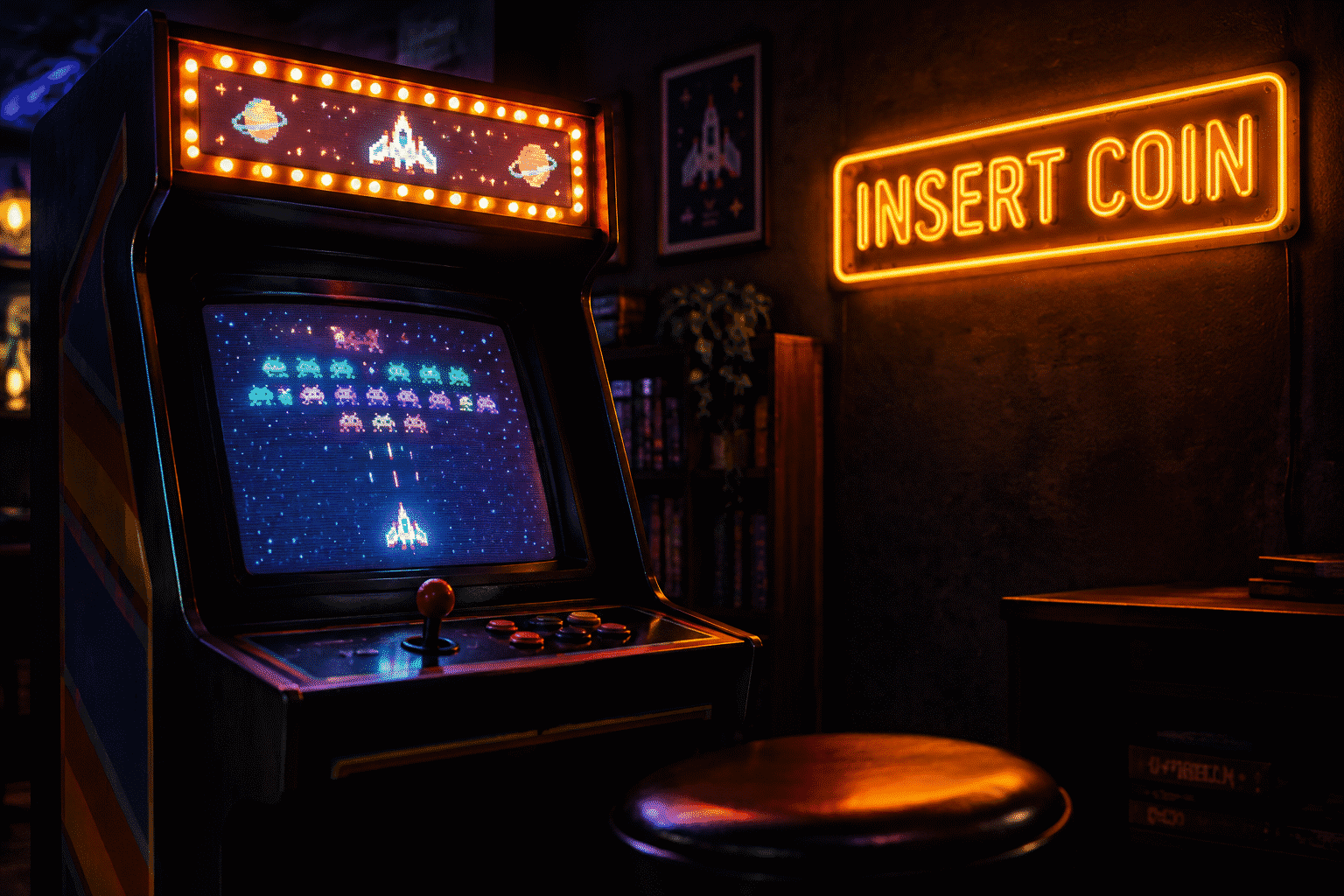
The arcade had a lighting design before it had a name: black walls, glowing marquees, a floor of cabinets each running its own attract mode, the whole room humming at the exact brightness where a quarter felt like an event. The retro gaming corner — the modern room that rebuilds that Friday night — is one of neon decor’s most natural deployments, because the aesthetic was literally made of neon and its cousins.
This guide builds the corner properly: the arcade’s three visual layers, the four-piece corner kit, the palette, the phrase canon, and the border between the retro corner and the modern battlestation. The single-IP deep dives (starting with our Pac-Man guide) cover the classics individually.
The Three Visual Layers of the Arcade
The original arcade ran three distinct light tiers, and the rebuilt corner runs the same stack:
- The marquee tier. The cabinet’s lightbox header — the game’s name in its own art, lit from within. The marquee is the arcade’s signature object and the corner’s anchor piece: the game title (or the corner’s own name) in the lit-header format, hung at the top of the wall. The custom builders render the format in neon: the title in its era font, the border frame, the internal glow.
- The attract-mode tier. The screens themselves — the cabinets’ glowing CRTs, each running its demo loop. In the rebuilt corner: the actual CRTs and emulator screens if you run hardware, or the neon “screen” pieces — pixel-art icons in tube light — if you don’t. The pixel tier is the aesthetic’s native neon genre: game icons render as chunky, blocky tube drawings exactly the way the era drew them.
- The coin tier. The smallest and most nostalgic layer: the coin slot’s glow, the “INSERT COIN” blink, the one-quarter promise. The coin-tier pieces are the corner’s accent builds — small, warm, and devastating to anyone who was there.
The Four-Piece Corner Kit
The corner assembles from four elements, in order of importance:
- The cabinet (or its ghost). A real cabinet if the room allows; a cabinet-shell with a modern screen if you’re clever; or the ghost — the wall that marks where a cabinet would stand, with the marquee piece mounted above and the pixel icon beside. The corner starts with what occupies the floor; the wall follows it.
- The marquee anchor. The title piece at the wall’s top — one game’s name or the corner’s own name (“THE ARCADE,” “PLAYER ONE’S ROOM”). 24–36 inches, the era’s fonts.
- The pixel sidekick. The icon piece beside the marquee — a character, a ghost, a mushroom, a bomb, in the blocky tube rendering. This is the corner’s personality piece; the Pac-Man guide covers the most iconic of them.
- The phrase footer. The canon phrases at bench or chair height: “INSERT COIN,” “GAME OVER,” “HIGH SCORE,” “PRESS START” — the era’s complete vocabulary, at 12–18 inches, in the warm registers.
The Palette (The CRT Warmth)
The arcade’s palette was the CRT’s: warm, saturated, glowing against black.
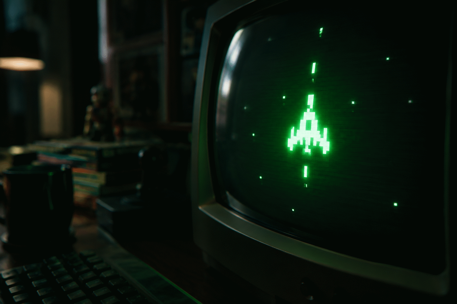
- The warm core. Amber, warm white, and yellow — the cabinet-and-coin-slot registers, the glow the era’s photos remember. The corner’s base palette.
- The sprite hues. The game icons keep their game colors — the ghosts’ red-pink-cyan-orange, the heroes’ yellow. The one place the register runs multicolor happily (the games themselves did).
- The neon-blue exception. The cool tier appears in the maze-and-screen pieces — the game’s own blues. One cyan or blue piece per corner (the blue gaming setup page covers the hue), balanced by the warm core.
- The black-wall standard. The corner wants the darkest wall in the house — the arcade ran black for a reason, and every glow decision reads better against it.
The Phrase Canon
The arcade’s vocabulary, complete in four phrases:
- “INSERT COIN.” The invitation — the register’s most iconic two words, the piece that makes everyone who sees it reach for a pocket that hasn’t held quarters in years.
- “GAME OVER.” The era’s memento mori — the piece that works as humor, as philosophy, and as decor simultaneously. The most-ordered arcade build.
- “HIGH SCORE.” The ambition piece — the corner’s aspirational tier, often customized (“DAD’S HIGH SCORE,” the family’s own record).
- “PRESS START.” The welcome mat — the two-player couch’s invitation, the corner’s entry piece.
All four price by width in the custom builder; the era’s pixel fonts render natively in tube light.
The Retro Corner vs. The Modern Battlestation
The two gaming rooms share a tube and split a decade — worth getting right:
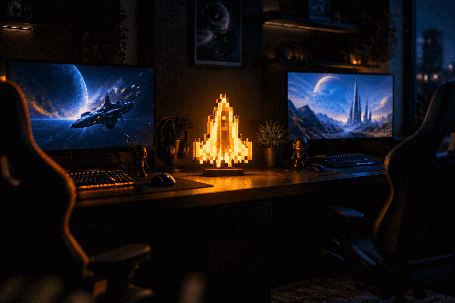
- The retro corner is warm and low. CRT amber, black walls, the marquee format, brightness at the attract-mode register (dim enough to feel like a screen in a dark room). The corner is about memory.
- The modern battlestation is cool and bright. RGB, cyan, the monitor-tier integration, brightness at the performance register. The setup is about presence.
- The crossover wall. The two share a room well in exactly one configuration: the retro corner on one wall (warm, marquee, icons) and the modern setup on another (cool, RGB) — the room split by decade, the door as the time machine. The eighties and synthwave guides cover the retro side’s wider aesthetic; cyberpunk covers the forward side.
The Arcade-Bar Economics (What the Revival Taught)
The retro arcade’s commercial revival – the arcade bars and museum-game venues of the last decade – is worth a section because it validated the whole register’s economics:
- The glow-is-the-brand lesson. The arcade bars that succeeded ran the period lighting design (black walls, marquee glow, the attract-mode brightness) rather than modern bar lighting with games in it. The customers came for the room as much as the cabinets – the aesthetic was the product’s other half. The home corner inherits this: the corner that runs the palette honestly feels like the era; the corner that runs bright white overheads feels like a storage unit with a screen.
- The two-player economics. The venues learned that the glow corner is where groups linger – the photo tier, the standing-and-watching tier. The home corner’s planning can borrow the insight: build the corner for the group, not the player – the seating that faces the screen, the glow that photographs, the phrase tier that includes the visitors.
- The tournament-and-event tier. The revival’s event calendar (the tournaments, the speedrun marathons, the retro-expo circuit) keeps the icon set in circulation as event decor – the register’s commercial rental tier. The home corner’s marquee piece is the same object the venues rent.
What is the difference between a marquee sign and a regular neon sign? The marquee format copies the arcade cabinet’s lit header – the title inside a border frame, often two-line, with the lightbox’s internal-glow look. A regular neon piece is the shape or text alone. The marquee reads as the whole cabinet’s spirit in one object; the regular piece reads as the icon. Both serve the corner; the marquee is the deeper cut.
FAQ: Retro Gaming Neon Signs
What is a retro gaming neon sign? Any piece in the arcade’s three layers: the marquee format (lit-header title pieces), the pixel tier (game icons in blocky tube rendering), or the coin tier (INSERT COIN, GAME OVER, HIGH SCORE – the era’s complete vocabulary).
How do I build an arcade corner at home? The four-piece kit: the cabinet or its wall-ghost, the marquee anchor at the top, the pixel sidekick beside it, the phrase footer at chair height. Black walls, warm palette – the corner wants the darkest wall in the house.
What should a game room neon sign say? The canon: INSERT COIN (the invitation), GAME OVER (the most-ordered build), HIGH SCORE (the customizable ambition tier), PRESS START (the welcome). The game titles carry the marquee tier; the Pac-Man guide covers the most iconic of those.
What colors for an arcade room? The CRT warmth: amber, warm white, and yellow as the base – the glow the era’s photos remember. The sprite icons keep their game colors (the multicolor exception); one blue piece balances the warm core.
How much does a retro arcade sign cost? The phrase pieces run $80-$150; the pixel icons $90-$180; the marquee-format anchors $150-$280. The complete four-piece corner assembles for $400-$700 – the price of the cabinet you’re not storing.
Can the retro corner and the modern setup share a room? Yes, in the crossover configuration: retro corner on one wall (warm, marquee, memory), modern battlestation on the other (cool, RGB, presence) – the room split by decade. One piece per register on the shared walls keeps the peace.
Insert Coin
The Friday night that never closed down, rebuilt one marquee at a time. The title, the icon, the quarter’s promise — build the corner and press start.
More game glow: Pac-Man deep dive, gaming room layouts, the eighties, synthwave rooms.
Sources & Further Reading
- Neon sign (Wikipedia) — the consolidated public record of neon-sign history and technology.
Pricing based on CustomNeon’s current catalog (2026); custom quotes come live from the sign builder.