Blog
Bedroom Neon Signs by Style: 28 Ideas Mapped
The bedroom is neon’s home room — the place where a sign is less decoration than atmosphere, doing the work of a lamp, a mood, and a personality statement in one piece. But “bedroom style” is not one thing: the sign that makes a boho room sing will kill a minimalist one, and the cyberpunk piece looks like a mistake in a farmhouse. The style-first approach is how the best bedrooms get built.
Here are 28 ideas mapped to the eight bedroom styles that actually hang neon, with the palette logic that keeps each coherent. The shopping tier lives at neon signs for bedroom, and the piece-level canon is in the bedroom ideas guide.
Minimalist: Ideas 1–4
Less everything, one warm piece.
- A single warm-white script word — “breathe,” “stay,” “home”: one word, one piece, done. The minimalist bedroom’s entire neon allowance.
- A line-art shape — a single-line face, wave, or moon in warm white; the white treatment covers the register in depth.
- The monogram — one letter, thin stroke, oversized; the piece that carries minimalism without breaking it.
- The cord discipline — the minimalist’s real project: cord channeled, dimmer hidden, the sign floating. The hanging guide covers the clean-mount system.
Boho: Ideas 5–8
- A cactus or pampas shape — warm white or muted rainbow; the boho tier’s icons, glowing gently over woven textures.
- “Wander” / “Stay Wild” — the free-spirit register; script formats in earthy tones.
- A sun-and-moon pair — the celestial tier that anchors tapestry walls; the boho palette runs warm.
- The layered-rug glow — a small piece mounted over a textile wall hanging: the depth composition that defines the style.
Aesthetic / Soft: Ideas 9–12
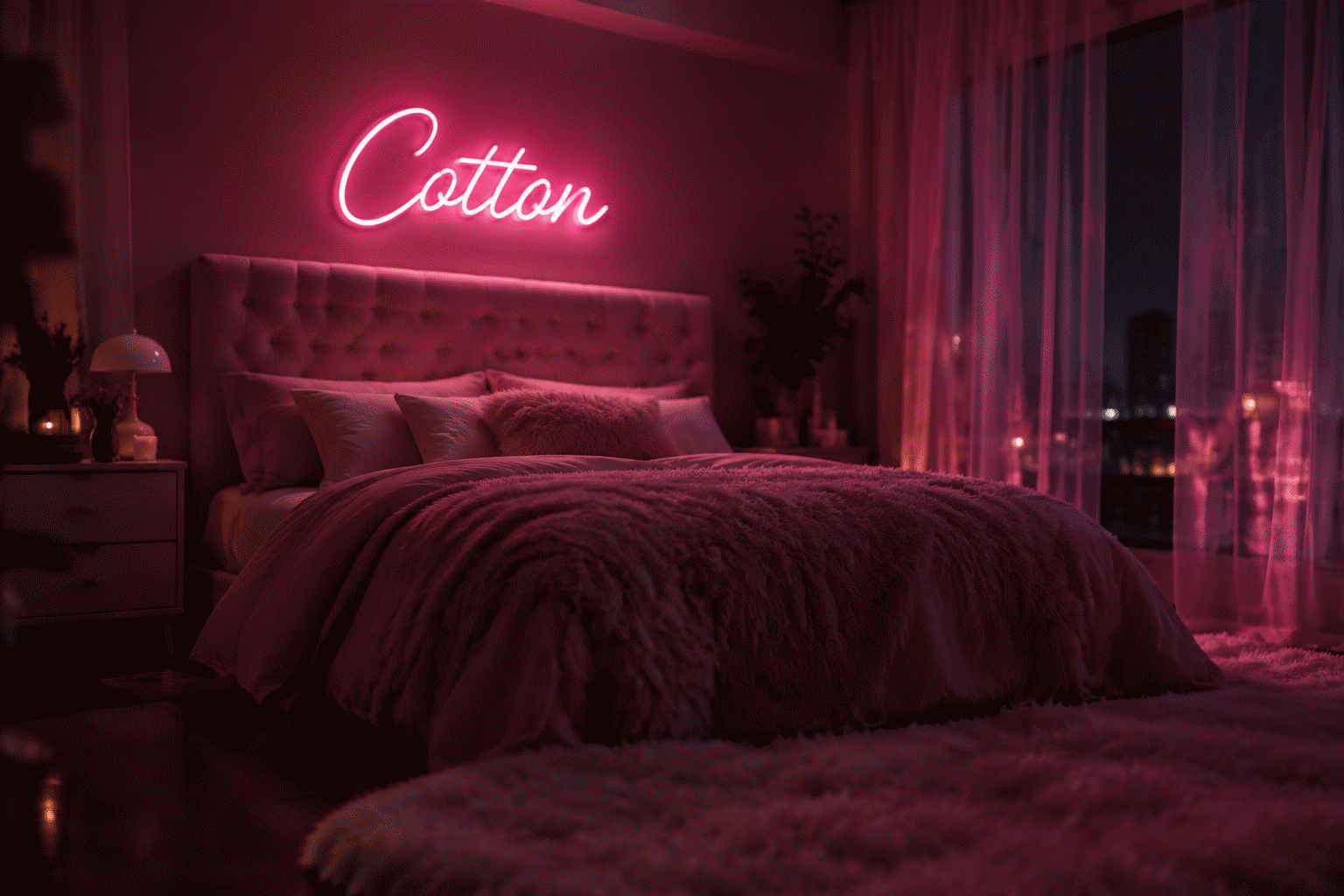
- The pink system — layered pinks (blush script + hot-pink accent): the soft-aesthetic bedroom’s signature, covered fully in the linked treatment.
- You’re Like Really Pretty — the compliment register; the aesthetic wall’s most-hung phrase.
- A sunset-gradient piece — the two-tone build (pink-to-orange); the gradient tier that carries the sunset-lamp era.
- The cloud tier — one or two neon clouds plus a phrase; the dreamy composition that photographs softest.

Dark Academia & Moody: Ideas 13–16
- Warm amber script — “read” or a Latin phrase in candle-toned amber; the study-bedroom’s light source and thesis in one.
- A book or quill shape — the academia icons; warm white on dark walls, brass-adjacent glow.
- “It Was All A Dream” — the moody register (the piece); strongest in purple or ice blue over dark bedding.
- The dark-purple system — purple decor at 30% brightness: the midnight-library register, moody and deliberate.
Cyberpunk & Gaming: Ideas 17–20
- The dual-tone tech build — ice blue + hot pink in one composition: cyberpunk’s native palette, and the style’s whole identity in two colors.
- A Japanese-katakana piece — the neo-Tokyo register; strongest paired with a skyline or kanji phrase.
- The controller/bolt piece — the gaming corner’s icons (full canon); the bedroom-gaming hybrid runs them at 40% after dark.
- The wire-wrap tier — neon plus visible cable-management aesthetics: the cyberpunk room where the cords are part of the look (the one style where this is allowed).

Scandinavian & Light Wood: Ideas 21–23
- A muted-tone arc — the rainbow in Scandinavian-muted colors (sage, clay, oat); the Scandi room’s one playful piece.
- “Hygge” — the word itself in warm white; the coziest import in home decor, lit.
- The above-bed arc — the arc shape over the headboard (not text): the Scandi placement standard, size-matched to the bed width.
Vintage & Retro: Ideas 24–26
- A 70s-style script — burnt orange or harvest gold; the era-exact tier for wood-panel and macrame rooms.
- The retro motel piece — “vacancy”-adjacent humor or a starburst; the Americana register, yellow treatment for the palette logic.
- A vintage-logo piece — the era’s brand scripts (the archive covers the category); one strong piece carries the whole style.
Romantic & Shared: Ideas 27–28
- The couple’s phrase — “Better Together” or Love You More: the shared-bedroom register, warm white or blush.
- The above-bed names — two names or initials joined; the composition covered in the backdrop guide’s sizing logic — scaled down to headboard width.
The Style-to-Palette Decoder
Every style above runs a coherent palette, and the decoder is short: minimal and Scandi run warm white; boho runs warm earth tones; aesthetic runs layered pink; moody runs amber and dark purple; cyberpunk runs blue-plus-pink; retro runs burnt orange and gold; romantic runs blush and champagne. The bedroom’s bedding and wall color confirm the call before any purchase — the bedroom color guide maps the full logic, and the aesthetic guide covers the cross-style compositions.
Placement runs one rule per style: above the headboard (centered, width-matched to the bed) for everything text; the corner wall for the shape tiers; and the desk corner for the gaming-adjacent builds. Bedrooms want 30–50% brightness after dark — the bedroom is the dimmest room in the neon house by design, which is exactly why it photographs best.
The Style-to-Purchase Decoder
Every style above runs a purchase sequence, and the decoder compresses it: palette first, anchor second, supports last.
Minimalist: one warm-white script or line-art piece, $100-250, the room’s entire neon allowance – and the discipline to stop there. The minimalist bedroom’s failure mode is the second piece; the style IS the restraint (the white treatment).
Boho: the earth-tone shapes and script, $150-350 – the cactus or pampas, the “Stay Wild,” the sun-and-moon pair. The boho budget runs the texture tier harder than the glow tier; the neon joins the room’s woven everything rather than leading it.
Aesthetic/soft: the layered-pink system, $200-500 – the script, the clouds, the gradient piece. The aesthetic room’s neon IS the room; the budget reflects the priority.
Dark academia/moody: the amber and dark-purple registers, $150-400 – the study-piece, the book shape, the moody phrase. The dark room’s glow out-photographs every other register at 30% brightness; the budget’s return concentrates in the evening hours, which is where the style lives anyway.
Cyberpunk/gaming: the dual-tone tech build, $200-550 – the blue-plus-pink composition, the katakana accent, the bias glow. The style’s neon budget merges with the setup budget – the two purchases are one system.
Scandi, retro, romantic: the arc tiers, the 70s scripts, the blush-and-champagne registers – $150-450 by ambition. The three styles that predate neon’s home era run their glow as an accent rather than a statement; the budget follows the modesty.
The Style Transitions: When the Room Changes Its Mind
Bedrooms change styles every 3-5 years, and the transition math favors the neutral-anchored room: the warm-white namepiece or monogram rides every style change (it agrees with all of them), the style-specific pieces retire with their style, and the transition costs two accent pieces rather than a full re-commission. The style-specific big pieces (the cyberpunk wall, the aesthetic system) are the rooms that committed – and the commitment reads great until it doesn’t, at which point the neutral anchor saves the budget (the style decoder maps the full transition logic).
The one rule that survives every style: the dimmer. The bedroom’s 15-40% brightness band is every style’s nighttime register – the dial that makes the minimalist’s single script and the aesthetic room’s full system equally livable at midnight (the brightness physics covers the wiring).
Variations and Pairings
The style canon’s variants. The word-face variants: “bedroom neon sign ideas by style,” “aesthetic bedroom neon,” and “minimalist bedroom neon sign” serve the style-mapped tier – the general faces (the produced canon, the landing) carrying the unsorted range. The style faces: the pink (the treatment), the white (the white guide), the blue (the blue guide), and the purple (the purple decor) each carry their dedicated treatments – the color cross-over running strongest in the bedroom.
The pairing logic: the styles pair within their registers – the minimalist’s single piece with the room’s restraint, the boho’s shapes with the texture layers, the aesthetic’s three-piece system with the photographed corner. The pairings that work run one style per room (the decoder’s discipline); the pairings that fail run the style blend (the cyberpunk piece in the boho room) – the mismatch the decoder exists to prevent.
The transition pairing: the room that changes styles pairs the neutral keeper (the namepiece) with the new phase’s pieces – the anchor surviving the transition, the phases rotating around it (the transition logic runs the same architecture for childhood).
FAQ About Bedroom Neon Signs by Style
How do I match a neon sign to my bedroom style? Palette first: pull the room’s dominant color and pick the register from the decoder above (warm white for minimal/Scandi, pink for aesthetic, amber for moody, blue-pink for cyberpunk). Then size to the headboard or corner wall. The style guide covers the cross-overs.
What’s the best bedroom neon sign overall? A single warm-white script word or the monogram — the pieces that work in every style, age with the room, and dim to a night-light. Style-specific pieces come second; the bedroom canon ranks the full tier.
Where should a neon sign go in a bedroom? Above the headboard, centered, width within the bed’s footprint; or the corner accent wall for shapes and gaming builds. Never opposite the bed at eye level (glare at 2 a.m.) — the placement mechanics have the full logic.
What brightness should a bedroom neon run at night? 30% or below for sleep-adjacent glow; 50% for reading hour. The bedroom dimmer is the style-agnostic upgrade that makes every register livable.
How do I match a neon sign to my bedroom style? Palette first, then form: pull the room’s dominant color and pick the register from the decoder (warm white for minimal and Scandi, pink for aesthetic, amber for moody, purple for the teen and dark registers, blue-plus-pink for cyberpunk – the decoder maps all twelve). Then the form follows the style’s discipline: the minimalist’s single line-art piece, the boho’s earth-tone shapes, the aesthetic’s three-piece system. The style-matching test: the piece should look like it was commissioned for the room rather than bought for the wall – the room’s existing palette picked it, the style’s discipline sized it, and the bedroom’s night-self approved it (the style guide above runs every case).
Are neon bedroom signs safe to leave on overnight? Yes – with the brightness discipline that makes the overnight glow a feature rather than a sleep problem: the LED tubing runs cool (the heat facts), draws a few watts (the power math), and contains none of the heat or glass the question remembers from the old neon era. The bedroom-specific rules: the 10-20% overnight band for the sleep-adjacent pieces, the warm registers rather than the blue (the spectrum discipline the night-light logic covers), and the placement that keeps the glow off the pillow’s direct line. The bedroom sign that follows the three rules glows all night for about a dollar a month – the cheapest ambience the room’s nights will ever buy.
Color is half the style decision: the pink landing, blue, purple and white each map to different bedroom moods, and the wallpaper guide extends the glow past the sign itself. Before checkout, the buying checklist and birthday sign ideas round out the order.
Sources & Further Reading
- Neon sign (Wikipedia) — the consolidated public record of neon-sign history and technology.
- Mercury (U.S. EPA) — federal guidance on mercury exposure and safe handling.
Pricing based on CustomNeon’s current catalog (2026); custom quotes come live from the sign builder.