Business Sign Size Guide: The Complete Chart

Business sign sizing is physics with money attached: too small and the street never reads it (the sign that cost real dollars and converts nothing); too big and the code (or the budget, or the architecture) pushes back. The commercial sizing decision runs on four variables — viewing speed, viewing distance, wall or window proportions, and the local code — and this guide puts them in one chart-logic you can apply to any storefront.
The consumer-side version (bedrooms, parties, home bars) lives at the neon sign size guide; this is the street’s version.
The Master Variables
Speed: the speed at which your audience passes decides legibility, and legibility decides everything. The rule of thumb from a century of signage practice: every 10 mph of approach speed wants roughly 1 inch of letter height per 10 feet of viewing distance. Pedestrian traffic (2–3 mph) reads fine detail at 15–25 feet; arterial traffic (35+ mph) needs letters visible at 100+.
Distance: measure from the sign to the farthest point it must convert — the far sidewalk, the parking lot’s far row, the road’s approach lane. The sign’s letter height should hold a comfortable read at that distance, not just a visible glow.
Proportion: the sign’s width belongs to its anchor — the storefront’s beam, window, or entry (the piece sized to the architecture reads designed; the piece floating in the wall’s middle reads stuck). The consumer-side ratio transfers: anchor width minus 20–25%.
Code: the local sign ordinance caps the whole calculation — height, area, brightness, and sometimes animation. It’s a real ceiling, and it’s checked before the budget, not after (the permit logic).
The Chart by Location
| Sign location | Typical size | Letter height | The read |
|---|---|---|---|
| Interior window (pedestrian street) | 18–24 in | 4–6 in | Sidewalk at 15–25 ft |
| Exterior window/door (parking-side) | 24–36 in | 6–9 in | Lot approach at 30–60 ft |
| Main storefront sign (pedestrian) | 36–60 in wide | 9–15 in | Both sidewalks, intersection diagonal |
| Main storefront sign (arterial) | 60–96 in wide | 16–24 in | 35 mph approach at 100–250 ft |
| Blade/projecting sign | 24–36 in | 8–12 in | Sidewalk’s perpendicular view |
| Interior wall piece (customer-facing) | 36–60 in | 8–14 in | The room’s browsing distance |
| Lobby/reception piece | 24–48 in | 6–12 in | The entry’s 10–20 ft |
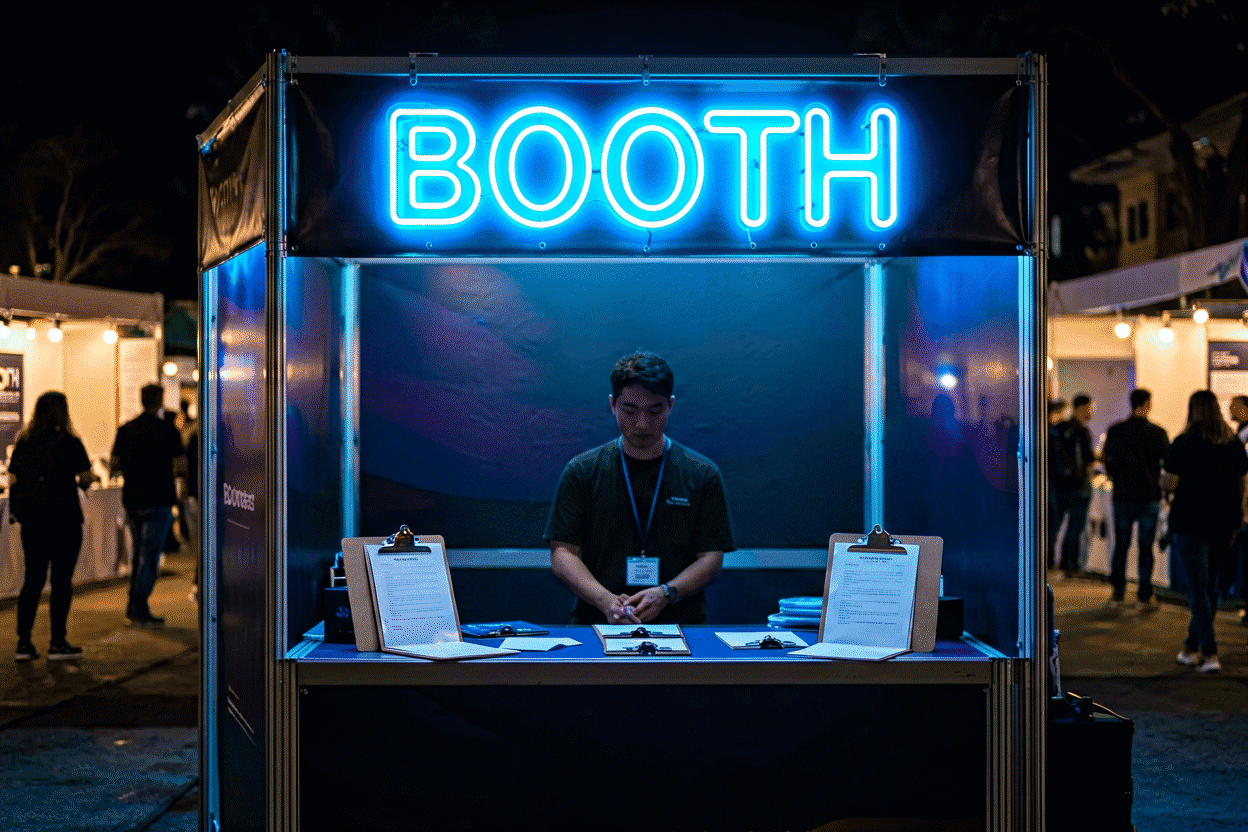
| Trade-show booth piece | 18–36 in | 5–9 in | The aisle at 8–20 ft |
The chart’s logic: every row is a speed-and-distance answer, and the wrong row for your street is the most common (and most expensive) sizing error — the 24-inch sign on the 35-mph frontage that nobody driving past has ever read.
By Trade: The Working Sizes
Food & drink: the open sign at window tier (24–36 in), the specialty piece at street tier (36–60), the menu-board accent at counter distance (the restaurant canon). Beauty: the namepiece at entry tier (30–48), the mirror piece at room tier (24–36) (the salon canon). Retail: the identity sign at architecture tier, the category markers at browsing tier (the retail canon). Nightlife: the marquee at arterial tier — the venue’s identity wants the biggest read the code allows (the nightclub canon).

The Code Layer
The size conversation’s ceiling: most municipal sign codes cap total sign area per frontage (often 1–1.5 sq ft per linear foot of storefront), cap projection and height for blade signs, and restrict brightness near residential zones. The sequence that avoids re-mounts: code check → speed-and-distance sizing → proportion fitting → budget (the permits guide covers the process; the cost brackets close the math).
The Mistakes Chart
The four from the field: (1) the undersized arterial — the most common and most expensive; (2) the floating sign — sized to the wall instead of the architecture; (3) the code surprise — sized before the ordinance was read, remounted after; (4) the letter-height miss — the sign wide enough but the letters too fine for the distance (the glow reads, the name doesn’t). The chart’s rows are the counter-programming, in order.

The Letter-Height Chart: Readability by Distance
The size guide’s core table – the letter height, the readable distance, the location it serves.
| Letter height | Max readable distance | The locations |
|---|---|---|
| 4-6 in | 25-30 ft | Interior windows, counter signage |
| 8-10 in | 50-60 ft | Pedestrian storefronts, small lobbies |
| 12-15 in | 75-100 ft | Main-street frontages, parking-side |
| 16-24 in | 100-150 ft | Arterial roads, big-box frontages |
| 24-36 in | 150-250 ft | Highway-adjacent, large venues |
The chart’s rule-of-thumb source: the signage industry’s accumulated practice (roughly 1 inch of letter height per 10-15 feet of viewing distance, with the conservative end for the fast-and-glancing reads) – the numbers that a century of storefronts converged on before anyone wrote them down (the full logic).
The chart’s application: measure the farthest point the sign must convert (the far sidewalk, the lot’s far row, the road’s approach lane), find the distance’s row, and buy the letter height that clears it – the sizing decision as measurement rather than taste. The undersized arterial (the chart’s most-violated row) is the most expensive mistake in commercial signage: the sign that cost real money and converts nobody driving past (the mistakes chart).
The Code’s Ceilings and the Brightness Compensations
The sign code caps the size (the area-per-frontage formulas), and the capped sign has one recovery: brightness and contrast (the physics). The smaller-but-bolder sign outreads the bigger-but-dimmer one at every distance the code allows – the luminance contrast that makes the 12-inch letter at full glow outperform the 16-inch letter at half. The capped storefront’s program: the code’s maximum area, spent on the fewest, boldest letters – the “OPEN” that fills the allowance beats the “WELCOME TO OUR SHOP” that divides it.
The code’s other ceilings – the height limits (the sign’s vertical band), the projection limits (the blade sign’s reach), and the brightness limits (the residential-adjacent curfews) – each have their compensations, and the permit logic covers the appeals and the variances for the frontages that need more than the standard allowance.
FAQ About Business Sign Sizes
What size should a business neon sign be? By location and speed: the chart above — pedestrian storefronts carry 36–60 inch pieces with 9–15 inch letters; arterials need 60+ with 16+ letters (the logic). Code caps the ceiling (the permits).
How big should letters be to read from the street? Roughly 1 inch of letter height per 10 feet of viewing distance at driving speeds; pedestrian windows read 4–6 inch letters fine at sidewalk range (the chart).
Does sign size affect cost? Directly — size drives the cost brackets more than any other variable. The sizing discipline (right-size for the street, not max-size for the wall) is the budget’s best friend.
What if the code caps my sign smaller than the street needs? The tier-trading answer: put the compliant piece’s size into brightness and contrast (the physics) — the smaller-but-bolder sign outreads the bigger-but-dimmer one at every distance the code allows.
How do I measure for a business sign? Four measurements: the farthest conversion point (the sidewalk’s far corner, the lot’s far row – the viewing distance that sets the letter height), the approach speed (the mph that sets the size class), the anchor width (the storefront’s beam, the window’s frame – the proportion the piece belongs to), and the code’s area allowance (the ceiling that caps everything) (the master variables above). The chart converts the measurements to the size; the ten-minute tape work that produces them is the signage decision’s highest-leverage quarter hour.
How do I size a sign for a pedestrian street? The pedestrian math: the 15-25 foot read at walking speed permits the detail tier – the 18-24 inch window pieces with the 4-6 inch letters, the 36-60 inch storefront identities with the 9-15 inch letters (the chart above). The pedestrian street’s advantage: the browsing read (the passerby’s two-to-three seconds at the slow speed carry the phrase pieces and the icon detail that the arterial’s glance cannot) – the small storefront’s window program running the full creative tier at the sizes the driving streets forbid. The pedestrian sizing’s one discipline: the far-corner test – the sign readable from the block’s intersection diagonal (the 60-80 foot read) earns the street’s whole length rather than its half.
How does a corner storefront change the size math? Corner units carry two sightlines, and the oblique approach loses roughly a third of legibility — so letter height gets set by the harder street, not the front one, typically one inch of letter per twelve feet of the longer view. The second sign (or a wrap-around bend) earns its cost on corner parcels specifically because single-face sizing leaves the side street squinting; measure both curbs before ordering anything.
What’s the right sign width for a ten-foot window? Hold the sign to about 60 percent of the window’s width — a six-foot piece in a ten-foot opening leaves breathing room that reads as confidence, while anything wider fights the frame and the glass behind it. Letter height lands at 8-10 inches for that width, which stays crisp from the opposite curb and still photographs honestly at doorway distance.
The Code Ceiling vs the Physics Floor
The sizing decision’s two constraints, compared:
| Decision axis | The code ceiling | The physics floor |
|---|---|---|
| The source | The municipal ordinance (the legal maximum) | The street’s speed and distance (the readable minimum) |
| The measurement | The area-per-frontage formulas (the permits) | The letter-height chart (the table above) |
| The violation’s cost | The re-mount and the fine | The invisible sign (the silent failure) |
| The negotiation | The variance process (the slow appeal) | None (the physics doesn’t hear appeals) |
| The compensation | Brightness and contrast (the recovery) | The budget’s honest acceptance |
| The buyer’s work | The ten-minute call | The tape measure’s ten minutes |
The two constraints’ working relationship: the physics floor sets what the sign must be (the readable minimum for the street’s speed), the code ceiling sets what it may be (the legal maximum for the frontage) – and the compliant sign lives between them, bought at the size the intersection permits.
The collision case (the physics floor above the code ceiling – the fast street and the small allowance): the brightness compensation is the only recovery (the open-sign physics) – the smaller-but-bolder sign outreading the bigger-but-dimmer at every distance the code allows. The collision’s honest outcome: some frontages cannot carry their street’s speed within their code, and those frontages’ businesses win their conversion at the window tier and the interior program instead (the storefront logic).
Sources & Further Reading
- Neon sign (Wikipedia) — the consolidated public record of neon-sign history and technology.