Neon Color Chart: Every Shade and Hex Reference
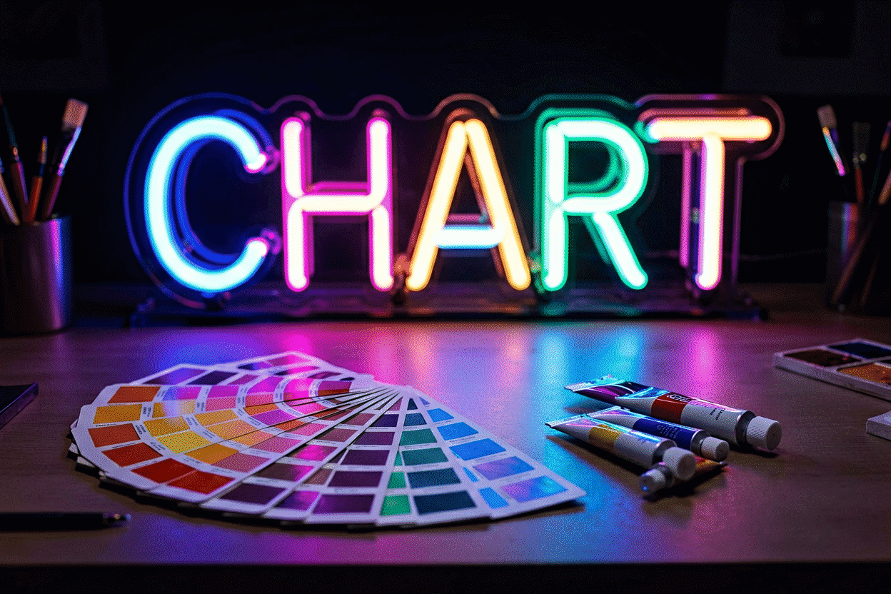
The complete neon color reference: every core shade with its design-side hex and RGB values, its light-side character (what the glow actually does in a room), and its dark and pale variants — plus the honest media-translation note that makes this chart work (screen colors and glowing tubes are different physics, and matching between them is approximation, not identity). Designers use the hex; buyers use the descriptions; everyone benefits from having both on one page.
The pairing-and-palette methodology lives at neon color palette; the physics of how signs produce these hues at all at what are neon colors. This page is the reference table.
The Core Chart (Ten Hues + Variants)
| Color | Hex | RGB | The glow reads as |
|---|---|---|---|
| Hot pink | #FF007F | 255, 0, 127 | The signature social glow — saturated, flattering |
| Bubblegum pink | #FF69B4 | 255, 105, 180 | Softer pink — playful, sweet |
| Dusty rose | #DCAE96 | 220, 174, 150 | Muted pink — vintage romantic |
| Classic red | #FF3860* | 255, 56, 96 | Red-orange glow — the historical original |
| Crimson | #DC143C | 220, 20, 60 | Deep red — romantic-noir |
| Burgundy | #800020 | 128, 0, 32 | Wine-dark — leather-and-lounge |
| Orange | #FF6E27 | 255, 110, 39 | Warm energy — sunset, appetite |
| Golden yellow | #FFD300 | 255, 211, 0 | The brightest glow — sun, diner, cheer |
| Lime green | #CCFF00 | 204, 255, 0 | Electric yellow-green — high-energy |
| Emerald green | #00FF7F† | 0, 255, 127 | Jewel green — rich botanical |
| Kelly/true green | #39FF14 | 57, 255, 20 | The neon green default — fresh, matrix |
| Mint | #98FF98 | 152, 255, 152 | Pale green — airy, dessert-shop |
| Electric blue | #00FFFF‡ | 0, 255, 255 | Saturated cyan-blue — tech, screens |
| Ice blue | #ADD8E6 | 173, 216, 230 | Pale blue — spa, frozen-air |
| Royal blue | #4169E1 | 65, 105, 225 | Deep blue — moody tech |
| Purple | #BF00FF | 191, 0, 255 | True violet — mystic-luxe |
| Lavender | #E6E6FA | 230, 230, 250 | Pale purple — soft, airy |
| Magenta | #FF00FF | 255, 0, 255 | Electric pink-purple — statement register |
| White | #FFFFFF | 255, 255, 255 | Pure white — gallery-clean |
| Warm white | #FFF5E1 | 255, 245, 225 | Candlelight-adjacent — the cozy premium |
| Black (as combination) | — | — | Glow-on-black: the drama format (guide) |
\* Classic neon red’s design-side representation; the physical red-orange glow sits slightly warmer than most screen reds. † Often cited as spring green; the sign’s emerald reads deeper. ‡ Frequently used as the “electric blue” reference though technically cyan — sign blues span cyan through royal.
The Media-Translation Note (Read This Once)
A hex code describes light on a screen; a neon sign is light in a room — and the two differ predictably:
- Glow halos: emitted light spills and breathes; screen color sits flat. The same hex feels more atmospheric as a sign.
- Ambient interaction: wall color, dimming level, and room darkness all shift perceived color (the physics) — a hex can’t encode your wall.
- Saturation ceiling: screens max out lower than perceived glow saturation; neon pinks feel pinker than #FF007F looks on your phone.
- Dimming shifts brightness, not hue (PWM) — the hex holds; the volume changes.
Practical protocol: use hex values to communicate (“match this #FF007F energy”) and use live previews and physical samples to decide — every color renders against your actual words in the custom builder.
Dark and Pale Variant Logic
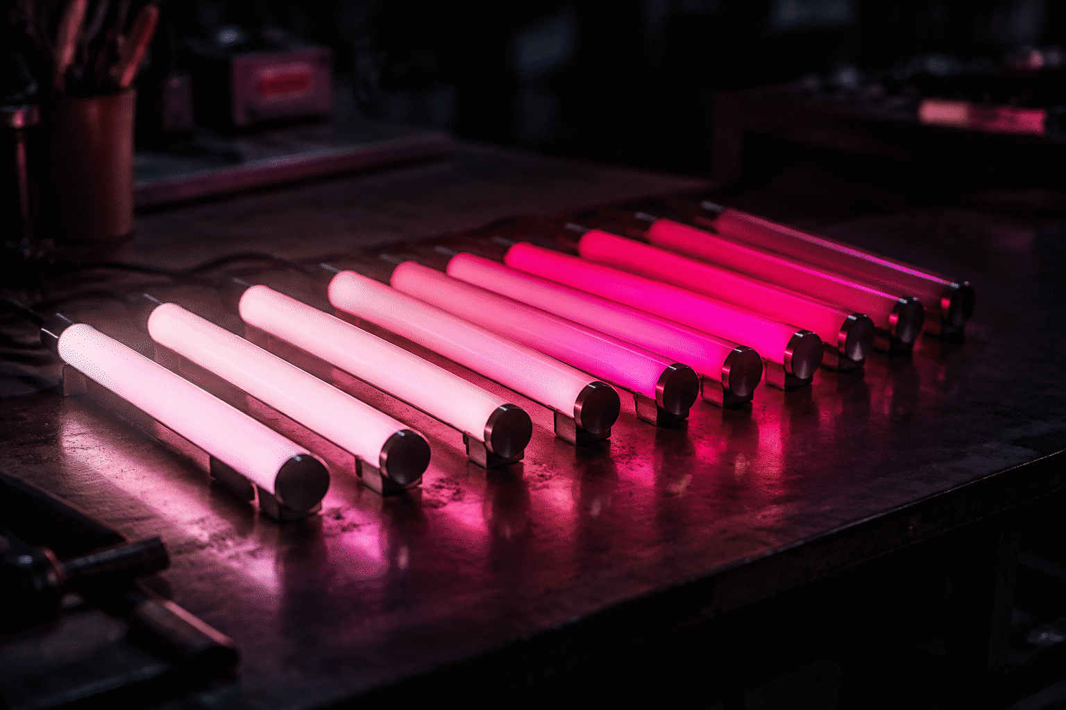
Every hue above has its depth axis — and depth changes meaning (the shade guides):
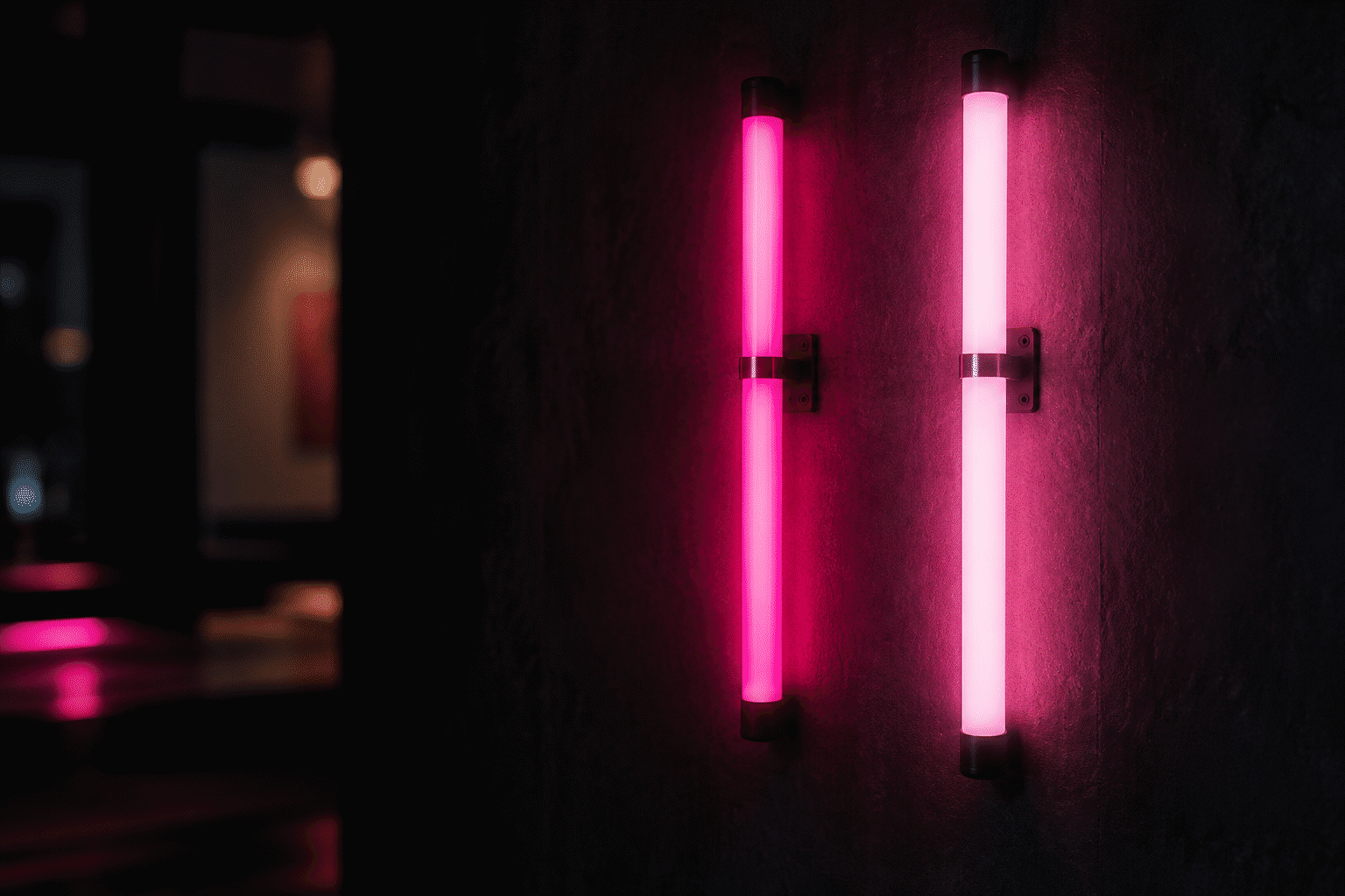
- Deep variants (crimson, burgundy, royal blue, deep purple): mood registers — romance, noir, luxe
- True/bright variants (classic red, electric blue, hot pink): energy registers — statements, appetite, social
- Pale variants (ice blue, mint, lavender, dusty rose): air registers — soft rooms, daylight-friendly, pastel schemes
Rule of thumb: dark walls want deep or true variants; white walls want brights or pales; pastel interiors want the pale set.
Temperature Quick-Chart (The Whites)
The white family’s internal range, because “white” is three colors (the full method):
| Variant | Approx. Kelvin | Reads as | Rooms |
|---|---|---|---|
| Warm white | 2700–3000K | Candlelight, cozy premium | Bedrooms, hospitality |
| Natural white | ~4000K | Neutral, gallery | Studios, kitchens |
| Cool/ice white | 5500–6500K | Crisp, airy, clinical-spa | Bathrooms, tech-minimal |
How to Use This Chart (The Three Jobs)
- Specifying: communicate exact intent to designers, partners, or makers — hex + name + the glow description column
- Comparing: shortlist two or three candidates, then run them through the palette method and combinations guide against your wall and room
- Verifying: confirm the rendering you approve matches your intent before ordering — the builder’s preview is the chart’s living version
Using the Chart: Three Worked Match Cases
The chart in action — three real matching scenarios:
Case one: matching a brand color. A café’s brand pink (Pantone-matched at #E91E63) needs a sign. The chart’s nearest glow: bubblegum pink (#FF69B4) for the softer register, or hot pink (#FF007F) one saturation-step past the brand color. The matching decision framework: neon reads at full saturation and halo, so brands typically choose the glow that reads closest rather than measures closest — here, the hot pink’s perceived energy matches the brand’s identity better than the literal hex neighbor. Confirm on the maker’s physical samples or the live preview; brand-critical work samples before ordering (the fidelity logic).
Case two: building a duotone from the chart. A gaming wall needs its two hues: the chart’s electric blue (#00FFFF) plus the purple (#BF00FF) — the cyberpunk duotone (combinations). The chart work: confirm the two hexes read distinct at distance (they do — opposite energy registers), assign dominance (blue wordmark 80, purple icon 20), and check both against the room’s black wall (the black rules) where both hit their maximum-saturation register.
Case three: the pastel room’s near-miss. A mint-and-cream nursery scheme, one shade off from chart-mint (#98FF98) in the inspiration photos. The chart’s guidance: pastel signs need exact-hue confidence more than saturated ones (there’s less margin before a pale hue reads wrong), so the family’s three candidates — mint, ice blue, dusty rose — preview against the actual wall photo, and the winner is whichever pastel the room’s fabrics already echo. The chart names candidates; the wall elects (the palette method).
The chart’s standing use: keep it open during any sign conversation — hex for precision, the glow-description column for intent, the media-translation note for expectations (and preview everything before the order commits it).
FAQ: Neon Color Charts
What are the hex codes for neon colors? Core references: hot pink #FF007F, classic red-orange #FF3860, orange #FF6E27, golden yellow #FFD300, neon green #39FF14, electric blue #00FFFF, purple #BF00FF, magenta #FF00FF, warm white #FFF5E1 — full table with RGB above.
How many neon colors are there? Commercial sign palettes run 15–25 distinct shades (with dark/pale variants); the design-side neon vocabulary extends to dozens of hexes. The core chart covers the ten hues plus variants that account for nearly all real orders.
Do hex codes accurately represent neon sign colors? As communication references, yes; as predictions, approximately — emitted glow halos, saturation ceilings, and room interaction make physical neon feel richer than screen equivalents. Use hex to specify, previews to decide.
What’s the difference between neon green and lime? Lime (#CCFF00) is the yellow-shifted electric end — highest energy; neon/kelly green (#39FF14) is the balanced default; emerald reads deeper and jewel-toned. Three registers of one hue (the green guide).
Which neon color is brightest? Golden yellow — it sits in the wavelength band human eyes perceive as most luminous (the physics). Perceived brightness then depends on saturation and your room’s darkness.
Is there a neon color chart for LED signs specifically? This one covers both: LED flex signs realize these families with diode chemistry, while glass neon’s palette comes from gases and phosphors (the color physics) — the chart’s reference values serve either technology’s design conversations.
The chart’s closing instruction: keep it open during every sign conversation — hex for specifying, glow-descriptions for intending, the media-translation note for calibrating expectations, and the live preview for deciding (preview decides). Color communication fails between screen and wall less often than between people — the chart’s shared vocabulary is the bridge, and the builder’s render is the crossing. How do I match a neon sign to my existing decor colors? Pull the room’s three most-present colors, locate them on the chart, and choose the sign’s hue by relationship: a neighboring hue for harmony (blue sign in a blue-gray room), a complementary jump for energy (pink in a green room), or the neutral exit (warm white with everything — the universal anchor). Then preview against an actual room photo at evening hour — the chart names candidates, the wall elects (the palette method).
How many neon colors do sign makers actually offer? Commercial palettes run 15–25 shades (the chart’s core plus dark and pale variants), with quality makers publishing swatch pages — the full curve from hot pink through ice blue to burgundy (the chart). The practical subset that fills most orders: roughly ten hues; the rest are registers waiting for the specific room that needs them.
The chart holds every name, every code, and every caveat the medium’s color conversations need — bookmark it for the next sign talk, whatever hue it turns.
Every hue, every code, every caveat — the color conversation’s shared page, ready when the next sign talk starts.
Sources & Further Reading
- Neon: Strong Lines (NIST Physical Reference Data) — the standard reference for neon’s emission wavelengths.
- Neon sign (Wikipedia) — the consolidated public record of neon-sign history and technology.