Blog
26 Kitchen Neon Sign Ideas That Warm Up the Kitchen
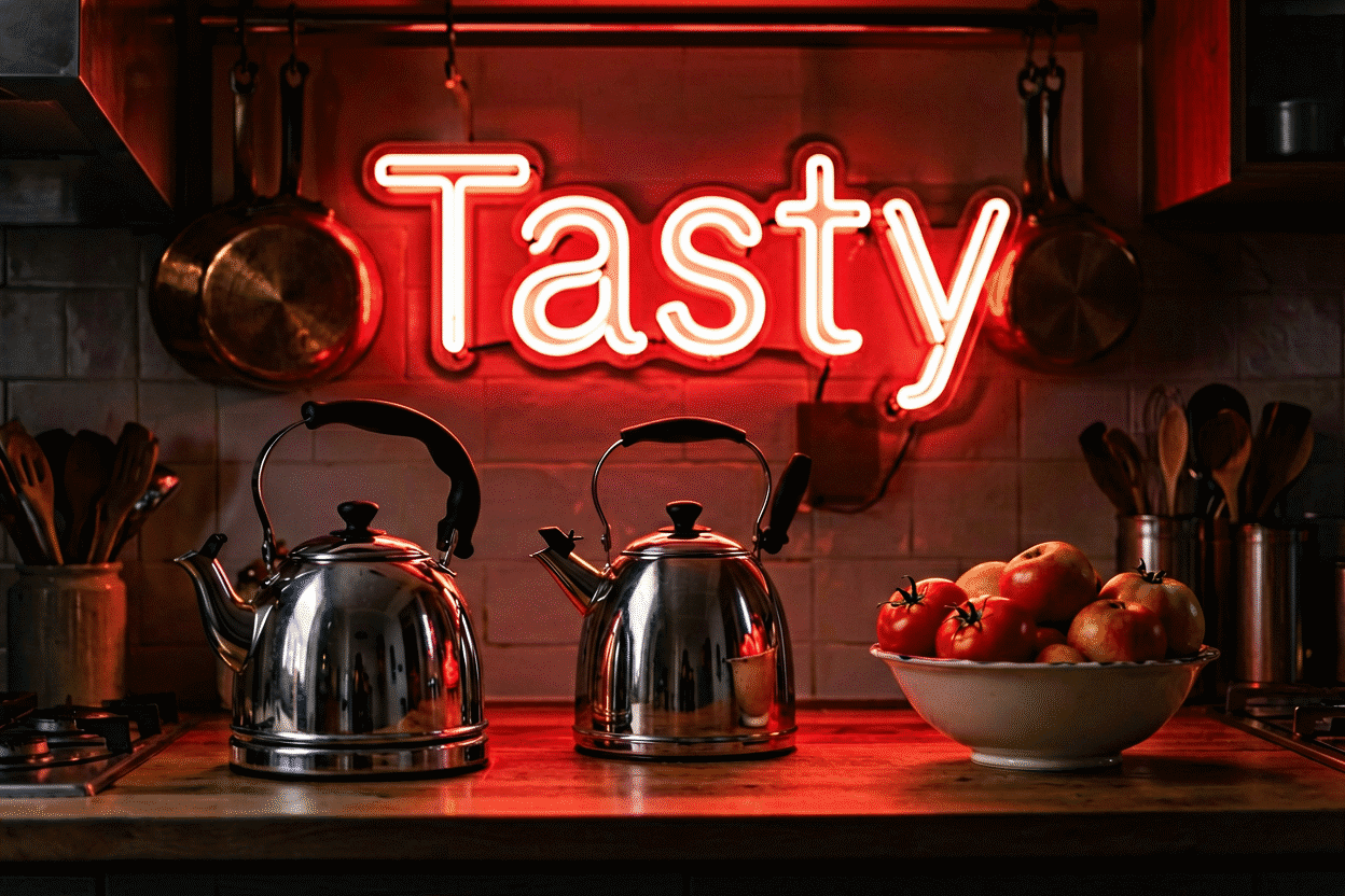
The kitchen is the one room where neon has a hundred years of precedent. Every diner that ever poured coffee at 3 a.m., every soda fountain that ever made a malted, every taqueria with a cerveza sign in the window — they all proved the same thing: food and glow belong together. Bringing that register home is the easiest decor decision you’ll make, because the kitchen already has the two things neon needs: something to say and people looking up.
Here are 26 ideas for the home kitchen, organized by wall and by mood, with the color calls that work over tile and the placement notes that keep glow out of your cooking line. The shopping tier lives at kitchen neon signs.
The Eating Words: Ideas 1–8
- “Eat” — the single most efficient kitchen sign ever made: three letters, universally understood, unbothered by trends. Oversized in warm white or red, it’s the room’s whole vocabulary.
- “Bon Appétit” — the Francophile’s version of the same word; script format, kitchen-adjacent elegance.
- “But First, Coffee” — the morning-person creed (see the café treatment for the full coffee-word canon).
- “EAT DRINK & BE MERRY” — the dinner-party register; works in the dining-adjacent kitchen where hosting happens.
- “Kitchen’s Open” — the home version of the restaurant classic; the piece that turns weeknight cooking into service with a smile.
- “Fresh Baked” or “Homemade” — for the household where the oven actually runs; bakery register borrowed wholesale.
- A coffee-cup or croissant shape — the zero-word tier; pastry shapes in warm tones flatter both tile and open shelving.
- “Good Food, Good Mood” — the rhyme that pays for itself at every brunch.
The Diner Register: Ideas 9–13
- A 1950s soda-fountain script — “DINER,” “MALT,” or “BURGERS” in era-correct script, red-and-white; the full mid-century playbook.
- The Coca-Cola treatment — the single most-hung brand piece in kitchen history; red script over white tile is a hundred-year-old composition that still works.
- A pie or donut shape — the dessert-case classics; small pieces that cluster well with the eating words.
- “OPEN 24 HOURS” — the diner joke for the kitchen that never closes; usually hung by whoever does the midnight fridge runs.
- Open/closed flip pair — the breakfast nook’s toy: “COFFEE: OPEN” and “KITCHEN: CLOSED” run on two switches. The household with teenagers reports heavy use.
The Color Kitchen: Ideas 14–19
- Green herbs and glow — green neon next to living basil and parsley is the farmer’s-market kitchen’s signature move; the linked treatment shows the full palette case.
- Yellow morning light — yellow is the breakfast color: it reads like morning sun, works over white cabinets, and flatters both coffee and citrus.
- Orange spice warmth — burnt orange is the chile-and-cast-iron kitchen’s register; pairs with copper pots and terracotta tile.
- Warm white script over open shelving — the minimalist’s entry point: one script phrase in warm white, tucked above the shelf line, does the work of three pieces.
- Pink pastry energy — soft pink “Baked With Love” or “Sprinkles” pieces for the birthday-cake household.
- Ice-blue bar zone — where the kitchen meets the drink station: “COLD BEER” or a cocktail glass in ice blue marks the territory.

The Family Kitchen: Ideas 20–23
- Welcome — over the doorway into the kitchen, the room’s official greeting; every guest photographs it.
- Hello Gorgeous — the self-greeting that starts the morning right; the most-hung piece in the category for a reason.
- The family name + “Kitchen” — “THE MORENOS’ KITCHEN, EST. 2014”; the custom nameplate (free preview) that turns the room into an address.
- “Gather” — the one-word gathering call for the household that actually does; warm white, over the table sightline.
The Statement Pieces: Ideas 24–26
- Hotel California — the rock-ballad register for the wine-and-records kitchen; pink-and-gold desert palette.
- “Life Is Short, Lick the Bowl” — the baker’s humor piece; the quote guests actually repeat.
- A recipe-card custom — grandma’s actual handwriting (“1 cup love, bake at 350”) reproduced in light; the heirloom tier, and the most-gifted kitchen custom of the last two years.

Placement, Color, and Grease Management
The kitchen’s best wall is the one you see from the sink and the stove’s side — not directly over the range. Glow above the burners reads in photos but collects grease; the cleaning guide covers the routine, but placement is the better fix: hang over the counter run, the breakfast nook, or the open shelving, and leave the range hood its own job.
Color follows the cabinets: white and light wood cabinets carry any register (yellow and green lead), dark cabinets want warm white or single-accent pieces, and the all-white kitchen can take the boldest piece in the house — red script, era diner, or full color. Tile backsplashes love neon; the glow doubles in glossy tile and makes 4-inch square white tile look deliberate. Standard mounting height is eye level above the counter line (60–66 inches to centerline); the hanging guide covers tile-specific anchoring, which wants a masonry bit and patience.
The Kitchen Environment: What Survives
The kitchen is the house’s hardest room on electronics – grease, steam, and the splatter arc of real cooking – and the neon that thrives in it is placed and maintained with that in mind.
The placement discipline is the whole game: the counter run and the breakfast nook (splash-free zones) carry the pieces; the range’s splash arc and the fryer corner carry none. The wall behind the stove looks like the natural spot – it is the room’s visual center – but it is the maintenance nightmare: grease films the tubes within months and the piece dims behind the grime. The honest alternative is the wall you see from the sink and the stove’s side, which carries the same visual weight and none of the grease.
The maintenance calendar runs monthly in a working kitchen: the dry method pass over the tubes and backing, with the damp-wipe tier for the kitchen’s specific film. The pieces near the coffee station and the range collect fastest; the nook pieces collect slowest. The five minutes a month is the difference between the piece that glows for years and the piece that browns out behind a grease film no one wants to touch.
The humidity question: the boiling-pot era of a family kitchen raises moisture that quality LED neon shrugs off – the vulnerability, as everywhere, is the power supply’s placement: open air, away from the steam column, and the outlet that isn’t behind the kettle. The temperature facts cover the rest: LED runs cool, and the kitchen’s ambient heat is not a factor worth engineering around.
The Kitchen Budget and Sizing Map
The budget: the entry tier ($60-150) runs the eating words (“Eat,” “Bon Appetit”) and the small shapes; the mid tier ($150-350) runs the diner-script statement and the era pieces; the commission tier ($250-500) runs the family charter and the recipe-card custom (preview) – the kitchen’s heirloom piece and the category’s most-gifted custom.
The sizing: the counter-run piece at 24-36 inches (within the counter’s footprint), the nook piece at 18-24 for a two-seater and 30-40 for a four-seat table, the backsplash-adjacent shapes small and clustered. The kitchen’s pieces run smaller than the living room’s by design – the room’s scale is intimate, and the piece that overpowers the cabinets reads commercial (the size guide for the full chart).
Variations and Pairings
The kitchen canon’s variants. The word-face variants: “kitchen neon sign ideas,” “neon signs for kitchen,” and “kitchen decor neon” serve the tier; the “diner kitchen” face leans the era registers, the “modern kitchen” face leans the warm-white minimalism (the style decoder logic applied to the room). The color faces: the green kitchen (the herbs tier), the yellow kitchen (the morning tier), and the orange kitchen (the spice tier) each carry their own treatments – the kitchen being the room where the color cross-over runs strongest.
The pairing logic: the kitchen’s pieces pair by station – the eating words over the table, the coffee register at the machine, the diner tier on the era wall – the stations’ pieces keeping to their stations’ walls. The kitchen that runs one phrase and one shape (the “Eat” and the coffee cup) covers every station’s need; the kitchen that runs five phrases has a signage situation.
The commercial pairing: the kitchen that serves customers (the cafe, the bakery – the B-end canons) pairs the home registers with the trade tiers – the “Eat” that works at home and the menu-board glow that works for business, the same room’s two modes.
FAQ About Kitchen Neon Signs
Is neon safe in a kitchen — heat, steam, grease? LED neon runs cool and handles normal cooking humidity without complaint (the safety numbers). The two real rules: keep it out of the direct splatter arc of the range, and mount the power supply where it gets airflow.
What’s the best first kitchen sign? “Eat” in warm white or red. It works in every kitchen style, from galley to great-room, and it never needs explaining. If your kitchen leans diner instead, start with the era script tier.
Where should a neon sign NOT go in a kitchen? Directly over the range or fryer zone, inside cabinets that close, and anywhere the coffee pot steams directly onto it. The counter run and nook walls do everything the range wall would, minus the grease.
What size works over a breakfast nook? Width follows the table: a two-seater nook carries 18–24 inches, a four-seat table wants 30–40. The sign should sit within the table’s footprint so the glow lands where the people are.
How do I clean grease off a kitchen neon sign? The dry method first – the soft brush and the microfiber, monthly, before the film sets (the cleaning guide). The grease that has set: the barely-damp microfiber with a drop of dish soap, wrung hard, wiped gently, dried immediately – the tubes themselves are sealed and forgiving; the connections and the backing are what the moisture discipline protects. The placement does the rest: the piece on the counter-run wall collects a fraction of the range wall’s film, and the five-minute monthly pass keeps even the coffee-station pieces fresh. The kitchen sign that dims almost never wears out – it accumulates, and the accumulation is a maintenance calendar, not a lifespan.
Are neon signs a fire hazard in the kitchen? No – LED neon runs cool (the fire-safety facts), draws minimal power, and contains none of the heat sources the kitchen already hosts. The kitchen’s actual fire risks (the range, the fryer, the toaster’s crumb tray) dwarf the sign’s contribution, which rounds to zero. The one real placement rule: keep the piece out of the range’s direct heat and splatter column – for the grease-film reason more than the safety one, and the power supply in open air away from the steam (the kitchen engineering above covers the full placement logic).
Sources & Further Reading
- Neon sign (Wikipedia) — the consolidated public record of neon-sign history and technology.
- Mercury (U.S. EPA) — federal guidance on mercury exposure and safe handling.
Pricing based on CustomNeon’s current catalog (2026); custom quotes come live from the sign builder.