Neon Color Meanings: What Each Glow Says

Every neon color arrives carrying meaning — decades of signage, cinema, and cultural coding that make a pink heart and a red heart say different things before anyone reads a word. Choosing a glow is choosing a message, and this guide is the decoder: what each of the ten core neon colors communicates, in home and business contexts, plus how the meanings combine when colors pair. The mechanism behind why these associations move behavior lives in the companion piece at neon colors psychology; the palette itself (hex codes and all) at neon color palette.
The Ten Core Meanings
Red — urgency, appetite, passion. The original glow (pure neon’s own color) and still the attention-getter: OPEN signs, bars, fast food. Red says now — which is why it sells speed and appetite, and why in homes it reads as passion or retro rather than calm. (Deep-dive)
Orange — warmth, friendliness, energy. Red’s approachable sibling: appetizing without urgency, energetic without alarm. Orange reads welcoming — cafés, casual dining, creative spaces — and at home carries sunset warmth. (Deep-dive)
Yellow — optimism, cheer, attention. The brightest physical glow and the sun’s vocabulary: happiness, welcome, breakfast. Yellow signs read friendly before anything else — kids’ rooms, kitchens, retro diners. (Deep-dive)
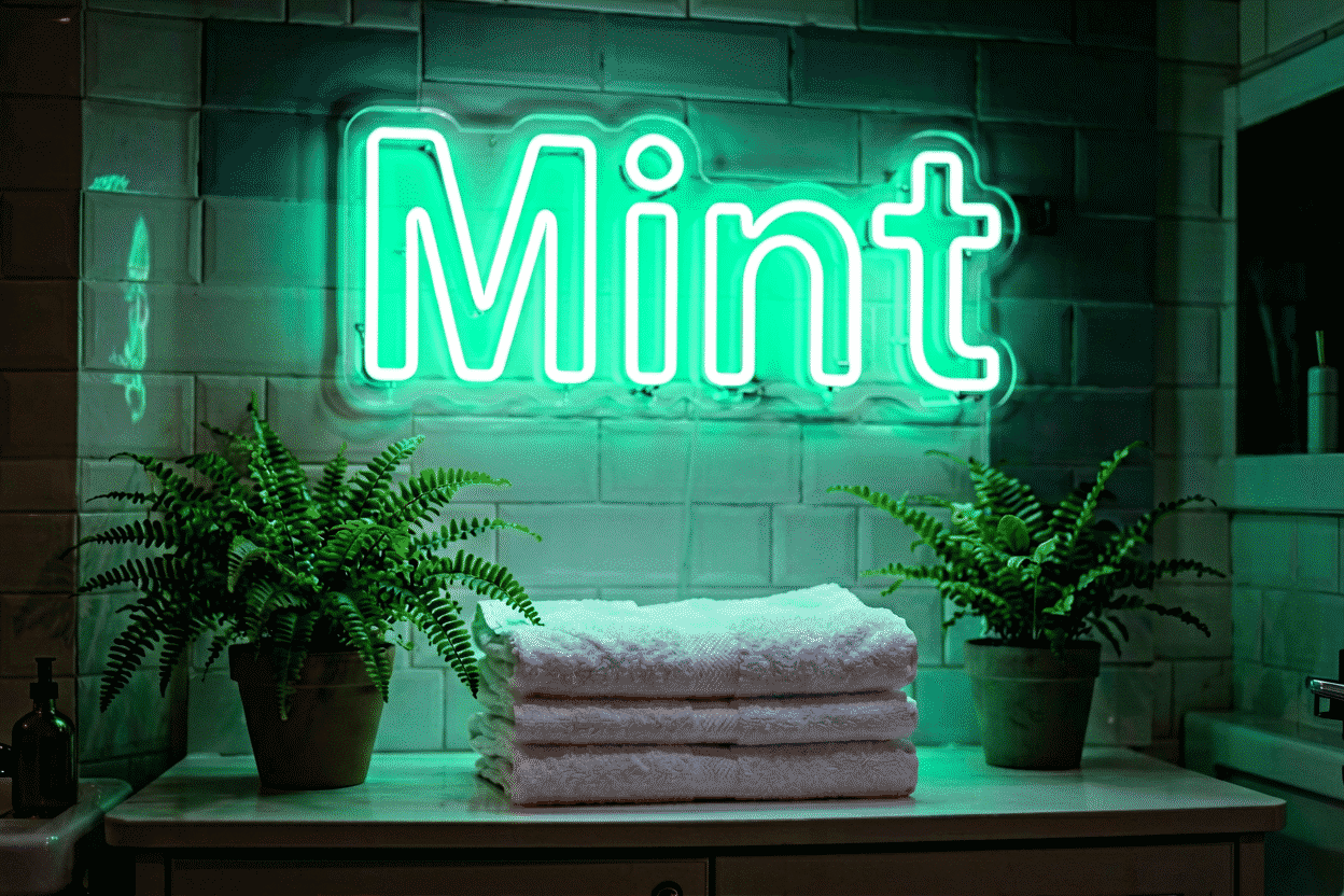
Green — nature, money, freshness. The triple-code: alive (plants, eco, herbal), prosperous (the hustle vocabulary), and digital (matrix, terminals). Context picks the meaning; the glow supplies all three’s potential. (Deep-dive)
Blue — trust, calm, technology. The corporate and tech register: competence, coolness, the screen-age glow. Blue says modern and reliable — offices, tech brands, gaming — and at home, composed nights. (Deep-dive)
Purple — luxury, mystery, creativity. Royalty’s old code plus the mystic register: purple reads premium and enigmatic — lounges, beauty, the witchy corner, the artistic studio. (Deep-dive)
Pink — sweetness, romance, confidence. The social-media era’s signature: playful and flattering, romantic in its warm shades, bold in its hot ones. Pink says photograph me — bedrooms, salons, events. (Deep-dive)
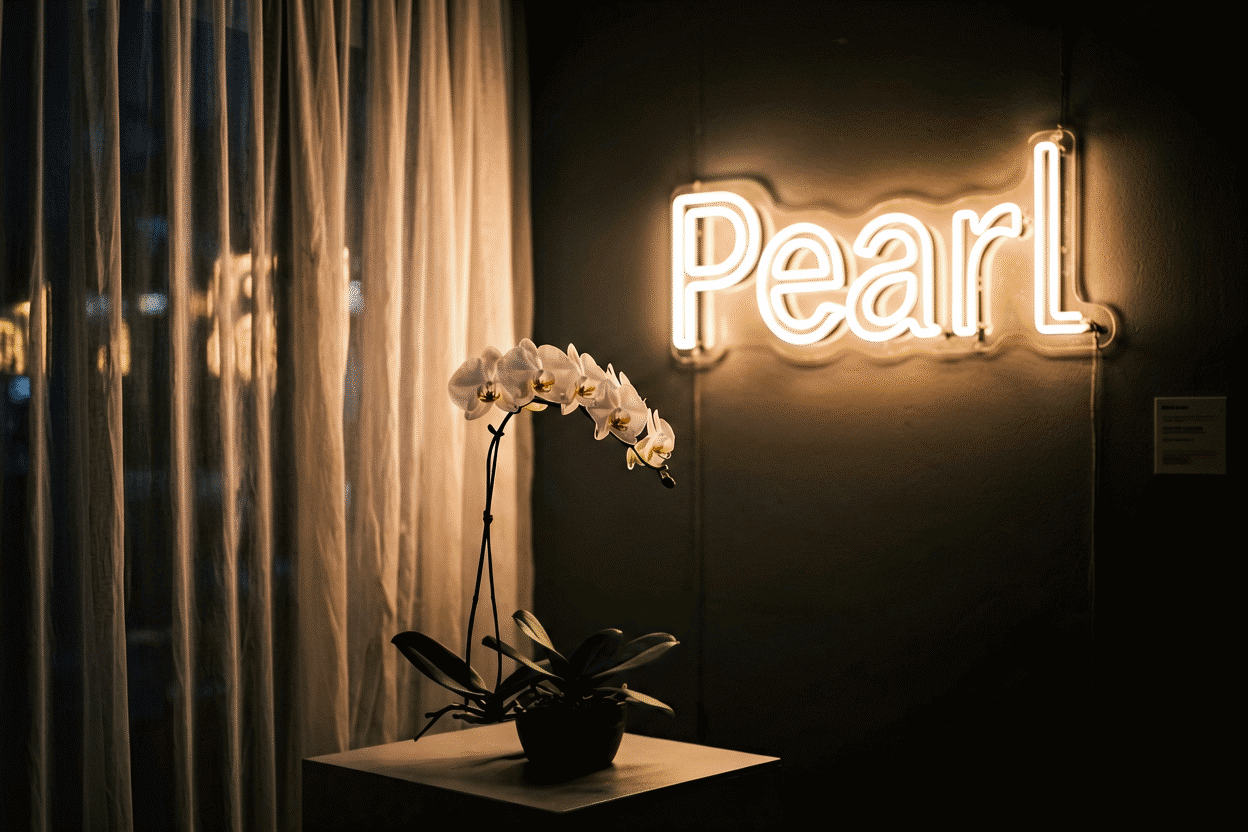
White — clarity, premium, minimalism. The absence-of-color statement: modern, clean, gallery-grade. White says designed rather than decorated — the minimalist’s glow. (Deep-dive)
Warm white — intimacy, calm, candlelight-adjacent. The soft variant: coziness and romance without hue-statement — hospitality’s quiet choice and the bedroom’s most livable glow. (Deep-dive)
Black (+glow combinations) — sophistication, edge, drama. The combination aesthetic: black backboards and dark walls make every paired color mean its most intense self — noir, luxe, cyber. (Deep-dive)
The Same Color, Two Contexts
Meanings shift by setting — the decoder’s most useful column:
| Color | In a business | In a home |
|---|---|---|
| Red | “Come in now” — appetite, urgency | Passion, retro, cinema |
| Orange | Welcoming, casual, affordable | Sunset warmth, playfulness |
| Yellow | Cheerful service — cafés, family | Optimism, kids’ energy |
| Green | Fresh/eco/money — juice bars, finance | Alive, growing, plant-forward |
| Blue | Trust, tech, competence | Calm evenings, focus rooms |
| Purple | Premium, beauty, lounge | Creativity, mystery, mood |
| Pink | Flattery economy — salons, desserts | Romance, confidence, social |
| White | Established, gallery, clinical-clean | Designed minimalism |
The business column is why choosing colors for business is its own discipline — the meanings are doing commercial work. The home column is why bedroom color choice runs on mood rather than message.
When Colors Combine
Paired glows compose meanings like chords (the full combinations guide):
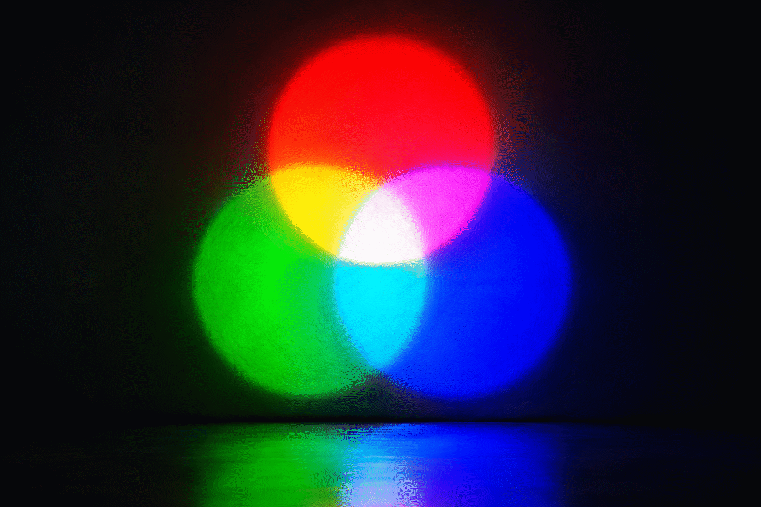
- Pink + blue: the sunset gradient — nostalgia plus romance (the synthwave chord)
- Red + white: the diner classic — appetizing plus clean
- Purple + blue: the dream sequence — mystic plus calm
- Green + pink: the garden chord — alive plus sweet
- Monochrome pairs (deep + bright of one hue): sophistication with energy — the layered single-color statement
Choosing by Meaning (The Decision Tree)
- What should the room or brand say? — one word (welcome, calm, bold, premium, playful)
- Read the word off the table above — two or three candidate colors
- Filter by context: the wall colors, the materials, the existing palette (the method)
- Filter by function: bedroom needs dimmable-warm or calm; business needs visibility and message (the two contexts)
- Preview the finalists on your actual words — meaning finalizes at the rendering, where message meets typeface (the builder)
The Meanings Are Real (Not Just Poetics)
These associations aren’t decoration-talk: decades of signage effectiveness, brand-color research, and environmental psychology sit behind them — the reason every fast-food chain runs red-and-yellow and every fintech runs blue (the evidence layer). Choosing a glow is participating in a working communication system with a century of calibration. Choose your message, then choose its color — in that order, in the custom builder.

Meaning in Practice: The Quick-Reference Scenarios
The decoder table applied to the eight most common real-world scenarios:
“I want the bedroom to feel romantic.” Meaning-first: passion (red family) or tenderness (pink family), filtered by room darkness — crimson or dusty pink for dark rooms, warm white as the meaning-neutral compromise for light ones (the bedroom color map). The meaning layer says warm; the physics layer says dimmable; the intersection is the answer.
“The business needs walk-ins.” Urgency and appetite: red and orange’s commercial century (the business logic). “OPEN” in red is the medium’s oldest working sentence because the meaning is the message.
“The salon should flatter clients.” The flattery economy: pink and warm registers — the color that makes everyone near it look good (the pink physics), which is why beauty runs it worldwide.
“The gaming wall needs energy.” Arousal hues at saturation: electric blue, purple duotones, RGB flexibility (the gaming schemes) — meaning-tech, meaning-focus, meaning-mood.
“The wedding sign must be timeless.” Warm white’s neutrality dividend (the wedding palette logic): meaning-clean, decade-proof, palette-universal — the color that means designed rather than dated.
“The kids’ room wants friendly.” Yellow and warm registers at low dim (the kids’ setups): meaning-cheer, meaning-safe, and the gentlest nightlight physics in the palette.
“The bar should feel crafted.” Amber, burgundy, deep green — the speakeasy vocabulary (the bar palette): meanings of warmth, depth, and establishment.
“The home office needs focus without coldness.” Natural white or soft green — meaning-clarity with meaning-alive (the office ideas): the corporate world’s trust hues, softened for home.
The scenarios’ shared method: name the meaning first, filter by physics and room second, and the color chooses itself — the decoder’s whole architecture in one habit (render the finalists).
FAQ: Neon Color Meanings
What do neon colors mean? Each glow carries coded meaning: red urgency and appetite, orange warmth, yellow cheer, green nature and money, blue trust and tech, purple luxury and mystery, pink romance and confidence, white clarity and premium. The full decoder table above maps home and business contexts.
Which neon color means love? Red and pink, in different registers: red is passionate and cinematic, pink is sweet and romantic. Dark reds (crimson) read sultry; dusty pinks read tender (the guides).
What does a purple neon sign mean? Luxury, mystery, and creativity — the royal code plus the mystic register: premium lounges, beauty brands, artistic spaces, and the witchy-aesthetic corner at home.
What neon color is best for a business? Match the message: red/orange/yellow for appetite and energy (food, casual), blue for trust (tech, professional), green for fresh/eco/finance, purple for premium beauty, pink for flattery-economy (salons, desserts) — the full commercial logic in the business color guide.
Do neon color meanings actually affect behavior? Yes — the associations are the operating system of a century of signage and brand color: appetite reds measurably move food sales, trust blues anchor professional branding. The behavioral evidence is covered in our psychology guide.
Can the same neon color mean different things in different rooms? Consistently — red means urgency at a storefront and romance in a bedroom; the context column in the decoder table is where meaning finalizes. Room, materials, and accompanying palette all modulate the code.
The decoder’s closing note: meanings are the medium’s operating system — a century of signage, brand, and culture coding responses to each hue, free to read and expensive to ignore (speak the code). Name the message first, filter by room and physics second, and every color choice becomes communication rather than decoration. The table above is the vocabulary; the walls you hang it on are the conversation. Do neon color meanings vary by culture? Yes, meaning systems are cultural — the decoder above reflects the Western signage tradition where the medium’s century ran; other cultures layer their own codes (red’s fortune-meaning in Chinese contexts, white’s mourning associations in some East Asian traditions). The practical rule for global-facing work: verify the palette’s local reading before committing (the commercial logic) — the physics is universal; the poetry translates unevenly.
What color neon means love or romance? Red for passion (the cinematic register), pink for tenderness (the social-romantic), and warm white for the timeless version — three love registers the decoder maps fully (the meanings), with the shade choice setting the tone: crimson for sultry, blush for sweet, warm white for wedding-elegant.
The meanings were built by a century of shops, films, and feeds working in concert — the free dictionary every buyer inherits at first glow.
Choose your message, then choose its color, in that order — and the decoder above translates between them fluently.
Sources & Further Reading
- Neon sign (Wikipedia) — the consolidated public record of neon-sign history and technology.
- Mercury (U.S. EPA) — federal guidance on mercury exposure and safe handling.