Yellow Neon Sign Aesthetic: Sunny Glow Ideas
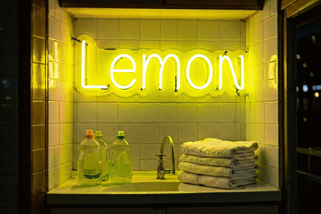
Yellow neon is the palette’s brightest physical glow — the wavelength band human eyes perceive as most luminous — and that single fact shapes its entire aesthetic: yellow signs achieve full presence at smaller sizes and lower dim settings than any other hue, read cheerful before anything else, and own the retro-diner register outright. Where red shouts and blue calms, yellow shines: the room’s sun, available at midnight.
The physics of that brightness lives at what makes neon yellow; this is the aesthetic guide: yellow’s two registers, its unusual rules of use, and the rooms it lights best. The warm-white adjacency (yellow’s sophisticated cousin) is covered in the color temperature guide.
Yellow’s Two Registers
The optimist. Yellow’s default read: cheerful, warm, sunny, friendly. Smileys, suns, star icons, happy-word scripts — the register that makes rooms feel like good moods (the smiley genre). This yellow suits kids’ rooms, kitchens, and any corner that wants morning energy at all hours.
The retro diner. Yellow’s vintage register: the golden-age diner and motel vocabulary, where yellow script and arrows meant food, rest, and welcome (the retro look). This yellow pairs with red and cream for the Americana trinity, and with warm wood for the breakfast-counter look.
Between them sits the practical truth both registers share: yellow is the high-efficiency glow — maximum presence per watt, per inch, and per dollar of visual impact.
The Brightness Rules (Yellow’s Unusual Discipline)
Because yellow out-glows every other hue, using it well inverts the usual advice:
- Size down further than instinct: a yellow sign reads one size larger than the same sign in any other color — order modestly (sizing math)
- Dim is not optional, it’s the aesthetic: full-brightness yellow is daylight; 20–30% yellow is honey. The evening setting is where the color lives (dimming)
- It flatters everything: yellow light warms skin tones (it’s candlelight-adjacent) — the reason yellow selfie corners work without the flattery engineering pink requires
- Dark rooms, maximum pop: yellow against black or charcoal is the sun-at-night look — the highest contrast pairing after red-on-black, with a friendlier register
The Rooms Yellow Owns
Kitchens and breakfast corners. Yellow’s domestic home: sunny, appetizing, diner-authentic (kitchen placement). Coffee vocabulary in yellow is the genre standard (the coffee register).

Kids’ rooms and playrooms. The optimist register’s home field: suns, stars, smileys — cheerful at 20% dim as the world’s friendliest nightlight (kids’ setups).
Retro diners and Americana schemes. The vintage register: arrows, script, “EAT,” the motel-row vocabulary in its authentic gold (vintage style).
Reading nooks and morning corners. The cozy use: warm yellow at low dim over a chair — sunlight on demand, the anti-noir.
Content corners. The camera logic: yellow holds saturation on sensors and flatters faces — the selfie-wall color that doesn’t need color-grading (photography method).
The Shade Range
- Golden yellow — the warm original: diner, honey, morning registers
- True/bright yellow — the high-energy sun: optimist default, maximum brightness
- Lemon yellow — the zesty fresh: playful, kitchen-forward, pairs with mint
- Amber-yellow — the deepest end: vintage glass warmth, candlelight-adjacent (the warm spectrum)
The Pairings That Work
- Yellow + black — sun-at-night; maximum pop, friendly register
- Yellow + red + cream — the diner trinity, authentic Americana
- Yellow + warm wood — the breakfast-counter look
- Yellow + mint/teal — the retro-fresh pairing: fifties palette, modern execution
- Yellow + gray — the contemporary balance: sun against slate
- Yellow + white walls — the bright minimal look; daylight decor
Full pairing system: neon color combinations.
The Sign Vocabulary in Yellow
- Suns, stars, smileys: the optimist icon set (the smiley guide)
- Happy-word scripts: HELLO, GOOD VIBES, sunshine vocabulary (the hello genre)
- Diner vernacular: EAT, arrows, OPEN-era scripts (retro vocabulary)
- Coffee and breakfast words: the kitchen standards (café register)
- Lightning bolts: yellow’s energy icon — sunshine-adjacent rather than blue’s tech read (the bolt genre)
- Small-and-mighty pieces: because yellow needs less size to carry — the desk and shelf format’s best color

Building the Yellow Room (Order of Operations)
- Pick the register: optimist (true/lemon) or retro (golden/amber) — shade follows
- Order one size down from instinct: yellow inflates visually
- Set the dim schedule immediately: honey at 20–30% is the living-with-it setting
- Stage against dark or warm surroundings: black for pop, wood for authenticity, gray for balance
- Choose the icon-forward or word-forward path: yellow carries icons exceptionally (its brightness does the design work)
- Preview shade + word live in the custom builder
Galleries: yellow neon sign for finished examples; neon room aesthetic ideas for the whole method.
The Yellow Workbook: Size, Dim, Register
Yellow’s decision sheet — the efficiency glow’s three questions:
Which register — optimist or retro? The optimist runs true and lemon yellows with suns, stars, smileys, and happy words (the icon set); the retro runs golden and amber with diner scripts, arrows, and the Americana vocabulary (the vintage look). The room’s existing mood names it: playful spaces take the optimist, wood-and-cream spaces take the retro.
How small should you order? Smaller than instinct — the brightness rule: yellow out-glows every hue and reads one size larger than its measurements (the physics). A yellow desk piece carries like a medium wall sign; a 36-inch yellow statement owns a large room. When torn between sizes, choose down.
What’s the dim schedule from day one? Yellow’s living level is 20–30% — honey, not daylight (the dimming habit). Full brightness is for photos and parties; the dim is for everything else. Yellow without dimming reads as energy first and fixture second; yellow with dim discipline reads as warm design lighting that happens to spell something.
The materials check. Yellow’s best stages: black and charcoal (sun-at-night — the maximum-pop pairing (the black rules)), warm wood (the breakfast counter), cream and gray (the modern balance), and red accents (the diner trinity). What defeats yellow: competing saturated colors — yellow wants the room’s color budget for itself.
The camera dividend. Yellow flatters faces (continuous-spectrum warmth) and holds saturation on sensors — the selfie-corner hue that needs no color-grading (the photography notes). Vanity corners and content walls running yellow get the flattery physics free.
The one-config recommendation. A sun or smiley icon at desk scale, golden yellow, dimmed to honey, against a dark or wood-toned wall — the smallest sign with the largest warmth-per-dollar in the palette (size it in the builder).
FAQ: Yellow Neon Aesthetics
What does a yellow neon sign say about a room? Cheerful and warm with retro undertones: yellow reads sunny and optimistic by default, diner-authentic in its vintage register — and physically, it’s the brightest glow in the palette, achieving presence at smaller sizes and lower settings than any other hue.
Is yellow neon too bright for bedrooms? At full brightness, it’s daylight — but dimmed to 20–30%, yellow becomes honey: the warm cozy glow that flatters everything. The dimmer is the bedroom tool, not a smaller sign.
What goes well with yellow neon? Black (sun-at-night contrast), red and cream (the diner trinity), warm wood (breakfast-counter), mint (retro-fresh), gray (contemporary balance) — and yellow flatters skin tones in photos without effort.
What’s the most popular yellow neon sign? Suns, stars, and smileys in the optimist register; diner scripts and arrows in the vintage one — and coffee-vocabulary pieces as the kitchen crossover, all in the golden-to-true shade range.
How is yellow different from warm white neon? Yellow is saturated and sunny — a color statement; warm white is neutralized and architectural — a lighting statement. The spectrum between them is mapped in the color temperature guide.
Does yellow neon work in small spaces? Exceptionally — it’s the efficiency color: high perceived brightness per inch makes yellow the best desk, shelf, and small-wall glow in the palette (desktop formats).
Yellow’s summary: the brightest physics in the palette, the cheer register with the retro undertow, the size-down-dim-down discipline that turns sunshine into honey, and the small-format champion where presence-per-inch beats every hue (size it in the builder). The yellow room done right is the medium’s optimism engine — suns, stars, and diner scripts glowing at living levels, warming everything near them. Order one size smaller than instinct, set the dim two steps lower, and yellow out-performs its price in every room it enters. What is the difference between golden yellow and amber neon? Golden yellow sits in the bright-sun register (the optimist default, highest perceived brightness); amber runs deeper toward orange (the vintage glass warmth, candlelight-adjacent). The choice is register: morning-energy rooms take golden, evening-authenticity rooms take amber — and both dim into the honey range that makes yellow the palette’s coziest low-glow family (the temperature spectrum).
What is the best yellow neon sign for a kitchen? The breakfast-register pieces: coffee and culinary scripts in golden yellow, sun and citrus icons, the diner-vocabulary classics — sized modest (kitchen walls break fast) and dimmed to honey for the evening hours (kitchen placement). The coffee-word piece is the genre’s best-seller for a reason: it works at 7 am and 11 pm alike.
Sources & Further Reading
- Neon: Strong Lines (NIST Physical Reference Data) — the standard reference for neon’s emission wavelengths.
- Neon sign (Wikipedia) — the consolidated public record of neon-sign history and technology.