Dark Pink Aesthetic Neon Signs: Deep Glow Ideas
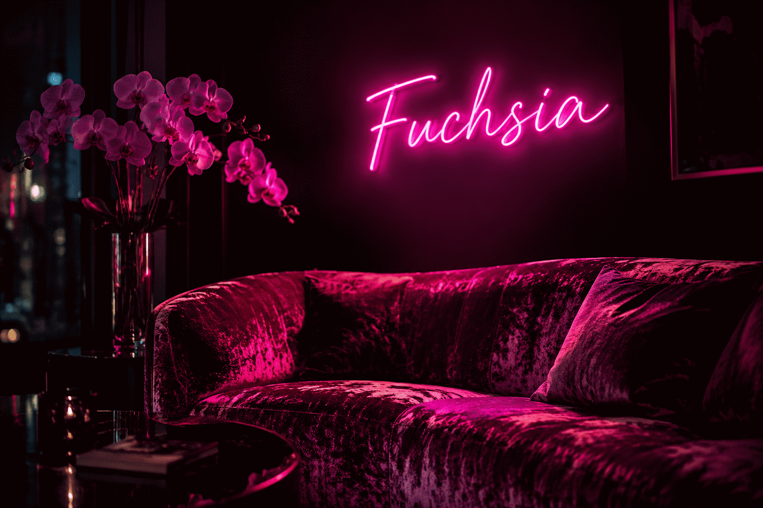
Dark pink neon is hot pink with the maturity turned up — the same confidence, less bubblegum. Where bright pink reads playful and social, dark pink reads sophisticated-sultry: the boudoir register, the wine-bar glow, the “adult aesthetic” that the palette’s deeper magentas and raspberry tones have quietly built into their own category. If pink is the aesthetic era’s signature color, dark pink is its evening mode.
The physics and social history of the parent hue live at what makes neon pink and the full-color aesthetic at pink neon sign aesthetic; this is the shade-depth guide — what dark pink does differently, where it belongs, and how to use the palette’s most adult glow.
The Shade, Defined (It’s a Range)
“Dark pink” in neon practice spans four neighbors worth telling apart:
- Deep hot pink — the saturated center: everything bright pink does, with the volume knob one turn down and the depth one turn up
- Magenta — the red-shifted end: berry-rich, dramatic, the wine-register pink
- Raspberry/fuchsia — the electric end: dark pink’s most vivid face — punchy but grown
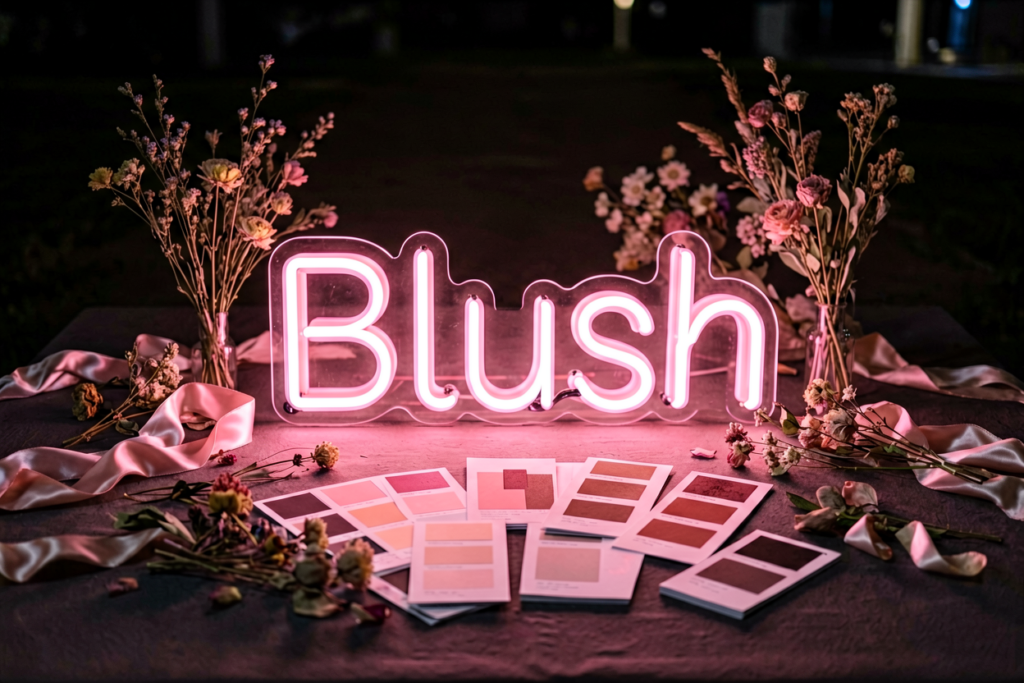
- Dusty rose/blush — the muted end: not dark so much as grayed pink — vintage, romantic, the wedding-world favorite
The practical distinction: deep hot pink and fuchsia are energy shades (statement pieces), magenta and dusty rose are mood shades (atmosphere pieces). Rooms usually want one or the other, not both.
What Dark Pink Does Differently
It reads adult rather than playful. Bright pink’s register is the party and the selfie; dark pink’s is the cocktail lounge and the boudoir. The same heart icon changes meaning entirely by shade — worth remembering when a room’s style skews sophisticated.
It survives serious design contexts. Bright pink asks for fun surroundings; dark pink holds its own against leather, dark wood, and gallery walls — it’s the pink that works in rooms that don’t otherwise run pink (the pairing logic).
It photographs cinematic. Deep magentas hold saturation on camera beautifully and grade like film stills — the moody-pink content look runs on this (shooting neon).
It dims into luxury. Dark pink at 15–20% is candlelight-adjacent — arguably the most romantic low-dim glow in the palette after red itself (dimming).
The Rooms Dark Pink Owns
Boudoir bedrooms and vanity corners. The signature use: deep pink script over dark walls or velvet — the adult-glamour register bright pink can’t quite carry (bedroom placement).

Wine bars, cocktail corners, speakeasies. Magenta’s commercial home: the glow that says crafted cocktails, not sports bar (the bar vocabulary).
Bachelorette-and-bridal, elevated. The party register’s sophisticated version: bride-and-squad vocabulary in deep pink instead of bright — the look that photographs well at every age (the bachelorette genre).
Salon and beauty interiors. The flattery-adjacent register with maturity: deep pink glow in salons reads luxe rather than candy (salon color logic).
Romantic living corners. The two-seat conversation nook, deep pink at low dim — the evening-room look.
The Pairings That Work
- Dark pink + black — the boudoir standard; maximum sultry contrast (black-glow rules)
- Dark pink + burgundy/wine tones — the monochrome-deep look, texture-driven
- Dark pink + gold/brass — the luxe pairing; hardware richness meets glow richness
- Dark pink + navy — the sophisticated contrast: berry against midnight
- Dark pink + cream/ivory — the vintage-romantic register: dusty rose’s home turf
- Dark pink + emerald — the jewel-box pairing: two saturated depths holding each other
The Sign Vocabulary in Dark Pink
- Romantic scripts: LOVE, names, French vocabulary — the register’s native format
- Boudoir wordmarks: the confidence phrases, in magenta rather than bubblegum (the phrase vocabulary)
- Hearts and lips, deepened: the same icons, adult register (the lips genre)
- Wine and cocktail vocabulary: the bar-corner standards
- Bride-and-party words: the elevated bachelorette set
- Florals in outline: roses and peonies in deep pink line-work (the rose genre)

Choosing Between the Pinks (The Fast Decision)
Bright pink: parties, kids-teens, selfie corners, playful rooms (the bright guide). Dark pink: boudoirs, bars, sophisticated schemes, romantic evenings, rooms with leather and velvet. Dusty rose: weddings and vintage-romantic registers. If the room’s materials are dark and rich, the answer is dark pink almost by definition.
Preview every shade against your own words — the four dark pinks are genuinely different glows — in the custom builder. The finished examples live at pink neon sign, shades included.
The Dark-Pink Workbook: Shade and Staging
The dark-pink purchase’s decision sequence:
Which of the four shades — by room role. Deep hot pink (the saturated center — energy rooms, statements); magenta (the red-shifted wine register — bars, boudoirs); raspberry/fuchsia (the electric end — punchy party pieces); dusty rose (the muted vintage-romantic — weddings, cream-and-wood rooms (the full shade map)). The role test: statement rooms take the electric three, atmosphere rooms take the muted one.
The staging pre-check. Dark pink’s stage requirements: black or charcoal (the boudoir standard), velvet and leather (the texture carriers), brass and gold (the luxe multiplier — combinations), or deep wine tones (the monochrome depth). The anti-stage: bright daylight rooms with pastel furnishings — the adult register needs its darkness the way noir needs night.
Word or icon, in dark pink’s grammar. The romantic scripts (names, French vocabulary, LOVE-adjacent), the boudoir confidence phrases, wine-and-cocktail vocabulary for the bar corner, hearts and lips deepened (the icon set), and floral outlines (roses, peonies) for the softer end. Dark pink’s words skew intimate; its icons skew editorial — the register is adult in both.
The dim expectation — the palette’s romantic champion. Dark pink at 10–15% is the closest glow to candlelight in the palette (the dimming profiles): plan the evening level as the sign’s primary identity, with full brightness as the party mode. Bedrooms and wine corners discover this setting on night one and never leave it.
The choosing-between-pinks cheat. Bright pink for party/social/teen registers (the parent guide), dark pink for sophistication/romance/bar registers, dusty rose for weddings and vintage — three pinks, three rooms, no overlap when the room’s materials are the tiebreaker (dark and rich take the dark; light and sweet take the bright; cream and lace take the rose).
Preview every dark shade on your words — the four are genuinely different glows — in the builder.
FAQ: Dark Pink Neon
What is a dark pink neon sign? The shade-depth category spanning deep hot pink, magenta, fuchsia, and dusty rose — the adult register of the palette’s most popular color: sophisticated-sultry where bright pink is playful-social.
Is dark pink or bright pink better for bedrooms? Bright pink for playful and teen registers; dark pink for boudoir, romantic, and sophisticated schemes — deep magentas against dark walls or velvet are the signature adult-bedroom glow, and dim to the most romantic low light in the palette.
What colors go with dark pink neon? Black (the boudoir standard), gold and brass (luxe), navy (sophisticated contrast), wine tones (monochrome depth), cream (vintage romantic), and emerald (the jewel-box pairing) — dark pink survives serious materials that bright pink can’t.
What’s the difference between magenta and dusty rose neon? Energy versus mood: magenta and fuchsia are statement shades — vivid and dramatic; dusty rose is the muted-romantic end — grayed, vintage, the wedding-world favorite. Different rooms, different uses.
Are dark pink neon signs good for bars and salons? They’re the register’s native color: wine bars and cocktail corners run magenta for the crafted-evening mood, and salons run deep pink for luxe flattery — the sophisticated versions of pink’s commercial history (the business logic).
What words look best in dark pink neon? Romantic scripts and names, boudoir confidence phrases, wine and cocktail vocabulary, bridal words, and floral outlines — the register’s whole lexicon above, in the shade that carries them.
The dark-pink summary: pink’s evening mode — four shades from deep hot pink to dusty rose naming four rooms, the boudoir-and-wine-bar register, the velvet-and-brass staging requirements, and the palette’s most romantic dim (set the evening level). The dark-pink room done right is sophistication without coldness — adult energy, candlelight physics, the confidence bright pink has at parties translated into the register rooms live in nightly. Choose the shade by the room’s materials, dim into the 15% register, and the aesthetic earns its adjective. What backsplash or wall color goes with dark pink neon? The boudoir stack: charcoal, black, deep aubergine, and warm grays (the glow’s contrast carriers — the black rules); the softer stack: cream, warm white, and blush-tinted whites for the dusty-rose register. The anti-statement: saturated cool blues and greens competing with the pink’s warmth — dark pink wants its stage warm or dark, and rewards both.
What words look best in dark pink neon? The intimate register: names and romantic scripts, boudoir confidence phrases, wine and cocktail vocabulary for bar corners, and deepened hearts-and-lips icons (the vocabulary map) — dark pink’s words skew personal and adult, which is precisely its differentiation from the bright register’s party vocabulary.
Between the bright register’s parties and the dusty register’s weddings, dark pink owns the rooms where the evening is the point — and it holds those rooms with more sophistication than any hue this side of burgundy.
Sources & Further Reading
- Neon sign (Wikipedia) — the consolidated public record of neon-sign history and technology.