Neon Wedding Colors: Matching Your Palette
Wedding neon is a different color discipline from home neon: at home the sign is the palette, but at a wedding the sign joins one — your florals, linens, dresses, and venue tones already decided the color story, and the glow’s job is to complete it. The principle that prevents almost every mismatch: pick the sign color from colors already in the wedding, in this priority order — a hue from your florals, then your accent color, then warm white (the universal guest that works with every palette). Here’s the matching logic for the six common wedding palettes, plus the photographer’s preference that should carry real weight.
The full wedding-sign playbook (formats, phrases, backdrops, timelines) lives at wedding neon signs; this page is the color decision.
The Six Palettes and Their Glows
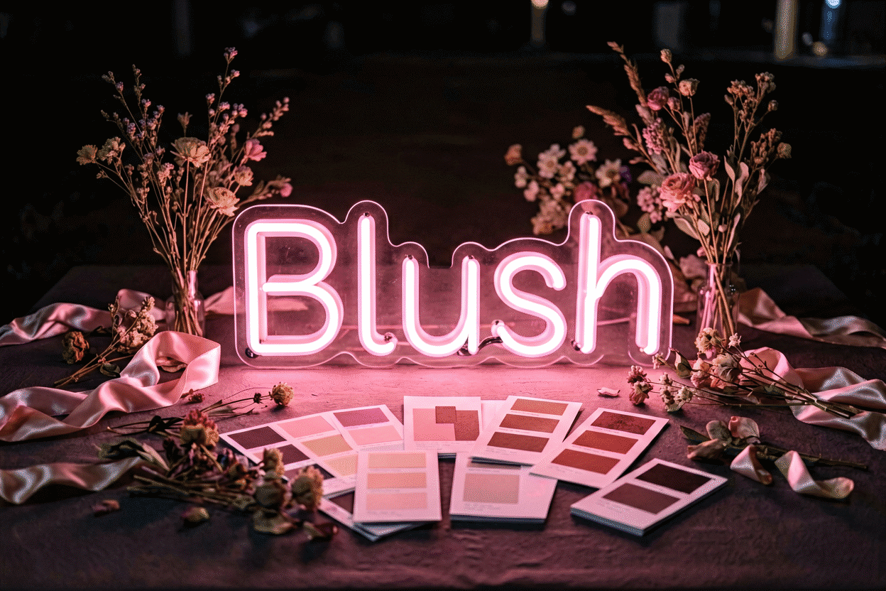
Blush / soft romantic (dusty rose, cream, sage): blush pink or warm white — the sign echoes the florals (blush logic). Deep pink reads too loud here; dusty rose glows are the exact register.
Classic white and green (white blooms, eucalyptus): warm white — the monochrome-elegant answer; the sign becomes lighting rather than color, which photographs as timeless (white guide).
Bold and moody (burgundy, black, gold): crimson or amber — the jewel-glows that hold their own against rich palettes (dark red logic).
Garden bright (coral, yellow, mixed brights): orange or golden yellow — playful energy that matches the palette’s own warmth.
Coastal / airy (blue, white, sand): ice blue or warm white — the soft-cool register (ice logic); electric blue overwhelms airy schemes.
Modern minimal (black, white, one accent hue): the accent hue — the sign becomes the palette’s single color statement; if no accent, warm white on a dark backdrop.
Why Warm White Is the Default Answer
When in doubt — and even florists agree here — warm white wins:
- Palette-universal: it flatters every scheme rather than competing with any (the temperature logic)
- Photographs as elegance: white glow reads editorial in wedding photography — “designed” rather than “party” (the shooting method)
- Ageless: colored glows date themselves by palette-era; warm white names-and-dates look as right in twenty years as this June
- Home-compatible: the sign that returns from the honeymoon to a bedroom wall integrates best in white (the afterlife)
The Photographer’s Preference (Evening Physics)
Most receptions happen in evening light, and warm glows — white, blush, amber — hold beautifully as ambient light fades, while cool saturated hues photograph harsher after dark and can tint skin oddly under mixed DJ lighting. The working rule from wedding photography: warm glows for the sign that anchors the evening; cool glows only for daylight-adjacent ceremonies and photo booths with controlled light. (Skin-flattery physics: the continuous-spectrum kindness of warm whites and pinks.)
Backdrop Interactions (The Color’s Partner)
The sign color finalizes against its backdrop, not in isolation (backdrop craft):
- Greenery and flower walls: warm glows (white, blush, amber) — cool hues sink into foliage
- White drape: everything works; blush and warm white read softest
- Dark or black backdrops: any saturated hue reaches maximum pop (the rules) — the moody-palette opportunity
- Balloon garlands: match the sign to the garland’s dominant balloon color, not its accent
The Two-Color Wedding Sign
Names-and-dates formats invite two hues — the craft rules (combinations):

- Word + accent split: names in warm white, the date or a small icon in the palette hue (or the reverse) — the standard, elegant execution
- Avoid 50/50: one hue dominates (names), one accents (icon/date); even splits read busy at distance
- Both hues from the palette: this is the whole secret — neither color invented, both pulled from florals or bridesmaid dresses
The Decision, Compressed
- Pull your three most-present palette colors from florals and linens
- Match the glow to one of them (priority: floral hue → accent → warm white)
- Check the backdrop interaction (warm on greenery; anything on dark)
- If two hues: names dominant + date/icon accent, both palette-native
- Lean warm for evening receptions (photographer’s rule)
- Preview your names in the finalists — the custom builder renders the exact pairing before you order (and wedding gallery shows finished examples per palette)
The Wedding Sign Spec Sheet
The color decision, translated to the order form:

The palette-pull specification. From your three most-present palette colors (florals, linens, bridesmaid dresses — pull from photos, not memory), the sign’s hue maps: floral hue first, accent second, warm white default (the priority logic). The spec sheet names it exactly: “blush pink matching the dahlias” photographs better than “pink” orders better than instinct.
The backdrop-matched specification. The backdrop enters the order: greenery walls want warm glows (white, blush, amber — the foliage pairing), dark backdrops accept any saturation, white drape softens everything (the backdrop interactions). Signs ordered for specific venues (the backdrop known) confirm the pairing at proof stage; signs for unknown backdrops default warm white — the universal guest.
The two-hue specification. Names-and-dates formats ordering two hues: names dominant in warm white or the palette hue, date-and-icon accent in the second — both palette-native, 80/20 dominance (the combinations discipline). The order-time check: both hues against the backdrop’s photo in the builder preview, not against each other in isolation.
The photographer’s specification, formalized. Evening receptions order warm (the after-dark physics (the wedding color guide)); daylight ceremonies have latitude for the cool and pastel registers. The one-line spec: “warm hues for the sign that anchors the evening; the cooler palette lives in the daylight photos.”
The afterlife specification. The sign’s home chapter enters the order: pieces destined for bedroom walls order their hue with the home palette in mind (the afterlife) — warm white and the palette pinks transition best; saturated statement hues love weddings and puzzle bedrooms. The two-chapter question (“wedding wall then home wall”) resolves at order time for free.
Five specifications, one proof, and the sign arrives speaking the wedding’s exact palette (order it — the builder renders both hues on your names before the deposit clears the calendar).
FAQ: Wedding Neon Colors
What color neon sign is best for a wedding? Pulled from your own palette: the floral hue first, the accent color second, and warm white as the universal default — palette-native beats favorite-color. The six standard palettes and their glows are matched above.
Is white or colored neon better for wedding signs? Warm white for timeless, palette-safe elegance (and the home-afterlife advantage); colored when your palette wants the echo — blush for romantic schemes, crimson for moody ones. Evening receptions lean warm either way.
What color neon sign suits a blush-pink wedding? Blush or dusty rose — the glow matching the florals; warm white beside it for names. Deep hot pink overwhelms soft-romantic palettes (the shade logic).
Should a wedding neon sign match the flowers or the dresses? The florals — they’re the palette’s most visible and most photographed element, and the glow echoing them reads intentional in every shot. Dresses set the tone (warm/cool family), florals set the hue.
Can a wedding neon sign have two colors? Yes, with dominance: names in one hue (dominant) plus the date or an icon in the second — both pulled from the palette. Fifty-fifty splits read busy; 80/20 reads designed (combinations).
What neon colors photograph best at evening receptions? Warm glows — warm white, blush, amber — hold beautifully in fading light and flatter skin under mixed DJ lighting; cool saturated hues turn harsh after dark and want daylight-adjacent or controlled-light placement (the method).
The wedding summary: the sign as palette member — pulled from florals first, accent second, warm white default; the six palette pairings; the evening-warm photographer’s rule; and the two-hue dominance discipline (order the palette piece). Wedding color is home color’s opposite brief: the room’s palette decides, the glow completes, and the warm whites win the decades. The names-and-dates piece that follows these rules photographs as timeless — which is what the format was always for. Can I see what the wedding sign color will look like before ordering? Yes, two ways: the builder’s live render on your names in each candidate hue (the preview), and the physical-sample route — makers ship color swatches or sample chips for palette-critical work, and wedding work qualifies (the vendor questions). Photograph the swatch against your florals’ photo in the same light; the match confirms or corrects before any deposit grows up into an invoice.
Should the wedding sign match the bridesmaid dresses or the flowers? Flowers first — they are the palette’s most photographed element and appear in nearly every frame the sign does; the dresses set tone (warm or cool family) more than hue. The sign pulled from florals reads intentional in every shot (the priority logic); the sign pulled from the dresses reads coordinated; the sign matching neither reads like it arrived with the DJ.
Florals first, warm white when in doubt, evening-lean for the reception — the wedding color discipline that photographs as timeless, in one line.
The palette decides, the glow completes, and the decades decide who was right — warm white’s quiet dynasty continues.
Sources & Further Reading
- Mercury (U.S. EPA) — federal guidance on mercury exposure and safe handling.
- Neon sign (Wikipedia) — the consolidated public record of neon-sign history and technology.