White Neon Sign Aesthetic: Minimal Glow Ideas
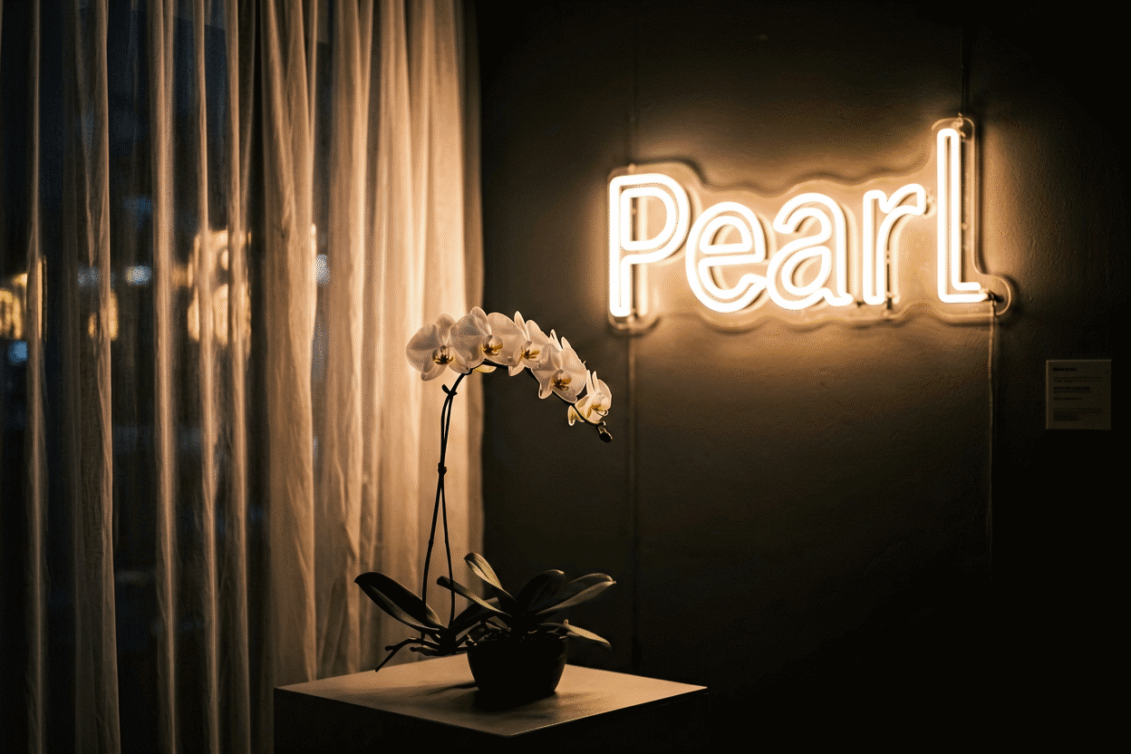
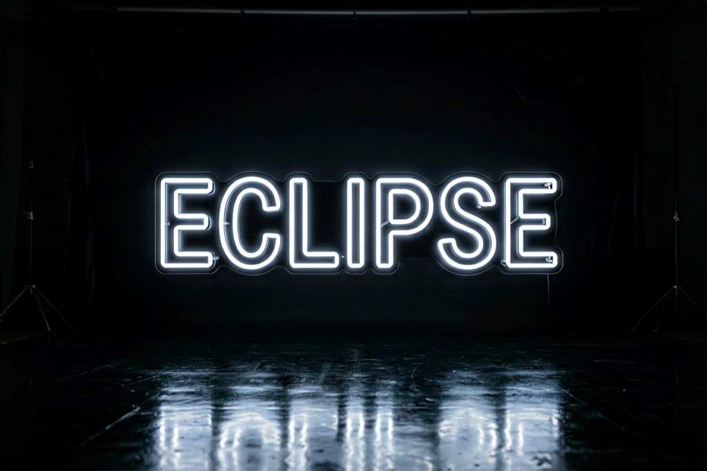
White neon is the palette’s quiet power move: the glow that reads as lighting rather than signage — architectural, gallery-grade, and endlessly versatile. Where colored neon says something, white neon illuminates something: the room itself becomes the statement. It’s the choice of minimalist interiors, Scandinavian schemes, and every space where the glow should feel designed-in rather than added-on — and the surprise of the modern market is that white (especially warm white) quietly outsells most colors for exactly that reason.
The physics of how neon makes white at all lives at what makes neon white; the aesthetic guide — temperature choice, the rooms white owns, and the pairing logic — is here.
The Core Idea: Lighting, Not Signage
Colored neon is content — a pink heart means something. White neon is form: a white script word over a bed is simultaneously the word and the room’s lighting layer. That double duty is the aesthetic’s entire value:
- It reads premium — the gallery-and-hotel register, where glow is architecture
- It survives redesigns — white works with every future wall color and furniture era
- It flatters universally — warm white is candlelight-adjacent, kind to every skin tone and material
- It photographs editorial — white glow is the “designed space” signal in interior photography (shooting it)
The Temperature Decision (White Is Three Colors)
White neon’s hidden depth is temperature — and choosing it well is the whole game:
| Temperature | Reads as | Best in |
|---|---|---|
| Warm white (~2700–3000K) | Candlelight-adjacent, cozy, premium | Bedrooms, living rooms, hospitality — the default choice |
| Pure/natural white (~4000K) | Clean, neutral, gallery | Studios, offices, modern kitchens |
| Cool/ice white (~6000K+) | Crisp, clinical, airy | Bathrooms, minimalist tech, spa registers (ice adjacency) |
The rule of thumb: match your room’s existing bulb temperature. A warm-lamp bedroom with a cool-white sign reads as a mistake; matched whites read as designed (the full temperature method).
The Rooms White Owns
Minimalist bedrooms. The signature look: warm white script over a neutral headboard — the “designed calm” glow. One word, one temperature, one statement (bedroom placement).

Scandinavian and modern schemes. White-on-white and white-on-wood: the glow integrates rather than decorates — the hygge register’s lighting answer (the aesthetic method).
Gallery walls and art corners. White neon as the neutral frame: it lights the wall’s actual art without competing — the gallery’s own trick.
Weddings and events. The sophisticated event register: warm white signage photographs as elegance rather than festivity (the wedding vocabulary) — names-and-dates in white is the timeless version.
Salons, boutiques, and studios. The premium commercial look: white glow says established rather than loud (the business color logic).
Bathrooms and spa corners. Cool white’s home: the hotel-spa register, at low dim (damp-room ratings).
The Pairings That Work
- White + everything — the neutrality dividend: any wall, any material, any future redesign
- White + wood — the Scandinavian standard; warm glow, warm grain
- White + monochrome rooms — the maximal-minimal look: white glow in gray/white/black schemes
- White + one accent color — the disciplined palette: white signage plus a single colored element (the favorite formula of interior editors)
- White + plants — the soft-jungle look: green foliage, warm glow (plant-corner method)
The Sign Vocabulary in White
- Script wordmarks: names, single words (DREAM, BREATHE, HELLO) — the signature format (the script logic)
- Line-art outlines: faces, hands, botanicals, geometric shapes — white suits line drawing best; it reads as pencil-light (the line-art genre)
- Quotes and lyrics: white’s neutrality suits longer text — the color lets words carry meaning without hue-interference
- Wedding formats: names-and-dates, MR & MRS — the timeless event standard (wedding gallery)
- Architectural shapes: moons in outline, suns in line — the celestial-minimal genre
The White-on-White Question
The one honest caveat: pure white signs against white walls in bright daylight can lose contrast when unlit — the glow solves it at night, but daytime presence depends on the backing and letter weight. Solutions that work: cut-to-shape backing with shadow-giving standoffs (backing guide), slightly heavier letterforms, or the black-backboard inversion — white glow on a black panel is among the sharpest looks in the palette (the black-glow rules).
Building the White Room (Order of Operations)
- Choose temperature by room and existing lighting — the one decision that matters most
- Pick the word or line-art — white rewards restraint: one script word or one outline shape
- Decide the daytime-presence strategy (backing, letter weight, or black board)
- Stage materials: wood, linen, stone — white glow loves natural textures
- Set the dim habit: warm white at 20–30% is the candlelight register
- Preview temperature + word live in the custom builder
Galleries: white neon sign for finished examples in every temperature; neon room aesthetic ideas for the whole-color method.
The White Workbook: Temperature, Presence, Pairing
The white purchase’s three decisions, in order of consequence:
Which temperature — and the room’s lamps decide. The 2700–3000K warm white for lamp-lit homes and evening rooms; the 4000K natural for studios and balanced kitchens; the 5500K+ cool for bathrooms and tech-minimal (the temperature guide). The unbreakable rule: match the room’s existing bulbs (the mixed-temperature error) — the one white-sign mistake no amount of design recovers.
The presence question — daylight strategy. White signs vanish against white walls in sunlight unless planned for: cut-to-shape backing with standoffs casts the shadow that defines (the backing guide), heavier letterforms hold contrast, and the black-board inversion makes white-on-black the palette’s sharpest look (the rules). Rooms that glow mostly at night can ignore this; daylight-lived rooms can’t.
Word or line? White’s two native formats: script wordmarks (names, single words — the signature (the font logic)) and line-art outlines (faces, botanicals, moons — pencil-light drawing). Longer text suits white uniquely well: its neutrality lets words carry meaning without hue-interference (the design flow). The minimal register’s discipline: one script word or one outline, never both.
The pairing freebie. White pairs with everything — it’s the palette’s universal anchor (combinations): white-plus-one-accent is the interior-editor formula; white-on-black is the noir-minimal; white-plus-wood is the Scandinavian standard. In multi-sign rooms, white is the harmony layer that lets one colored piece shine.
The dim expectation. Warm white at 15–20% is candlelight-adjacent — the premium low glow, the hotel-register evening. Plan to live there; full white is for tasks and photos (the dimming profiles).
Render every temperature on your actual words in the builder — white’s three temperatures are three different rooms, and the preview is the only honest way to feel the difference before it’s on your wall.
FAQ: White Neon Aesthetics
What does a white neon sign say about a room? Designed and calm: white glow reads as architectural lighting rather than signage — the gallery-and-hotel register, premium and endlessly versatile, which is why it quietly outsells most colors.
Is warm white or cool white better for a bedroom? Warm white (~2700–3000K), almost always — candlelight-adjacent and cozy. Cool white suits bathrooms and tech-minimal schemes. The full temperature logic is in the color temperature guide.
Do white neon signs work on white walls? At night, beautifully; in daylight, contrast depends on backing and letter weight — use cut-to-shape backing with standoffs, heavier letterforms, or invert with a black backboard for the sharpest version.
What are the best white neon sign designs? Script wordmarks (names, single words), line-art outlines (faces, botanicals, moons), quotes and lyrics in longer text, and wedding names-and-dates — white’s neutrality lets the form carry.
Is white neon good for weddings? It’s the sophisticated choice: warm white signage photographs as timeless elegance — the names-and-dates format that never looks dated against any wedding palette (the gallery).
Why is white neon so popular in minimal interiors? Because it’s double-duty: the word and the lighting layer. White glow integrates into any scheme and survives every redesign — the neutrality dividend no color can match.
White’s summary: the palette’s quiet power — lighting rather than signage, three temperatures naming three moods, the universal pairing layer, and the register that survives every redesign and wedding palette alike (choose your Kelvin). The white room done right is the interior-editor’s glow: one script or one outline, matched to the lamps, dimmed to candlelight-adjacent, reading as designed calm rather than decor. It is the least loud and most durable choice in the medium — the connoisseur’s default for good reason. Is white neon brighter than colored neon? Perceived brightness differs by design: white (especially natural and cool whites) reads as the most luminous to the eye across the whole sign, while yellow holds the single-hue brightness record and saturated colors trade brightness for color intensity (the physics). Practically: white signs light rooms best (the spill reads neutral), colored signs decorate rooms best — brightness is a function of what you want the glow to do, not a simple ranking.
Do white neon signs work in colorful rooms? They are the harmony layer: white glow beside any hue reads as lighting-plus rather than competing color — the reason multi-sign walls anchor in white and interior editors pair white signs with any palette (the pairing logic). In saturated rooms, match the temperature to the room’s warmth for full integration; the colorful room is white’s easiest assignment.
Sources & Further Reading
- Neon sign (Wikipedia) — the consolidated public record of neon-sign history and technology.
- Neon, element 10 (Wikipedia) — element properties: density, boiling point, abundance.